Downloaded 11 times


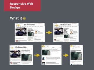

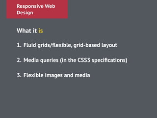
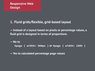
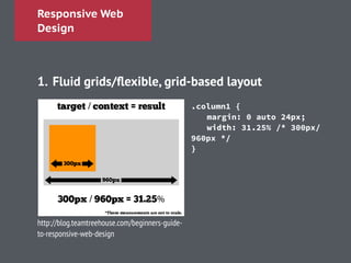


This document discusses responsive web design. It begins by defining the problem of desktop designs being unusable on mobile devices and having separate mobile sites. It then describes the key aspects of responsive web design: 1) fluid grids and flexible layouts based on proportions rather than pixels, 2) media queries to deliver different styles based on screen size, and 3) flexible images that scale to fit their container. It encourages researching users and sketching out the mobile experience before developing with a responsive grid, media queries, and frameworks.