Download as PDF, PPTX
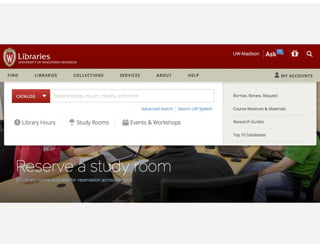
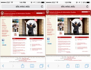
![WHAT IS RESPONSIVE WEB
DESIGN?
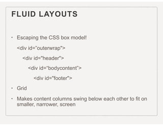
• Responsive web design (RWD) is an approach to web design aimed at
crafting sites to provide an optimal viewing experience—easy reading and
navigation with a minimum of resizing, panning, and scrolling—across a wide
range of devices (from desktop computer monitors to mobile phones).
[Wikipedia, the free encyclopedia]
3](https://image.slidesharecdn.com/cesrwd15-160224155036/85/Responsive-Web-Design-3-320.jpg)
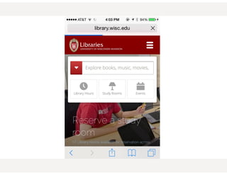
![WHAT IS RESPONSIVE WEB
DESIGN?
• Responsive web design (RWD) is an approach to web design aimed at
crafting sites to provide an optimal viewing experience—easy reading and
navigation with a minimum of resizing, panning, and scrolling—across a wide
range of devices (from desktop computer monitors to mobile phones).
[Wikipedia, the free encyclopedia]
“adapts the layout to the viewing environment by using fluid,
proportion-based grids”
3](https://image.slidesharecdn.com/cesrwd15-160224155036/85/Responsive-Web-Design-4-320.jpg)
![WHAT IS RESPONSIVE WEB
DESIGN?
• Responsive web design (RWD) is an approach to web design aimed at
crafting sites to provide an optimal viewing experience—easy reading and
navigation with a minimum of resizing, panning, and scrolling—across a wide
range of devices (from desktop computer monitors to mobile phones).
[Wikipedia, the free encyclopedia]
“adapts the layout to the viewing environment by using fluid,
proportion-based grids”
“flexible images”
3](https://image.slidesharecdn.com/cesrwd15-160224155036/85/Responsive-Web-Design-5-320.jpg)
![WHAT IS RESPONSIVE WEB
DESIGN?
• Responsive web design (RWD) is an approach to web design aimed at
crafting sites to provide an optimal viewing experience—easy reading and
navigation with a minimum of resizing, panning, and scrolling—across a wide
range of devices (from desktop computer monitors to mobile phones).
[Wikipedia, the free encyclopedia]
“adapts the layout to the viewing environment by using fluid,
proportion-based grids”
“flexible images”
“CSS3 Media Queries”
3](https://image.slidesharecdn.com/cesrwd15-160224155036/85/Responsive-Web-Design-6-320.jpg)
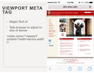
![WHAT IS RESPONSIVE WEB
DESIGN?
• Responsive web design (RWD) is an approach to web design aimed at
crafting sites to provide an optimal viewing experience—easy reading and
navigation with a minimum of resizing, panning, and scrolling—across a wide
range of devices (from desktop computer monitors to mobile phones).
[Wikipedia, the free encyclopedia]
“adapts the layout to the viewing environment by using fluid,
proportion-based grids”
“flexible images”
“CSS3 Media Queries”
<meta name=“viewport" content="width=device-width">
3](https://image.slidesharecdn.com/cesrwd15-160224155036/85/Responsive-Web-Design-7-320.jpg)
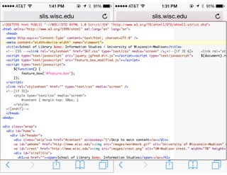


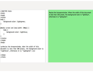
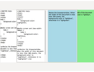
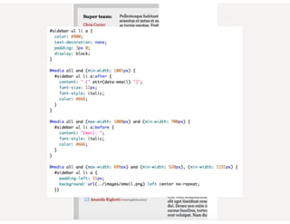
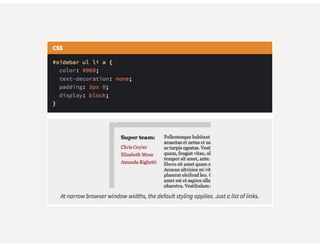
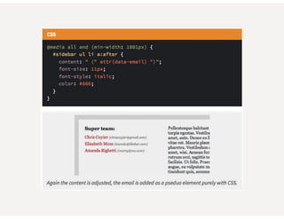
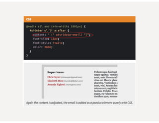
![CSS3 MEDIA QUERIES
• Used to mostly be screen or print
• Hide nav when printing
@media print { #navigation { display: none; } }.
• [W3Schools] Media queries look at the capability of the device, and
can be used to check many things, such as:
• width and height of the browser window
• width and height of the device
• orientation (is the tablet/phone in landscape or portrait mode?)
• Resolution
• You can also have different stylesheets for different media](https://image.slidesharecdn.com/cesrwd15-160224155036/85/Responsive-Web-Design-32-320.jpg)


This document provides an overview of responsive web design. It defines responsive web design as an approach that aims to provide optimal viewing experiences across different devices. It discusses the history and alternatives to responsive design. The key aspects of responsive design are then explained, including fluid grids, flexible images, CSS media queries, and using the viewport meta tag. Tools for responsive design like Bootstrap and techniques like fluid layouts are also covered. Finally, resources for further learning about responsive web design are provided.


![[heweb11] HTML5 Makeover](https://cdn.slidesharecdn.com/ss_thumbnails/html5-makeover-111027112644-phpapp01-thumbnail.jpg?width=640&height=640&fit=bounds)


![[edUi] HTML5 Workshop](https://cdn.slidesharecdn.com/ss_thumbnails/html5-workshop-2-111014103112-phpapp02-thumbnail.jpg?width=640&height=640&fit=bounds)


