Downloaded 438 times


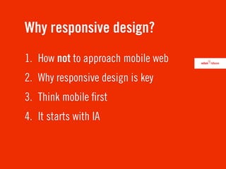


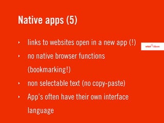


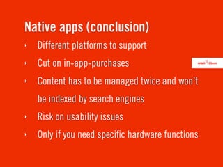


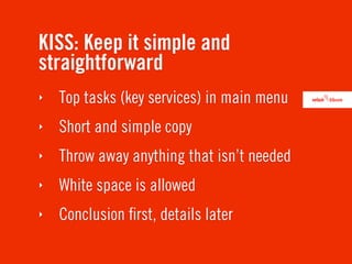


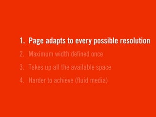


This document discusses responsive web design. It begins by outlining the failures of separate mobile websites and native apps. Responsive design is identified as the key approach because it allows for one website with a layout that adapts to any screen size. The document then covers various aspects of responsive design such as thinking mobile first, information architecture considerations, designing in the browser versus Photoshop, using a fluid or fixed grid, and making design decisions beyond just visual design.