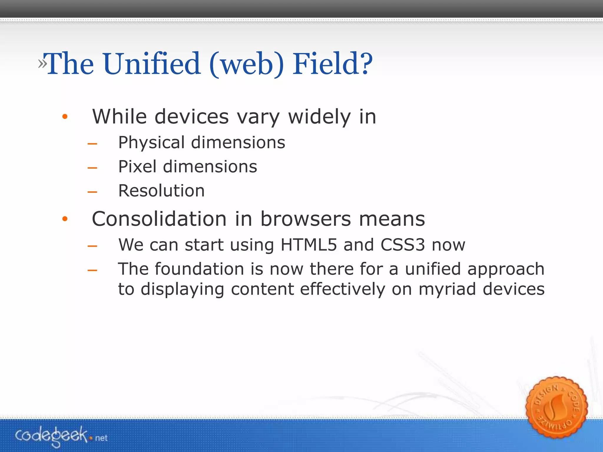
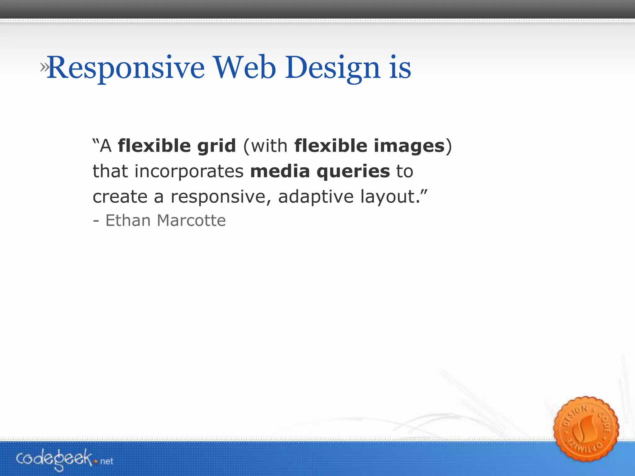
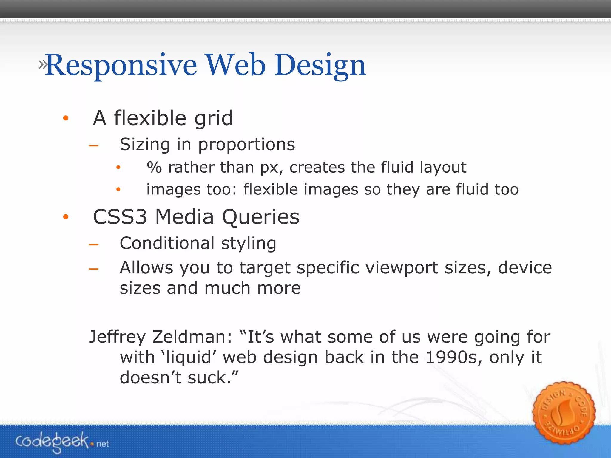
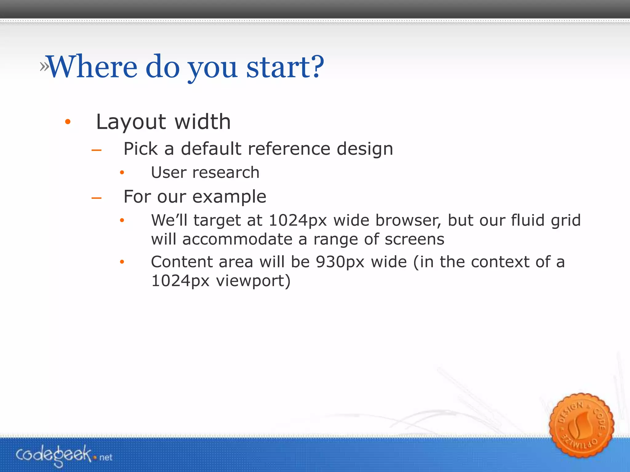
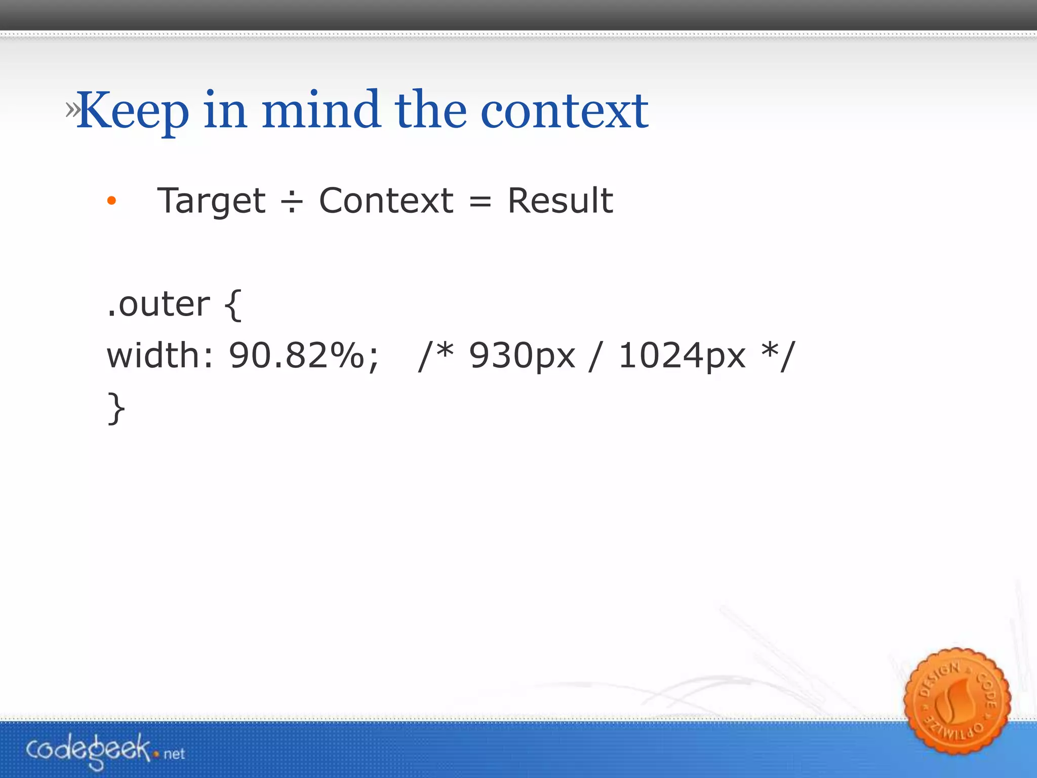
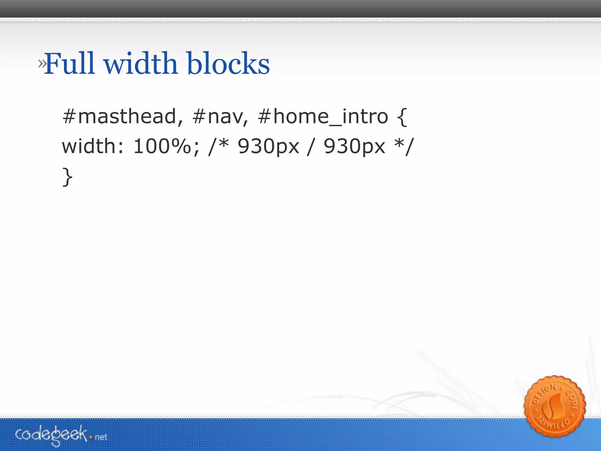
Responsive Web Design Fort Collins Internet Professionals August 12, 2010
When life was simple Flickr: Jean-Lou Dupont
1280 x 800 Photo: Steve Rhodes 1280 x 800 Flickr: goodrob13
1280 x 800 Photo: Steve Rhodes 16 : 9 Photo: Steve Rhodes
1280 x 800 Photo: Steve Rhodes Netbook 8.9” screen Flickr: ziaek
Title Many screens Flickr: aranarth
Title More is better 5120 x 1600 Flickr: jochenWolters
Title Flickr: photographer 2006 Smart Phones Flickr: barnoid
Title Flickr: photographer 2007 Smart Phones Flickr: PowerupMobile.com
Title Flickr: photographer And then came…
Title Flickr: photographer The One.
Title Flickr: photographer Copyright: Fox Studios
Title Flickr: photographer Flickr: bandita
Title Flickr: photographer January 9, 2007 Flickr: shapeshift
Title Flickr: photographer 2008 Smart Phones Flickr: midnightglory
Title Flickr: photographer 2009 Smart Phones Flickr: lalunablanca
Title Flickr: photographer 2009: Me Flickr: Spartacus007
Does Mobile Matter? Mobile internet adoption has outpaced desktop internet adoption by eight times http://www.morganstanley.com/institutional/techresearch/internet_ad_trends102009.html AT&T, the exclusive carrier for Apple's iPhone, has seen a 4,932% increase in mobile traffic data in the past three years http://www.lukew.com/ff/entry.asp?933 Smartphone sales will surpass worldwide PC sales by the end of 2011 http://www.pcworld.com/article/171380/
Flickr: Gravitywave
Title Flickr: photographer Innovation & Transition
Title Flickr: photographer 2010 iPad – 3 million sold in 80 days Flickr: JaredEarle
Title Flickr: photographer Oh yeah, it doesn’t run Flash Flickr: JaredEarle
Title Flickr: photographer iPhone 4 – 960 x 640 @ 326 ppi “Retina Display” Flickr: Yutaka Tsutano
Title Flickr: photographer Android, BlackBerry Flickr: Johan Larsson, dusk-photography
Title Flickr: photographer 2010 Many Screens Flickr: AndreasSchepers
Flickr: Malingering
Flickr: Beni Ishaque Luthor
We can rise above it Consolidation Web browsers are the most standards-compliant we’ve ever experienced Google Chrome: Webkit Safari: Webkit Firefox: Gecko IE8 is pretty darn good IE7 has issues, but manageable  IE6 < 10% usage (finally!)
Mobile browsers converging Android: Chrome: Webkit iOS: Safari: Webkit Blackberry:  Proprietary browser is default Opera Mobile available: Presto On par with Webkit Blackberry 6 will use Webkit http://devblog.blackberry.com/2010/08/developing-new-blackberry-browser/
Title Flickr: photographer Einstein’s quest for the Unified Field Flickr: Thomas Thomas
The Unified (web) Field? While devices vary widely in Physical dimensions Pixel dimensions Resolution Consolidation in browsers means We can start using HTML5 and CSS3 now The foundation is now there for a unified approach to displaying content effectively on myriad devices
Responsive Web Design is “ A  flexible grid  (with  flexible images ) that incorporates  media queries  to create a responsive, adaptive layout.” - Ethan Marcotte
Responsive Web Design A flexible grid Sizing in proportions % rather than px, creates the fluid layout images too: flexible images so they are fluid too CSS3 Media Queries Conditional styling Allows you to target specific viewport sizes, device sizes and much more Jeffrey Zeldman: “It’s what some of us were going for with ‘liquid’ web design back in the 1990s, only it doesn’t suck.”
Where do you start? Layout width Pick a default reference design User research For our example We’ll target at 1024px wide browser, but our fluid grid will accommodate a range of screens Content area will be 930px wide (in the context of a 1024px viewport)
Keep in mind the context Target ÷ Context = Result .outer { width: 90.82%;  /* 930px / 1024px */ }
Full width blocks #masthead, #nav, #home_intro { width: 100%; /* 930px / 930px */ }
Sizing in % rather than px .intro_content { width: 59.35%; /* 552px / 930px = 59.35% */  margin and padding too padding: 50px 30px 25px 25px; Becomes: padding: 50px 3.23% 25px 2.69%;  /* 30px / 930px,  25px / 930px */ }
What about images? img { max-width: 100%; } Important: in the HTML, don’t specify height and width attributes on images Can apply this to img, video, and object
Media Types <link rel=&quot;stylesheet&quot; media=&quot;screen&quot; href=&quot;c.css&quot; /> <link rel=&quot;stylesheet&quot; media=”print&quot; href=&quot;c.css&quot; />
CSS3 Media Queries… <link rel=&quot;stylesheet&quot;  media=&quot;screen and (max-width:340px)” href=“c.css” /> @media screen and (max-width:340px) { ... } @media screen and (max-width:340px) { ... }
CSS3 Media Queries min-width (refers to viewport dimensions) min-device-width refers to display dimensions of the device (maybe safe for identifying the device, iPad, iPhone, etc.) can select based on dpi or dpcm, not just width can select based on color depth
More Media Queries http://www.w3.org/TR/css3-mediaqueries/ width height device-width device-height orientation aspect-ratio device-aspect-ratio color color-index monochrome resolution scan grid
Browser Support Opera 9.5+ Firefox 3.5+ Safari 3 Chrome Mobile Webkit Opera Mobile ~
A magic bullet code.google.com/p/css3-mediaqueries-js/ IE8 and below Firefox 1 & 2 Safari 2
Design: Factors to Consider Range of devices with which your content will be viewed How to layout content effectively for different platforms Base image size may not be based on your default targeted layout. Have a plan for long-line lengths on large displays
Resources The article that started it all, by Ethan Marcotte: http://www.alistapart.com/articles/responsive-web-design/ Fluid Images by Ethan Marcotte: http://unstoppablerobotninja.com/entry/fluid-images IE8 and below Media Queries fix: http://code.google.com/p/css3-mediaqueries-js/ IE6 min/max-width hack: http://www.cameronmoll.com/archives/000892.html Fluid Grids by Ethan Marcotte: http://www.alistapart.com/articles/fluidgrids/ Media Queries reference, list of Media Query selectors available: http://www.w3.org/TR/css3-mediaqueries/ Responsive Typesetting: http://www.alistapart.com/d/responsive-web-design/ex/ex-article.html
A few examples http://www.zeldman.com/2010/06/23/responsive-design-is-the-new-black/
Resources Notes and links to resources: http://typewith.me/fcip-rwd
Where to find me @ron_z – follow me on Twitter [email_address] codegeek.net SocialMediaPilots.com EinsteinAndSockMonkey.com  @EinsteinMonkey A new web design/dev/ux podcast with Steve Martin @CleverCubed IgniteFortCollins.com and @IgniteFC The Fort Collins Hive: HiveFC.com
Many Thanks to: Ethan Marcotte – for the well-crafted articles describing and demonstrating Responsive Web Design, Fluid Grids, and Fluid Images. Thanks for the excellent talk on the topic at An Event Apart Minneapolis in July 2010 too. http://unstoppablerobotninja.com/ Luke Wroblewski for the info and stats about mobile trends and techniques during your talk at AEA Minneapolis and on the web http://www.lukew.com/ ff/
Responsive Web Design Fort Collins Internet Professionals August 12, 2010

Responsive Web Design

  • 1.
    Responsive Web DesignFort Collins Internet Professionals August 12, 2010
  • 2.
    When life wassimple Flickr: Jean-Lou Dupont
  • 3.
    1280 x 800Photo: Steve Rhodes 1280 x 800 Flickr: goodrob13
  • 4.
    1280 x 800Photo: Steve Rhodes 16 : 9 Photo: Steve Rhodes
  • 5.
    1280 x 800Photo: Steve Rhodes Netbook 8.9” screen Flickr: ziaek
  • 6.
    Title Many screensFlickr: aranarth
  • 7.
    Title More isbetter 5120 x 1600 Flickr: jochenWolters
  • 8.
    Title Flickr: photographer2006 Smart Phones Flickr: barnoid
  • 9.
    Title Flickr: photographer2007 Smart Phones Flickr: PowerupMobile.com
  • 10.
  • 11.
  • 12.
    Title Flickr: photographerCopyright: Fox Studios
  • 13.
  • 14.
    Title Flickr: photographerJanuary 9, 2007 Flickr: shapeshift
  • 15.
    Title Flickr: photographer2008 Smart Phones Flickr: midnightglory
  • 16.
    Title Flickr: photographer2009 Smart Phones Flickr: lalunablanca
  • 17.
    Title Flickr: photographer2009: Me Flickr: Spartacus007
  • 18.
    Does Mobile Matter?Mobile internet adoption has outpaced desktop internet adoption by eight times http://www.morganstanley.com/institutional/techresearch/internet_ad_trends102009.html AT&T, the exclusive carrier for Apple's iPhone, has seen a 4,932% increase in mobile traffic data in the past three years http://www.lukew.com/ff/entry.asp?933 Smartphone sales will surpass worldwide PC sales by the end of 2011 http://www.pcworld.com/article/171380/
  • 19.
  • 20.
    Title Flickr: photographerInnovation & Transition
  • 21.
    Title Flickr: photographer2010 iPad – 3 million sold in 80 days Flickr: JaredEarle
  • 22.
    Title Flickr: photographerOh yeah, it doesn’t run Flash Flickr: JaredEarle
  • 23.
    Title Flickr: photographeriPhone 4 – 960 x 640 @ 326 ppi “Retina Display” Flickr: Yutaka Tsutano
  • 24.
    Title Flickr: photographerAndroid, BlackBerry Flickr: Johan Larsson, dusk-photography
  • 25.
    Title Flickr: photographer2010 Many Screens Flickr: AndreasSchepers
  • 26.
  • 27.
  • 28.
    We can riseabove it Consolidation Web browsers are the most standards-compliant we’ve ever experienced Google Chrome: Webkit Safari: Webkit Firefox: Gecko IE8 is pretty darn good IE7 has issues, but manageable IE6 < 10% usage (finally!)
  • 29.
    Mobile browsers convergingAndroid: Chrome: Webkit iOS: Safari: Webkit Blackberry: Proprietary browser is default Opera Mobile available: Presto On par with Webkit Blackberry 6 will use Webkit http://devblog.blackberry.com/2010/08/developing-new-blackberry-browser/
  • 30.
    Title Flickr: photographerEinstein’s quest for the Unified Field Flickr: Thomas Thomas
  • 31.
    The Unified (web)Field? While devices vary widely in Physical dimensions Pixel dimensions Resolution Consolidation in browsers means We can start using HTML5 and CSS3 now The foundation is now there for a unified approach to displaying content effectively on myriad devices
  • 32.
    Responsive Web Designis “ A flexible grid (with flexible images ) that incorporates media queries to create a responsive, adaptive layout.” - Ethan Marcotte
  • 33.
    Responsive Web DesignA flexible grid Sizing in proportions % rather than px, creates the fluid layout images too: flexible images so they are fluid too CSS3 Media Queries Conditional styling Allows you to target specific viewport sizes, device sizes and much more Jeffrey Zeldman: “It’s what some of us were going for with ‘liquid’ web design back in the 1990s, only it doesn’t suck.”
  • 34.
    Where do youstart? Layout width Pick a default reference design User research For our example We’ll target at 1024px wide browser, but our fluid grid will accommodate a range of screens Content area will be 930px wide (in the context of a 1024px viewport)
  • 35.
    Keep in mindthe context Target ÷ Context = Result .outer { width: 90.82%; /* 930px / 1024px */ }
  • 36.
    Full width blocks#masthead, #nav, #home_intro { width: 100%; /* 930px / 930px */ }
  • 37.
    Sizing in %rather than px .intro_content { width: 59.35%; /* 552px / 930px = 59.35% */ margin and padding too padding: 50px 30px 25px 25px; Becomes: padding: 50px 3.23% 25px 2.69%; /* 30px / 930px, 25px / 930px */ }
  • 38.
    What about images?img { max-width: 100%; } Important: in the HTML, don’t specify height and width attributes on images Can apply this to img, video, and object
  • 39.
    Media Types <linkrel=&quot;stylesheet&quot; media=&quot;screen&quot; href=&quot;c.css&quot; /> <link rel=&quot;stylesheet&quot; media=”print&quot; href=&quot;c.css&quot; />
  • 40.
    CSS3 Media Queries…<link rel=&quot;stylesheet&quot; media=&quot;screen and (max-width:340px)” href=“c.css” /> @media screen and (max-width:340px) { ... } @media screen and (max-width:340px) { ... }
  • 41.
    CSS3 Media Queriesmin-width (refers to viewport dimensions) min-device-width refers to display dimensions of the device (maybe safe for identifying the device, iPad, iPhone, etc.) can select based on dpi or dpcm, not just width can select based on color depth
  • 42.
    More Media Querieshttp://www.w3.org/TR/css3-mediaqueries/ width height device-width device-height orientation aspect-ratio device-aspect-ratio color color-index monochrome resolution scan grid
  • 43.
    Browser Support Opera9.5+ Firefox 3.5+ Safari 3 Chrome Mobile Webkit Opera Mobile ~
  • 44.
    A magic bulletcode.google.com/p/css3-mediaqueries-js/ IE8 and below Firefox 1 & 2 Safari 2
  • 45.
    Design: Factors toConsider Range of devices with which your content will be viewed How to layout content effectively for different platforms Base image size may not be based on your default targeted layout. Have a plan for long-line lengths on large displays
  • 46.
    Resources The articlethat started it all, by Ethan Marcotte: http://www.alistapart.com/articles/responsive-web-design/ Fluid Images by Ethan Marcotte: http://unstoppablerobotninja.com/entry/fluid-images IE8 and below Media Queries fix: http://code.google.com/p/css3-mediaqueries-js/ IE6 min/max-width hack: http://www.cameronmoll.com/archives/000892.html Fluid Grids by Ethan Marcotte: http://www.alistapart.com/articles/fluidgrids/ Media Queries reference, list of Media Query selectors available: http://www.w3.org/TR/css3-mediaqueries/ Responsive Typesetting: http://www.alistapart.com/d/responsive-web-design/ex/ex-article.html
  • 47.
    A few exampleshttp://www.zeldman.com/2010/06/23/responsive-design-is-the-new-black/
  • 48.
    Resources Notes andlinks to resources: http://typewith.me/fcip-rwd
  • 49.
    Where to findme @ron_z – follow me on Twitter [email_address] codegeek.net SocialMediaPilots.com EinsteinAndSockMonkey.com @EinsteinMonkey A new web design/dev/ux podcast with Steve Martin @CleverCubed IgniteFortCollins.com and @IgniteFC The Fort Collins Hive: HiveFC.com
  • 50.
    Many Thanks to:Ethan Marcotte – for the well-crafted articles describing and demonstrating Responsive Web Design, Fluid Grids, and Fluid Images. Thanks for the excellent talk on the topic at An Event Apart Minneapolis in July 2010 too. http://unstoppablerobotninja.com/ Luke Wroblewski for the info and stats about mobile trends and techniques during your talk at AEA Minneapolis and on the web http://www.lukew.com/ ff/
  • 51.
    Responsive Web DesignFort Collins Internet Professionals August 12, 2010

Editor's Notes

  • #19 Prediction: by 2014 90% of web devices will be mobile
  • #34 Show example of Amscan.org