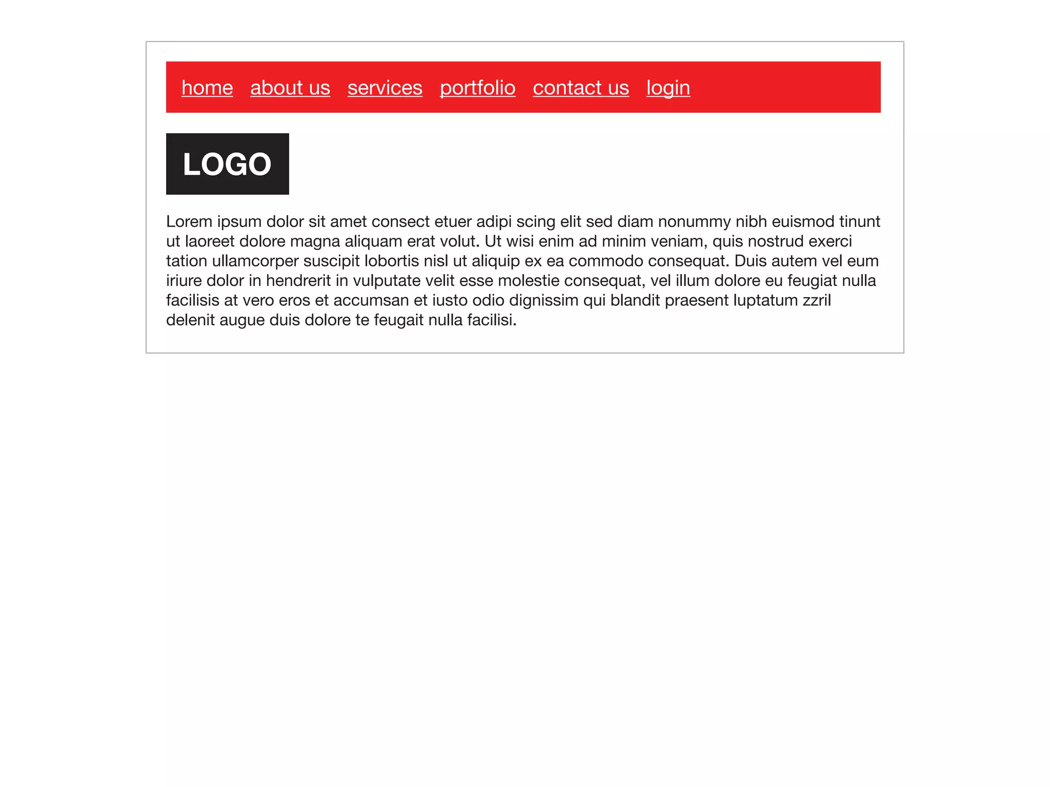
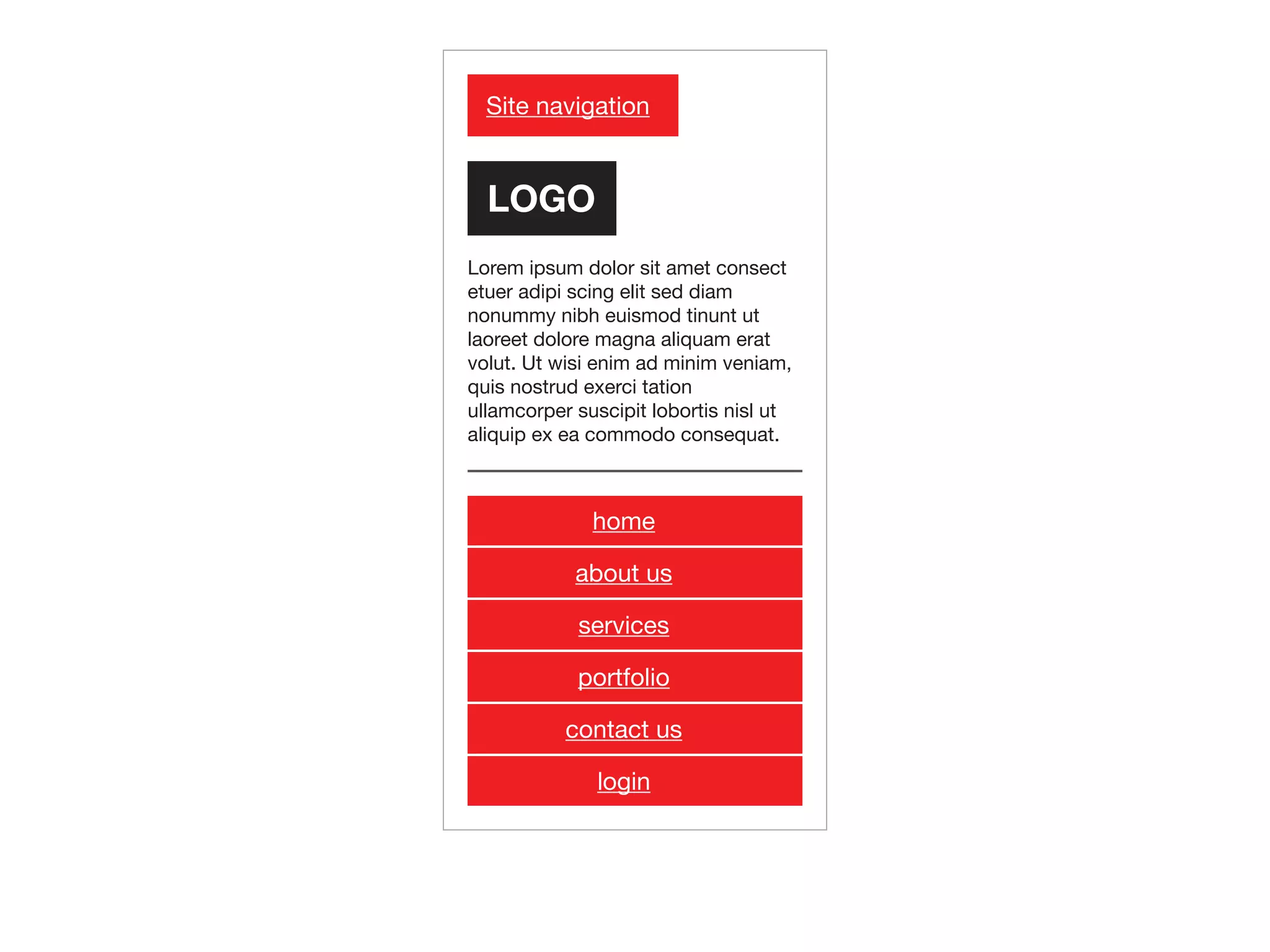
Download as PDF, PPTX


![<body>
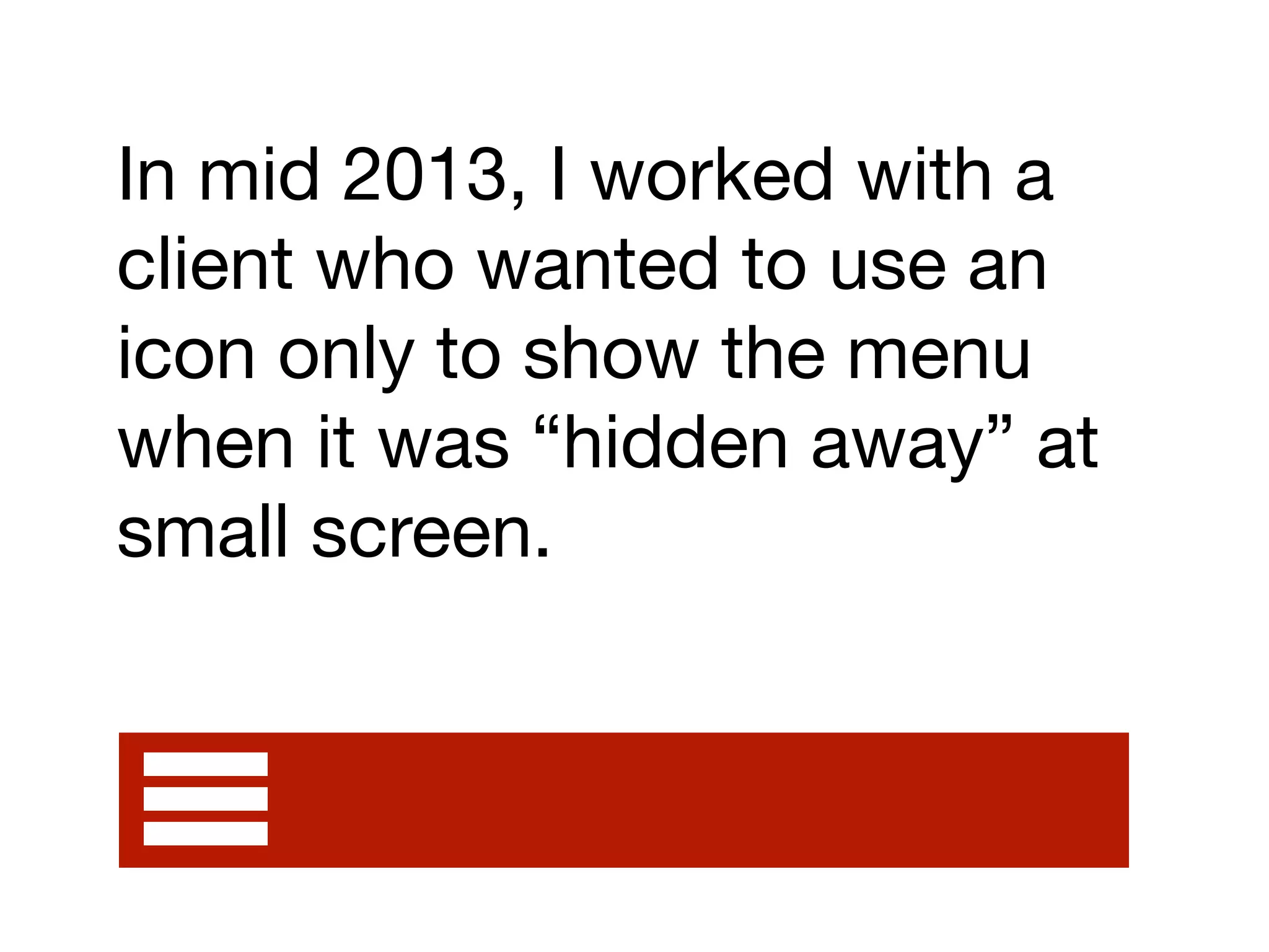
! {{>header}}
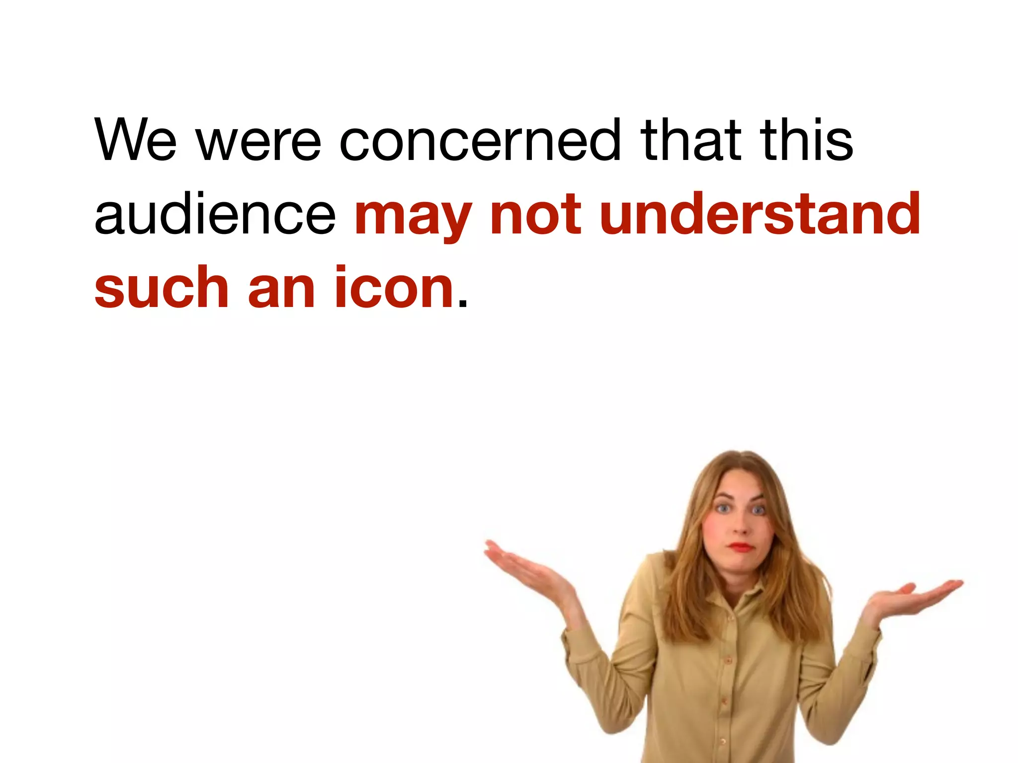
!
! [...document content...]
!
! {{>footer}}
</body>](https://image.slidesharecdn.com/ux-mobile2-140314031142-phpapp02/75/Responsive-Web-Design-more-than-just-a-buzzword-50-2048.jpg)
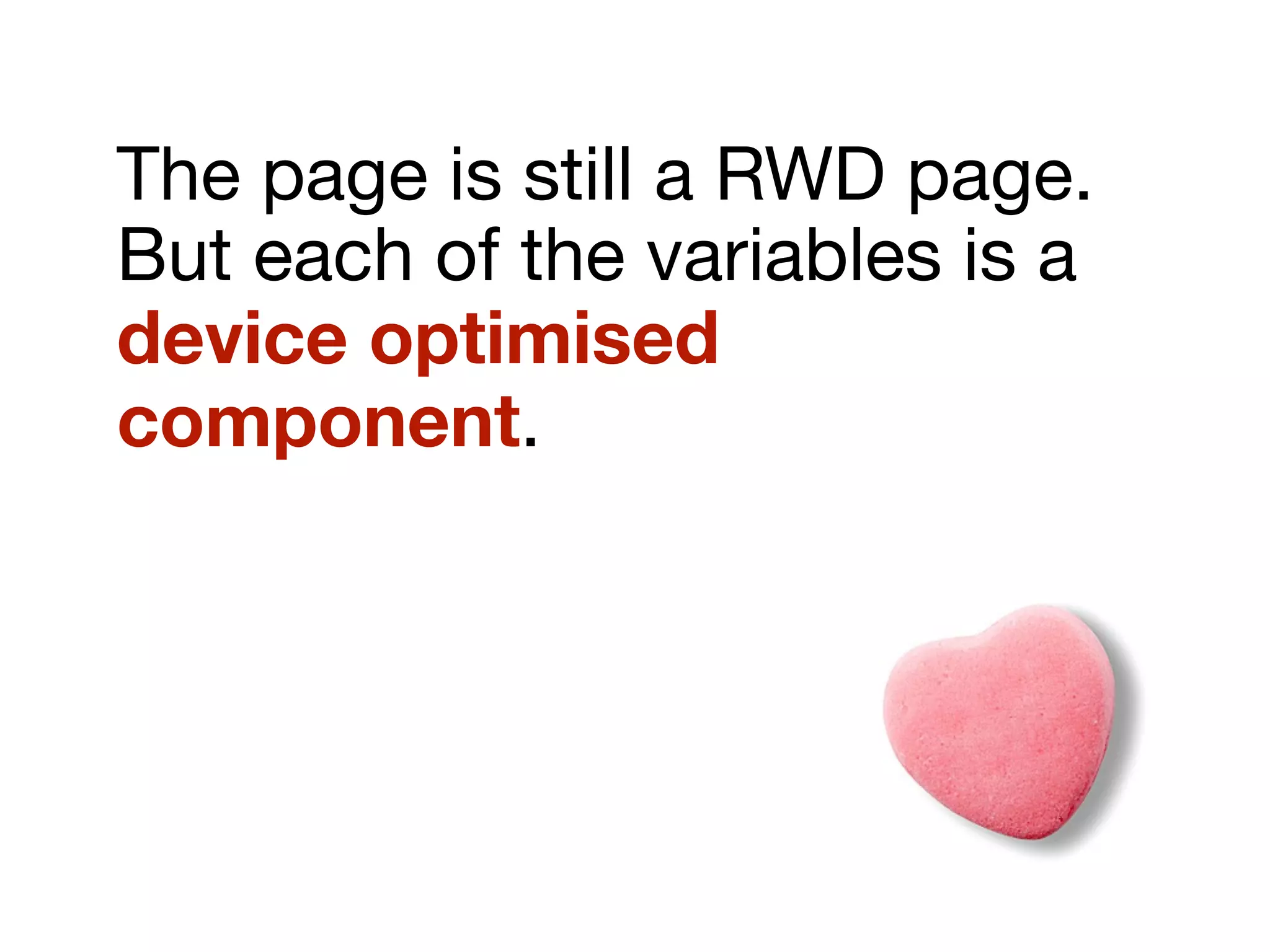


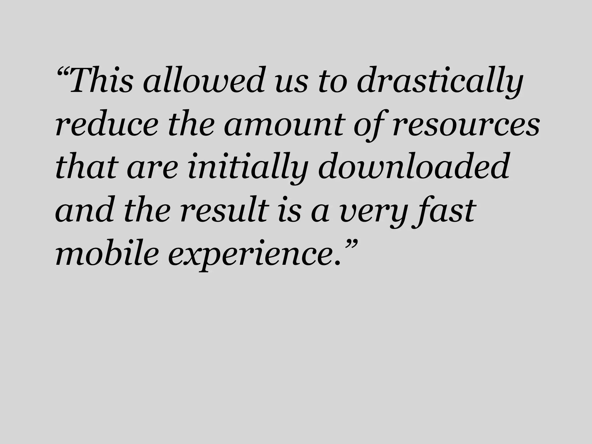
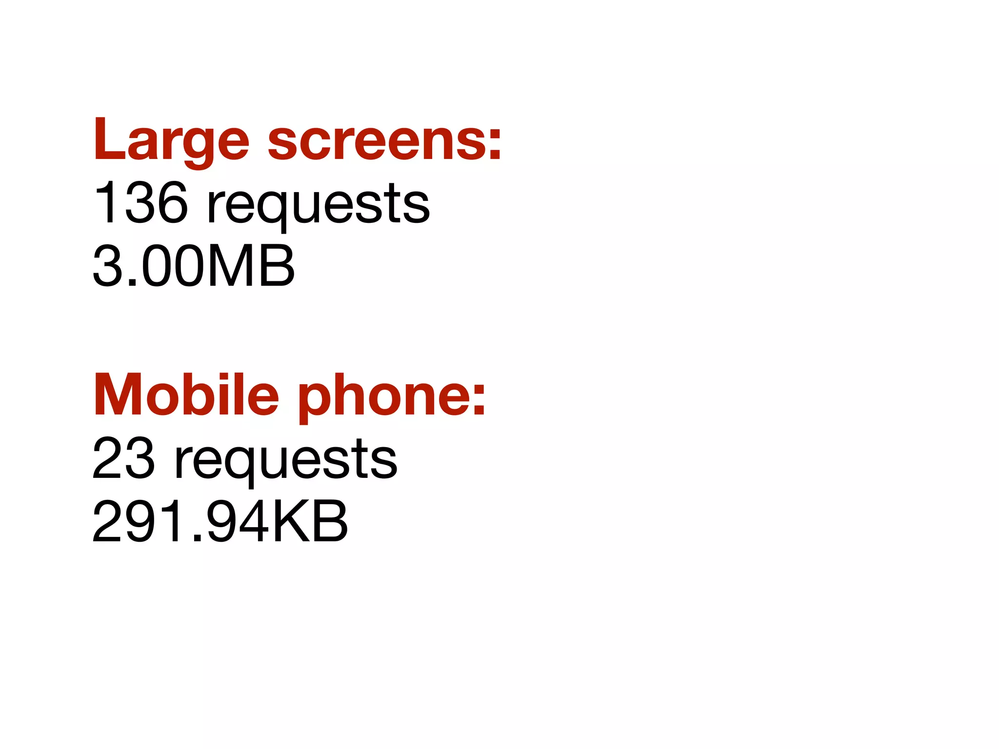


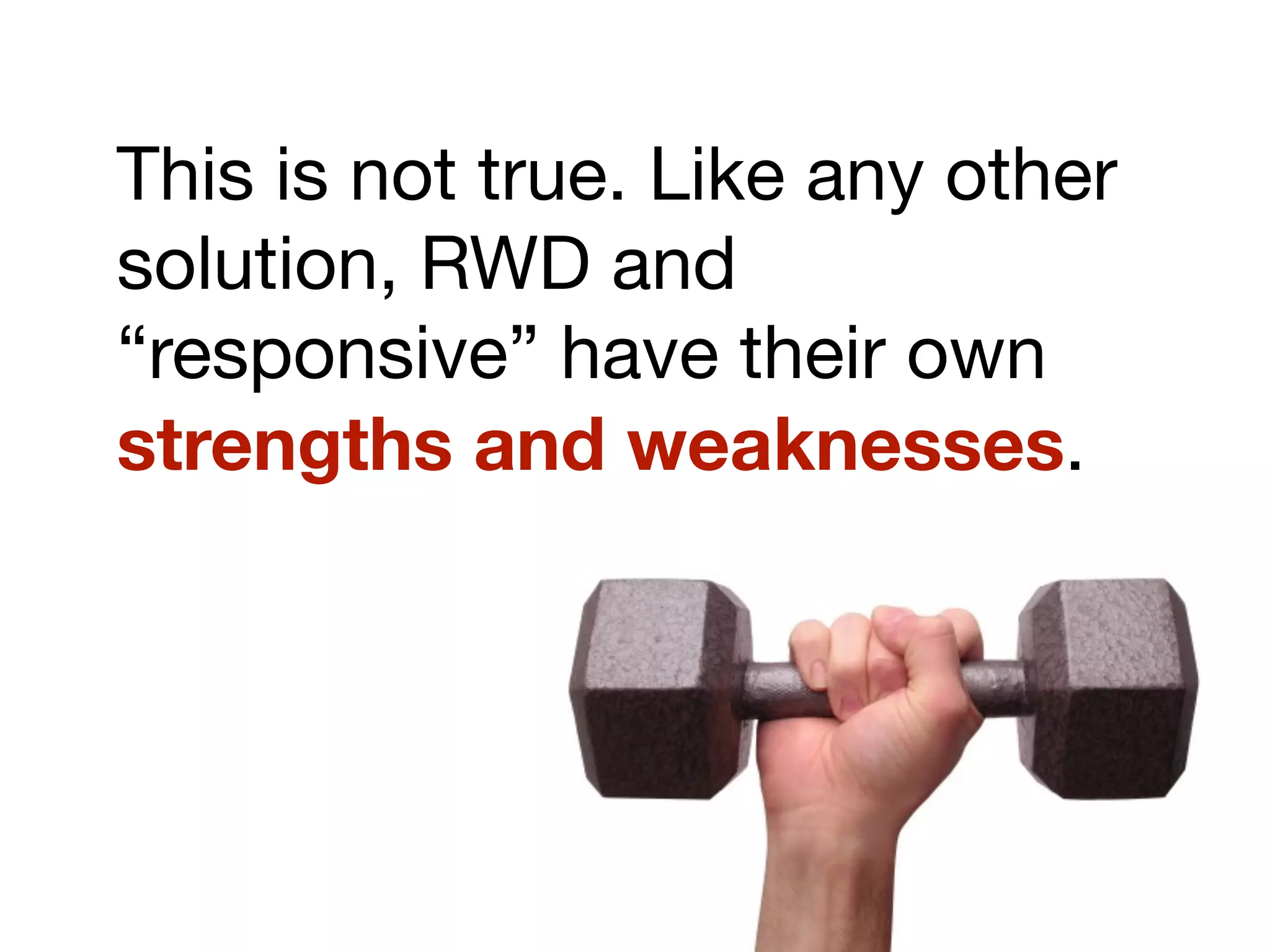

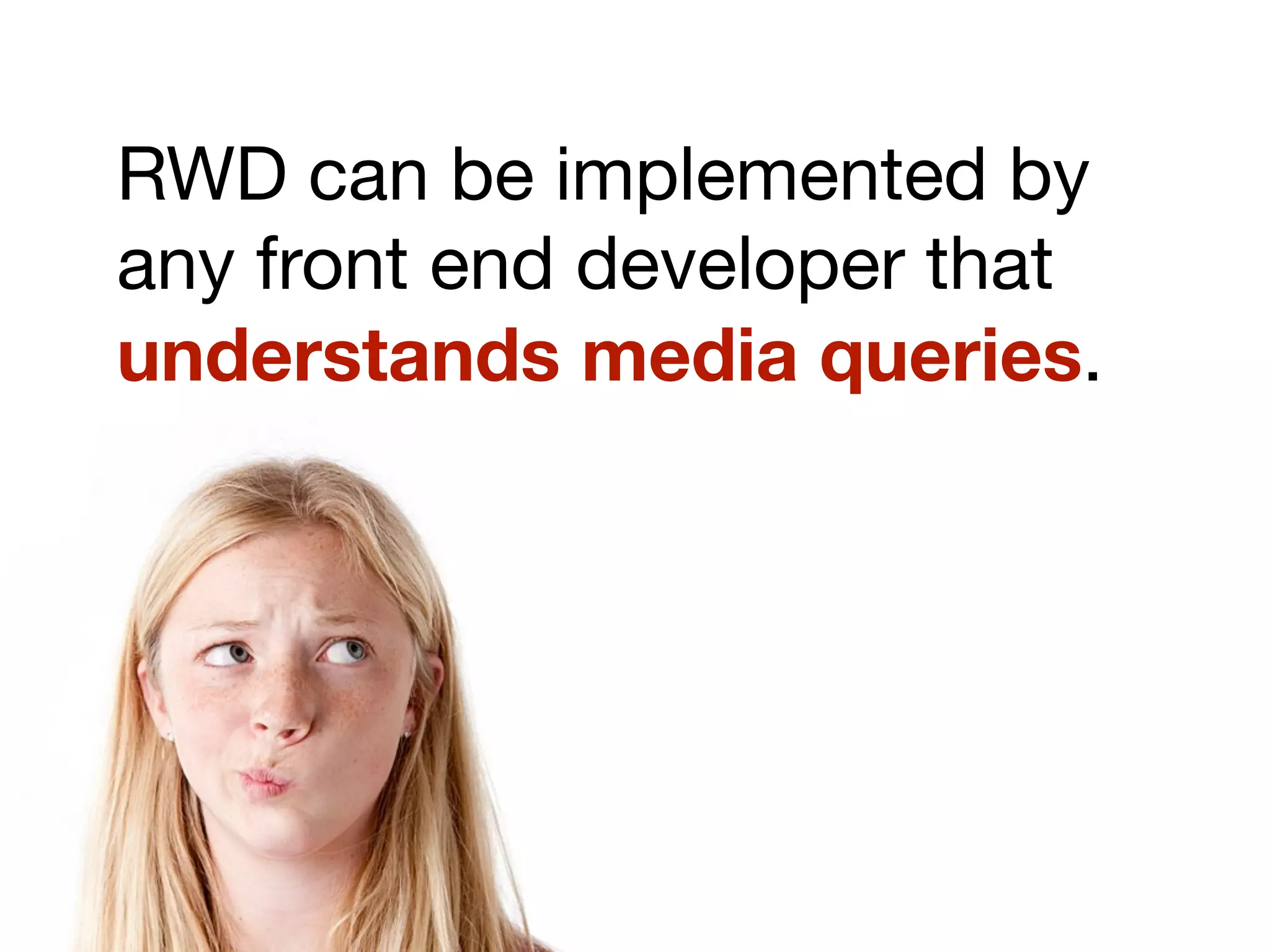


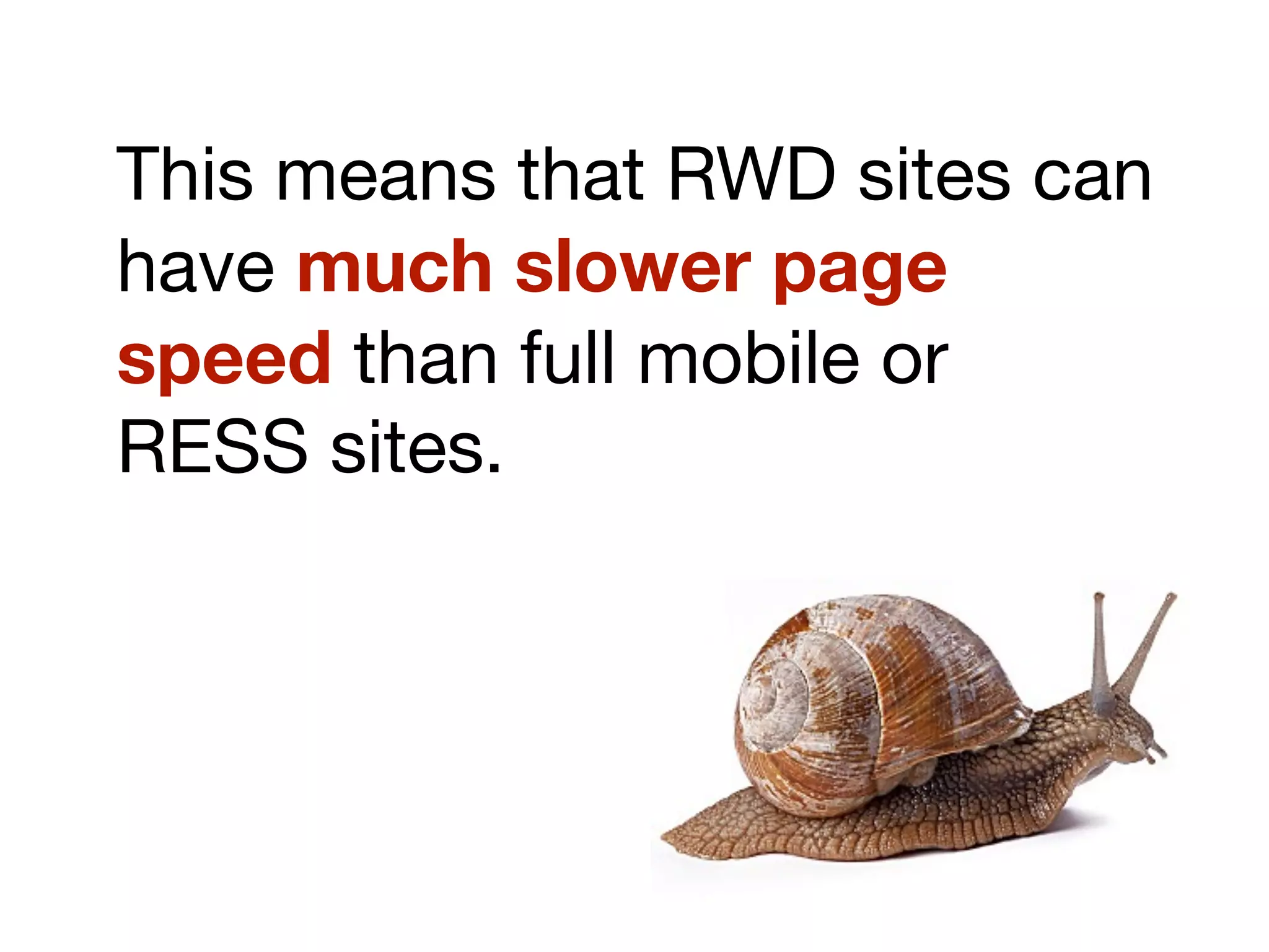
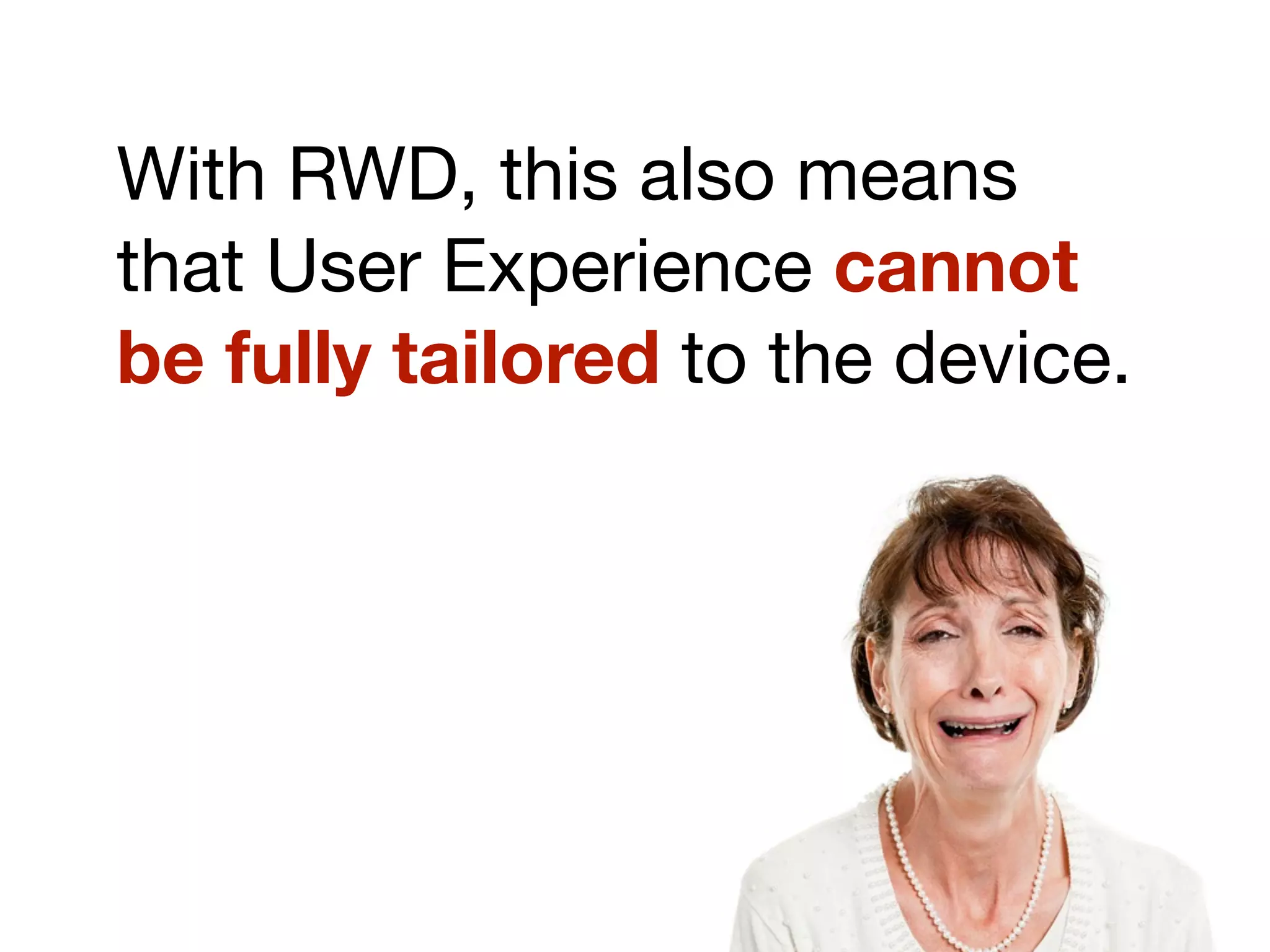


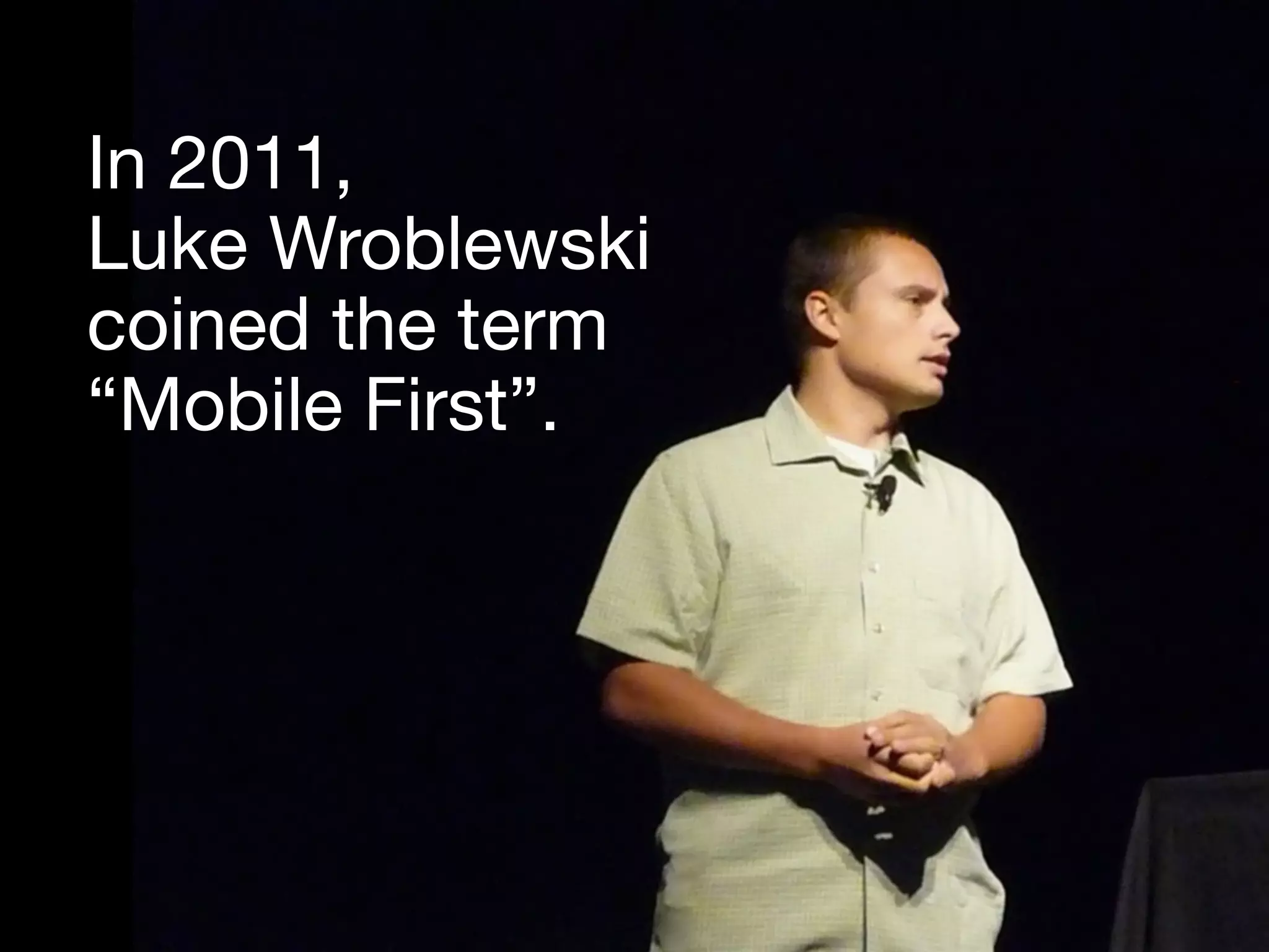
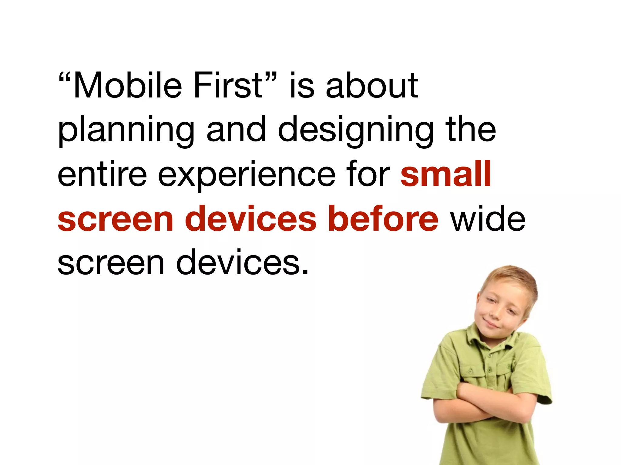
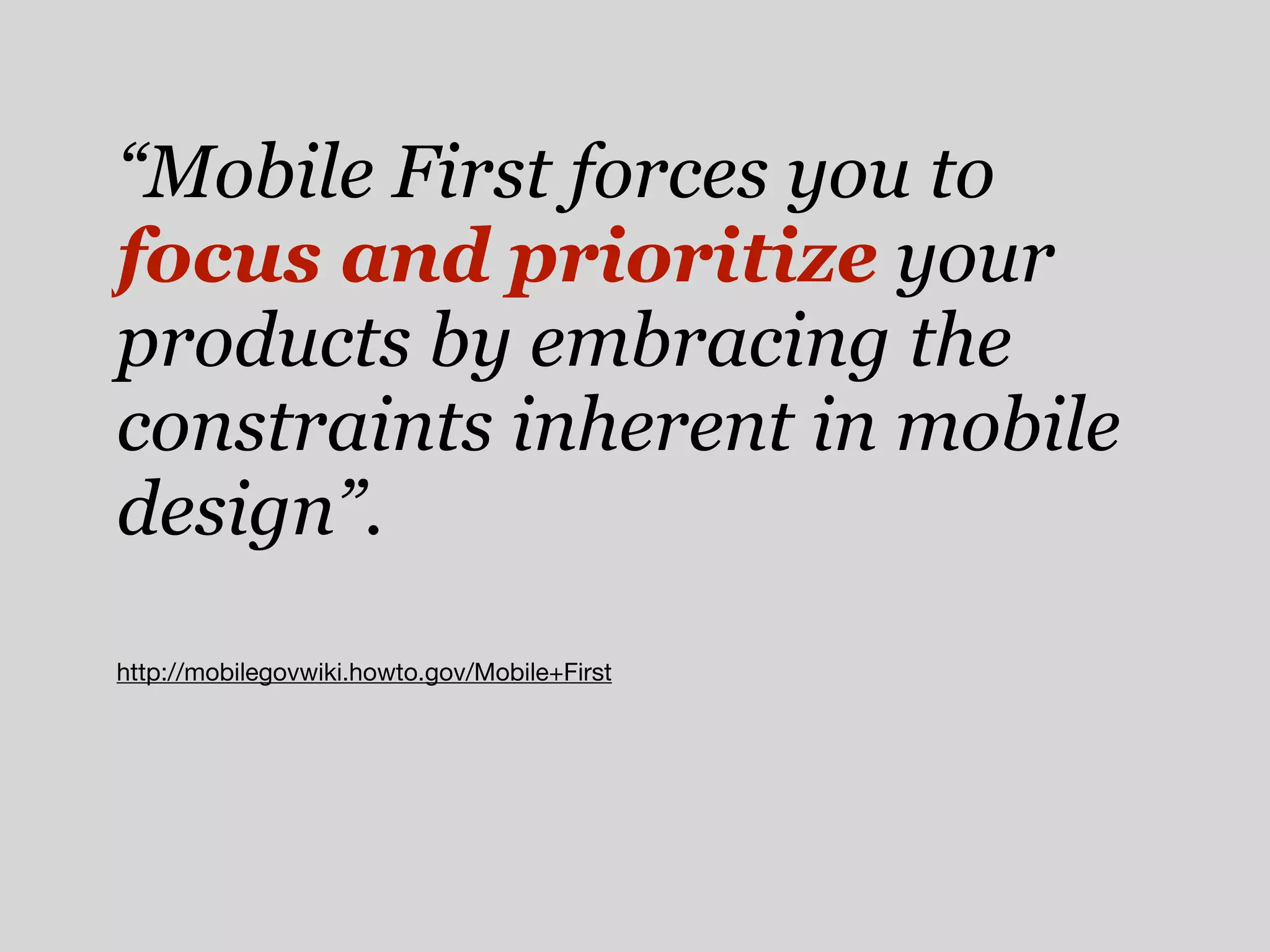


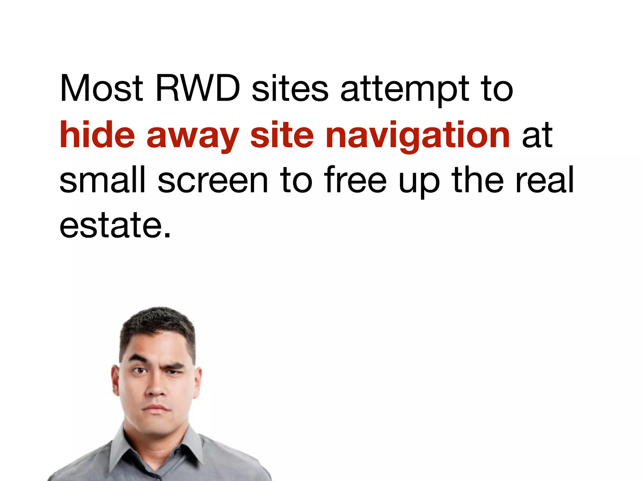
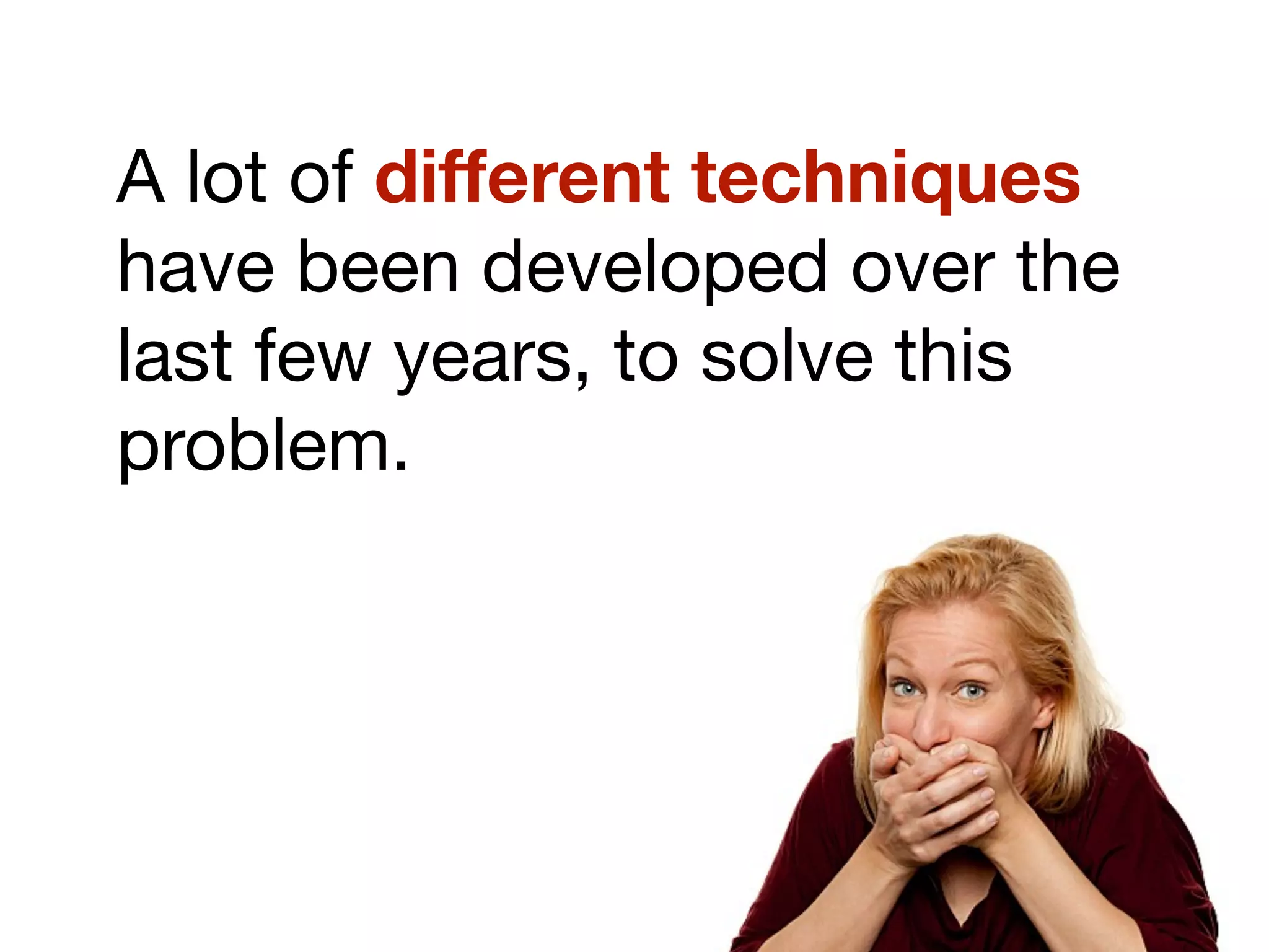


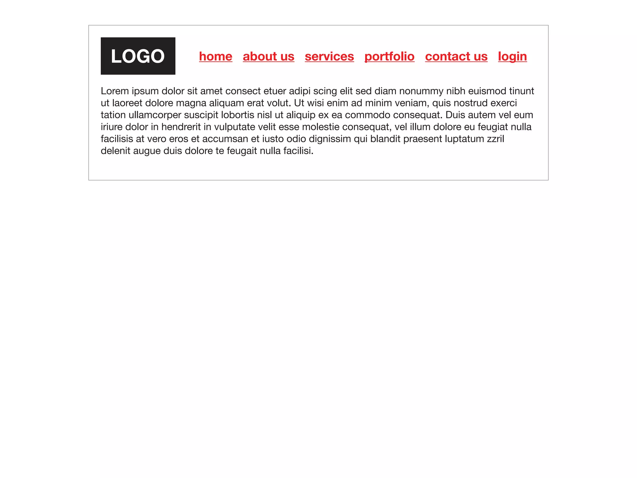
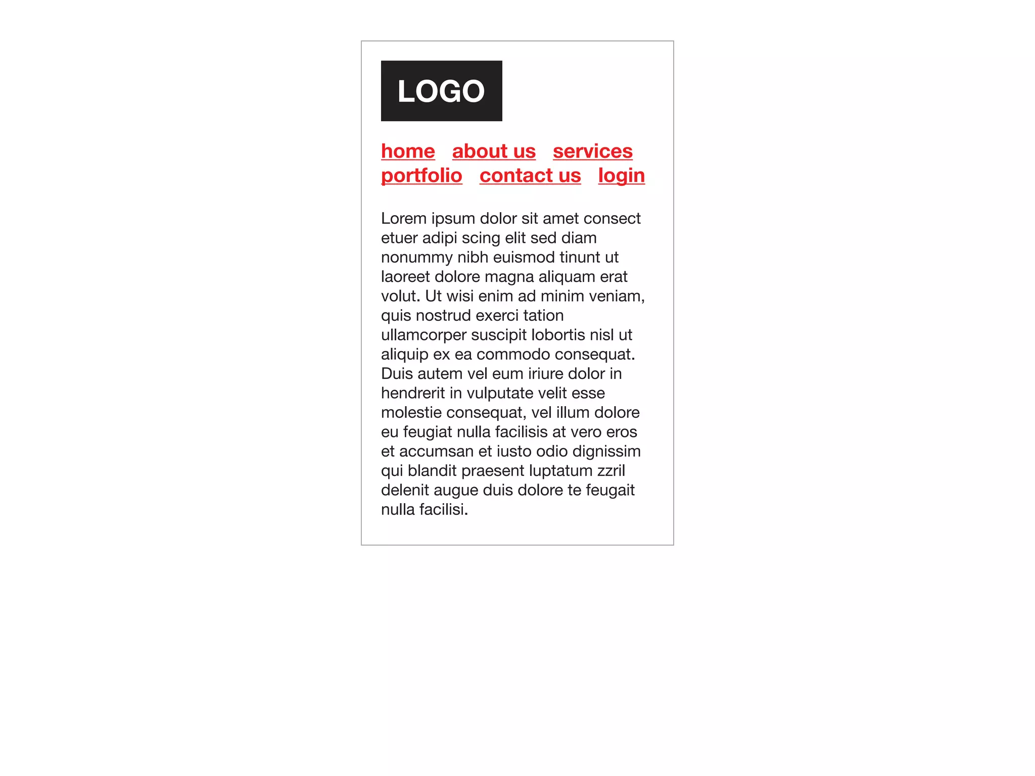


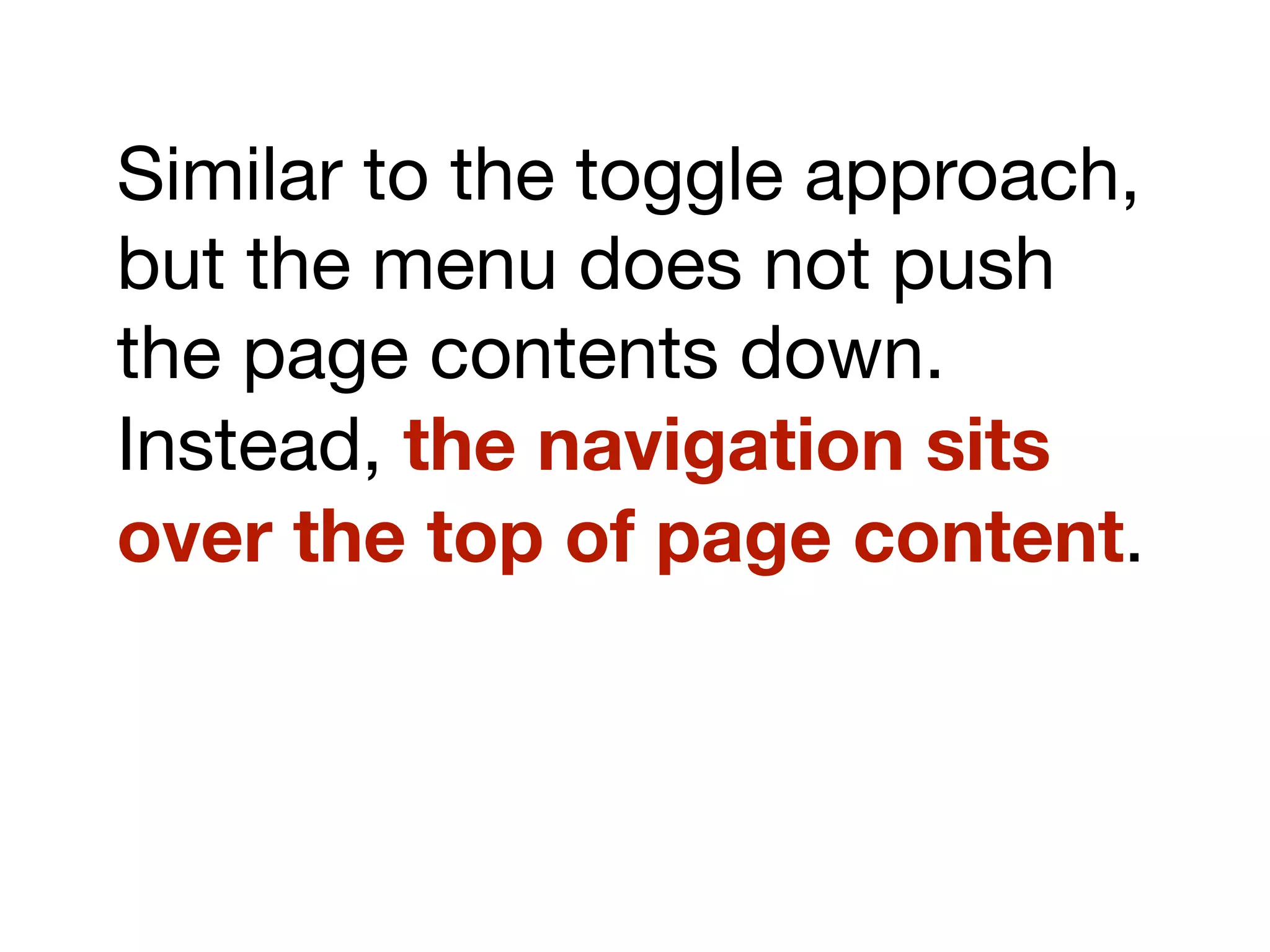

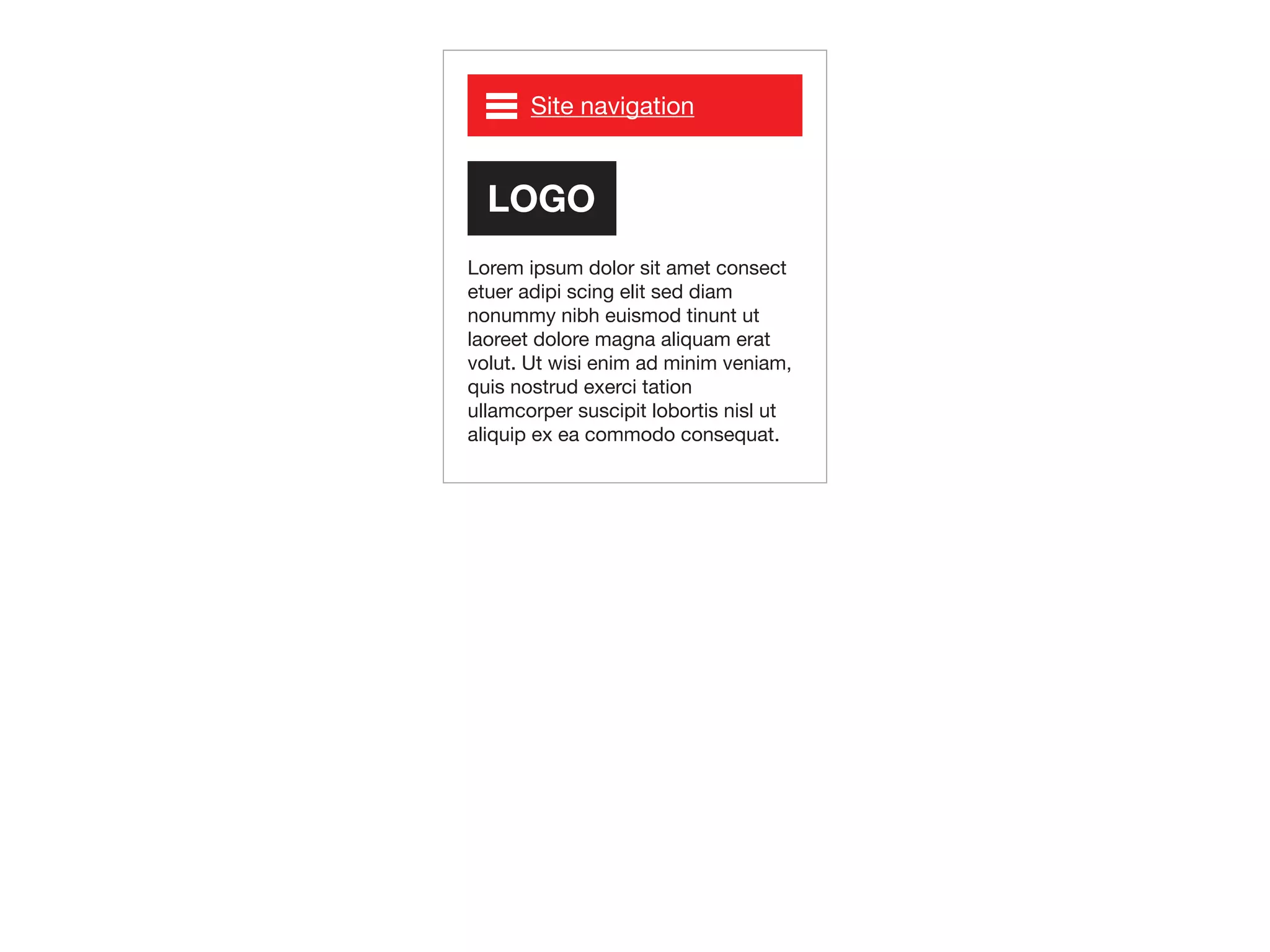
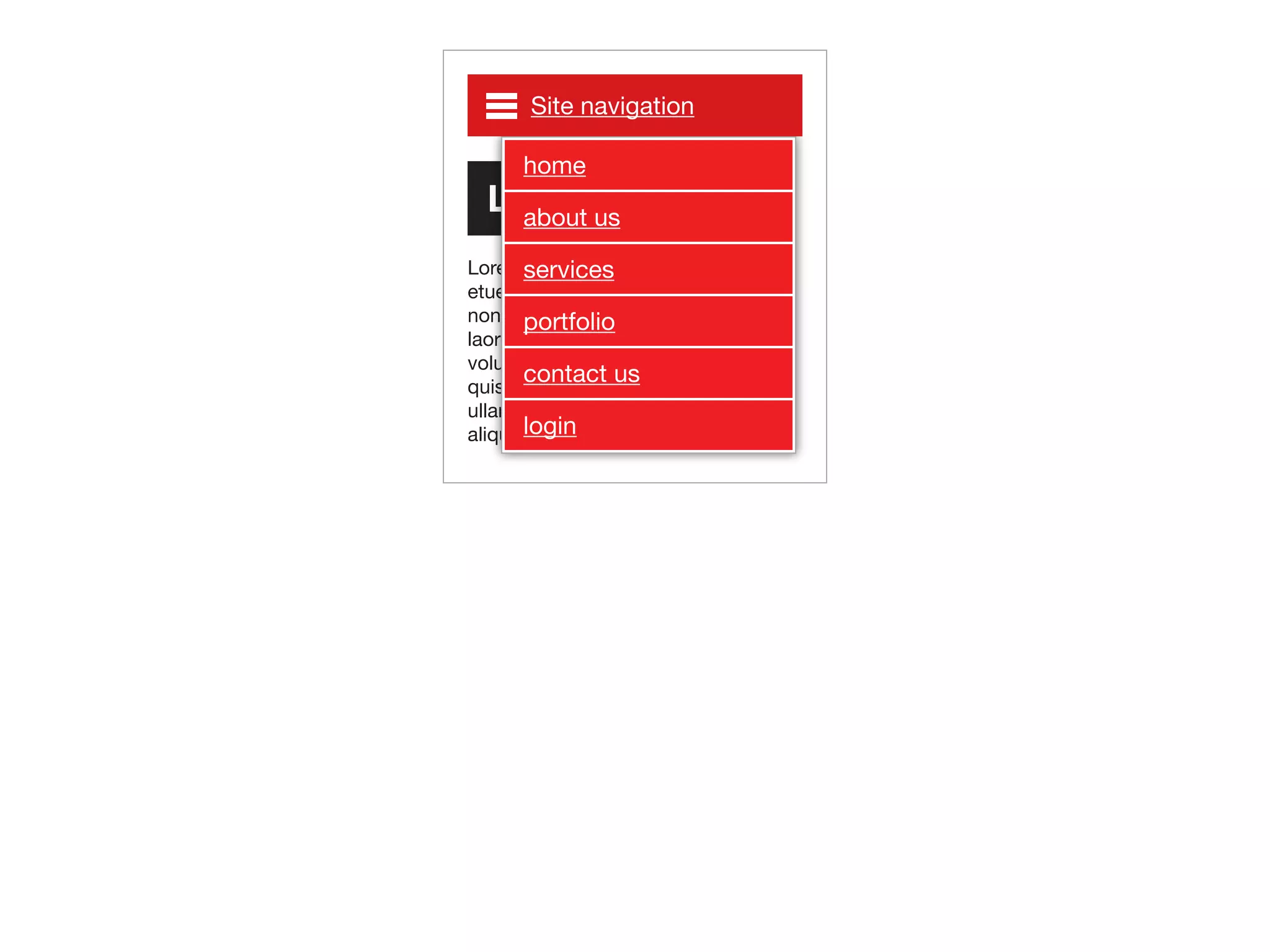


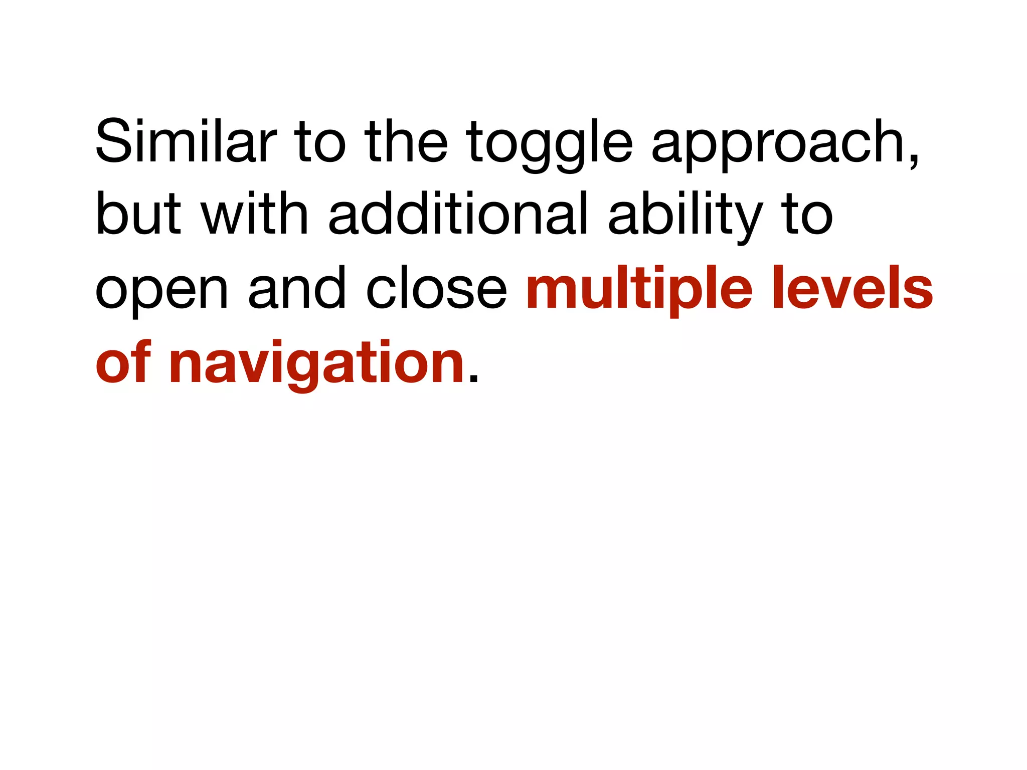


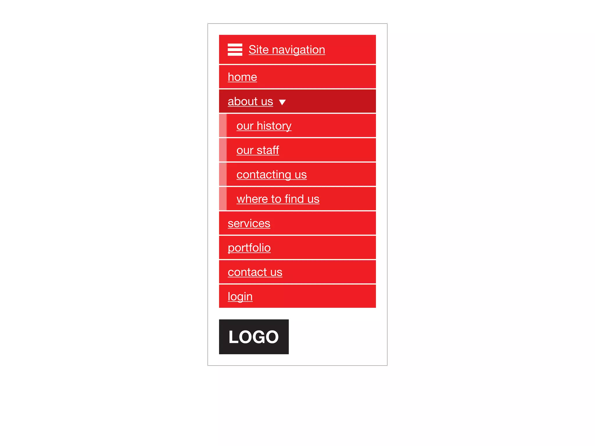
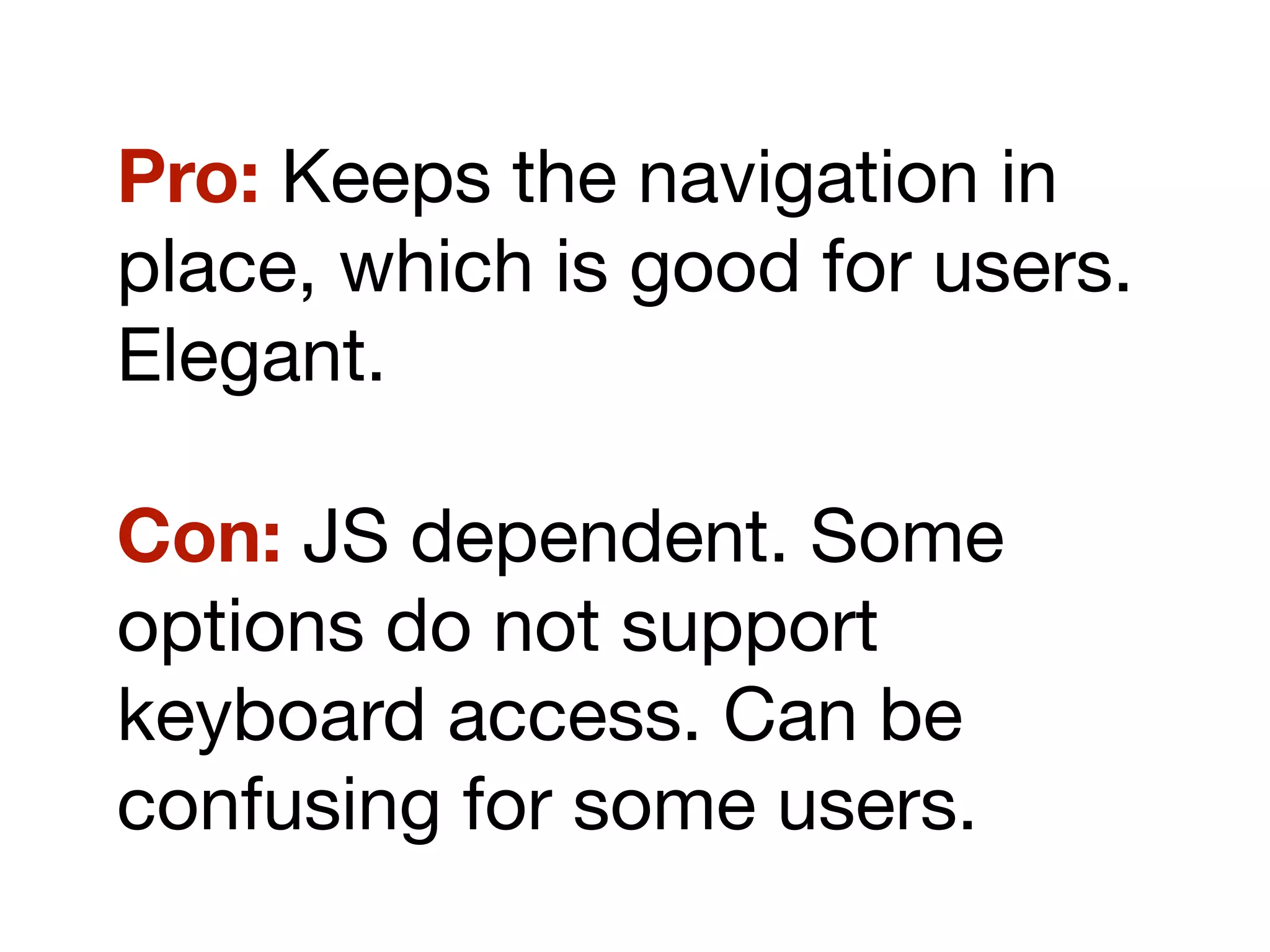


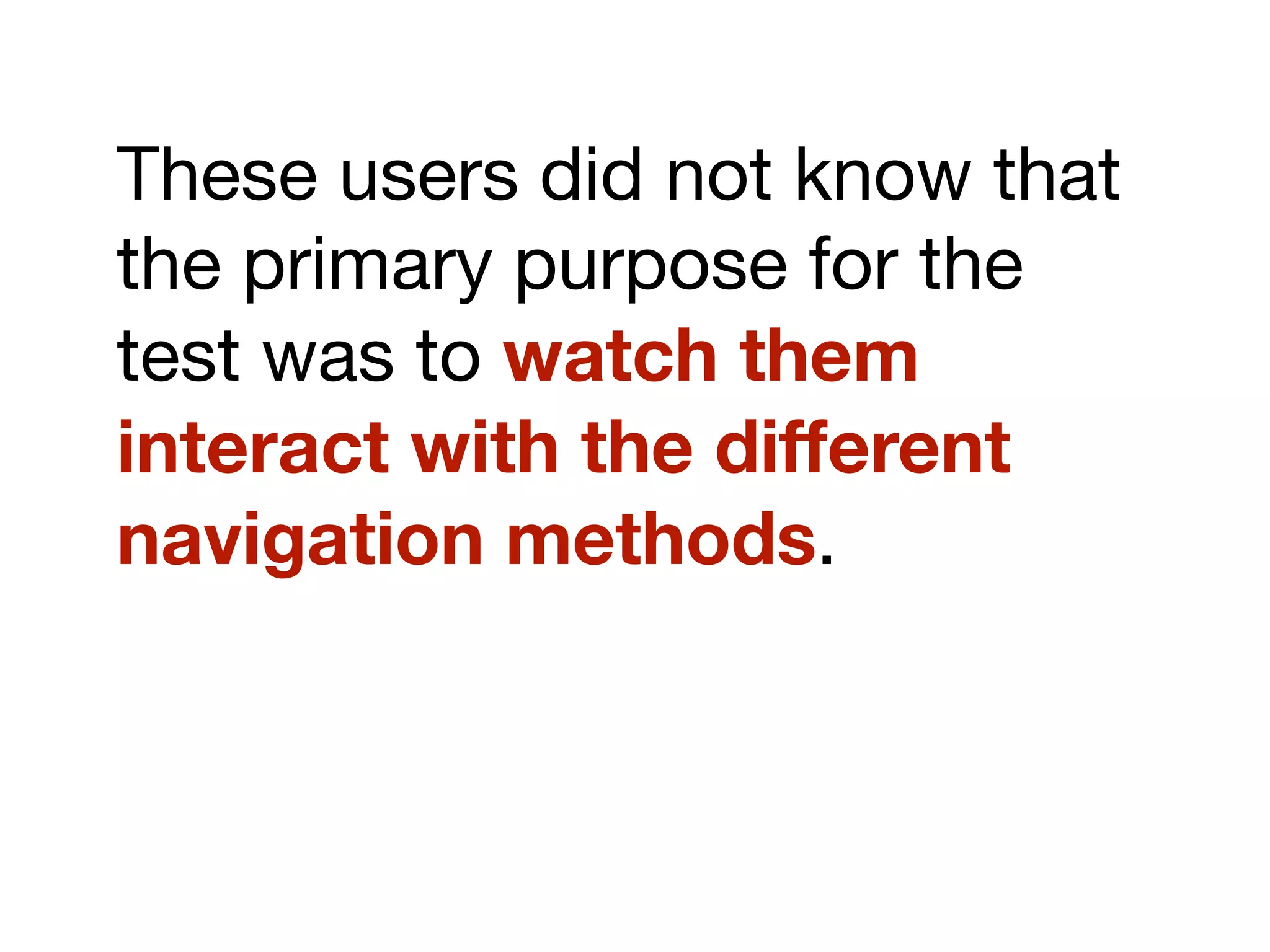
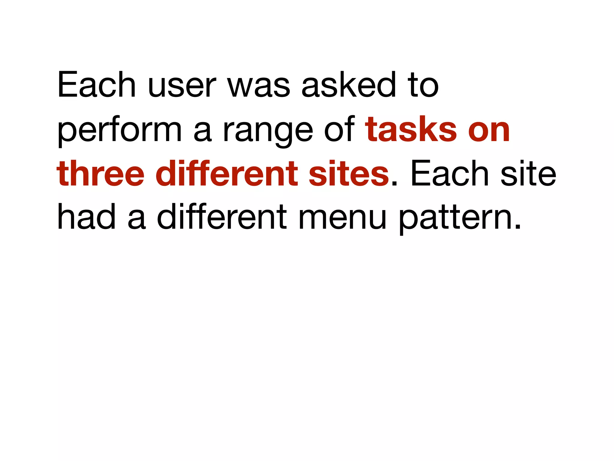
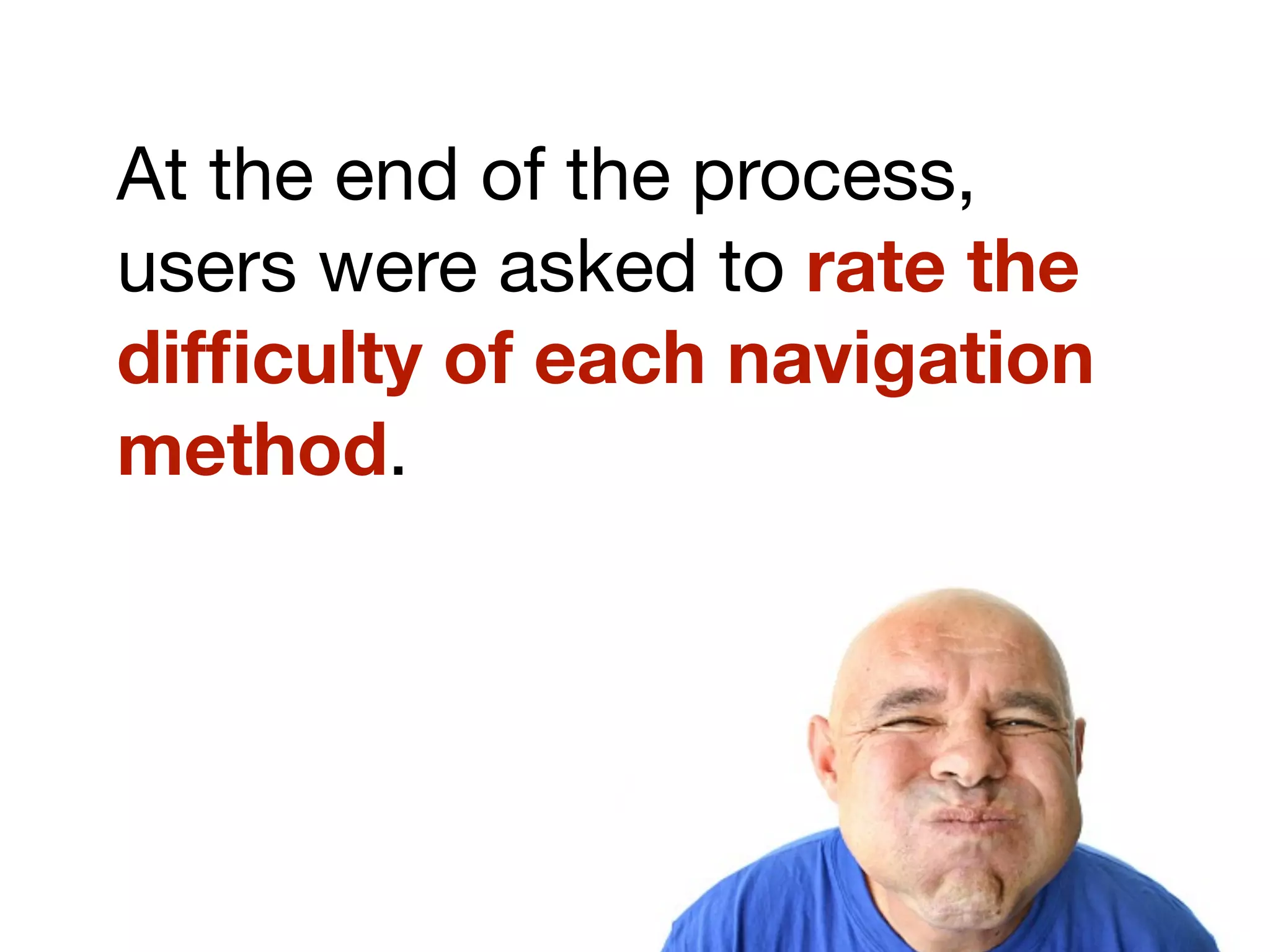
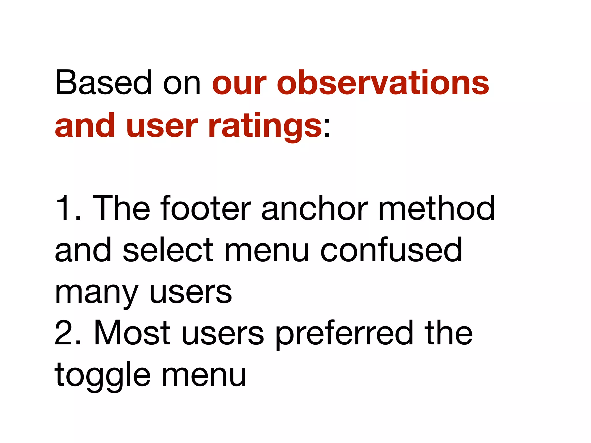


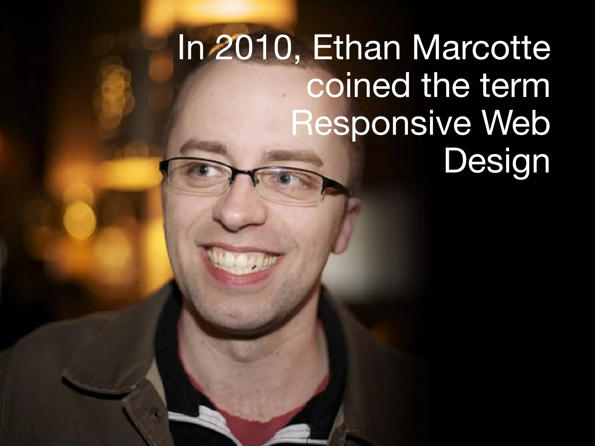
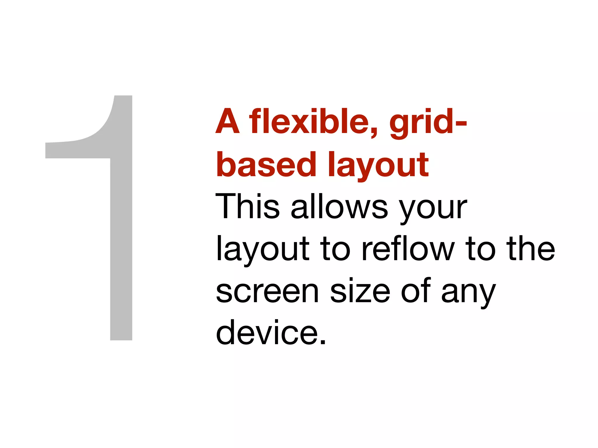
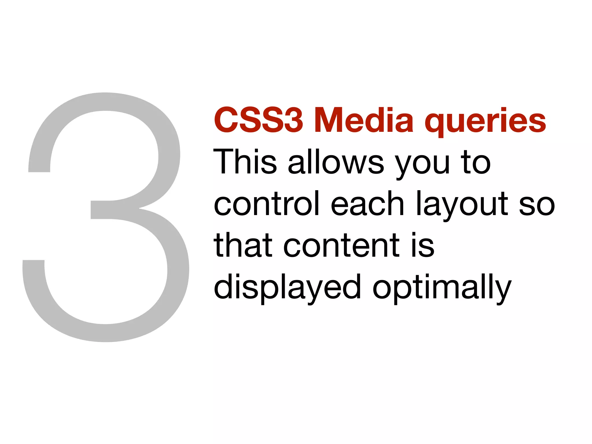
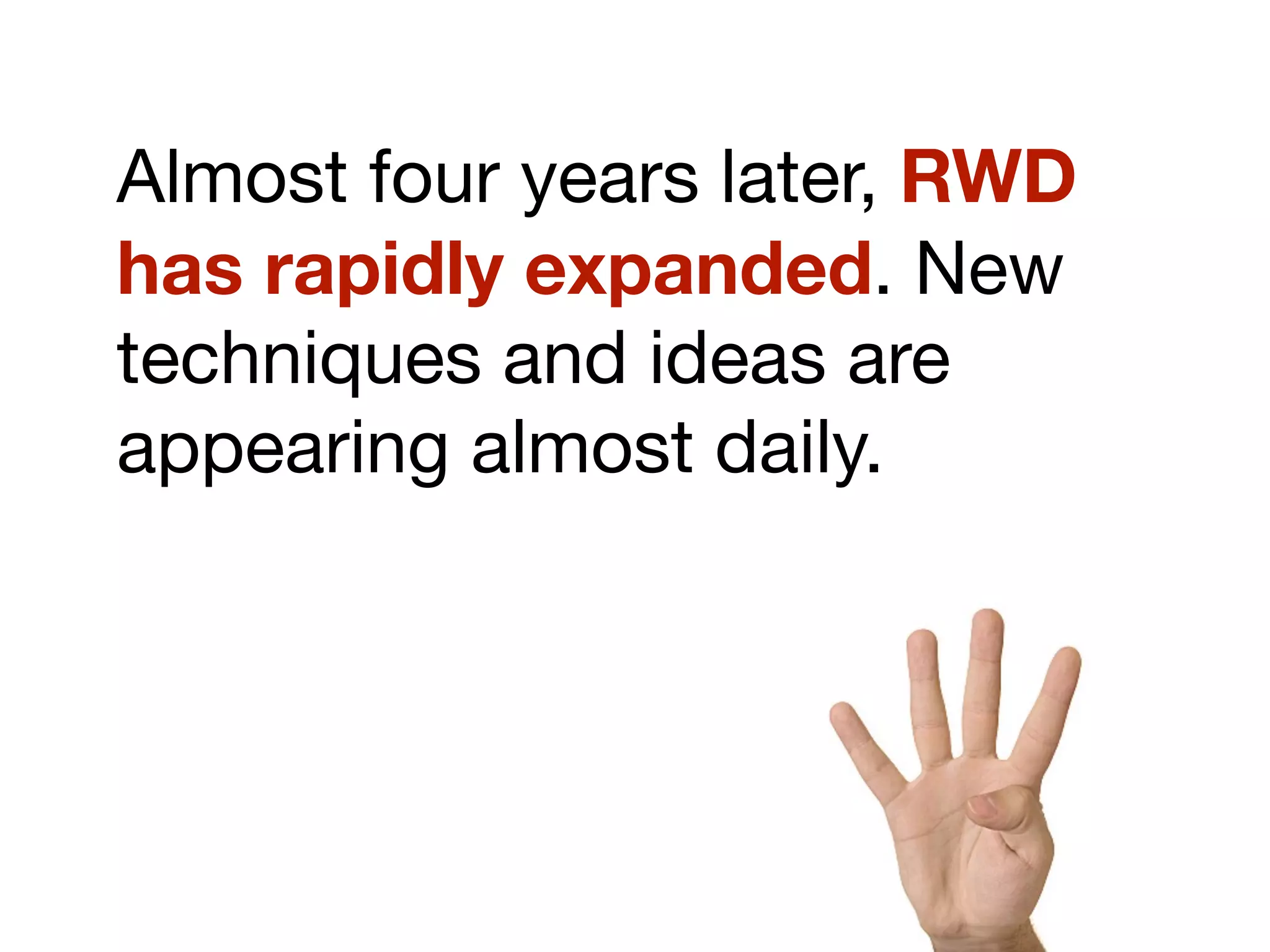
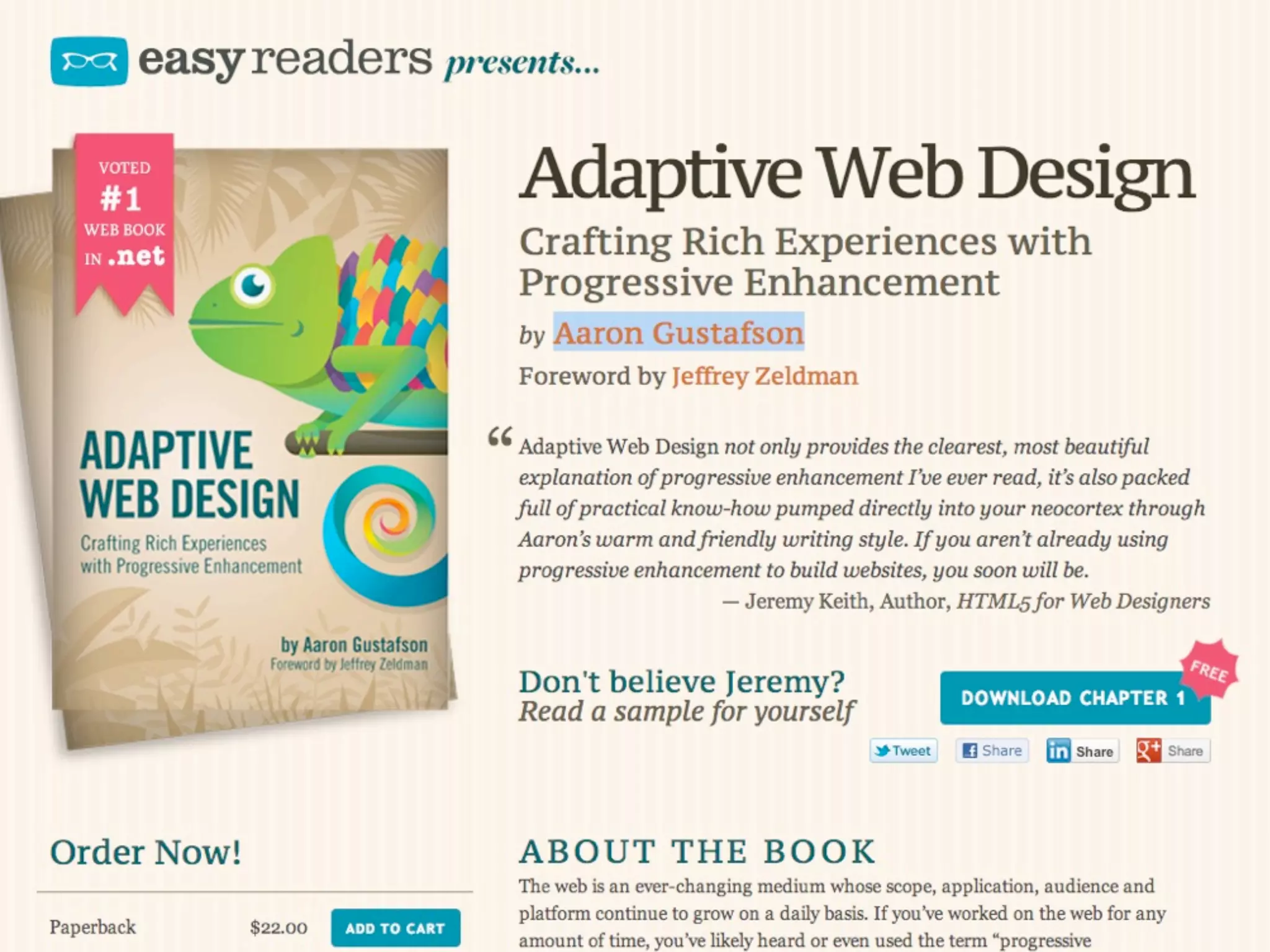
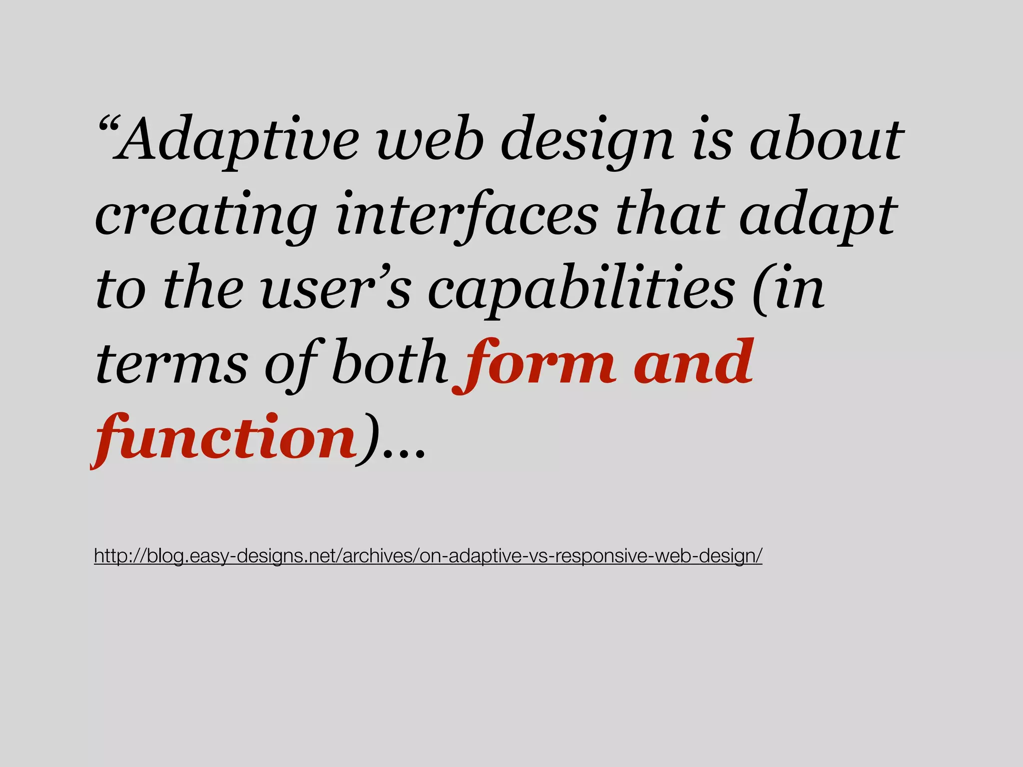
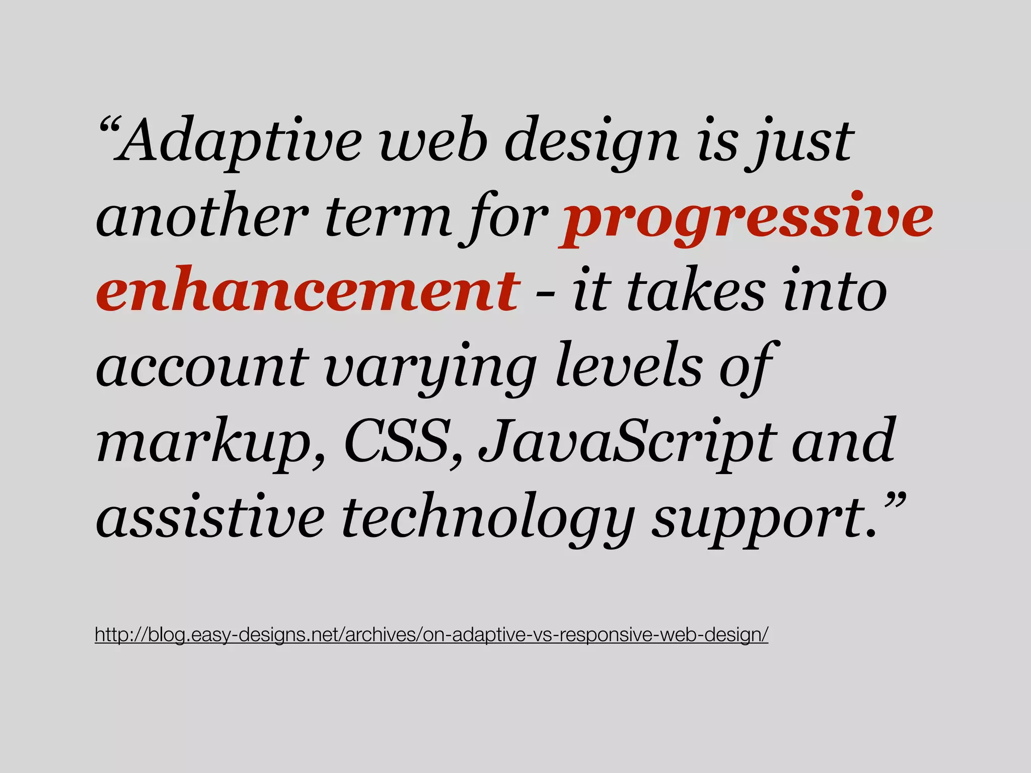
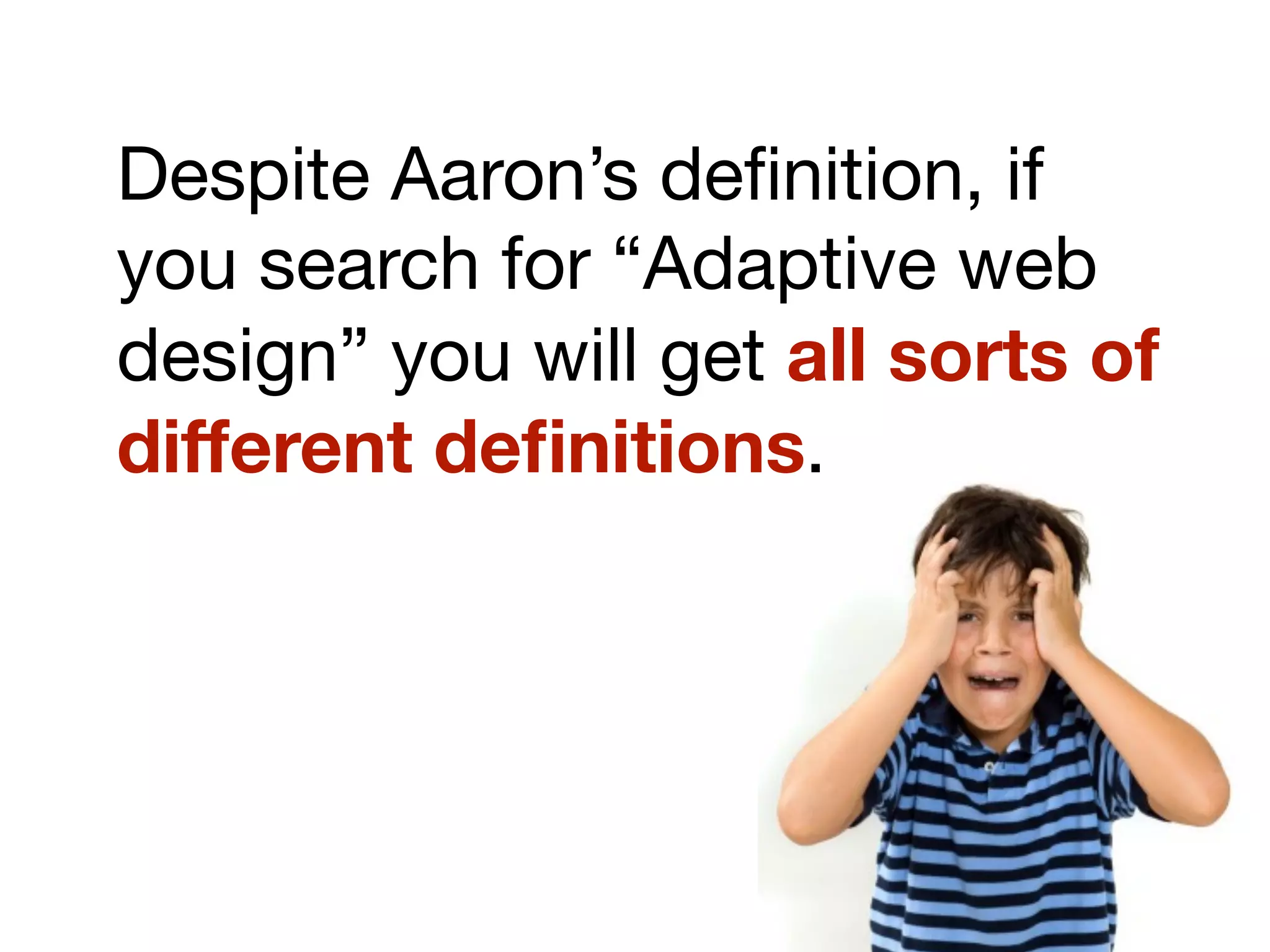
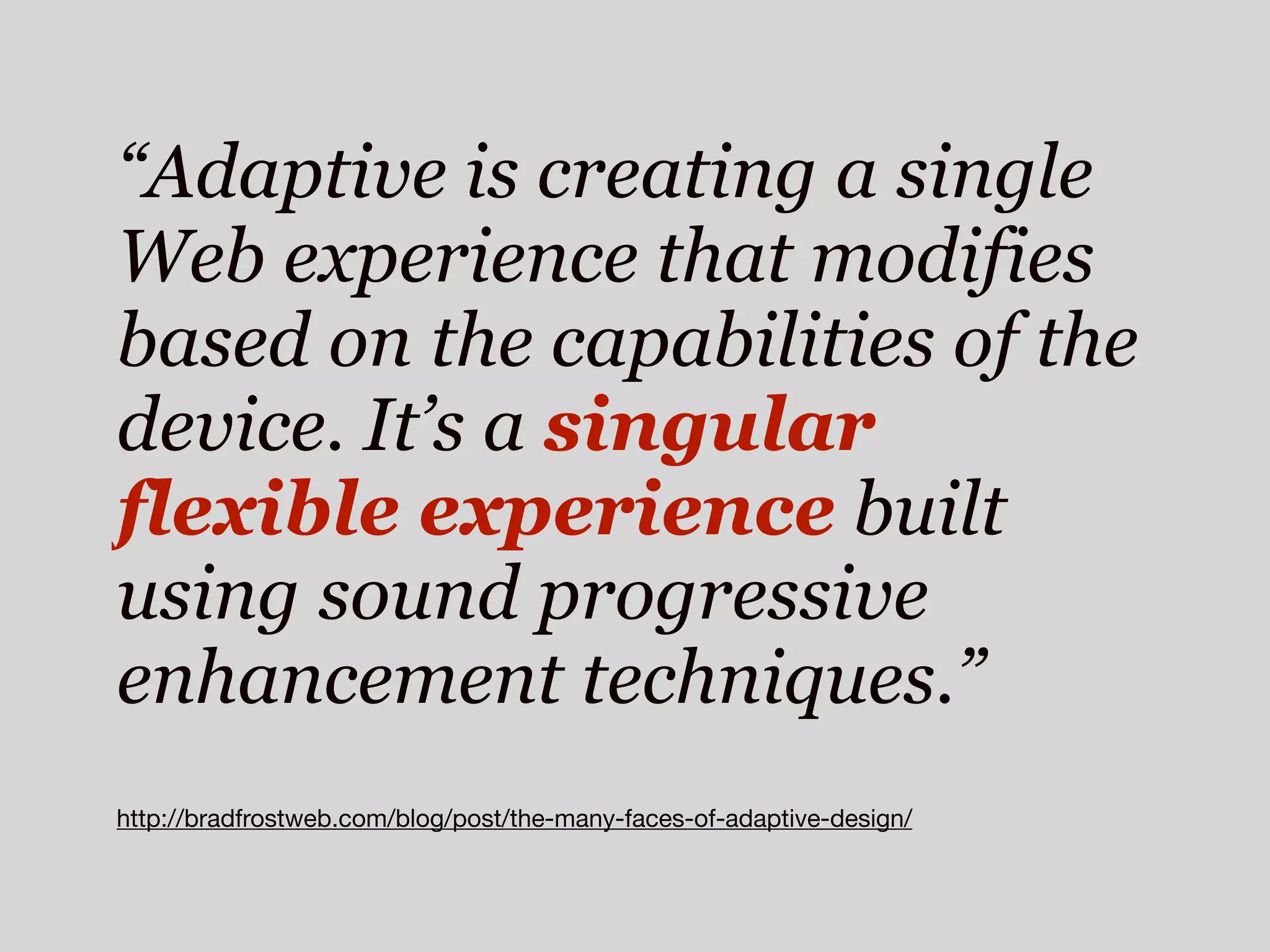
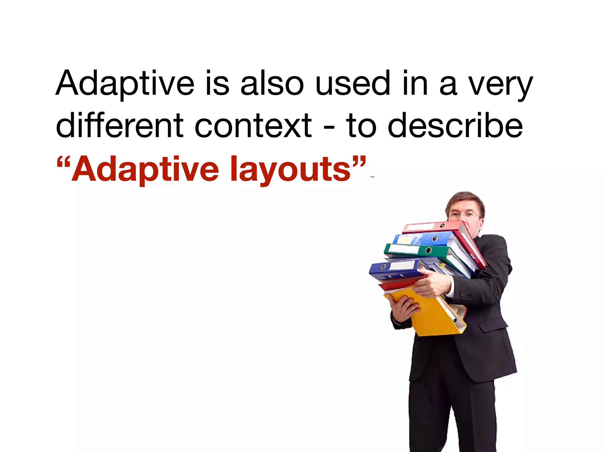
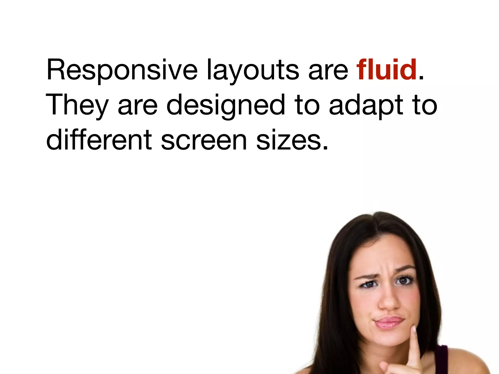
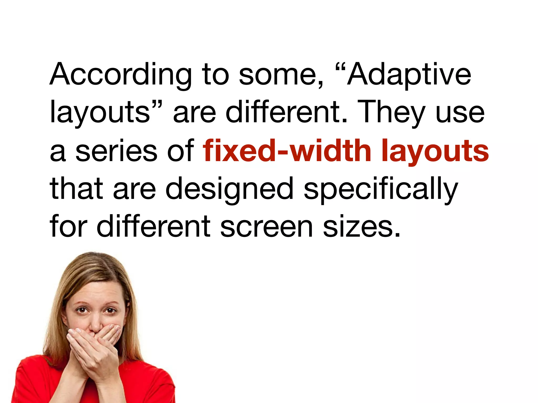
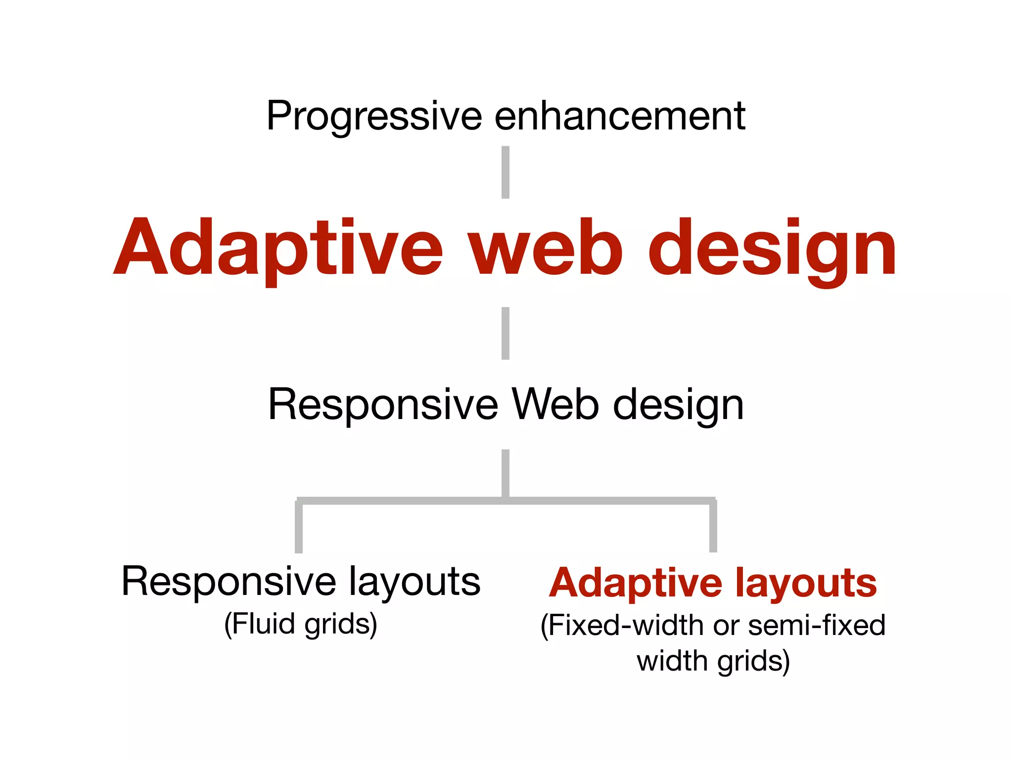
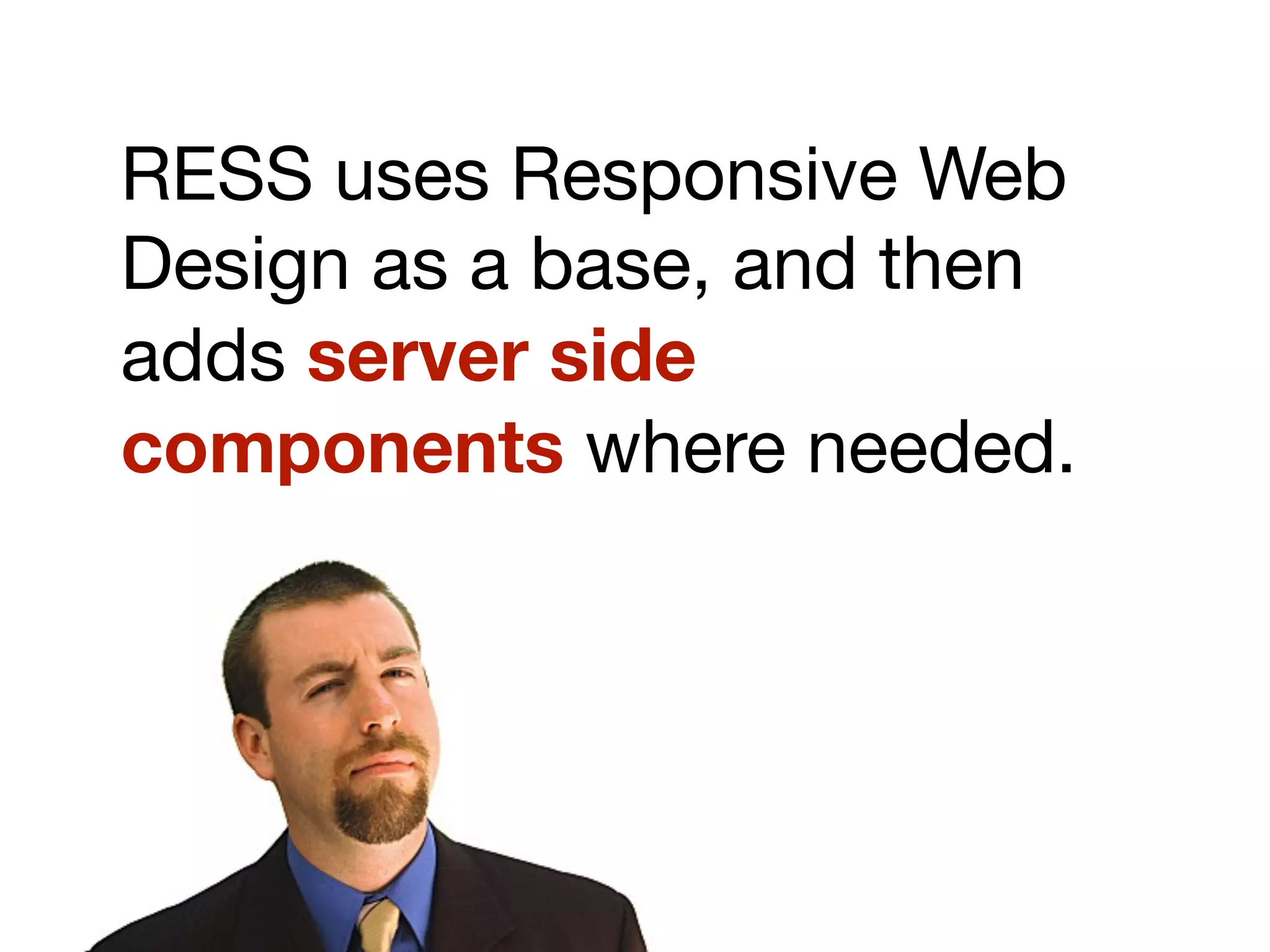
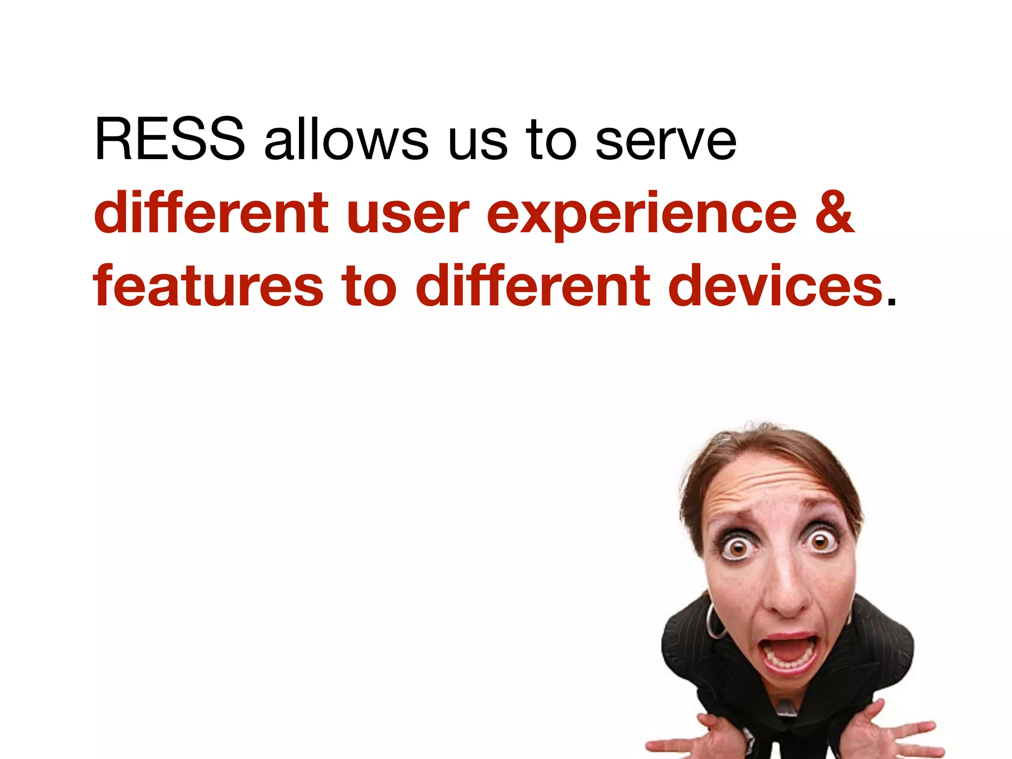
The document discusses the evolution and principles of responsive web design (RWD) as introduced by Ethan Marcotte, emphasizing its key components: flexible layouts, images, and CSS3 media queries. It contrasts RWD with adaptive web design and the broader 'responsive' concept, citing various design strategies for mobile navigation and the potential benefits of server-side responsive design (RESS). Additionally, it advocates for a 'mobile first' approach to ensure optimal user experience across all devices.