Download as PDF, PPTX
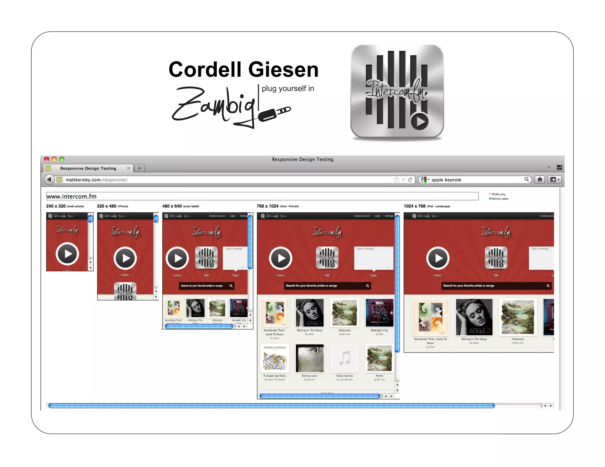


Responsive web design allows websites to automatically adjust their layout depending on the screen size and orientation of the device being used. It uses flexible grids, images and CSS media queries to detect screen size and orientation and rearrange the layout accordingly. The key aspects are a flexible grid, images that scale with the grid, and using media queries to apply different CSS styles based on screen properties. This allows a single website to be accessible and usable on any device.