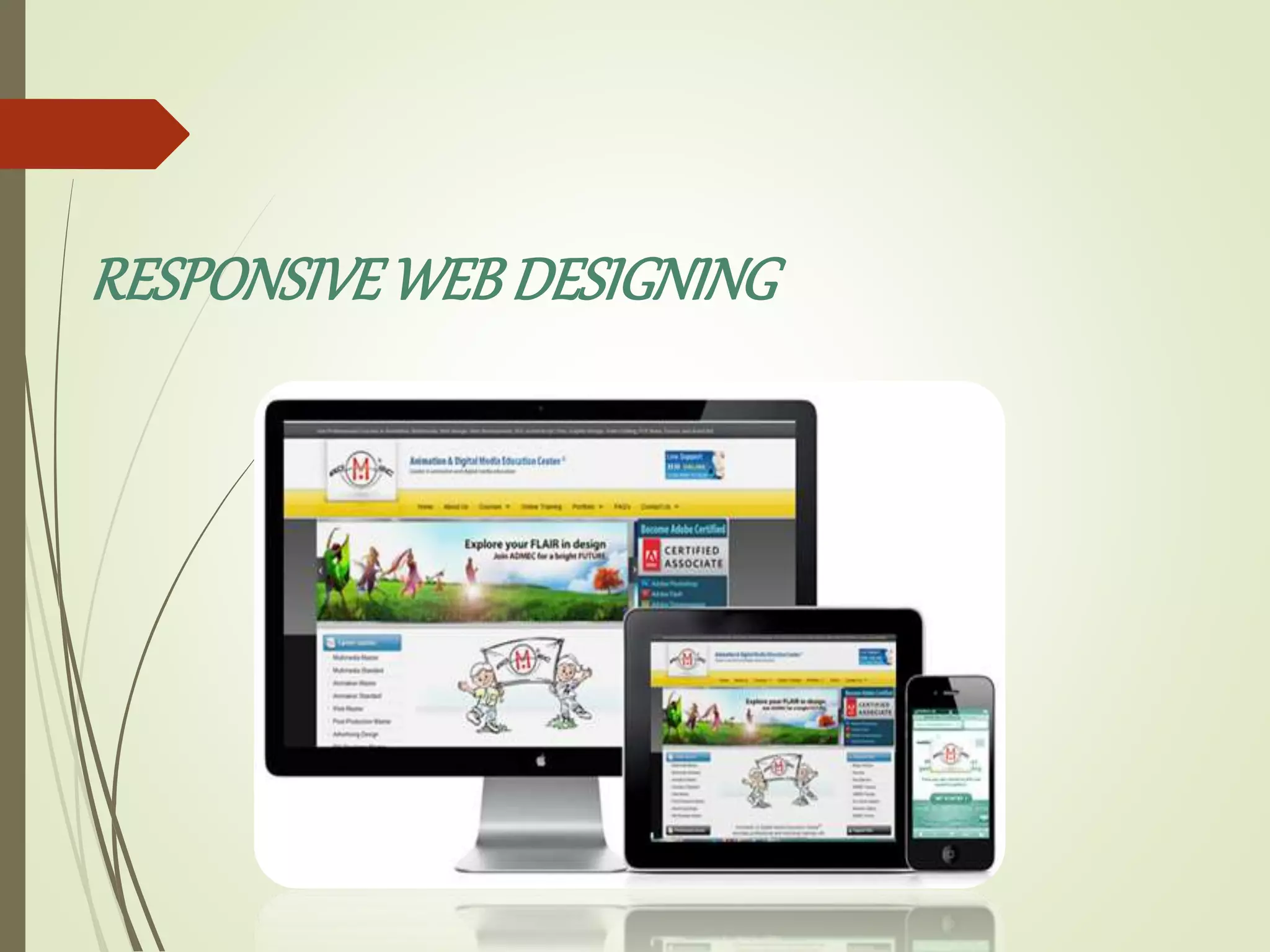
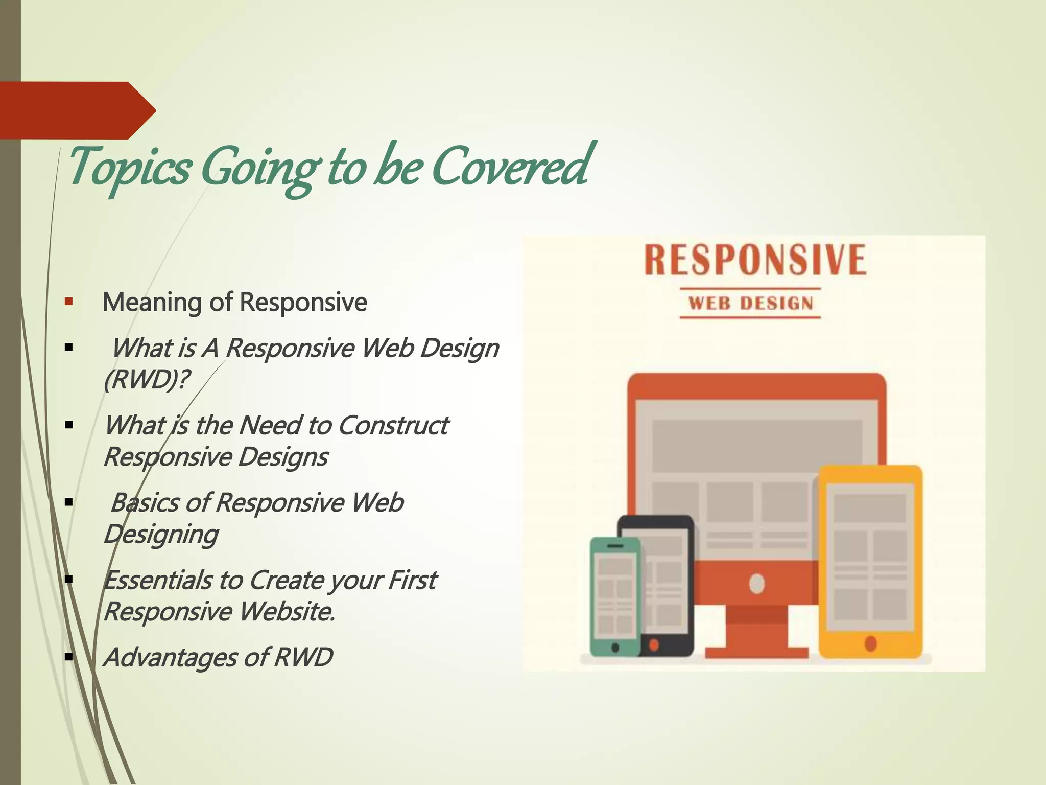
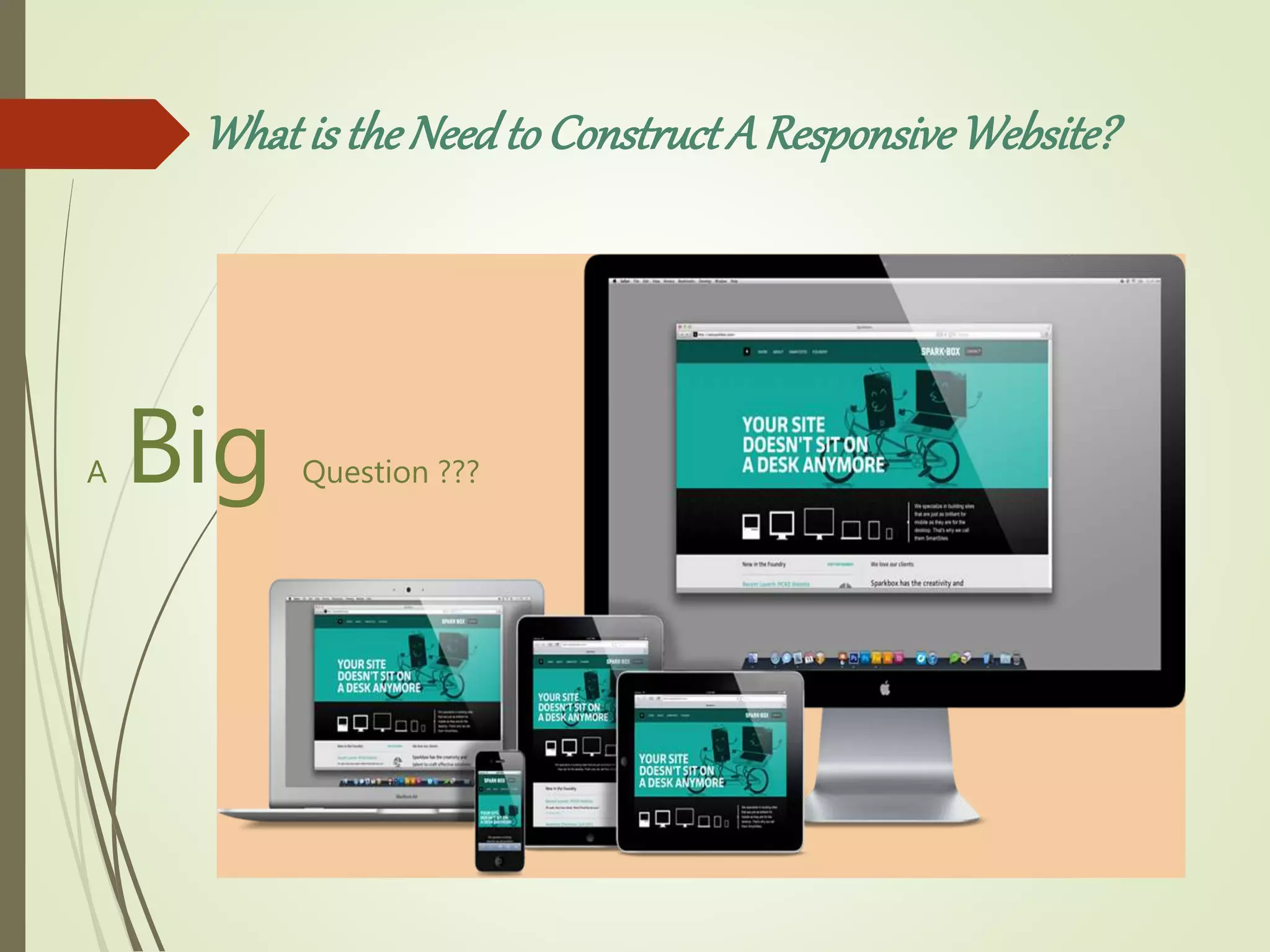
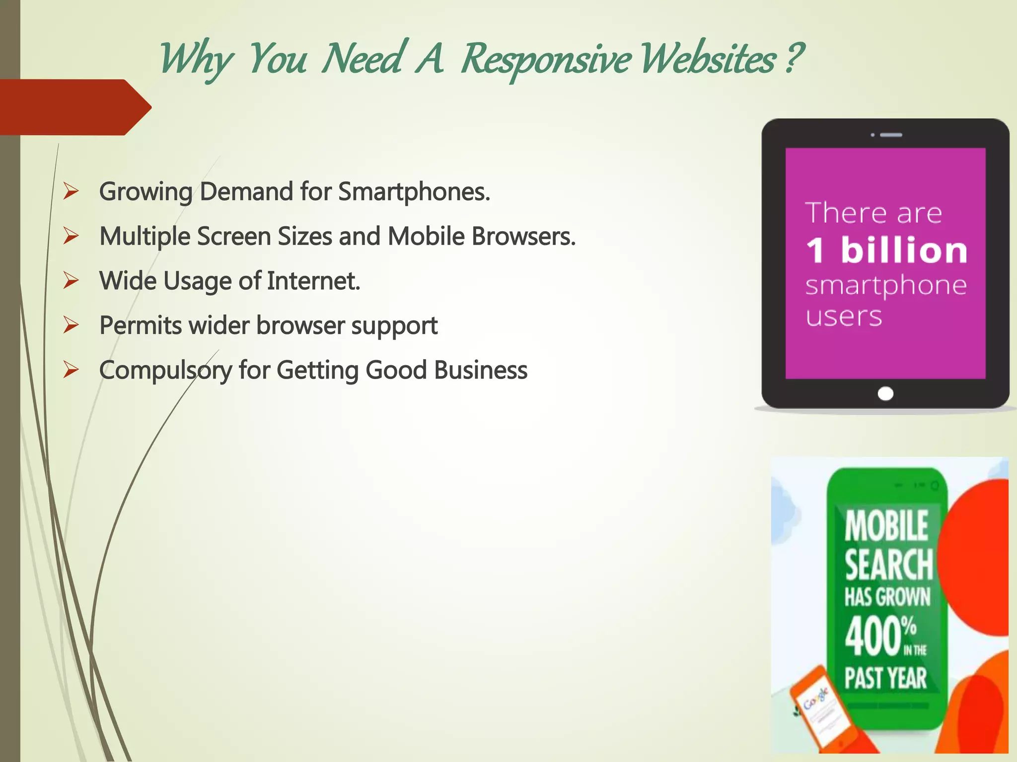
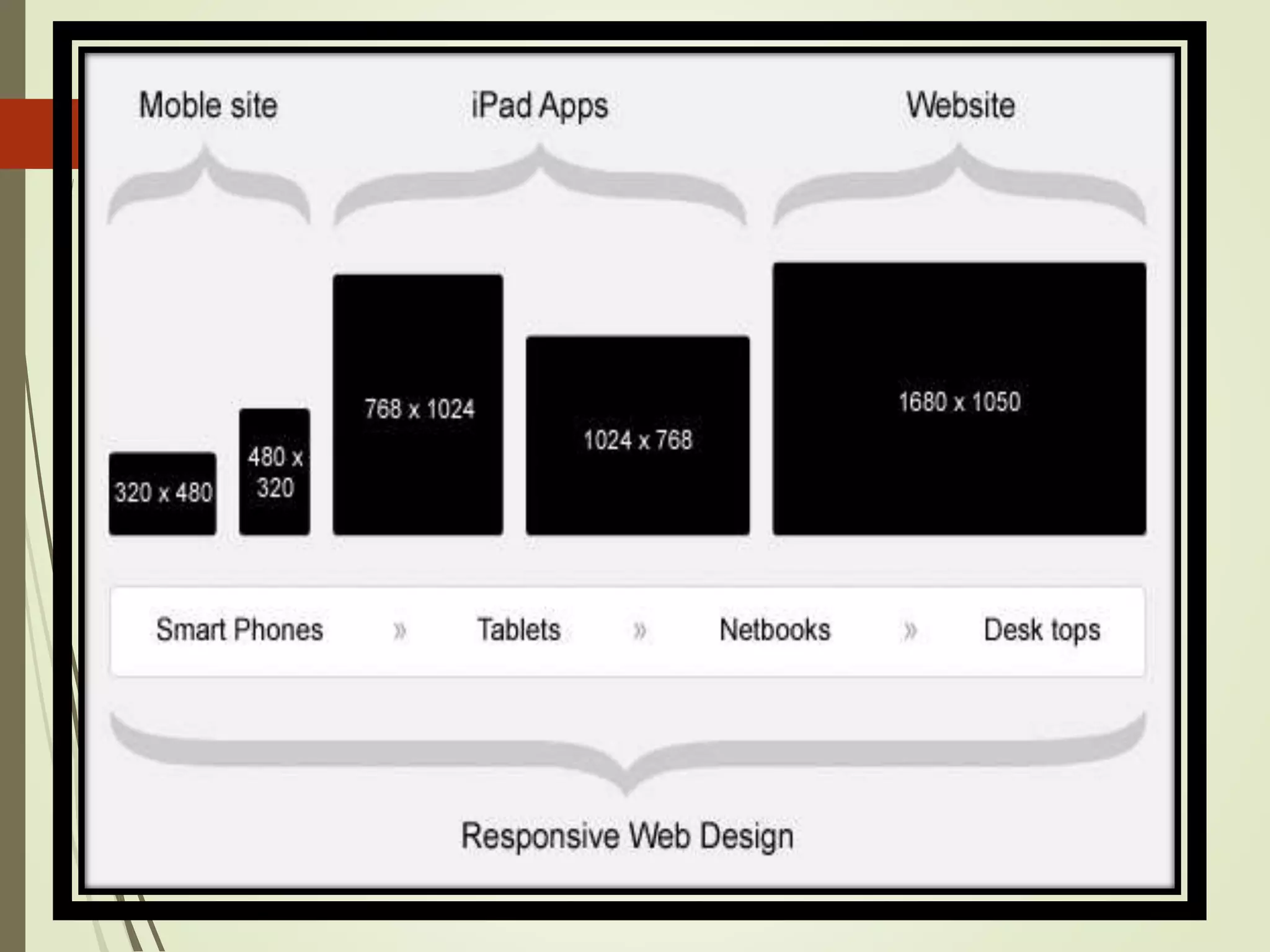
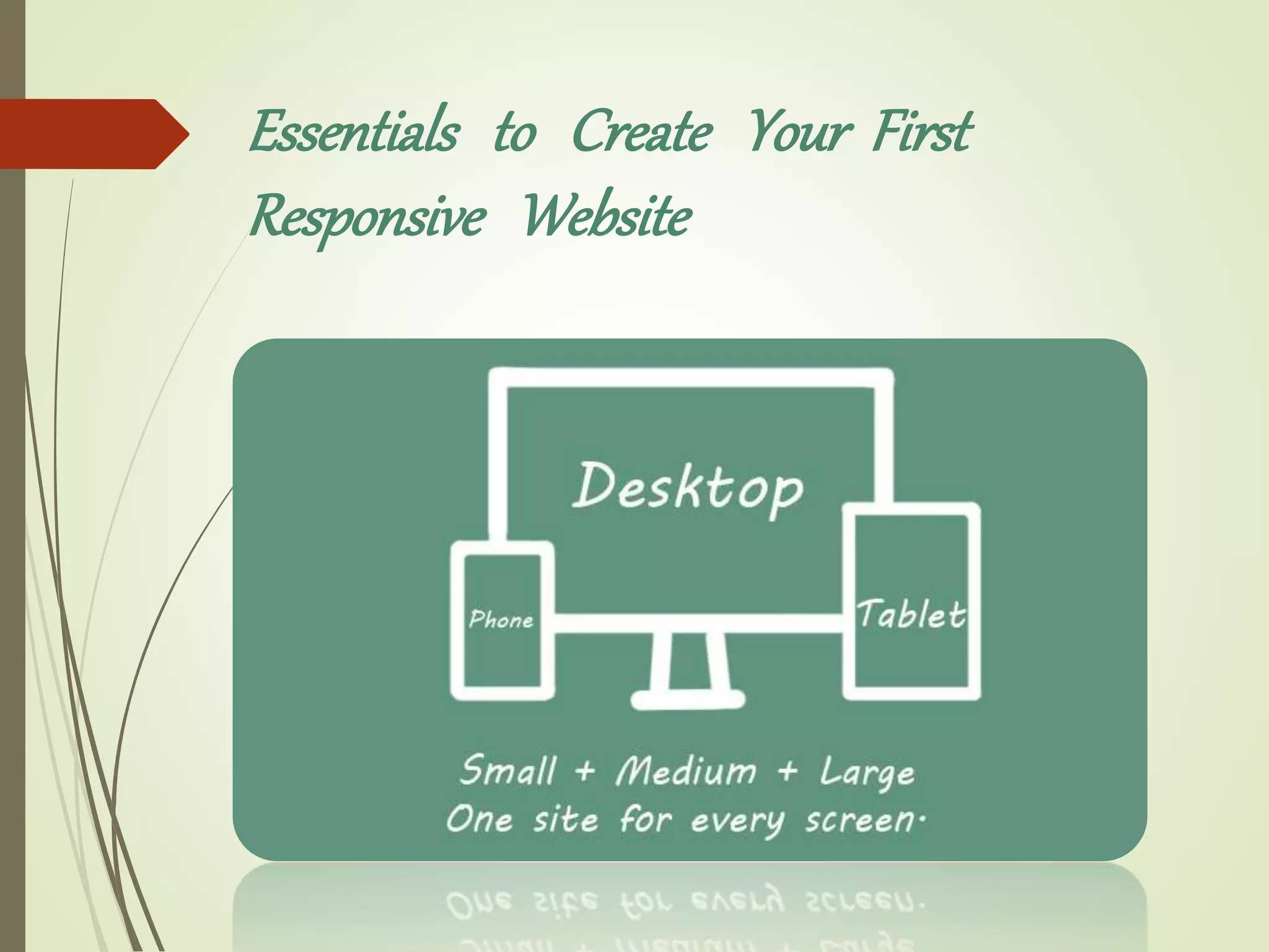
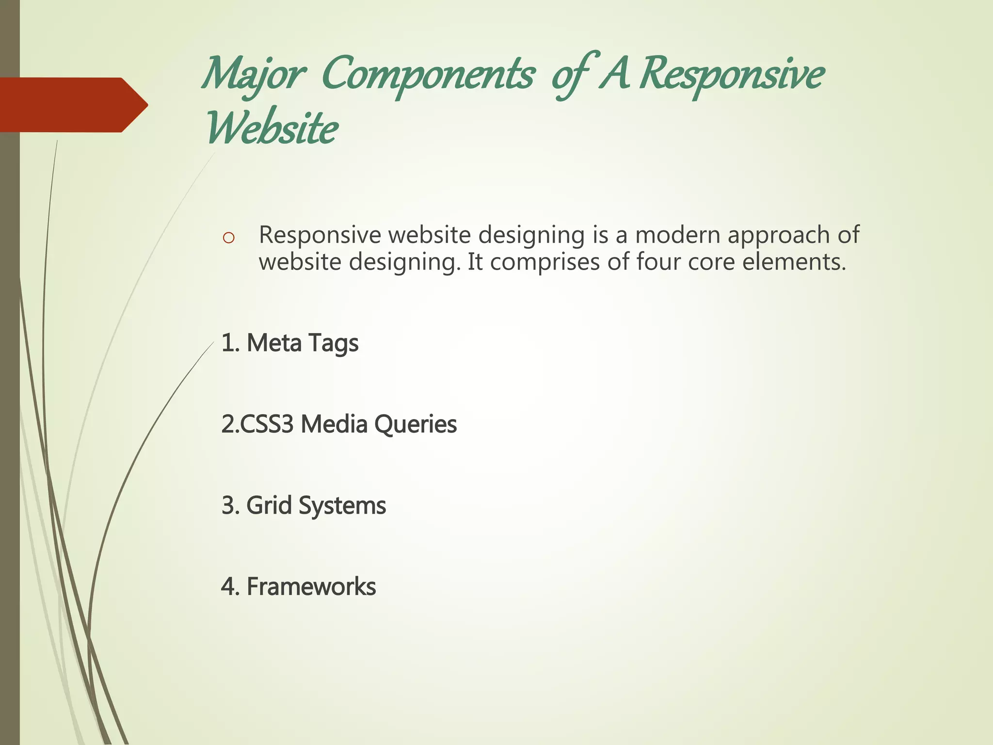
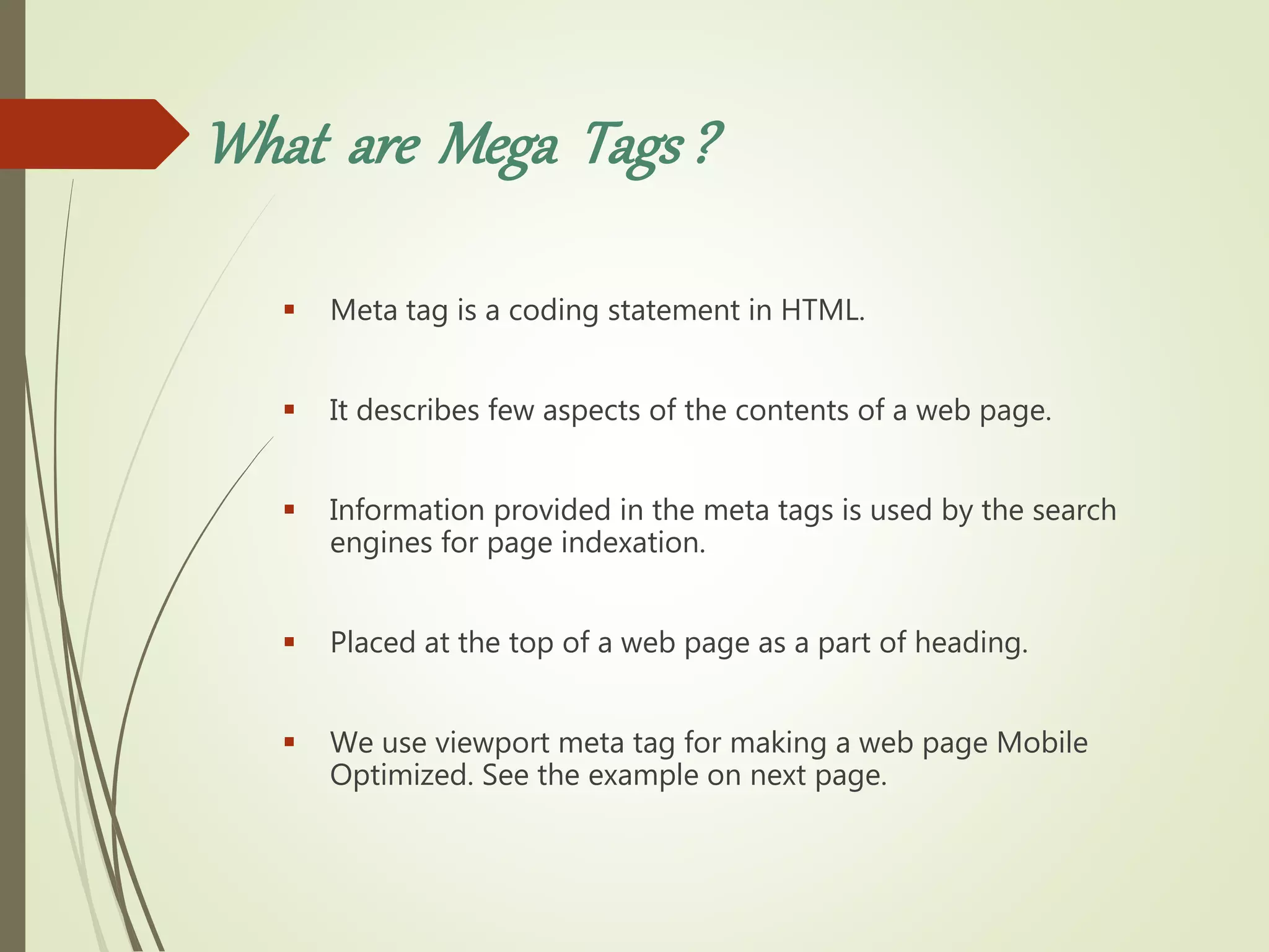
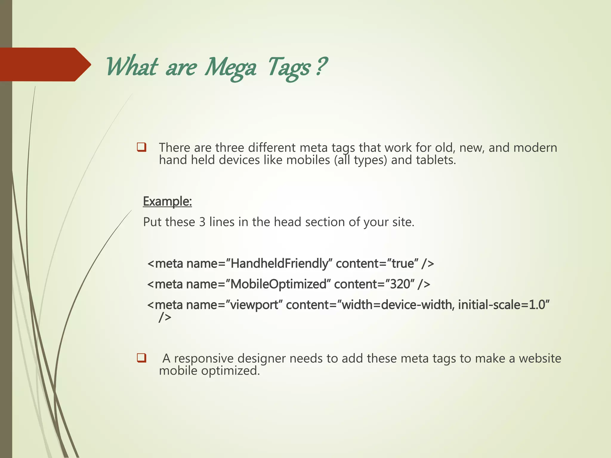
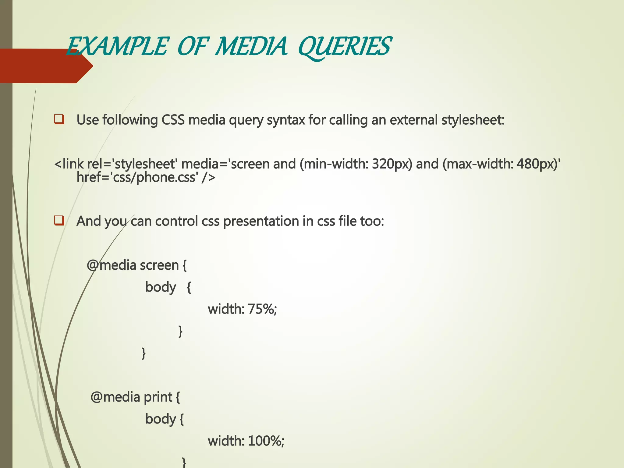
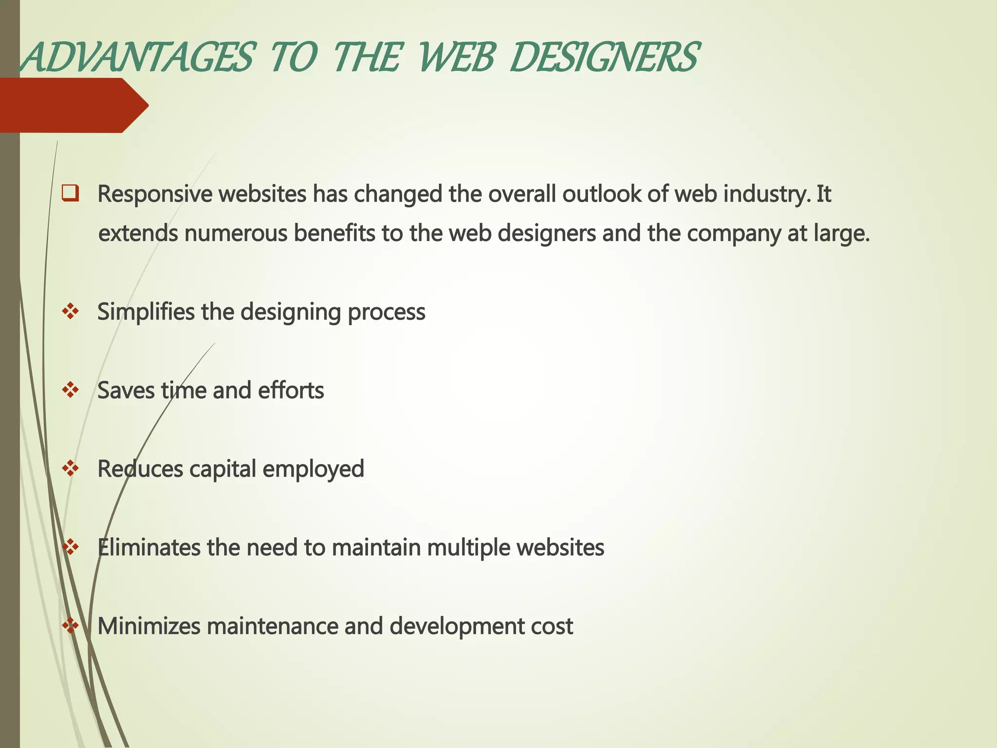
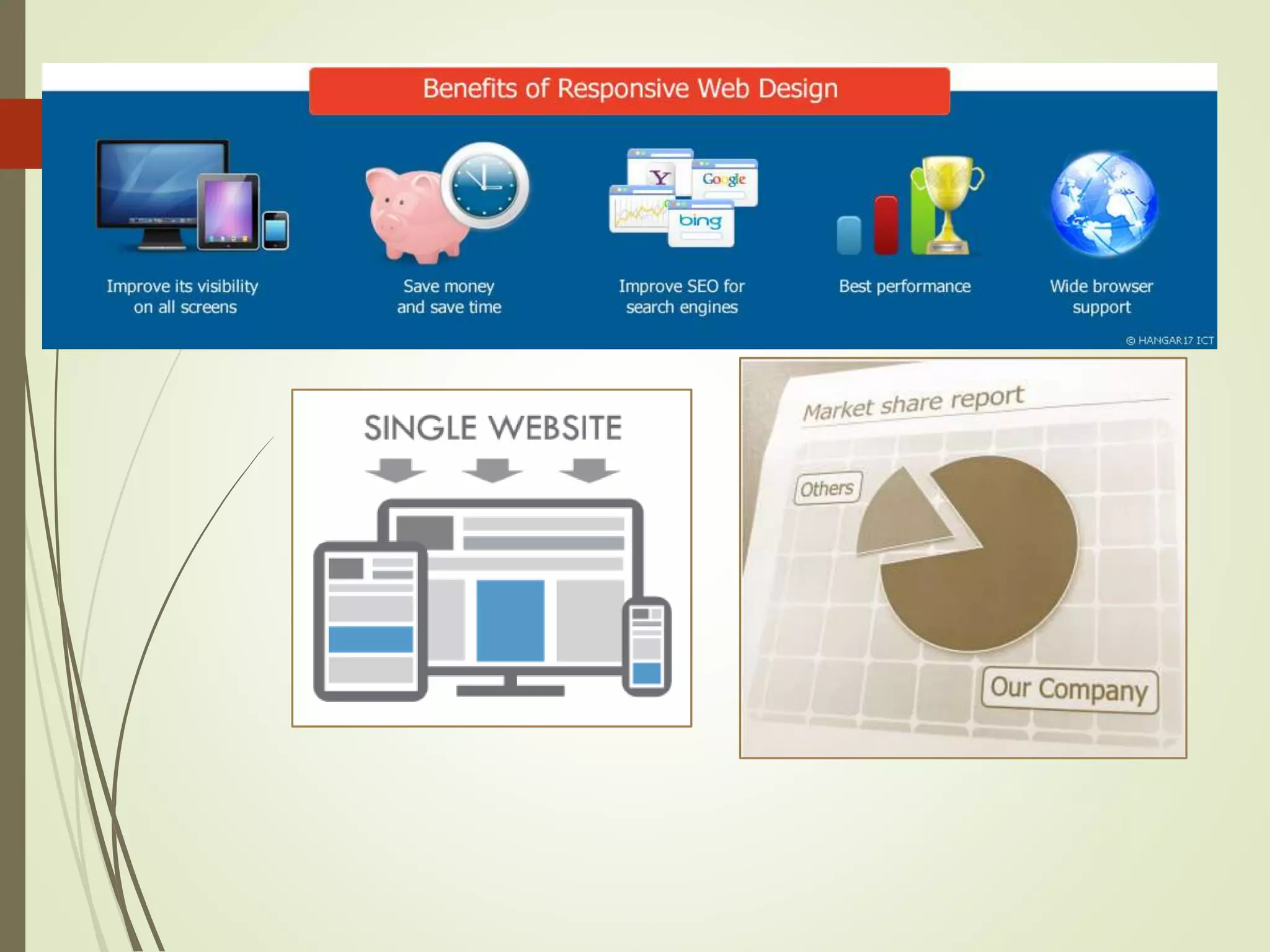
SlideShare a Scribd company logo
1 of 25
RESPONSIVEWEB DESIGNING
TopicsGoingto be Covered
 Meaning of Responsive
 What is A Responsive Web Design
(RWD)?
 What is the Need to Construct
Responsive Designs
 Basics of Responsive Web
Designing
 Essentials to Create your First
Responsive Website.
 Advantages of RWD
MEANINGOF RESPONCSIVE
The term Responsive means , To provide “Responses or
Adaptiveness
Quickly and Positively” to the users.
Responsive Web Designor RWD
Responsive Web Designing (RWD) is a process of
designing a single website to be used and
compatible on different portable or handy
electronic devices.
Also known as Adaptive Web Designing (AWD).
It regarded as an integrated approach of
designing through which compelling and easy to
use websites are built, to give an optimal viewing
user experience across a wide variety of devices
starting from desktop computers to mobile
phones.
Whatis theNeedto ConstructA ResponsiveWebsite?
A Big Question ???
Why You Need A ResponsiveWebsites?
 Growing Demand for Smartphones.
 Multiple Screen Sizes and Mobile Browsers.
 Wide Usage of Internet.
 Permits wider browser support
 Compulsory for Getting Good Business
Adapting the Apporipate Layout
o Designers should use appropriate layout to suit completely different screen
sizes.
Devices Size
Phones 480px and below
Phones to Tablets 767px and below
Portrait Tablets 768px and above
Net Book 990px to 1024px
Monitor 1024px and above
RememberImportantTipsWhile Devolping
RWD
1. Resizing images to fit the screen resolution
2. Hiding non-essential elements especially for smaller screen
3. Avoid web technologies that don’t work on mobile
4. Make sure that website can be read in seconds
5. Optimize your page for vertical scrolling
Essentials to Create Your First
Responsive Website
Major Components of A Responsive
Website
o Responsive website designing is a modern approach of
website designing. It comprises of four core elements.
1. Meta Tags
2.CSS3 Media Queries
3. Grid Systems
4. Frameworks
What are Mega Tags?
 Meta tag is a coding statement in HTML.
 It describes few aspects of the contents of a web page.
 Information provided in the meta tags is used by the search
engines for page indexation.
 Placed at the top of a web page as a part of heading.
 We use viewport meta tag for making a web page Mobile
Optimized. See the example on next page.
What are Mega Tags?
 There are three different meta tags that work for old, new, and modern
hand held devices like mobiles (all types) and tablets.
Example:
Put these 3 lines in the head section of your site.
<meta name=”HandheldFriendly” content=”true” />
<meta name=”MobileOptimized” content=”320” />
<meta name=”viewport” content=”width=device-width, initial-scale=1.0”
/>
 A responsive designer needs to add these meta tags to make a website
mobile optimized.
EXAMPLE OF MEDIA QUERIES
 Use following CSS media query syntax for calling an external stylesheet:
<link rel='stylesheet' media='screen and (min-width: 320px) and (max-width: 480px)'
href='css/phone.css' />
 And you can control css presentation in css file too:
@media screen {
body {
width: 75%;
}
}
@media print {
body {
width: 100%;
}
WHAT IS AGRID SYSTEMS?
 Grids are the simplest, strongest, and quick way to create
page layouts. A grid is a set of number of “columns” and
intervening “gutters” (margins) inside a “container” with
any width and flexibility.
 It gives a feeling of considered organization of one’s
website.
 In the words of Josef Muller Brockmann,” The grid system
is an aid, not a guarantee. It permits a number of possible
uses and each designer can look for a solution
appropriate to his personal style. But one must learn how
to use the grid; it is an art that requires practice.”
WHAT ARE CSS3 MEDIA QUERIES?
 CSS3 Media Queries consists of a media type and zero or an
optional expression to assign different style-sheets depending
on browser window size using media features such as width,
height, orientation, resolution, pixel aspect ration, and color etc.
 Using CSS3 media queries, presentations can be tailored to a
specific range of output devices without changing the content
itself.
 You can use media queries in different ways for different
reasons.
COMMONLY USED GRID SYSTEMS
 Following are some of the common grid system used to create a
responsive website:
 YUI CSS Grid
 960 Grid System
 Golden Grid System(also referred to as Folding Grid)
USEFUL FRAMEWOKS OF RWD
 Frameworks can be defined as a set of tools, libraries, conventions and
best practices that enable the designers to cut down their routine tasks
into reusable generic modules.
 CSS3 frameworks provide following benefits to web designers and
developers:
 Faster designing and building of websites.
 Designers can focus on crucial segments of website building-
using a grid, including a print style sheet, browser compliance,
creation of multiple layouts etc.
SOME COMMOM FRAMEWORKS
 Following are the popular frameworks that web designers
and developers used to develop responsive websites:
 Skeleton
 Foundation
 Bootstrap
ADVANTAGES OF RESPONSIVE WEBDESIGNING
ADVANTADES TO THE USERS
 Using Smartphone, Tablets, and Notebooks for accessing internet has become a common fashion or
trend. A popularity or charm had been seen among the users for responsive sites as it serve the
following advantages.
 A Responsive website is flexible to use.
 It automatically shuffles content, resizes images, and adjusts font size.
 Users are able to read information as per their needs and preferences.
 Helps encountering fast and intelligent sites.
 Saves user’s time while browsing the site.
 Helps increasing the user experience.
ADVANTAGES TO THE WEB DESIGNERS
 Responsive websites has changed the overall outlook of web industry. It
extends numerous benefits to the web designers and the company at large.
 Simplifies the designing process
 Saves time and efforts
 Reduces capital employed
 Eliminates the need to maintain multiple websites
 Minimizes maintenance and development cost
Responsive web designing

More Related Content

What's hot

Responsive web design
Responsive web designResponsive web design
Responsive web designRuss Weakley
 
Responsive Web Design with HTML5 and CSS3
Responsive Web Design with HTML5 and CSS3Responsive Web Design with HTML5 and CSS3
Responsive Web Design with HTML5 and CSS3Kannika Kong
 
Web development | Derin Dolen
Web development | Derin Dolen Web development | Derin Dolen
Web development | Derin Dolen Derin Dolen
 
Web development using javaScript, React js, Node js, HTML, CSS and SQL
Web development using javaScript, React js, Node js, HTML, CSS and SQLWeb development using javaScript, React js, Node js, HTML, CSS and SQL
Web development using javaScript, React js, Node js, HTML, CSS and SQLJayant Surana
 
Responsive Web Design - Introduction & Workflow Overview
Responsive Web Design - Introduction & Workflow OverviewResponsive Web Design - Introduction & Workflow Overview
Responsive Web Design - Introduction & Workflow OverviewAidan Foster
 
Web Development In 2018
Web Development In 2018Web Development In 2018
Web Development In 2018Traversy Media
 
ppt of web development for diploma student
ppt of web development for diploma student ppt of web development for diploma student
ppt of web development for diploma student Abhishekchauhan863165
 
WEB I - 01 - Introduction to Web Development
WEB I - 01 - Introduction to Web DevelopmentWEB I - 01 - Introduction to Web Development
WEB I - 01 - Introduction to Web DevelopmentRandy Connolly
 
Front End Development | Introduction
Front End Development | IntroductionFront End Development | Introduction
Front End Development | IntroductionJohnTaieb
 
1-01: Introduction To Web Development
1-01: Introduction To  Web  Development1-01: Introduction To  Web  Development
1-01: Introduction To Web Developmentapnwebdev
 
Introduction to asp.net
Introduction to asp.netIntroduction to asp.net
Introduction to asp.netSHADAB ALI
 
Full Stack Web Development
Full Stack Web DevelopmentFull Stack Web Development
Full Stack Web DevelopmentSWAGATHCHOWDARY1
 
Responsive web design ppt
Responsive web design pptResponsive web design ppt
Responsive web design pptaccede16
 

What's hot (20)

Responsive web design
Responsive web designResponsive web design
Responsive web design
 
Rwd ppt
Rwd pptRwd ppt
Rwd ppt
 
Web development
Web developmentWeb development
Web development
 
Web Design Trends: 2018 Edition
Web Design Trends: 2018 EditionWeb Design Trends: 2018 Edition
Web Design Trends: 2018 Edition
 
Responsive Web Design with HTML5 and CSS3
Responsive Web Design with HTML5 and CSS3Responsive Web Design with HTML5 and CSS3
Responsive Web Design with HTML5 and CSS3
 
WEB DESIGN
WEB DESIGNWEB DESIGN
WEB DESIGN
 
Web development | Derin Dolen
Web development | Derin Dolen Web development | Derin Dolen
Web development | Derin Dolen
 
Web development using javaScript, React js, Node js, HTML, CSS and SQL
Web development using javaScript, React js, Node js, HTML, CSS and SQLWeb development using javaScript, React js, Node js, HTML, CSS and SQL
Web development using javaScript, React js, Node js, HTML, CSS and SQL
 
Responsive Web Design - Introduction & Workflow Overview
Responsive Web Design - Introduction & Workflow OverviewResponsive Web Design - Introduction & Workflow Overview
Responsive Web Design - Introduction & Workflow Overview
 
Web Development
Web DevelopmentWeb Development
Web Development
 
Web Development In 2018
Web Development In 2018Web Development In 2018
Web Development In 2018
 
Backend Programming
Backend ProgrammingBackend Programming
Backend Programming
 
ppt of web development for diploma student
ppt of web development for diploma student ppt of web development for diploma student
ppt of web development for diploma student
 
WEB I - 01 - Introduction to Web Development
WEB I - 01 - Introduction to Web DevelopmentWEB I - 01 - Introduction to Web Development
WEB I - 01 - Introduction to Web Development
 
Front End Development | Introduction
Front End Development | IntroductionFront End Development | Introduction
Front End Development | Introduction
 
Angular
AngularAngular
Angular
 
1-01: Introduction To Web Development
1-01: Introduction To  Web  Development1-01: Introduction To  Web  Development
1-01: Introduction To Web Development
 
Introduction to asp.net
Introduction to asp.netIntroduction to asp.net
Introduction to asp.net
 
Full Stack Web Development
Full Stack Web DevelopmentFull Stack Web Development
Full Stack Web Development
 
Responsive web design ppt
Responsive web design pptResponsive web design ppt
Responsive web design ppt
 

Similar to Responsive web designing

Responsive Web design Zambig
Responsive Web design ZambigResponsive Web design Zambig
Responsive Web design ZambigTribune Media
 
Media queries and frameworks
Media queries and frameworksMedia queries and frameworks
Media queries and frameworksNicole Ryan
 
Responsive Web Designs
Responsive Web DesignsResponsive Web Designs
Responsive Web DesignsSanjida Afrin
 
Adaptive vs Responsive Layouts
Adaptive vs Responsive LayoutsAdaptive vs Responsive Layouts
Adaptive vs Responsive LayoutsIhor Zenich
 
G0373049057
G0373049057G0373049057
G0373049057theijes
 
Responsive Web Design & Its Significant Aspects
Responsive Web Design & Its Significant AspectsResponsive Web Design & Its Significant Aspects
Responsive Web Design & Its Significant Aspectsvanitharajblaze
 
Theming for mobile devices recent
Theming for mobile devices recentTheming for mobile devices recent
Theming for mobile devices recentArtem Shymko
 
Liquidizer.js: A Responsive Web Design Algorithm
Liquidizer.js: A Responsive Web Design AlgorithmLiquidizer.js: A Responsive Web Design Algorithm
Liquidizer.js: A Responsive Web Design Algorithmtheijes
 
Responsive Web Designs.pdf
Responsive Web Designs.pdfResponsive Web Designs.pdf
Responsive Web Designs.pdfJiniya Bipasha
 
Responsive Web Design | Website Designing
Responsive Web Design | Website DesigningResponsive Web Design | Website Designing
Responsive Web Design | Website DesigningMSA Technosoft
 
Responsive Web Designed for your communication and marketing needs
Responsive Web Designed for your communication and marketing needsResponsive Web Designed for your communication and marketing needs
Responsive Web Designed for your communication and marketing needsSEGIC
 
Introduction | SEO Expate BD Ltd.
Introduction | SEO Expate BD Ltd.Introduction | SEO Expate BD Ltd.
Introduction | SEO Expate BD Ltd.Sonia Simi
 
digital marketing[1].pdf
digital marketing[1].pdfdigital marketing[1].pdf
digital marketing[1].pdfTECHCENTRAL3
 
Impact_Responsive web design brings success to your business
Impact_Responsive web design brings success to your businessImpact_Responsive web design brings success to your business
Impact_Responsive web design brings success to your businessAmit Thakur
 
Impact_Responsive Web Design Brings Success to Your Business-AmitFBOXERLLP
Impact_Responsive Web Design Brings Success to Your Business-AmitFBOXERLLPImpact_Responsive Web Design Brings Success to Your Business-AmitFBOXERLLP
Impact_Responsive Web Design Brings Success to Your Business-AmitFBOXERLLPAmit Thakur
 

Similar to Responsive web designing (20)

Responsive Web Designing Fundamentals
Responsive Web Designing FundamentalsResponsive Web Designing Fundamentals
Responsive Web Designing Fundamentals
 
Responsive Web Design
Responsive Web DesignResponsive Web Design
Responsive Web Design
 
Responsive Web design Zambig
Responsive Web design ZambigResponsive Web design Zambig
Responsive Web design Zambig
 
Responsive web design
Responsive web designResponsive web design
Responsive web design
 
Responsive Design
Responsive DesignResponsive Design
Responsive Design
 
Media queries and frameworks
Media queries and frameworksMedia queries and frameworks
Media queries and frameworks
 
Responsive Web Designs
Responsive Web DesignsResponsive Web Designs
Responsive Web Designs
 
Adaptive vs Responsive Layouts
Adaptive vs Responsive LayoutsAdaptive vs Responsive Layouts
Adaptive vs Responsive Layouts
 
G0373049057
G0373049057G0373049057
G0373049057
 
Responsive Web Design & Its Significant Aspects
Responsive Web Design & Its Significant AspectsResponsive Web Design & Its Significant Aspects
Responsive Web Design & Its Significant Aspects
 
Theming for mobile devices recent
Theming for mobile devices recentTheming for mobile devices recent
Theming for mobile devices recent
 
Liquidizer.js: A Responsive Web Design Algorithm
Liquidizer.js: A Responsive Web Design AlgorithmLiquidizer.js: A Responsive Web Design Algorithm
Liquidizer.js: A Responsive Web Design Algorithm
 
Responsive Web Designs.pdf
Responsive Web Designs.pdfResponsive Web Designs.pdf
Responsive Web Designs.pdf
 
Responsive Web Design | Website Designing
Responsive Web Design | Website DesigningResponsive Web Design | Website Designing
Responsive Web Design | Website Designing
 
Responsive Web Designed for your communication and marketing needs
Responsive Web Designed for your communication and marketing needsResponsive Web Designed for your communication and marketing needs
Responsive Web Designed for your communication and marketing needs
 
Mobile Responsive ​ Website Designing.pdf
Mobile Responsive ​ Website Designing.pdfMobile Responsive ​ Website Designing.pdf
Mobile Responsive ​ Website Designing.pdf
 
Introduction | SEO Expate BD Ltd.
Introduction | SEO Expate BD Ltd.Introduction | SEO Expate BD Ltd.
Introduction | SEO Expate BD Ltd.
 
digital marketing[1].pdf
digital marketing[1].pdfdigital marketing[1].pdf
digital marketing[1].pdf
 
Impact_Responsive web design brings success to your business
Impact_Responsive web design brings success to your businessImpact_Responsive web design brings success to your business
Impact_Responsive web design brings success to your business
 
Impact_Responsive Web Design Brings Success to Your Business-AmitFBOXERLLP
Impact_Responsive Web Design Brings Success to Your Business-AmitFBOXERLLPImpact_Responsive Web Design Brings Success to Your Business-AmitFBOXERLLP
Impact_Responsive Web Design Brings Success to Your Business-AmitFBOXERLLP
 

Recently uploaded

Powerpoint exploring the locations used in television show Time Clash
Powerpoint exploring the locations used in television show Time ClashPowerpoint exploring the locations used in television show Time Clash
Powerpoint exploring the locations used in television show Time Clashcharlottematthew16
 
CloudStudio User manual (basic edition):
CloudStudio User manual (basic edition):CloudStudio User manual (basic edition):
CloudStudio User manual (basic edition):comworks
 
What's New in Teams Calling, Meetings and Devices March 2024
What's New in Teams Calling, Meetings and Devices March 2024What's New in Teams Calling, Meetings and Devices March 2024
What's New in Teams Calling, Meetings and Devices March 2024Stephanie Beckett
 
Transcript: New from BookNet Canada for 2024: BNC CataList - Tech Forum 2024
Transcript: New from BookNet Canada for 2024: BNC CataList - Tech Forum 2024Transcript: New from BookNet Canada for 2024: BNC CataList - Tech Forum 2024
Transcript: New from BookNet Canada for 2024: BNC CataList - Tech Forum 2024BookNet Canada
 
Dev Dives: Streamline document processing with UiPath Studio Web
Dev Dives: Streamline document processing with UiPath Studio WebDev Dives: Streamline document processing with UiPath Studio Web
Dev Dives: Streamline document processing with UiPath Studio WebUiPathCommunity
 
The Future of Software Development - Devin AI Innovative Approach.pdf
The Future of Software Development - Devin AI Innovative Approach.pdfThe Future of Software Development - Devin AI Innovative Approach.pdf
The Future of Software Development - Devin AI Innovative Approach.pdfSeasiaInfotech2
 
"Subclassing and Composition – A Pythonic Tour of Trade-Offs", Hynek Schlawack
"Subclassing and Composition – A Pythonic Tour of Trade-Offs", Hynek Schlawack"Subclassing and Composition – A Pythonic Tour of Trade-Offs", Hynek Schlawack
"Subclassing and Composition – A Pythonic Tour of Trade-Offs", Hynek SchlawackFwdays
 
Search Engine Optimization SEO PDF for 2024.pdf
Search Engine Optimization SEO PDF for 2024.pdfSearch Engine Optimization SEO PDF for 2024.pdf
Search Engine Optimization SEO PDF for 2024.pdfRankYa
 
Are Multi-Cloud and Serverless Good or Bad?
Are Multi-Cloud and Serverless Good or Bad?Are Multi-Cloud and Serverless Good or Bad?
Are Multi-Cloud and Serverless Good or Bad?Mattias Andersson
 
Integration and Automation in Practice: CI/CD in Mule Integration and Automat...
Integration and Automation in Practice: CI/CD in Mule Integration and Automat...Integration and Automation in Practice: CI/CD in Mule Integration and Automat...
Integration and Automation in Practice: CI/CD in Mule Integration and Automat...Patryk Bandurski
 
My Hashitalk Indonesia April 2024 Presentation
My Hashitalk Indonesia April 2024 PresentationMy Hashitalk Indonesia April 2024 Presentation
My Hashitalk Indonesia April 2024 PresentationRidwan Fadjar
 
Training state-of-the-art general text embedding
Training state-of-the-art general text embeddingTraining state-of-the-art general text embedding
Training state-of-the-art general text embeddingZilliz
 
Artificial intelligence in cctv survelliance.pptx
Artificial intelligence in cctv survelliance.pptxArtificial intelligence in cctv survelliance.pptx
Artificial intelligence in cctv survelliance.pptxhariprasad279825
 
New from BookNet Canada for 2024: BNC CataList - Tech Forum 2024
New from BookNet Canada for 2024: BNC CataList - Tech Forum 2024New from BookNet Canada for 2024: BNC CataList - Tech Forum 2024
New from BookNet Canada for 2024: BNC CataList - Tech Forum 2024BookNet Canada
 
SAP Build Work Zone - Overview L2-L3.pptx
SAP Build Work Zone - Overview L2-L3.pptxSAP Build Work Zone - Overview L2-L3.pptx
SAP Build Work Zone - Overview L2-L3.pptxNavinnSomaal
 
Kotlin Multiplatform & Compose Multiplatform - Starter kit for pragmatics
Kotlin Multiplatform & Compose Multiplatform - Starter kit for pragmaticsKotlin Multiplatform & Compose Multiplatform - Starter kit for pragmatics
Kotlin Multiplatform & Compose Multiplatform - Starter kit for pragmaticscarlostorres15106
 
Leverage Zilliz Serverless - Up to 50X Saving for Your Vector Storage Cost
Leverage Zilliz Serverless - Up to 50X Saving for Your Vector Storage CostLeverage Zilliz Serverless - Up to 50X Saving for Your Vector Storage Cost
Leverage Zilliz Serverless - Up to 50X Saving for Your Vector Storage CostZilliz
 
AI as an Interface for Commercial Buildings
AI as an Interface for Commercial BuildingsAI as an Interface for Commercial Buildings
AI as an Interface for Commercial BuildingsMemoori
 
Ensuring Technical Readiness For Copilot in Microsoft 365
Ensuring Technical Readiness For Copilot in Microsoft 365Ensuring Technical Readiness For Copilot in Microsoft 365
Ensuring Technical Readiness For Copilot in Microsoft 3652toLead Limited
 

Recently uploaded (20)

Powerpoint exploring the locations used in television show Time Clash
Powerpoint exploring the locations used in television show Time ClashPowerpoint exploring the locations used in television show Time Clash
Powerpoint exploring the locations used in television show Time Clash
 
CloudStudio User manual (basic edition):
CloudStudio User manual (basic edition):CloudStudio User manual (basic edition):
CloudStudio User manual (basic edition):
 
What's New in Teams Calling, Meetings and Devices March 2024
What's New in Teams Calling, Meetings and Devices March 2024What's New in Teams Calling, Meetings and Devices March 2024
What's New in Teams Calling, Meetings and Devices March 2024
 
Transcript: New from BookNet Canada for 2024: BNC CataList - Tech Forum 2024
Transcript: New from BookNet Canada for 2024: BNC CataList - Tech Forum 2024Transcript: New from BookNet Canada for 2024: BNC CataList - Tech Forum 2024
Transcript: New from BookNet Canada for 2024: BNC CataList - Tech Forum 2024
 
Dev Dives: Streamline document processing with UiPath Studio Web
Dev Dives: Streamline document processing with UiPath Studio WebDev Dives: Streamline document processing with UiPath Studio Web
Dev Dives: Streamline document processing with UiPath Studio Web
 
The Future of Software Development - Devin AI Innovative Approach.pdf
The Future of Software Development - Devin AI Innovative Approach.pdfThe Future of Software Development - Devin AI Innovative Approach.pdf
The Future of Software Development - Devin AI Innovative Approach.pdf
 
"Subclassing and Composition – A Pythonic Tour of Trade-Offs", Hynek Schlawack
"Subclassing and Composition – A Pythonic Tour of Trade-Offs", Hynek Schlawack"Subclassing and Composition – A Pythonic Tour of Trade-Offs", Hynek Schlawack
"Subclassing and Composition – A Pythonic Tour of Trade-Offs", Hynek Schlawack
 
Search Engine Optimization SEO PDF for 2024.pdf
Search Engine Optimization SEO PDF for 2024.pdfSearch Engine Optimization SEO PDF for 2024.pdf
Search Engine Optimization SEO PDF for 2024.pdf
 
Are Multi-Cloud and Serverless Good or Bad?
Are Multi-Cloud and Serverless Good or Bad?Are Multi-Cloud and Serverless Good or Bad?
Are Multi-Cloud and Serverless Good or Bad?
 
Integration and Automation in Practice: CI/CD in Mule Integration and Automat...
Integration and Automation in Practice: CI/CD in Mule Integration and Automat...Integration and Automation in Practice: CI/CD in Mule Integration and Automat...
Integration and Automation in Practice: CI/CD in Mule Integration and Automat...
 
My Hashitalk Indonesia April 2024 Presentation
My Hashitalk Indonesia April 2024 PresentationMy Hashitalk Indonesia April 2024 Presentation
My Hashitalk Indonesia April 2024 Presentation
 
DMCC Future of Trade Web3 - Special Edition
DMCC Future of Trade Web3 - Special EditionDMCC Future of Trade Web3 - Special Edition
DMCC Future of Trade Web3 - Special Edition
 
Training state-of-the-art general text embedding
Training state-of-the-art general text embeddingTraining state-of-the-art general text embedding
Training state-of-the-art general text embedding
 
Artificial intelligence in cctv survelliance.pptx
Artificial intelligence in cctv survelliance.pptxArtificial intelligence in cctv survelliance.pptx
Artificial intelligence in cctv survelliance.pptx
 
New from BookNet Canada for 2024: BNC CataList - Tech Forum 2024
New from BookNet Canada for 2024: BNC CataList - Tech Forum 2024New from BookNet Canada for 2024: BNC CataList - Tech Forum 2024
New from BookNet Canada for 2024: BNC CataList - Tech Forum 2024
 
SAP Build Work Zone - Overview L2-L3.pptx
SAP Build Work Zone - Overview L2-L3.pptxSAP Build Work Zone - Overview L2-L3.pptx
SAP Build Work Zone - Overview L2-L3.pptx
 
Kotlin Multiplatform & Compose Multiplatform - Starter kit for pragmatics
Kotlin Multiplatform & Compose Multiplatform - Starter kit for pragmaticsKotlin Multiplatform & Compose Multiplatform - Starter kit for pragmatics
Kotlin Multiplatform & Compose Multiplatform - Starter kit for pragmatics
 
Leverage Zilliz Serverless - Up to 50X Saving for Your Vector Storage Cost
Leverage Zilliz Serverless - Up to 50X Saving for Your Vector Storage CostLeverage Zilliz Serverless - Up to 50X Saving for Your Vector Storage Cost
Leverage Zilliz Serverless - Up to 50X Saving for Your Vector Storage Cost
 
AI as an Interface for Commercial Buildings
AI as an Interface for Commercial BuildingsAI as an Interface for Commercial Buildings
AI as an Interface for Commercial Buildings
 
Ensuring Technical Readiness For Copilot in Microsoft 365
Ensuring Technical Readiness For Copilot in Microsoft 365Ensuring Technical Readiness For Copilot in Microsoft 365
Ensuring Technical Readiness For Copilot in Microsoft 365
 

Responsive web designing

  • 2. TopicsGoingto be Covered  Meaning of Responsive  What is A Responsive Web Design (RWD)?  What is the Need to Construct Responsive Designs  Basics of Responsive Web Designing  Essentials to Create your First Responsive Website.  Advantages of RWD
  • 3. MEANINGOF RESPONCSIVE The term Responsive means , To provide “Responses or Adaptiveness Quickly and Positively” to the users.
  • 4. Responsive Web Designor RWD Responsive Web Designing (RWD) is a process of designing a single website to be used and compatible on different portable or handy electronic devices. Also known as Adaptive Web Designing (AWD). It regarded as an integrated approach of designing through which compelling and easy to use websites are built, to give an optimal viewing user experience across a wide variety of devices starting from desktop computers to mobile phones.
  • 5. Whatis theNeedto ConstructA ResponsiveWebsite? A Big Question ???
  • 6. Why You Need A ResponsiveWebsites?  Growing Demand for Smartphones.  Multiple Screen Sizes and Mobile Browsers.  Wide Usage of Internet.  Permits wider browser support  Compulsory for Getting Good Business
  • 7.
  • 8. Adapting the Apporipate Layout o Designers should use appropriate layout to suit completely different screen sizes. Devices Size Phones 480px and below Phones to Tablets 767px and below Portrait Tablets 768px and above Net Book 990px to 1024px Monitor 1024px and above
  • 9.
  • 10. RememberImportantTipsWhile Devolping RWD 1. Resizing images to fit the screen resolution 2. Hiding non-essential elements especially for smaller screen 3. Avoid web technologies that don’t work on mobile 4. Make sure that website can be read in seconds 5. Optimize your page for vertical scrolling
  • 11. Essentials to Create Your First Responsive Website
  • 12. Major Components of A Responsive Website o Responsive website designing is a modern approach of website designing. It comprises of four core elements. 1. Meta Tags 2.CSS3 Media Queries 3. Grid Systems 4. Frameworks
  • 13. What are Mega Tags?  Meta tag is a coding statement in HTML.  It describes few aspects of the contents of a web page.  Information provided in the meta tags is used by the search engines for page indexation.  Placed at the top of a web page as a part of heading.  We use viewport meta tag for making a web page Mobile Optimized. See the example on next page.
  • 14. What are Mega Tags?  There are three different meta tags that work for old, new, and modern hand held devices like mobiles (all types) and tablets. Example: Put these 3 lines in the head section of your site. <meta name=”HandheldFriendly” content=”true” /> <meta name=”MobileOptimized” content=”320” /> <meta name=”viewport” content=”width=device-width, initial-scale=1.0” />  A responsive designer needs to add these meta tags to make a website mobile optimized.
  • 15. EXAMPLE OF MEDIA QUERIES  Use following CSS media query syntax for calling an external stylesheet: <link rel='stylesheet' media='screen and (min-width: 320px) and (max-width: 480px)' href='css/phone.css' />  And you can control css presentation in css file too: @media screen { body { width: 75%; } } @media print { body { width: 100%; }
  • 16. WHAT IS AGRID SYSTEMS?  Grids are the simplest, strongest, and quick way to create page layouts. A grid is a set of number of “columns” and intervening “gutters” (margins) inside a “container” with any width and flexibility.  It gives a feeling of considered organization of one’s website.  In the words of Josef Muller Brockmann,” The grid system is an aid, not a guarantee. It permits a number of possible uses and each designer can look for a solution appropriate to his personal style. But one must learn how to use the grid; it is an art that requires practice.”
  • 17. WHAT ARE CSS3 MEDIA QUERIES?  CSS3 Media Queries consists of a media type and zero or an optional expression to assign different style-sheets depending on browser window size using media features such as width, height, orientation, resolution, pixel aspect ration, and color etc.  Using CSS3 media queries, presentations can be tailored to a specific range of output devices without changing the content itself.  You can use media queries in different ways for different reasons.
  • 18. COMMONLY USED GRID SYSTEMS  Following are some of the common grid system used to create a responsive website:  YUI CSS Grid  960 Grid System  Golden Grid System(also referred to as Folding Grid)
  • 19. USEFUL FRAMEWOKS OF RWD  Frameworks can be defined as a set of tools, libraries, conventions and best practices that enable the designers to cut down their routine tasks into reusable generic modules.  CSS3 frameworks provide following benefits to web designers and developers:  Faster designing and building of websites.  Designers can focus on crucial segments of website building- using a grid, including a print style sheet, browser compliance, creation of multiple layouts etc.
  • 20. SOME COMMOM FRAMEWORKS  Following are the popular frameworks that web designers and developers used to develop responsive websites:  Skeleton  Foundation  Bootstrap
  • 21. ADVANTAGES OF RESPONSIVE WEBDESIGNING
  • 22. ADVANTADES TO THE USERS  Using Smartphone, Tablets, and Notebooks for accessing internet has become a common fashion or trend. A popularity or charm had been seen among the users for responsive sites as it serve the following advantages.  A Responsive website is flexible to use.  It automatically shuffles content, resizes images, and adjusts font size.  Users are able to read information as per their needs and preferences.  Helps encountering fast and intelligent sites.  Saves user’s time while browsing the site.  Helps increasing the user experience.
  • 23. ADVANTAGES TO THE WEB DESIGNERS  Responsive websites has changed the overall outlook of web industry. It extends numerous benefits to the web designers and the company at large.  Simplifies the designing process  Saves time and efforts  Reduces capital employed  Eliminates the need to maintain multiple websites  Minimizes maintenance and development cost