Responsive web design
•
1 like•982 views

This document summarizes an agenda for a responsive design roundtable discussion. The roundtable will cover topics including what responsive design is, the user continuum, and mobile web vs responsive design vs apps. It will take place on June 12, 2013 from 8am to 10am and be led by Christian Glover Wilson. The agenda includes 4 topics to discuss and time for Q&A.

Recommended
More Related Content
What's hot
What's hot (20)
Viewers also liked
Viewers also liked (20)
Similar to Responsive web design
Similar to Responsive web design (20)
More from Christian Glover Wilson
Recently uploaded
Recently uploaded (20)
Responsive web design
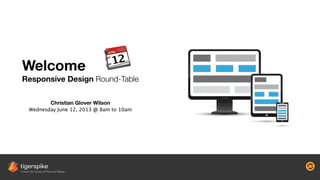
- 1. RO UN D TA B L E Welcome Responsive Design Round-Table Christian Glover Wilson Wednesday June 12, 2013 @ 8am to 10am
- 2. RO UN D TA B L E Responsive Design Round-Table Welcome and Overview What is Responsive Web Design? ! Topic 1 - RWD and The User Continuum Topic 2 - Mobile Web vs RWD vs App Q&A Agenda
- 3. RO UN D TA B L E Fragmented Landscape Responsive Design Round-Table
- 4. RO UN D TA B L E Device Widths Responsive Design Round-Table
- 5. RO UN D TA B L E What is it? Responsive Design Round-Table Wha! i" responsiv# desig$?Wha! i" desig$? responsiv#
- 6. RO UN D TA B L E Design and development that responds to the user’s behavior and environment based on screen size, platform and orientation. ! The practice consists of a mix of flexible grids and layouts, images and an intelligent use of CSS media queries. What is Responsive Web Design? Responsive Design Round-Table Wha! i" responsiv# desig$?Wha! i" desig$? responsiv#
- 7. RO UN D TA B L E Origins of Responsive Web Design Responsive Design Round-Table • a.k.a. Responsive / Responsive Design / RWD • Coined by Ethan Marcotte in 2010 ! • Adapts the usable layout of a website to a device’s screen width/resolution • Is a web design methodology made achievable by the use of CSS3 • Works universally on any modern browser-enabled device Wha! i" responsiv# desig$?Wha! i" desig$? responsiv#
- 8. RO UN D TA B L E Media Queries Responsive Design Round-Table 320px 768px 1024px 1280px 1920px SMARTPHONE TABLET NETBOOK MONITOR DISPLAY Wha! i" responsiv# desig$?Wha! i" desig$? responsiv#
- 9. RO UN D TA B L E Fluid Grids Responsive Design Round-Table Header A B C Header A D F B E G C H Header A I B J E Header C F H D G K 320px 1024px +768px Wha! i" responsiv# desig$?Wha! i" desig$? responsiv#
- 10. RO UN D TA B L E Flexible Media Responsive Design Round-Table 320px 1024px +768px Aa Bb Cc Aa Bb Cc Aa Bb Cc 76kb 200kb 1.4MB Wha! i" responsiv# desig$?Wha! i" desig$? responsiv#
- 11. RO UN D TA B L E Let’s have a play Responsive Design Round-Table Using http://quirktools.com/screenfly Look for: • Dynamic changes in image and text size • Different images for different views ! • Search bar moving around • Change in navigation shape / structure / position • Text changes to menu items or key elements ! • Simplification of content on the page • Content moving down the page or disappearing altogether Wha! i" responsiv# desig$?Wha! i" desig$? responsiv#
- 12. RO UN D TA B L E Responsive Design Round-Table Topic 1 Responsive Web and the User Continuum
- 13. RO UN D TA B L E Multi-screening Responsive Design Round-Table Source: http://services.google.com/fh/files/misc/multiscreenworld_final.pdf 90%use multiple screens sequentially to accomplish a task 22%use multiple screens to complement a task 78%use multiple screens when multi-tasking
- 14. RO UN D TA B L E Mobile Context Responsive Design Round-Table Contextual Influences User’s Considerations Device Capability
- 15. RO UN D TA B L E User Sentiments / Archetypes / Personas Responsive Design Round-Table
- 16. RO UN D TA B L E Responsive Design Round-Table
- 17. RO UN D TA B L E Responsive Design Round-Table
- 18. RO UN D TA B L E Responsive Design Round-Table Topic 2 Mobile Web vs RWD vs Native App ! ! ! +
- 19. RO UN D TA B L E Mobile Web vs RWD vs Native App Responsive Design Round-Table Does the experience need to work in no data connection situations? Does the experience require intense graphical rendering? Does the experience require access to device functionality? Will users download in order to engage/consume? Is the experience for task focussed utility or information consumption? Is the experience intended for enterprise users or consumers? Are users looking for simultaneous or sequential experience? Does the project have an imminent deadline/budget? Does the experience need to work on any/every platform/device? +
- 20. RO UN D TA B L E The Pros Responsive Design Round-Table Single Code Base SEO Advantage App-store agnostic Device Agnostic Future Proofing Multi-Device Experience Progressive Workflow Fast, easy updates Universal Code Base + +
- 21. RO UN D TA B L E The Cons Responsive Design Round-Table Longer development cycle Longer User Testing Slow performance depending on UI/UX/IA Content requires ongoing focusOften requires front-end rebuild Thorough learning curve +
- 22. RO UN D TA B L E Responsive Design Round-Table Topic 3 Mobile First and Progressive Enhancement
- 23. RO UN D TA B L E Overview of mobile design methodologies Responsive Design Round-Table Adaptive Web Progressive Enhancement Mobile First Responsive Web Design Adaptive Web The big picture of ‘one web’ ! Progressive Enhancement Being mindful of technical accessibility ! Mobile First Being mindful of context and device functions ! Responsive Web Design The flexible layout and design methodology
- 24. RO UN D TA B L E Progressive Enhancement Responsive Design Round-Table “Progressive enhancement isn’t about browsers. It’s about crafting experiences that serve your users by giving them access to content without technological restrictions.” — Aaron Gustafson, Adaptive Web Design Image source: http://www.laternastudio.com/blog/progressive-enhancement-in-2012
- 25. RO UN D TA B L E Mobile First Responsive Design Round-Table Prioritize content aggressively ! ! ! Use the device’s native capabilities ! ! ! Re-think forms and embrace input types ! ! ! Natural User Interface (NUI) is primal ! ! ! Respect the data connection Navigation styles must not obscure content ! ! ! Conditional and Lazy Loading for secondary content ! ! ! Use typography and font-size for readability ! ! ! Use Scalable Vector Graphics (SVGs) and Font Icons ! ! ! Load speed matters - reduce HTTP requests. ———
- 26. RO UN D TA B L E Responsive Design Round-Table Topic 4 Planning a responsive website
- 27. Mobile First = Progressive Enhancement ! ! ! Determine Sequential vs Simultaneous Usage ! ! ! Determine Content Context (location, date, time) ! ! ! Display Advertising Strategy RO UN D TA B L E Content Strategy Considerations Responsive Design Round-Table ——— Content Management (role, platform, integration) ! ! ! User Generated Content vs Brand ! ! ! Determine Content Types and Quantity ! ! ! Determine Update Frequency !
- 28. RO UN D TA B L E Mobile First Responsive Design Round-Table Design with mobile-first, progressive enhancement mindset ! ! Create a pattern and styles library ! ! Use Scalable Vector Graphics (SVGs) ! ! Use high-res images (retina display) and scale them with services like sencha.io ! ! No hover state challenge ! ! Still gotta give love to IE6 AlphaImageLoader and max-width issues Use typography and font-icons ! ! Use Minify to compact and gZip to compress HTML/CSS/JavaScript file sizes ! ! Don’t go overboard with CSS effects ! ! Use a responsive CSS framework like Zurb or Bootstrap for speed ! ! Minimize the initial loading time • Try to use external js and CSS files • Use lazy loading and conditional loading ! ! It’s an agile team sport - not true waterfall Get development and content team involved early
- 29. RO UN D TA B L E Getting Started Responsive Design Round-Table Step 1 Build a responsive project team • UI/UX Designer • IA Architect / Content Strategist • Front-End Developer • Stakeholder ! Productivity Tip • Keep it lean and agile • Start together, finish together Step 2 Research real use cases • Create personas/archetypes • Create workflows and user journeys • Validate with data - not just hunches • Identify real behaviors and usage patterns ! Productivity Tip • Rapid prototype to test internally • Follow Mobile-First (Progressive Enhancement)
- 30. Step 4 First prototype • Dev/UI/UX to lo-fi wireframe first draft • Agree to a grid system prior to wire-framing • Be ruthless with navigation and functionality • Perform regular design feedback loops ! Productivity Tip • Use tools to live preview wire-frames in device frames • Design with modularity and style guides/style tiles Step 3 Create a robust content strategy • Apply mobile-first thinking for focus • Apply usage insights to content creation • Assign strict deadlines for key content • Ensure devs are clear about the strategy ! Productivity Tip • Set realistic content deliverables • Workshop to discuss content consumption RO UN D TA B L E Getting Started Responsive Design Round-Table
- 31. RO UN D TA B L E Supplementary Responsive Design Round-Table Supplementary
- 32. RO UN D TA B L E Useful Resources Responsive Design Round-Table ! ! ! ! ! Flexible Grid Standards http://tgrs.pk/u7kjy ! Responsive Images Standards http://tgrs.pk/9849p ! Using Sencha for image optimization http://tgrs.pk/so2ho ! Content Handling http://tgrs.pk/p8iui ! Responsive CMS http://modx.com/ http://wordpress.com ! Performance Best Practices http://tgrs.pk/7pya9 ! Examples of great responsive designs http://mediaqueri.es Adaptive Content Management http://tgrs.pk/3gkod ! Thought Leadership http://tgrs.pk/tst71 http://tgrs.pk/sjsqn http://tgrs.pk/kfs07 ! Tigerspike Live Example http://www.careconnectivity.org ! Test a responsive design http://tgrs.pk/4cyx7 http://tgrs.pk/96u9l ! Modularity and Style Guides http://tgrs.pk/4jfqe ! Style Tiles http://styletil.es/ ! Great video by Brad Frost! Anatomy of an Adaptive Web Experience http://tgrs.pk/5j514
- 33. RO UN D TA B L E Upcoming Events Responsive Design Round-Table New York Thursday July 25th, 2013 8am to 10am EST ! Cyber security and Mobility Round-Table Rise of Mobility Proliferation of Personal Technology and Enterprise Mobility The Internet of Things Dealing with a network of IP-enabled components and appliances ! Understanding the Threats Prepare for threats to the device, the network and accidental losses ! Securing Communication Encryption and unsecured networks ! Addressing the Problem Protecting the device and best practice around BYOD
- 34. RO UN D TA B L E Americas 133 W 19th Street 7th Floor New York NY 10011 +1 646 330 4636 americas@tigerspike.com EMEA Level G, 1 & 3 18 Buckingham Gate London SW1E 6LB +44 20 7148 6600 emea@tigerspike.com Asia Pacific Level 1 28 Richards Avenue, Surry Hills Sydney NSW 2010 +61 2 9361 5132 asia-pacific@tigerspike.com Alex Hall, President alex@tigerspike.com | +1 646 388 0036 ! Christian Glover Wilson, VP of Technology & Strategy christian@tigerspike.com | +1 917 310 5249 Contact Information Responsive Design Round-Table