Downloaded 21 times

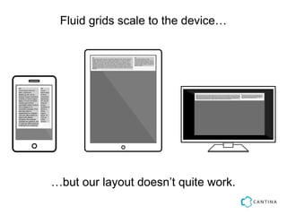
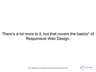
![And now some styles to make the grid work
*:before { -webkit-box-sizing: border-box; -moz-box-sizing: border-box; box-sizing:
ding: 1em 0 1em 1em }
{ content: ""; display: table; clear: both;}
l-'] { float: left; padding-right: 1em;}
width: 66.66% }
width: 33.33% }
Hat tip to @chriscoyier and http://css-tricks.com/dont-overthink-it-grids/](https://image.slidesharecdn.com/mobilemonday-responsivewebdesign-121206154141-phpapp01/85/Mobile-Monday-Presentation-Responsive-Web-Design-13-320.jpg)
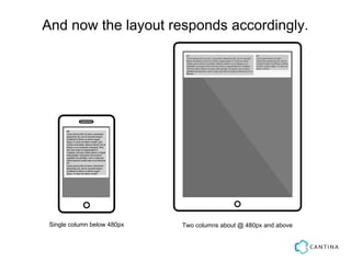
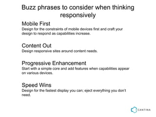
![Let’s use a media query to refine the layout.
after, *:before { -webkit-box-sizing: border-box; -moz-box-sizing: border-box; box-si
{ padding: 1em 0 1em 1em }
:after { content: ""; display: table; clear: both;}
s*='col-'] { float: left; padding-right: 1em;}
a screen and (min-device-width: 480px ) {
col-2-3 { width: 66.66% }
col-1-3 { width: 33.33% }
Hat tip to @chriscoyier and http://css-tricks.com/dont-overthink-it-grids/](https://image.slidesharecdn.com/mobilemonday-responsivewebdesign-121206154141-phpapp01/85/Mobile-Monday-Presentation-Responsive-Web-Design-15-320.jpg)
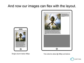
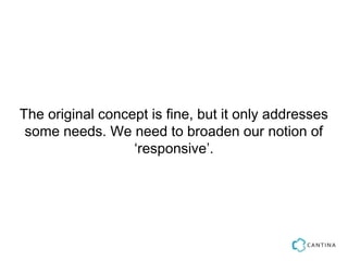
![Now, let’s make our images flex.
*:before { -webkit-box-sizing: border-box; -moz-box-sizing: border-box; box-sizing: b
ing: 1em 0 1em 1em }
{ content: ""; display: table; clear: both;}
-'] { float: left; padding-right: 1em;}
dth: 100% } // yep, that’s it
n and (min-device-width: 480px ) {
{ width: 66.66% }
{ width: 33.33% }](https://image.slidesharecdn.com/mobilemonday-responsivewebdesign-121206154141-phpapp01/85/Mobile-Monday-Presentation-Responsive-Web-Design-17-320.jpg)
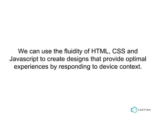
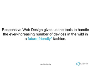
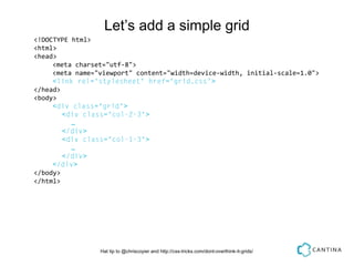
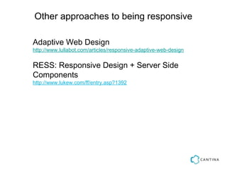
![“...the purpose behind “responsive design”—the concept
of what it strives to achieve—should be separated from
the specific techniques used to achieve it. As the
worldwide community embraces [Ethan’s] idea (and as
new methods of CSS layout become practical), the
techniques of responsive design will continue to improve
and, dare I say it, adapt.”
Jeffrey Zeldman,
Responsive Design. I don’t think that word means what you think it means.http://bit.ly/oP8eei](https://image.slidesharecdn.com/mobilemonday-responsivewebdesign-121206154141-phpapp01/85/Mobile-Monday-Presentation-Responsive-Web-Design-22-320.jpg)


The document discusses the fundamentals of responsive web design, emphasizing its importance in adapting to various devices using HTML, CSS, and JavaScript. It outlines key elements such as fluid grids, flexible images, and media queries while providing examples of basic boilerplate code. The document also touches on related concepts like mobile-first design and progressive enhancement to enhance user experience across different platforms.


![[wcatx] jQuery for WordPress Theme Designers](https://cdn.slidesharecdn.com/ss_thumbnails/jquery-for-designers-130519121413-phpapp01-thumbnail.jpg?width=640&height=640&fit=bounds)


