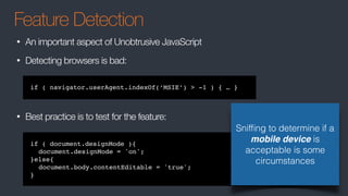
by Mike Wilcox, May 2016
Great
Responsive-ability
Web Design
With great power, comes…
CLUB AJAX
The key to RWD…
Use Bootstrap
THE END
What is RWD?
• Ethan Marcotte coined the term responsive web design (RWD)—and defined it
to mean fluid grid/ flexible images/ media queries—in a May 2010 article in A
List Apart
• WikiPedia:
• Crafting sites to provide an optimal viewing and interaction experience — easy reading and
navigation with a minimum of resizing, panning, and scrolling—across a wide range of
devices (from desktop computer monitors to mobile phones)
• Adapts the layout using fluid, proportion-based grids, flexible images, and CSS3 media queries
What is RWD?
• Usually refers to a page displaying on a mobile device
• More specially refers to a page displaying at any size
• Technically means any size and any device
Why RWD?
• The client wants the website to work on the iPhone.
• And the iPad
• And the iPad Pro
• And the iPad Mini
• And the Galaxy Note 3
• And the Nexus 7
• And myriad other Android devices
• And watches
• And TV…
The days of “what is the
minimum screen size we are
targeting?” are over.
Browser Stats
Don’t worry about IE8. The world is IE11+ now
Mobile Browser Stats
More of a concern is the various Android browsers, using 40% of the market
Media Queries
• Are just a small part of RWD!
• RWD is primarily about fluid designs, with resizable containers
• Media Queries come into play when the design needs to be restructured
More on Media Queries later…
Unobtrusive JavaScript
A consideration for web apps
• Separation of functionality (behavior) from the presentation
• Best practices such as scalability
• Progressive enhancement for user agents that may not support advanced
functionality
https://en.wikipedia.org/wiki/Unobtrusive_JavaScript
Progressive Enhancement
A consideration for web sites
• Basic content should be accessible to all web browsers
• Basic functionality should be accessible to all web browsers
• Sparse, semantic markup contains all content
• Enhanced layout is provided by externally linked CSS
• Enhanced behavior is provided by unobtrusive, externally linked JavaScript
• End-user web browser preferences are respected
https://en.wikipedia.org/wiki/Progressive_enhancement
Feature Detection
• An important aspect of Unobtrusive JavaScript
• Detecting browsers is bad:
• Best practice is to test for the feature:
if ( document.designMode ){
document.designMode = 'on';
}else{
document.body.contentEditable = 'true';
}
if ( navigator.userAgent.indexOf(‘MSIE’) > -1 ) { … }
Sniffing to determine if a
mobile device is
acceptable is some
circumstances
Server Considerations
• Display device-dependent content
• Render different HTML and CSS
• Minimize network requests
JS Frameworks
• Some more mobile friendly than others
• Jeff Atwood complains about poor Ember perf for Discourse
• Isomorphic/Universal Apps using server side rendering
• Virtual DOM can sometimes be effective
• But is by no means a silver bullet
• On demand loading
Mobile First
• Consider the design of mobile and desktop at the same time
• Don’t retrofit mobile
• In-betweens (tablets, small browser windows) can be done as you go
• UI elements (drop downs, modals) will need to work in both
• JavaScript architecture should be lean
• Start with minimal code, and on demand, add features
• Load a second style sheet only if desktop
• Test: browser resizing, emulator, then actual device
Meta Tags
• At the minimum, the following tags should be used in the HTML page:
• width=device-width
• to match the screen's width in device-independent pixels.
• initial-scale=1
• to establish a 1:1 relationship between CSS pixels and device-independent
<meta name="viewport" content="width=device-width, initial-scale=1">
<meta name="format-detection" content="telephone=no">
<meta name="apple-mobile-web-app-capable" content="yes">
Images
• Images
• Seriously, NO IMAGES!
• Images don’t scale
• Say goodbye to your image sprites
• Instead, use font icons or SVG
• SVG can be styled
Images
• Obviously websites use images… as in pictures… and web apps may use
them for a splash screen
• Use the <picture> element
http://www.html5rocks.com/en/tutorials/responsive/picture-element/
REM & EM
• px is a fixed width
• em is relative to its container size
• body{ font:10px} / body div{ font:0.5em} [5px] / body div div{ font:0.5em} [2.5px]
• rem is relative to root size
• body{ font:10px} / body div{ font:0.5em} [5px] / body div div{ font:0.5em} [5px]
• Use px for dimensions and borders
• Use a combination of em and rem for text, borders, and margins
• em works best for media queries
• Test all browsers - Safari is buggy
http://zellwk.com/blog/media-query-units/
block vs inline vs inline-block
• inline has no dimensions. It takes the size of its contained text
• width, height, margin has no affect
• padding works since it is part of the contained text
• inline-block allows for dimensions
• By default, is the size of contained text
• block allows for dimensions
• Creates a new line (don’t use <br>!!)
• Cannot be a child of a <p>
• By default, width is “auto”, sized to its container
• “auto” !== 100%
float vs inline-block
• inline-block
• supports vertical-align
• Suffers from white space issues
• float
• Designed to support magazine style layouts where text floats around the image
• clear-fix is unintuitive (tip: use overflow:auto)
• Causes unwanted bugs or unpredictable side effects
https://www.w3.org/wiki/Floats_and_clearing
Floats
flex-box
• The flexbox layout is direction-agnostic as opposed to the regular layouts: block
which is vertically-based and inline which is horizontally-based.
• Provides flexibility when it comes to orientation changing, resizing, stretching,
shrinking, etc.
• Not intuitive, and difficult to learn (but is worth the effort)
.container{
display: flex;
flex-flow: row wrap;
}
.item {
flex: 1 1 auto;
}
CSS Grid Layout (NA)
• The solution to layouts
• Works well with flex box
• The spec is still be worked on
.container{
grid-template-columns: 40px 50px auto 50px 40px;
grid-template-rows: 25% 100px auto;
}
https://css-tricks.com/snippets/css/complete-guide-grid/
Media Queries
Media Queries
• The first public working draft published in 2001
• Became a W3C Recommendation in 2012 after browsers added support
• Essentially true/false expressions
• Simply defined: DEVICE : EXPRESSION
• min-width:500px will apply to >=500px
• Typically, use min-width for mobile-first, max-width for desktop-first
@media screen and (min-width:500px) { background: red; }
@media screen and (max-width:500px) { background: blue; }
Media Queries
@media screen and (min-width:500px) { background: red; }
@media print and (max-width:500px) { background: transparent; }
<link rel="stylesheet" media="print" />
<link rel="stylesheet" media="screen" />
// roughly targets mobile:
<link rel="stylesheet" media="screen and (max-device-width: 799px)" />
Usage
• They can be used to target styles or stylesheets
Media Queries
And

@media (min-width: 600px) and (max-width: 800px) { body { background: red; } }
Or

@media (max-width: 600px), (min-width: 800px) { body { background: red; } }
Not

@media not all and (max-width: 600px) { body { background: red; } }
Operators
Media Queries
@media screen and (min-width:500px) { background: red; }
Devices
• braille
• embossed
• handheld
• print
• projection
• screen
• speech
• tty
• tv
You’ll pretty much only ever
use screen.
handheld isn’t what you think
it is. There is no device type
for mobile.
Media Queries
/* Smartphones (portrait and landscape) -- -- -- -- -- - */

@media only screen

and (min-device-width : 320px) 

and (max-device-width : 480px) { 

/* Styles */


} 


/* Smartphones (landscape) -- -- -- -- -- - */

@media only screen

and (min-width : 321px) { 

/* Styles */


} 


/* Smartphones (portrait) -- -- -- -- -- - */

@media only screen

and (max-width : 320px) { 

/* Styles */


} 


/* iPads (portrait and landscape) -- -- -- -- -- - */

@media only screen

and (min-device-width : 768px) 

and (max-device-width : 1024px) { 

/* Styles */


} 


Targeting Mobile
/* iPads (landscape) -- -- -- -- -- - */

@media only screen

and (min-device-width : 768px) 

and (max-device-width : 1024px) 

and (orientation : landscape) { 

/* Styles */


} 

/* iPads (portrait) -- -- -- -- -- - */

@media only screen

and (min-device-width : 768px) 

and (max-device-width : 1024px) 

and (orientation : portrait) { 

/* Styles */


}

/* Desktops and laptops -- -- -- -- -- - */

@media only screen

and (min-width : 1224px) { 

/* Styles */


} 


/* Large screens -- -- -- -- -- - */

@media only screen

and (min-width : 1824px) { 

/* Styles */


}
Don’t do this nonsense!!
Media Queries
Targeting Mobile
@media screen and (max-device-width: 773px) and (max-device-height: 435px) {
body { background: red; }
}
• The design should be responsive, not specific
• Don’t rely on min-resolution: 2dppx - this targets Macs with Retina Display
• Don’t rely on @media handheld, this is for older, flip-style (etc) phones
These dimensions target the
largest Android device
Media Queries
Targeting Mobile and Tablets, and desktop
// mobile
@media
screen and (max-device-width: 773px) and (max-device-height: 435px),
screen and (max-device-width: 435px) and (max-device-height: 773px),
screen and (max-width: 773px) {
body { background: red; }
}
//tablet
@media
screen and (max-device-width: 768px) and (max-device-height: 1024px),
screen and (max-device-width: 1024px) and (max-device-height: 768px),
screen and (max-width: 768px) {
body { background: red; }
}
These dimensions target the
largest devices and desktop
Media Queries
JavaScript
function onMediaChange(e){
var
mq = e.srcElement;
if(mq.matches){
node.innerHTML = 'Matches: ' + mq.media;
}else{
node.innerHTML = 'Matches no media queries';
}
}
var mq = window.matchMedia('(min-width: 600px)');
mq.addListener(onMediaChange);
• Much better than listening to window.onresize
• Use for conditionally launching desktop-only widgets or ads
DEMOS
CLUB AJAX

Great Responsive-ability Web Design

  • 1.
    by Mike Wilcox,May 2016 Great Responsive-ability Web Design With great power, comes… CLUB AJAX
  • 2.
    The key toRWD…
  • 3.
  • 4.
    What is RWD? •Ethan Marcotte coined the term responsive web design (RWD)—and defined it to mean fluid grid/ flexible images/ media queries—in a May 2010 article in A List Apart • WikiPedia: • Crafting sites to provide an optimal viewing and interaction experience — easy reading and navigation with a minimum of resizing, panning, and scrolling—across a wide range of devices (from desktop computer monitors to mobile phones) • Adapts the layout using fluid, proportion-based grids, flexible images, and CSS3 media queries
  • 5.
    What is RWD? •Usually refers to a page displaying on a mobile device • More specially refers to a page displaying at any size • Technically means any size and any device
  • 6.
    Why RWD? • Theclient wants the website to work on the iPhone. • And the iPad • And the iPad Pro • And the iPad Mini • And the Galaxy Note 3 • And the Nexus 7 • And myriad other Android devices • And watches • And TV… The days of “what is the minimum screen size we are targeting?” are over.
  • 7.
    Browser Stats Don’t worryabout IE8. The world is IE11+ now
  • 8.
    Mobile Browser Stats Moreof a concern is the various Android browsers, using 40% of the market
  • 9.
    Media Queries • Arejust a small part of RWD! • RWD is primarily about fluid designs, with resizable containers • Media Queries come into play when the design needs to be restructured More on Media Queries later…
  • 10.
    Unobtrusive JavaScript A considerationfor web apps • Separation of functionality (behavior) from the presentation • Best practices such as scalability • Progressive enhancement for user agents that may not support advanced functionality https://en.wikipedia.org/wiki/Unobtrusive_JavaScript
  • 11.
    Progressive Enhancement A considerationfor web sites • Basic content should be accessible to all web browsers • Basic functionality should be accessible to all web browsers • Sparse, semantic markup contains all content • Enhanced layout is provided by externally linked CSS • Enhanced behavior is provided by unobtrusive, externally linked JavaScript • End-user web browser preferences are respected https://en.wikipedia.org/wiki/Progressive_enhancement
  • 12.
    Feature Detection • Animportant aspect of Unobtrusive JavaScript • Detecting browsers is bad: • Best practice is to test for the feature: if ( document.designMode ){ document.designMode = 'on'; }else{ document.body.contentEditable = 'true'; } if ( navigator.userAgent.indexOf(‘MSIE’) > -1 ) { … } Sniffing to determine if a mobile device is acceptable is some circumstances
  • 13.
    Server Considerations • Displaydevice-dependent content • Render different HTML and CSS • Minimize network requests
  • 14.
    JS Frameworks • Somemore mobile friendly than others • Jeff Atwood complains about poor Ember perf for Discourse • Isomorphic/Universal Apps using server side rendering • Virtual DOM can sometimes be effective • But is by no means a silver bullet • On demand loading
  • 15.
    Mobile First • Considerthe design of mobile and desktop at the same time • Don’t retrofit mobile • In-betweens (tablets, small browser windows) can be done as you go • UI elements (drop downs, modals) will need to work in both • JavaScript architecture should be lean • Start with minimal code, and on demand, add features • Load a second style sheet only if desktop • Test: browser resizing, emulator, then actual device
  • 16.
    Meta Tags • Atthe minimum, the following tags should be used in the HTML page: • width=device-width • to match the screen's width in device-independent pixels. • initial-scale=1 • to establish a 1:1 relationship between CSS pixels and device-independent <meta name="viewport" content="width=device-width, initial-scale=1"> <meta name="format-detection" content="telephone=no"> <meta name="apple-mobile-web-app-capable" content="yes">
  • 17.
    Images • Images • Seriously,NO IMAGES! • Images don’t scale • Say goodbye to your image sprites • Instead, use font icons or SVG • SVG can be styled
  • 18.
    Images • Obviously websitesuse images… as in pictures… and web apps may use them for a splash screen • Use the <picture> element http://www.html5rocks.com/en/tutorials/responsive/picture-element/
  • 19.
    REM & EM •px is a fixed width • em is relative to its container size • body{ font:10px} / body div{ font:0.5em} [5px] / body div div{ font:0.5em} [2.5px] • rem is relative to root size • body{ font:10px} / body div{ font:0.5em} [5px] / body div div{ font:0.5em} [5px] • Use px for dimensions and borders • Use a combination of em and rem for text, borders, and margins • em works best for media queries • Test all browsers - Safari is buggy http://zellwk.com/blog/media-query-units/
  • 20.
    block vs inlinevs inline-block • inline has no dimensions. It takes the size of its contained text • width, height, margin has no affect • padding works since it is part of the contained text • inline-block allows for dimensions • By default, is the size of contained text • block allows for dimensions • Creates a new line (don’t use <br>!!) • Cannot be a child of a <p> • By default, width is “auto”, sized to its container • “auto” !== 100%
  • 21.
    float vs inline-block •inline-block • supports vertical-align • Suffers from white space issues • float • Designed to support magazine style layouts where text floats around the image • clear-fix is unintuitive (tip: use overflow:auto) • Causes unwanted bugs or unpredictable side effects https://www.w3.org/wiki/Floats_and_clearing Floats
  • 22.
    flex-box • The flexboxlayout is direction-agnostic as opposed to the regular layouts: block which is vertically-based and inline which is horizontally-based. • Provides flexibility when it comes to orientation changing, resizing, stretching, shrinking, etc. • Not intuitive, and difficult to learn (but is worth the effort) .container{ display: flex; flex-flow: row wrap; } .item { flex: 1 1 auto; }
  • 23.
    CSS Grid Layout(NA) • The solution to layouts • Works well with flex box • The spec is still be worked on .container{ grid-template-columns: 40px 50px auto 50px 40px; grid-template-rows: 25% 100px auto; } https://css-tricks.com/snippets/css/complete-guide-grid/
  • 24.
  • 25.
    Media Queries • Thefirst public working draft published in 2001 • Became a W3C Recommendation in 2012 after browsers added support • Essentially true/false expressions • Simply defined: DEVICE : EXPRESSION • min-width:500px will apply to >=500px • Typically, use min-width for mobile-first, max-width for desktop-first @media screen and (min-width:500px) { background: red; } @media screen and (max-width:500px) { background: blue; }
  • 26.
    Media Queries @media screenand (min-width:500px) { background: red; } @media print and (max-width:500px) { background: transparent; } <link rel="stylesheet" media="print" /> <link rel="stylesheet" media="screen" /> // roughly targets mobile: <link rel="stylesheet" media="screen and (max-device-width: 799px)" /> Usage • They can be used to target styles or stylesheets
  • 27.
    Media Queries And @media (min-width:600px) and (max-width: 800px) { body { background: red; } } Or @media (max-width: 600px), (min-width: 800px) { body { background: red; } } Not @media not all and (max-width: 600px) { body { background: red; } } Operators
  • 28.
    Media Queries @media screenand (min-width:500px) { background: red; } Devices • braille • embossed • handheld • print • projection • screen • speech • tty • tv You’ll pretty much only ever use screen. handheld isn’t what you think it is. There is no device type for mobile.
  • 29.
    Media Queries /* Smartphones(portrait and landscape) -- -- -- -- -- - */ @media only screen and (min-device-width : 320px) and (max-device-width : 480px) { /* Styles */ } /* Smartphones (landscape) -- -- -- -- -- - */ @media only screen and (min-width : 321px) { /* Styles */ } /* Smartphones (portrait) -- -- -- -- -- - */ @media only screen and (max-width : 320px) { /* Styles */ } /* iPads (portrait and landscape) -- -- -- -- -- - */ @media only screen and (min-device-width : 768px) and (max-device-width : 1024px) { /* Styles */ } Targeting Mobile /* iPads (landscape) -- -- -- -- -- - */ @media only screen and (min-device-width : 768px) and (max-device-width : 1024px) and (orientation : landscape) { /* Styles */ } /* iPads (portrait) -- -- -- -- -- - */ @media only screen and (min-device-width : 768px) and (max-device-width : 1024px) and (orientation : portrait) { /* Styles */ } /* Desktops and laptops -- -- -- -- -- - */ @media only screen and (min-width : 1224px) { /* Styles */ } /* Large screens -- -- -- -- -- - */ @media only screen and (min-width : 1824px) { /* Styles */ } Don’t do this nonsense!!
  • 30.
    Media Queries Targeting Mobile @mediascreen and (max-device-width: 773px) and (max-device-height: 435px) { body { background: red; } } • The design should be responsive, not specific • Don’t rely on min-resolution: 2dppx - this targets Macs with Retina Display • Don’t rely on @media handheld, this is for older, flip-style (etc) phones These dimensions target the largest Android device
  • 31.
    Media Queries Targeting Mobileand Tablets, and desktop // mobile @media screen and (max-device-width: 773px) and (max-device-height: 435px), screen and (max-device-width: 435px) and (max-device-height: 773px), screen and (max-width: 773px) { body { background: red; } } //tablet @media screen and (max-device-width: 768px) and (max-device-height: 1024px), screen and (max-device-width: 1024px) and (max-device-height: 768px), screen and (max-width: 768px) { body { background: red; } } These dimensions target the largest devices and desktop
  • 32.
    Media Queries JavaScript function onMediaChange(e){ var mq= e.srcElement; if(mq.matches){ node.innerHTML = 'Matches: ' + mq.media; }else{ node.innerHTML = 'Matches no media queries'; } } var mq = window.matchMedia('(min-width: 600px)'); mq.addListener(onMediaChange); • Much better than listening to window.onresize • Use for conditionally launching desktop-only widgets or ads
  • 33.
  • 34.