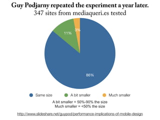
Downloaded 239 times
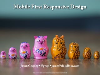


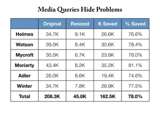
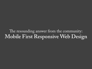


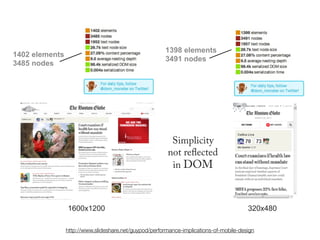


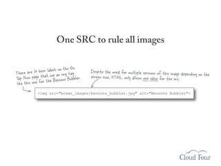
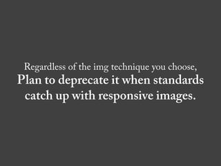
![Reorder media queries so cascade goes
from small to large screens
/* Wider viewports/higher resolutions (e.g. desktop) */
@media screen and (min-width:481px) {
[Desktop layout rules here] M ove the mobile media query block
} above the desktop media query.
By doing this, we’re making S re
su
the cascading effect of CSfiris
/* Mobile/lower-resolution devices */
@media screen and (max-width:480px) { st
consistent with our mobile oach.
[Mobile layout rules here] progressive enhancement appr
}
Keep basic styles outside of media queries.](https://image.slidesharecdn.com/mobilefirstresponsivedesign-121201072449-phpapp01/85/Mobile-First-Responsive-Design-58-320.jpg)
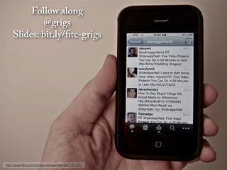
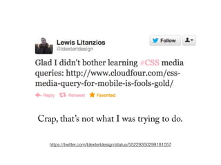
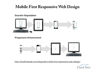
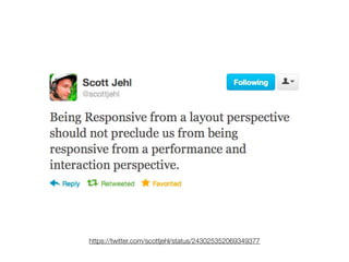
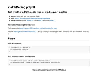
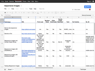
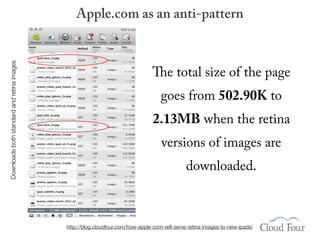
![IE conditional comments
<link rel="stylesheet" type="text/css" href="taps.css" />
<link rel="stylesheet" type="text/css" href="layout.css" media="all and
(min-width: 481px)">
<!--[if (lt IE 9)&(!IEMobile)]>
<link rel="stylesheet" type="text/css" href="layout.css" media="all" />
<![endif]-->
The conditional comment repeats the line above it
ensuring desktop IE sees our layout.css file.](https://image.slidesharecdn.com/mobilefirstresponsivedesign-121201072449-phpapp01/85/Mobile-First-Responsive-Design-61-320.jpg)
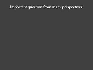
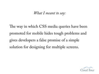
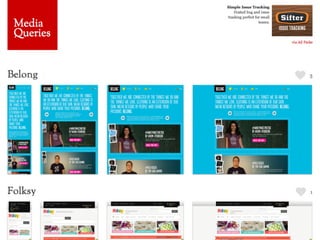
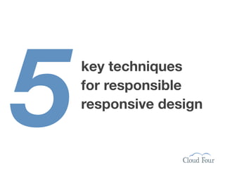
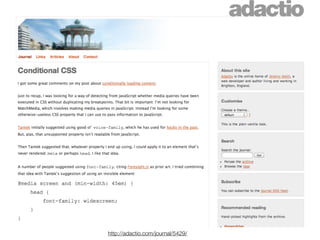
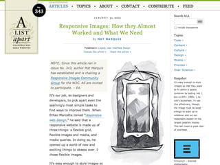
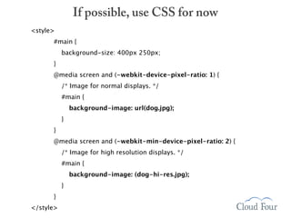
![IE conditional comments
<link rel="stylesheet" type="text/css" href="taps.css" />
<link rel="stylesheet" type="text/css" href="layout.css" media="all and
(min-width: 481px)">
<!--[if (lt IE 9)&(!IEMobile)]>
<link rel="stylesheet" type="text/css" href="layout.css" media="all" />
<![endif]-->
The conditional comment repeats the line above it
ensuring desktop IE sees our layout.css file.
or use Respond.js
(a media query polyfill for IE)](https://image.slidesharecdn.com/mobilefirstresponsivedesign-121201072449-phpapp01/85/Mobile-First-Responsive-Design-62-320.jpg)

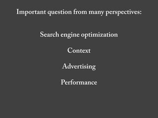
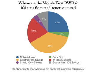
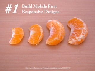
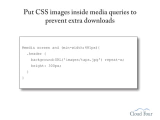
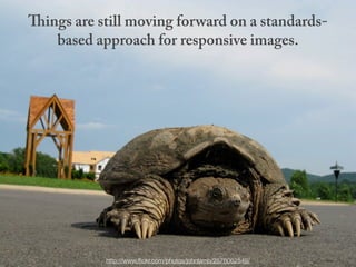
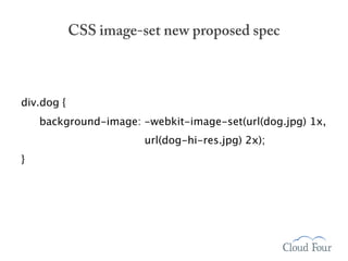
![Images with display:none are still downloaded
K making it
The taps.jpg file is 440.7 .
the largest file on the page
@media screen and (max-width:480px) {
[Other CSS rules are here]
.header {display:none;}
}](https://image.slidesharecdn.com/mobilefirstresponsivedesign-121201072449-phpapp01/85/Mobile-First-Responsive-Design-64-320.jpg)


The document summarizes key techniques for responsible responsive web design, including building mobile-first responsive designs, keeping CSS images in their place, conditionally loading JavaScript based on screen size and capabilities, delivering different sized images at different screen sizes, and handling high-density images carefully. It also discusses debates around whether a one-size-fits-all responsive approach can compete with a tailored experience and ensuring responsive designs are optimized for performance.


![Responsive Design & Beyond [Code & Creativity Workshop]](https://cdn.slidesharecdn.com/ss_thumbnails/codecreativityworkshop1-140506164731-phpapp01-thumbnail.jpg?width=640&height=640&fit=bounds)
![Adaptive Designs Across Devices [UXIM 2015]](https://cdn.slidesharecdn.com/ss_thumbnails/beyondresponsive-150413180811-conversion-gate01-thumbnail.jpg?width=640&height=640&fit=bounds)


