Download as PDF, PPTX


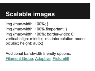
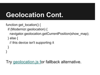
![HTML5 tags and ARIA roles
<HEAD> role="banner"
<NAV> role="navigation"
<SECTION> role="main" (new!)
<ARTICLE> role="complementary"
<ASIDE> role="search"
<FOOTER> role="contentinfo"
<HGROUP> use instead of a class
header[role="banner"]
Needs Shiv for IE < 9 {}](https://image.slidesharecdn.com/html5mobile-nittygritty-130310133949-phpapp01/85/Html-5-mobile-nitty-gritty-38-320.jpg)


This document provides an overview of HTML5 best practices for mobile design. It begins with introductions and outlines the session agenda. The presenter then discusses high-level principles like universal design and progressive enhancement. Specific techniques covered include viewport meta tags, media queries, scalable images, HTML5 tags, and touch-friendly guidelines. CSS topics include grids, backgrounds, gradients, and transitions. JavaScript behaviors like navigation, forms, and geolocation are also reviewed. Useful frameworks, polyfills, and testing tools are presented. The overall message is that mobile design requires an adaptive, user-centered approach through careful content structuring, responsive presentation, and unobtrusive behavior.