The document discusses responsive web design. It begins by defining responsive design as making websites work on all devices. It provides an example of a responsive site and discusses how the design adapts based on screen width. It emphasizes that discrimination based on device sucks. It then discusses why responsive design is important, noting things like smartphone sales surpassing PCs and easier maintenance.
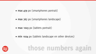
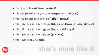
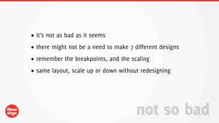
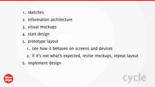
It outlines several breakpoints for different screen widths that should be designed for. It discusses using a workflow involving sketching, information architecture, mockups, prototyping, and implementation. Key technologies mentioned include HTML5, CSS3, and JavaScript. It ends by noting benefits of responsive design like better compatibility and support for more users.


