Downloaded 1,352 times

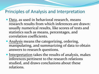
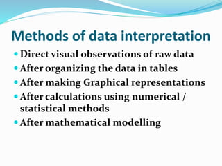


This document discusses principles and methods of research data interpretation. It describes how data is organized, analyzed, and interpreted to draw meaningful inferences. Specifically, it outlines various methods of data interpretation including direct observation, tables, graphs, numerical/statistical methods, and mathematical modeling. It emphasizes that interpretation establishes relationships within data and relates results to existing knowledge to further research. Proper interpretation requires avoiding biases and false generalizations.


![Writing researchproposal[1]](https://cdn.slidesharecdn.com/ss_thumbnails/writingresearchproposal1-110223141726-phpapp02-thumbnail.jpg?width=640&height=640&fit=bounds)