This document discusses how a media product uses, develops, and challenges conventions of real music magazines.
It summarizes how the front cover uses conventions like colors and puffs seen in rock magazines to attract its target audience. It challenges conventions by placing the band image overlapping the masthead.
The contents pages follow conventions like a column layout but develop them by adding page numbers to images and offering a free gift to subscribers.
Double page spreads generally show rock stars seriously but this challenges that by using a candid, smiling image of the band. It develops conventions by incorporating quotes into the title and using a column layout for the article text.
Pv day frankfurt june 2015 zittartz presentationpharmasol
Medical Devices and Pharmaceutical products have long been separate worlds with distinct regulations.
Advances in technology continue to create new opportunities by merging devices with drugs or biologics to provide previously impossible benefits to patients. As these combination products involve components that are normally regulated under different types of regulatory authorities, they raise several challenges to traditional pharmaceutical companies, not previously exposed to Device regulations.
Compared to drug regulations, device regulations are more diverse depending on the classification of the device. But the safety of Medical Devices has recently become the focus of regulatory activities in Europe following the scandal about industrial silicone breast implants in France, leading to changes in regulations that follow pharmacovigilance principles.
In this presentation Dr Marc Zittartz, Chief Quality Officer at pharmasol, provides an overview on drug-device combinations, the recent regulatory developments, and how this affects the traditional pharmacovigilance activities of pharmaceutical companies.
Before we start talking about marketing agencies here is one thing we need to understand is what is marketing. So, for that here are some points which defines marketing.
Instructions for Submissions thorugh G- Classroom.pptxJheel Barad
This presentation provides a briefing on how to upload submissions and documents in Google Classroom. It was prepared as part of an orientation for new Sainik School in-service teacher trainees. As a training officer, my goal is to ensure that you are comfortable and proficient with this essential tool for managing assignments and fostering student engagement.
This is a presentation by Dada Robert in a Your Skill Boost masterclass organised by the Excellence Foundation for South Sudan (EFSS) on Saturday, the 25th and Sunday, the 26th of May 2024.
He discussed the concept of quality improvement, emphasizing its applicability to various aspects of life, including personal, project, and program improvements. He defined quality as doing the right thing at the right time in the right way to achieve the best possible results and discussed the concept of the "gap" between what we know and what we do, and how this gap represents the areas we need to improve. He explained the scientific approach to quality improvement, which involves systematic performance analysis, testing and learning, and implementing change ideas. He also highlighted the importance of client focus and a team approach to quality improvement.
Read| The latest issue of The Challenger is here! We are thrilled to announce that our school paper has qualified for the NATIONAL SCHOOLS PRESS CONFERENCE (NSPC) 2024. Thank you for your unwavering support and trust. Dive into the stories that made us stand out!
The Roman Empire A Historical Colossus.pdfkaushalkr1407
The Roman Empire, a vast and enduring power, stands as one of history's most remarkable civilizations, leaving an indelible imprint on the world. It emerged from the Roman Republic, transitioning into an imperial powerhouse under the leadership of Augustus Caesar in 27 BCE. This transformation marked the beginning of an era defined by unprecedented territorial expansion, architectural marvels, and profound cultural influence.
The empire's roots lie in the city of Rome, founded, according to legend, by Romulus in 753 BCE. Over centuries, Rome evolved from a small settlement to a formidable republic, characterized by a complex political system with elected officials and checks on power. However, internal strife, class conflicts, and military ambitions paved the way for the end of the Republic. Julius Caesar’s dictatorship and subsequent assassination in 44 BCE created a power vacuum, leading to a civil war. Octavian, later Augustus, emerged victorious, heralding the Roman Empire’s birth.
Under Augustus, the empire experienced the Pax Romana, a 200-year period of relative peace and stability. Augustus reformed the military, established efficient administrative systems, and initiated grand construction projects. The empire's borders expanded, encompassing territories from Britain to Egypt and from Spain to the Euphrates. Roman legions, renowned for their discipline and engineering prowess, secured and maintained these vast territories, building roads, fortifications, and cities that facilitated control and integration.
The Roman Empire’s society was hierarchical, with a rigid class system. At the top were the patricians, wealthy elites who held significant political power. Below them were the plebeians, free citizens with limited political influence, and the vast numbers of slaves who formed the backbone of the economy. The family unit was central, governed by the paterfamilias, the male head who held absolute authority.
Culturally, the Romans were eclectic, absorbing and adapting elements from the civilizations they encountered, particularly the Greeks. Roman art, literature, and philosophy reflected this synthesis, creating a rich cultural tapestry. Latin, the Roman language, became the lingua franca of the Western world, influencing numerous modern languages.
Roman architecture and engineering achievements were monumental. They perfected the arch, vault, and dome, constructing enduring structures like the Colosseum, Pantheon, and aqueducts. These engineering marvels not only showcased Roman ingenuity but also served practical purposes, from public entertainment to water supply.
How to Create Map Views in the Odoo 17 ERPCeline George
The map views are useful for providing a geographical representation of data. They allow users to visualize and analyze the data in a more intuitive manner.
The French Revolution, which began in 1789, was a period of radical social and political upheaval in France. It marked the decline of absolute monarchies, the rise of secular and democratic republics, and the eventual rise of Napoleon Bonaparte. This revolutionary period is crucial in understanding the transition from feudalism to modernity in Europe.
For more information, visit-www.vavaclasses.com
Synthetic Fiber Construction in lab .pptxPavel ( NSTU)
Synthetic fiber production is a fascinating and complex field that blends chemistry, engineering, and environmental science. By understanding these aspects, students can gain a comprehensive view of synthetic fiber production, its impact on society and the environment, and the potential for future innovations. Synthetic fibers play a crucial role in modern society, impacting various aspects of daily life, industry, and the environment. ynthetic fibers are integral to modern life, offering a range of benefits from cost-effectiveness and versatility to innovative applications and performance characteristics. While they pose environmental challenges, ongoing research and development aim to create more sustainable and eco-friendly alternatives. Understanding the importance of synthetic fibers helps in appreciating their role in the economy, industry, and daily life, while also emphasizing the need for sustainable practices and innovation.
Palestine last event orientationfvgnh .pptxRaedMohamed3
An EFL lesson about the current events in Palestine. It is intended to be for intermediate students who wish to increase their listening skills through a short lesson in power point.
We all have good and bad thoughts from time to time and situation to situation. We are bombarded daily with spiraling thoughts(both negative and positive) creating all-consuming feel , making us difficult to manage with associated suffering. Good thoughts are like our Mob Signal (Positive thought) amidst noise(negative thought) in the atmosphere. Negative thoughts like noise outweigh positive thoughts. These thoughts often create unwanted confusion, trouble, stress and frustration in our mind as well as chaos in our physical world. Negative thoughts are also known as “distorted thinking”.
1. In what ways does your media product
use, develop or challenge forms and
conventions of real media products?
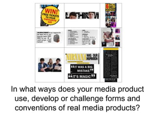
2. FRONT COVER, Image 1:
I have used a puff to advertise the possibility to win free
merchandise, a convention of music magazines. However,
fans within the rock genre are typically the biggest music
merch’ purchasers as they are often known as ‘real music
fans’, the music being a big part of their life, they also
chose to support the band, knowing it helps to finance
them. This opportunity to win FREE stuff appeals to my
target audience as they are at the age (15-25) where they
will most likely be students who do not have a lot of
money for luxuries.
Here I have used yellow, red and black as these are
conventional colours used in rock magazines that would
appeal to my target audience of rebellious young adults,
mainly male, as explored in my Moodboard and target
audience profile.
The style of the puff makes it seem like a sticker that
jumps out at the audience telling them to look at it. This
could act as a key selling point, gaining their interest and
convincing my audience to pick up the magazine and
purchase it.
3. FRONT COVER, Image 2:
Here is have met music magazine conventions, but placing
the main image of the band members slightly overlapping
the masthead, as these are easily recognised artists and it
is important they stand out to the audience. This is
essential as the band as the main image on the front cover
will be the first feature of the cover that grabs the reader’s
attentions, making it a key selling point.
I have used a simple, bold font, conventional of magazines
aimed at men. I have also used a ‘beaten’ looking font,
conventional of rock magazines, giving a rebellious image.
4. FRONT COVER, Image 3:
Much like the ‘Win’ puff, advertising posters inside is much
to my target audience’s interest. ‘Posters’, acts as a buzz
word for my audience, as they typically have
‘teenage/student bedrooms’ consisting of mostly posters.
This is guaranteeing them free merchandise, making it
another key selling point of the front cover.
5. CONTENTS PAGE, Image 1:
In a magazine there is always a subscription notice. Whereas here I have
developed this convention and added a free gift, acting as a luring device,
convincing readers to subscribe to my magazine. I have specifically chosen the
free gift to meet the audience’s interest. I chose a Vans backpack, as I
mentioned in my Moodboard, I looked at brands my target audience are
interested in and found that Vans was a major interest within this genre of
music. Appealing not only to their music interests but with their fashion and
lifestyle interests also.
By using the visual imagery of the backpack itself, grabs the reader’s attention
and encourages them to read on.
6. CONTENTS PAGE, Image 2:
A convention of contents pages is the column layout, I have used this
convention as when on the contents page as the reader needs to be able to
navigate through the magazine and find what they want to read. Often, the
contents page is still acting as a selling point before a customer purchases it, so
it is essential that a reader can clearly see everything in the issue. This is done
by using a clear column layout , telling the reader of every feature with the
corresponding page number so they can go straight to it.
I have used headers and numbers here to make the experience even easier for
the readers. I have used a dark purple for the page numbers and black for the
text, relating to the decisions made during the creation of my Moodboard.
7. CONTENTS PAGE, Image 3:
It is conventional to use images to illustrate the features of
the magazine in the contents page as readers do not want
to be bombarded with a lot of text as soon as they open
the magazine and images typically persuade the audience
to read on. I have developed this convention by also
adding page numbers to each image so that if a readers
was interested in a certain picture they could immediately
find the full article on this by following to the page
number.
The largest image on the contents page relates to the main
image on the front cover, as this is usually what has gained
the readers interest, to keep that interest I need to keep
stimulating it, with this image. The size of it compared to
the secondary images tells the reader of its importance,
that it’s the main feature of the magazine.
The smaller images relate to the secondary features on the
front cover, e.g. the “WIN FREE TICKETS” puff on the front
cover relating to the secondary image of tickets.
8. DOUBLE PAGE SPREAD, Image 1:
My main image of my double page article both meets and challenges rock
magazine conventions.
It is often conventional with rock magazines to have images of rock stars
looking serious and/or rebellious; however my main image is one of the band
smiling and laughing together, seeming almost candid, as this is the side of
them their fans want to see, their real and honest side, so they can relate to
them. This is less conventional representation with ‘heavier’ bands; however
my magazine contains bands ranging from pop-punk to heavy metal, much
like Kerrang! and this is often conventional with pop-punk to alternative rock
bands, which this band fits.
9. DOUBLE PAGE SPREAD, Image 2:
It is conventional to use quotations from the article to
attract the audience. It gives them information about what
the article is about, so I made sure to use quirky
quotations that make the reader question the content of
the article, e.g. “It was a big mistake”, the audience thinks
‘What was a big mistake?’ encouraging them to stop and
read the article. The quotes are informal, appealing to my
young target audience. I made the quotations a bigger and
bolder font to stand out from the main body of text.
I also developed this convention by creating the title of the
article using a quote from the article itself, the quote
mentioned a very popular band from the 80’s/90’s;
Nirvana, I have used the Nirvana colours and font here
(yellow) persuading a wider audience to read my article
through similar interests. Even if they don’t know the band
the article is on, some may feel inclined to read it as they
recognise the band Nirvana.
10. DOUBLE PAGE SPREAD, Image 3:
As with the contents page it is conventional to use a
column layout for articles, as it helps the separate the text
making it seem less lengthy to the reader, as my young
target audience (15-25) often are not willing to read a long
article. By splitting it up using column and quotes the
audience is more likely to read my article.
I have also added a small piece of text at the bottom of the
main body, briefly telling the reader what the band is up to
e.g. the band in question is on tour.