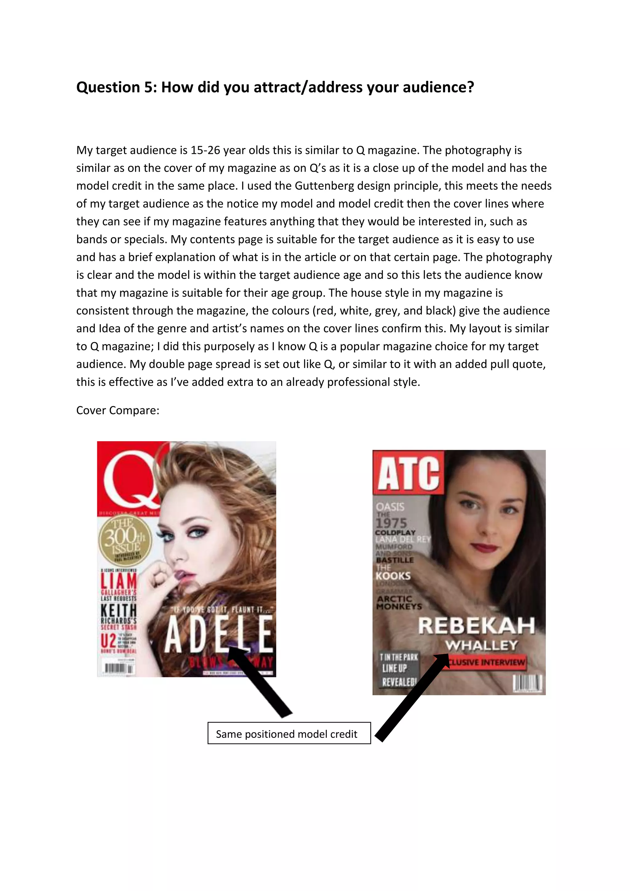
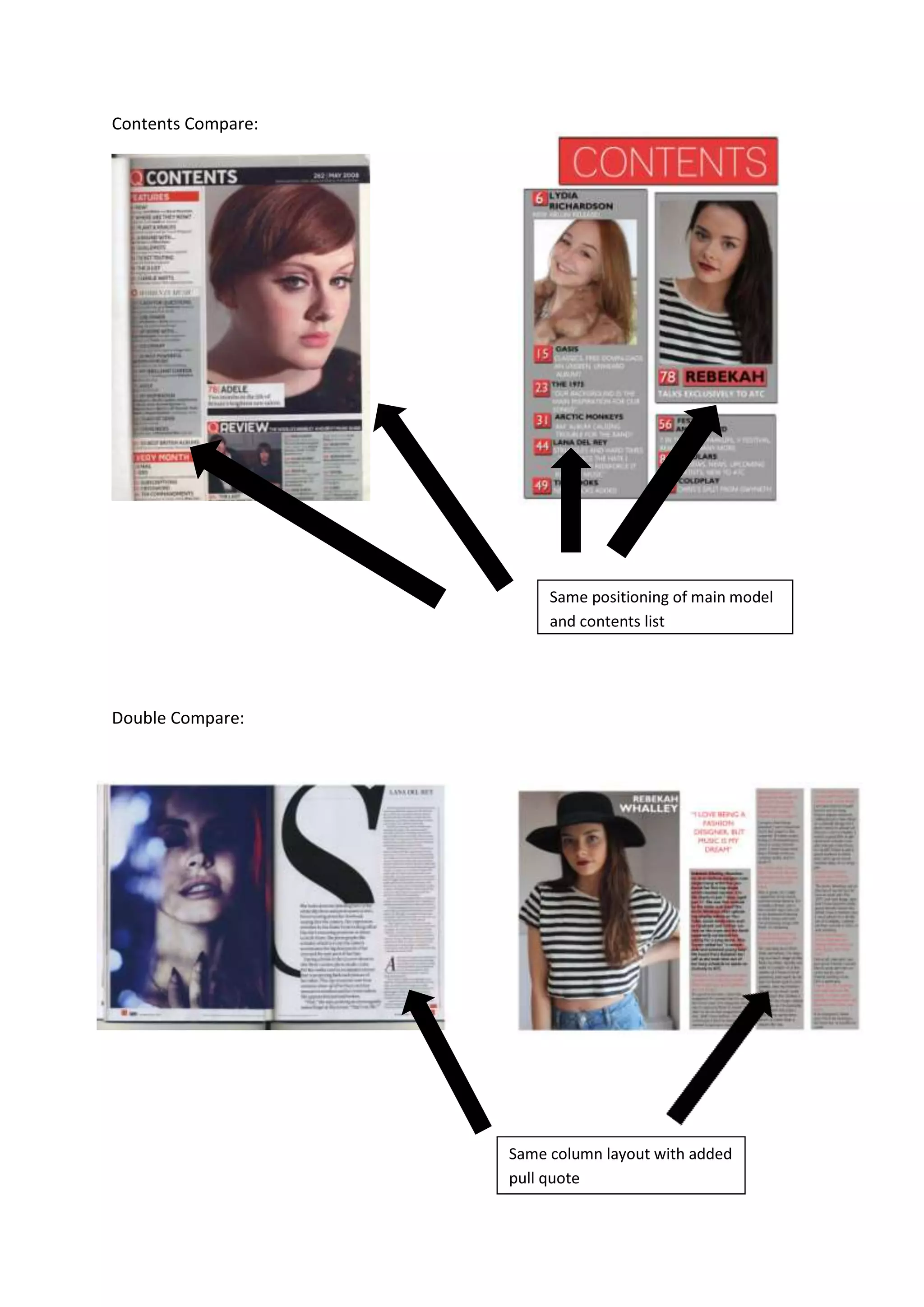
Question 5: How did you attract/address your audience?
My target audience is 15-26 year olds this is similar to Q magazine. The photography is
similar as on the cover of my magazine as on Q’s as it is a close up of the model and has the
model credit in the same place. I used the Guttenberg design principle, this meets the needs
of my target audience as the notice my model and model credit then the cover lines where
they can see if my magazine features anything that they would be interested in, such as
bands or specials. My contents page is suitable for the target audience as it is easy to use
and has a brief explanation of what is in the article or on that certain page. The photography
is clear and the model is within the target audience age and so this lets the audience know
that my magazine is suitable for their age group. The house style in my magazine is
consistent through the magazine, the colours (red, white, grey, and black) give the audience
and Idea of the genre and artist’s names on the cover lines confirm this. My layout is similar
to Q magazine; I did this purposely as I know Q is a popular magazine choice for my target
audience. My double page spread is set out like Q, or similar to it with an added pull quote,
this is effective as I’ve added extra to an already professional style.
Cover Compare:
Same positioned model credit
Contents Compare:
Double Compare:
Same positioning of main model
and contents list
Same column layout with added
pull quote
Question 5

Question 5

  • 1.
    Question 5: Howdid you attract/address your audience? My target audience is 15-26 year olds this is similar to Q magazine. The photography is similar as on the cover of my magazine as on Q’s as it is a close up of the model and has the model credit in the same place. I used the Guttenberg design principle, this meets the needs of my target audience as the notice my model and model credit then the cover lines where they can see if my magazine features anything that they would be interested in, such as bands or specials. My contents page is suitable for the target audience as it is easy to use and has a brief explanation of what is in the article or on that certain page. The photography is clear and the model is within the target audience age and so this lets the audience know that my magazine is suitable for their age group. The house style in my magazine is consistent through the magazine, the colours (red, white, grey, and black) give the audience and Idea of the genre and artist’s names on the cover lines confirm this. My layout is similar to Q magazine; I did this purposely as I know Q is a popular magazine choice for my target audience. My double page spread is set out like Q, or similar to it with an added pull quote, this is effective as I’ve added extra to an already professional style. Cover Compare: Same positioned model credit
  • 2.
    Contents Compare: Double Compare: Samepositioning of main model and contents list Same column layout with added pull quote