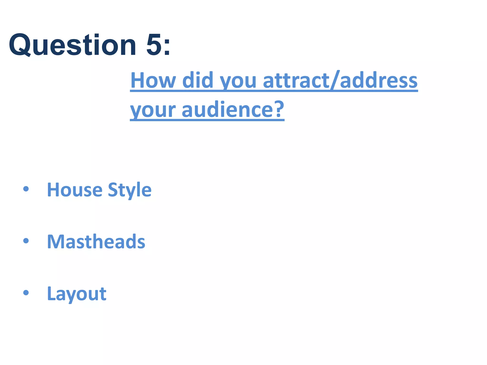
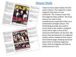
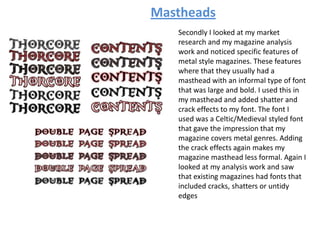
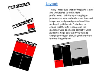
Question 5:
How did you attract/address
your audience?
• House Style
• Mastheads
• Layout
I kept my house style simple and only
used 3 colours. This makes for a clean
magazine look that isn’t too
cartoonish. The 3 colours mean that
the magazine looks uniform. Too many
colours can make it look
unprofessional, especially if they use a
combination of bright colours. The
Guttenberg principle was used to
ensure that as the reader’s viewpoint
moves left to right so that all the
necessary information can be seen. My
house style was based on my magazine
analysis where I looked at front covers
and contents pages. Keeping my house
style similar to existing magazines
means that my magazine will look as
professional as it can.
House Style
Mastheads
Secondly I looked at my market
research and my magazine analysis
work and noticed specific features of
metal style magazines. These features
where that they usually had a
masthead with an informal type of font
that was large and bold. I used this in
my masthead and added shatter and
crack effects to my font. The font I
used was a Celtic/Medieval styled font
that gave the impression that my
magazine covers metal genres. Adding
the crack effects again makes my
magazine masthead less formal. Again I
looked at my analysis work and saw
that existing magazines had fonts that
included cracks, shatters or untidy
edges
Layout
Thirdly I made sure that my magazine is tidy
and uncluttered so that it looks
professional. I did this by making layout
plans so that my mastheads, cover lines and
images were all placed properly and lined
up. I used guidelines in Photoshop to
ensure that the different areas of the
magazine were positioned correctly. Using
guidelines helps because if you want to
change your layout plan, all you have to do
is move the guidelines

Question 5

  • 1.
    Question 5: How didyou attract/address your audience? • House Style • Mastheads • Layout
  • 2.
    I kept myhouse style simple and only used 3 colours. This makes for a clean magazine look that isn’t too cartoonish. The 3 colours mean that the magazine looks uniform. Too many colours can make it look unprofessional, especially if they use a combination of bright colours. The Guttenberg principle was used to ensure that as the reader’s viewpoint moves left to right so that all the necessary information can be seen. My house style was based on my magazine analysis where I looked at front covers and contents pages. Keeping my house style similar to existing magazines means that my magazine will look as professional as it can. House Style
  • 3.
    Mastheads Secondly I lookedat my market research and my magazine analysis work and noticed specific features of metal style magazines. These features where that they usually had a masthead with an informal type of font that was large and bold. I used this in my masthead and added shatter and crack effects to my font. The font I used was a Celtic/Medieval styled font that gave the impression that my magazine covers metal genres. Adding the crack effects again makes my magazine masthead less formal. Again I looked at my analysis work and saw that existing magazines had fonts that included cracks, shatters or untidy edges
  • 4.
    Layout Thirdly I madesure that my magazine is tidy and uncluttered so that it looks professional. I did this by making layout plans so that my mastheads, cover lines and images were all placed properly and lined up. I used guidelines in Photoshop to ensure that the different areas of the magazine were positioned correctly. Using guidelines helps because if you want to change your layout plan, all you have to do is move the guidelines