1. Q5. How did you attract/address your audience?
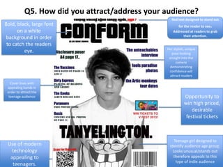
Cover lines with
appealing bands in
order to attract the
teenage audience Opportunity to
win high priced,
desirable
festival tickets
Bold, black, large font
on a white
background in order
to catch the readers
eye.
Red text designed to stand out
for the reader to see.
Addressed at readers to grab
their attention.
Use of modern
technology
appealing to
teenagers.
Teenage girl designed to
identify audience age group.
Looks unusual/stands out
therefore appeals to this
type of indie audience
Her stylish, unique
pose looking
straight into the
camera
demonstrating
confidence will
attract readers
2. Sepia effect on the
picture to attract
the indie audience
as this will be
appealing to them
Website email
address
appealing to
young audiences.
Black and white
to show diversity
within the
magazine.
Eye catching colors
such as red and
black. This is more
appealing as it
makes the general
presentation look
attractive.
Page numbers
make it easy to
navigate the
magazine
Headings making it
simple for the reader
to choose what to
read. Young audiences
will find something
simple to read more
appealing as its more
relaxing
3. Black and white
gives the image a
vintage look
appealing to the
audience. It gives
a retro effect
which is
appealing to the
audience as it
ties in with their
fashion sence.
Young girl featured
in the picture, could
be inspiring to the
audience as she’s
seen as successful,
therefore could be
an inspiration
Simplistic yet sophisticated
layout, not overwhelming the
reader.
Different font colors appear
eye catching to the audience
Bold font
showing
the reader
who the
article is
about