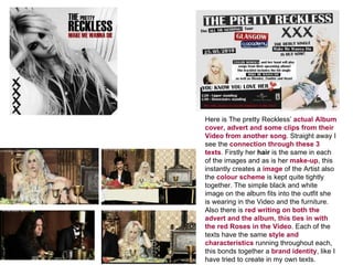
The document discusses how the author effectively connected their main product (a digital pack) to ancillary texts (an advertisement and music video) through consistent visual elements.
The author maintained similarities in hair, makeup, color scheme, and positioning of the artist across the three texts to create a cohesive brand identity. Font, clothing, and motifs like roses were also kept consistent.
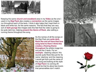
Locations and dark, moody aesthetics were replicated between the digital pack, advertisement, and music video to further tie the texts together and represent the intended rock genre.