Yaroslav Rozhankivskyy: Три складові і три передумови максимальної продуктивн...
Question 2
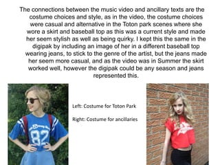
1. The connections between the music video and ancillary texts are the
costume choices and style, as in the video, the costume choices
were casual and alternative in the Toton park scenes where she
wore a skirt and baseball top as this was a current style and made
her seem stylish as well as being quirky. I kept this the same in the
digipak by including an image of her in a different baseball top
wearing jeans, to stick to the genre of the artist, but the jeans made
her seem more casual, and as the video was in Summer the skirt
worked well, however the digipak could be any season and jeans
represented this.
Left: Costume for Toton Park
Right: Costume for ancillaries
2. I used the similar costume to the singing scenes of the music video on
my ancillaries, however contrasted the colours by having her wear a
white shirt instead of the black one she wore in the video. I did this
as it represents an innocent side to the artist, and for the three
images blended together, it focuses the attention to her face and
emotion, instead of costume. I chose a shirt as it is a sophisticated
garment, and makes the artist seem presentable, whilst being
fashionable.
3. The styling of her also continues throughout the media texts I’ve
created, so that the audience are able to recognise her as a unique
individual, and gives her star image which supports Dyer’s theory as
she is creative with her image.
Although the make-up and
hair changed slightly, I
kept the black eye liner
flicks and red lipstick in
each style, and did her
hair wavy in all styles.
4. The locations of the music video are also similar to the backgrounds
that I chose for the digipak, as I took my own photographs when
researching possible locations, and used the ones which
represented the album best.
Similar locations in the background
of the digipak, and the print screen
from the music video.
5. The digipak and magazine advert link together well as I used the same
photography which I edited on Photoshop, by blending the images
together and fading them so they looked like one image. I used this
on the front of the digipak and as the magazine advert imagery as I
felt this would work as synergy for the audience to remember the
image from the advertisement, making it easier to locate the album
for purchasing.
6. I also kept the colour scheme the same in the advert and digipak as
this made the ancillary texts link together and the audience would be
able to recognize the artist’s media texts more easily. I didn’t keep
the fonts the same on the media texts, and I feel this could have
been changed to make the link between ancillary texts stronger;
however I wanted a more subtle title on the digipak, and for it to
stand out on the magazine to attract the consumer.
7. The shot I used on the ‘Thank You’ quote page of my digipak, where my
model is using a cheeky facial expression was inspired by a similar
shot we used in the music video where she is shown licking her
teeth. I wanted to continue this type of expression in the digipak as it
represents the artist’s personality as mischievous, and shows the
less serious side of the album. It could also be seen as
seductive, supporting Laura Mulvey’s theory of the ‘male gaze’ as
she is appealing to them in particular.
8. Overall I think that the ancillary texts work well together as they are
very similar with colour schemes and imagery, and I think that the
artist is represented well throughout all of the media texts I’ve
created. The most effective part of them is the clear photography as
the lighting is bright yet still looks natural and demonstrates the
model’s make-up and costume well, especially through a mid-shot
so that the costume is visible.