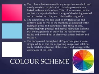
1) The magazine uses bold pinks and blues in the design to appeal to its target audience of teenage girls. Pink represents love and crushes, while blue promotes relaxation.
2) Images of pop artists, fashion, and the target audience themselves are used throughout to make the magazine visually appealing and to help readers relate to the content.
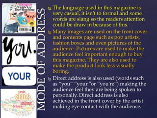
3) Casual language and direct addresses to "you" and "your" are employed to speak to readers personally and draw them into the magazine.