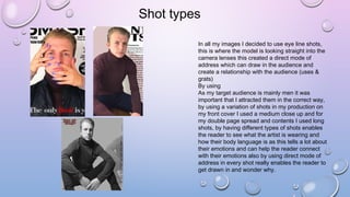
The document discusses how the media product represents social groups. It specifically targets white British teenagers and young adults aged 17-25. Images in the magazine feature white British male models around the same age to allow the target audience to connect with and relate to the artists. The magazine also represents middle-class audiences. Photos are used to engage the male audience and create a sense of identification and relationship with the magazine. Shot types, layout, and ideology are designed to attract the target demographic and build fan loyalty.
2. • In my magazine the social group that I was
representing are white British teenagers/young
adults this is very similar to my target audience
age range (17-25) I done this on purpose as I
wanted them to be able to connect with the artist
in the magazine and what was being said.
• Although I am not trying to rule out a heterosexual
audience by using a white British made is
representing that it is cool as the model is acting
as a role model by doing this will attract more of a
mass audience.
• I also choose middle class representation, I have only
used a male figure in my production and I used
one picture of a female in the bottom right hand
corner of the double page spread this is
representing an album cover and letting the
readers know that they will find out more if they
turn over the page. Although the magazine only
has male images it is aimed to attract both
genders., the male used in my magazine is also
within the target audience age range I done this so
that the audience could connect with the artist
personally and it will attract my target audience as
it is a popular genre.
3. Front cover
On my front cover I chose to engage the male audience by using a male model for
the main image, by doing this will enable them to understand and connect with the
magazine personally this creates a relationship with the reader and the magazine (
uses & grats) in keeping with this theme the models facial expression is very plain
and doesn't show any particular emotion this makes the image more interesting
this is a current occurrence in the magazines similar to mine.
The mise –en-scene is another factor that represents my target audience by the
colours contrasting the background makes the page pop but due to my magazine
being aimed at young adults it wouldn’t be appealing to them if the page was
covered in different vibrant colours.
The clothing on the male artist are very fashionable and satisficed the colours are
dark which is in contrast to the white background these clothes are not what you
would expect teenagers to wear however this is showing a good role model.
Finally, during the research I found that when woman were on the front of a
magazine they were sexualized (Mulverys male gaze) for example rolling stone. I
have however, not chosen a woman on the front of my magazine.
This billboard magazine front
cover, is similar to mine in the
way that the image is covering
most of the page and that there is
very little expression and the
image is inform of the mast head.
4. Shot types
In all my images I decided to use eye line shots,
this is where the model is looking straight into the
camera lenses this created a direct mode of
address which can draw in the audience and
create a relationship with the audience (uses &
grats)
By using
As my target audience is mainly men it was
important that I attracted them in the correct way,
by using a variation of shots in my production on
my front cover I used a medium close up and for
my double page spread and contents I used long
shots, by having different types of shots enables
the reader to see what the artist is wearing and
how their body language is as this tells a lot about
their emotions and can help the reader connect
with their emotions also by using direct mode of
address in every shot really enables the reader to
get drawn in and wonder why.
5. Layout
In my production the layout of my contents page is very similar to vibe magazine, I used one
image that was the main factor on the page and the text was shaped around it I feel that this makes
the page different from a typical conventional contents page and draws the reader in although there
is not a lot of images there is still limited of writing which still allows the reader to get the key
information but not get bored of reading. However if my age ranges were lower I would have used
more images and less writing as this would be more appealing to them. By making my contents
page like this may have led my contents page to feel too sophisticated and neat but this only further
reinforces my target audience as they would be attracted to this layout.
The double page spread layout is very unusual as I used two of the same image but one is very
faded out so that the writing can go over its is not sticking to codes and conventions as this is not
normally seen however, I feel that this also adds a mysterious feel to the magazine and draws in
the reader ( uses & grats)
In the double page spread I used columns for the text layout as this is very convectional and makes
it clear and easy for the audience to read and therefor for fill any needs adequately ( whether
cognitive or integrative) I wanted to make the artist name bold so that it attracts fans and entices
the audience.
6. Ideology
For my music magazine I use the
reception theory to draw in my target
audience by doing this allowed me to
create a relationship between the
audience and magazine through the
comparison and similarities included.
Not only should this entice the fans to
buy the magazine and also created an
inspiration for them resulting in the
potentially for a loyal fan base if this is a
frequent occurrence. I chose to use a
similar ages model to my target age
range this is so that the artist played a
particular big role in being a role model
and how my target audience perceive the
magazine and therefor, if they can relate
or not.
7. Ideology
For my music magazine I use the
reception theory to draw in my target
audience by doing this allowed me to
create a relationship between the
audience and magazine through the
comparison and similarities included.
Not only should this entice the fans to
buy the magazine and also created an
inspiration for them resulting in the
potentially for a loyal fan base if this is a
frequent occurrence. I chose to use a
similar ages model to my target age
range this is so that the artist played a
particular big role in being a role model
and how my target audience perceive the
magazine and therefor, if they can relate
or not.