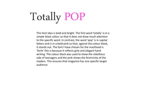
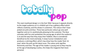
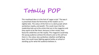
The document discusses different masthead designs for a magazine called "Totally POP". It analyzes the font choices, colors, and symbolism used in three masthead ideas. The first uses a simple black font with a bold pink font to attract the target feminine audience. The second uses childish glittery font in pink and blue, colors that appeal to the young readers and create a calming effect. The third uses a slightly italic feminine script font in dark purple, symbolizing the royalty and wealth the readers aspire to, and rebellion, attracting the audience to help achieve their dreams.