2. Ways in which my media product use, develop
or challenge forms and conventions of REAL
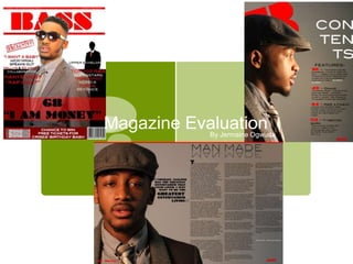
MEDIA PRODUCTS My media product product is a music base hip hop/ R&B magazine,
my product develops the codes and conventions of real media
products of the same category rather than challenge it because it
follows the codes and conventions of real media products, and I
have developed my flat plan in order to create a a professional hip
hop/ R&B magazine which would appeal to the target audience of
teenagers and adults, appealing more to the male sex. I have
demonstrated my use of knowledge by using the codes and
conventions, used in real music magazine and have altered my
magazine so it fits within the same category. I chose the name “
BASS “ as I believe it resembles the hip-hop genre, as hip hop
music/ R&B is usually loud, rhythmic and noisy. Also the word bass
is associated with the loud single beat in music and music lovers
seek for headphones, speakers or earphones with the clearest bass.
The audience would assume this magazine would be prestigious by
just the name and its association. Another reason I used “BASS”; as
the name for my music magazine was, that is resembles the typical
16-24 year old age group is about, turning from a teenager into a
young adult and in sense , you are turning up a level and are open to
a whole new widespread world in the music industry, moreover the
aspirers which my magazine is targeted at are usually “wanna –
be’s” , which follow the trend in terms of what is “cool “ and “in",
and by amplifying your life you are making it more exciting and
adventurous. I have also used the left – third to attract aspirers to
buy my magazine, as I have included top list celebrities which are
usually popular among the typical 16-24 age group who are into the
hip- hop/R&B genre , also by adding the fact that its “exclusive” the
reader will be the first to know about there favorite celebrities and
therefore alter their lifestyles and idolize them, e.g. if a celebrity has
certain diet secret, young aspirers will change there diets to become
like that celebrity. As I have mentioned before the left hand third is
the left side of the magazine which sticks out for the magazine as
they are stacked vertically and my top-list celebrity exclusive
interviews will stand out amongst the rest and will, hopefully
persuade people to buy my magazine.
3. How does your media product represent
particular SOCIAL GROUPS
Use of model who is clearly is in
the age range of the target
audience so I assumed this would
appeal to the target audience as
they would feel comfortable to a
similar character. Also I believe the
model looks like many of hip hop &
RnB artists like the likes of Usher,
Jeremih, Trey songz etc.
From my research which I found
out that most of my target age
audience favorite genre was either
hip hop or RnB. Also I found out
that all of them mainly read only
this type of magazine such as
VIBE and CHASER. As well as that
all of my target audience knew
major hip hop artists such as Trey
Songz which I have included in my
magazines.
I think my music magazine is
easily recognisable and
potentially appealing to someone
who's is specifically into Hip Hop
music and RnB. I feel my
magazine would be popular in
this social group as Hip Hop is a
very recognizable genre as it is
publicised in the media through
celebrities and big music artists
such as Chris Brown
Background – My background is plain with two
simple colours of black and white. I believe that
the background helps to represent the social
group of my target age range, as many hip hop
artists feature in their music videos in black or
white as it’s a very bold colour when worn
correctly, also the colours counteract each other
which makes the audience think if the magazine
is going towards a dark them or a light theme.
Images- the images are taken of one male within the
target audience age range, and therefore people
would buy my magazine because the celebrity on the
front cover is of the same age group to them and is
going through the same difficulties and obstacles in
life as the reader, and in theory they would buy the
magazine as it would relate to them, and the
exclusive interview would give them advice on how
they overcome their struggles, and how the readers
can conquer there troubles so that they can succeed
in life.
Fonts & colour schemes- the fonts I used were
meant to be simplistic, bold and basic, this was to
help reach out to a wider audience , also the colour
scheme appeals to both genders at it is not bright
pink which would stereotypically appeal to females
also I used my colour scheme which is red, white
and black and the occasional odd colour to make
certain sub - headings stand out .I believe it
effectively reflects my target audience.