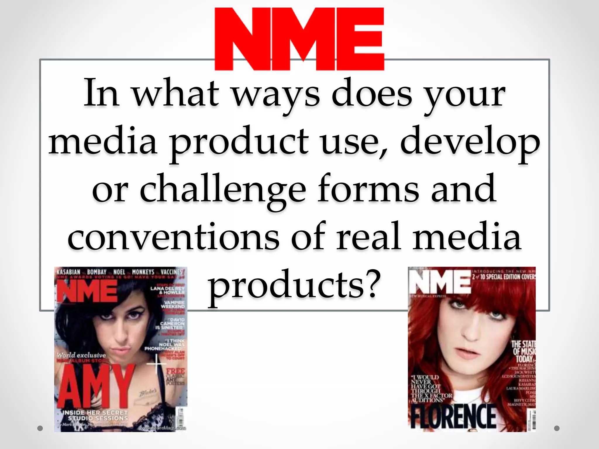
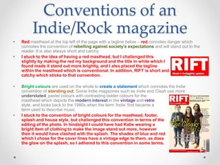
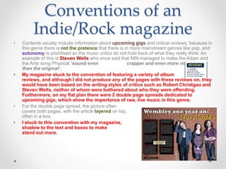
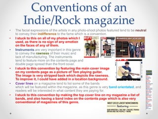
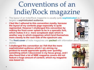
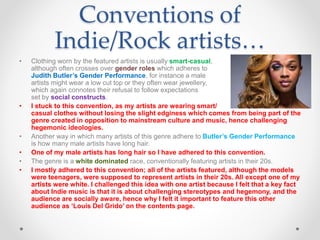
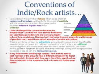
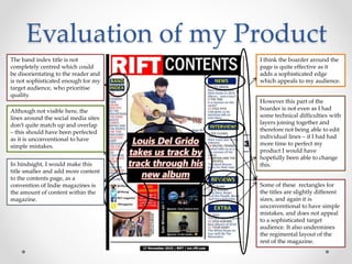
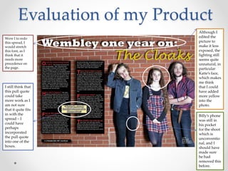
The document summarizes how the media product adheres to and challenges conventions of real indie/rock music magazines. It discusses conventions related to design elements, typical content, portrayal of artists, and ownership models. The product aims to stick closely to conventions like using bright colors and featuring band information prominently while challenging conventions such as having a more minimal front cover and portraying a diverse band. The evaluation identifies some areas that could be improved like centering a title and perfecting layout details.
