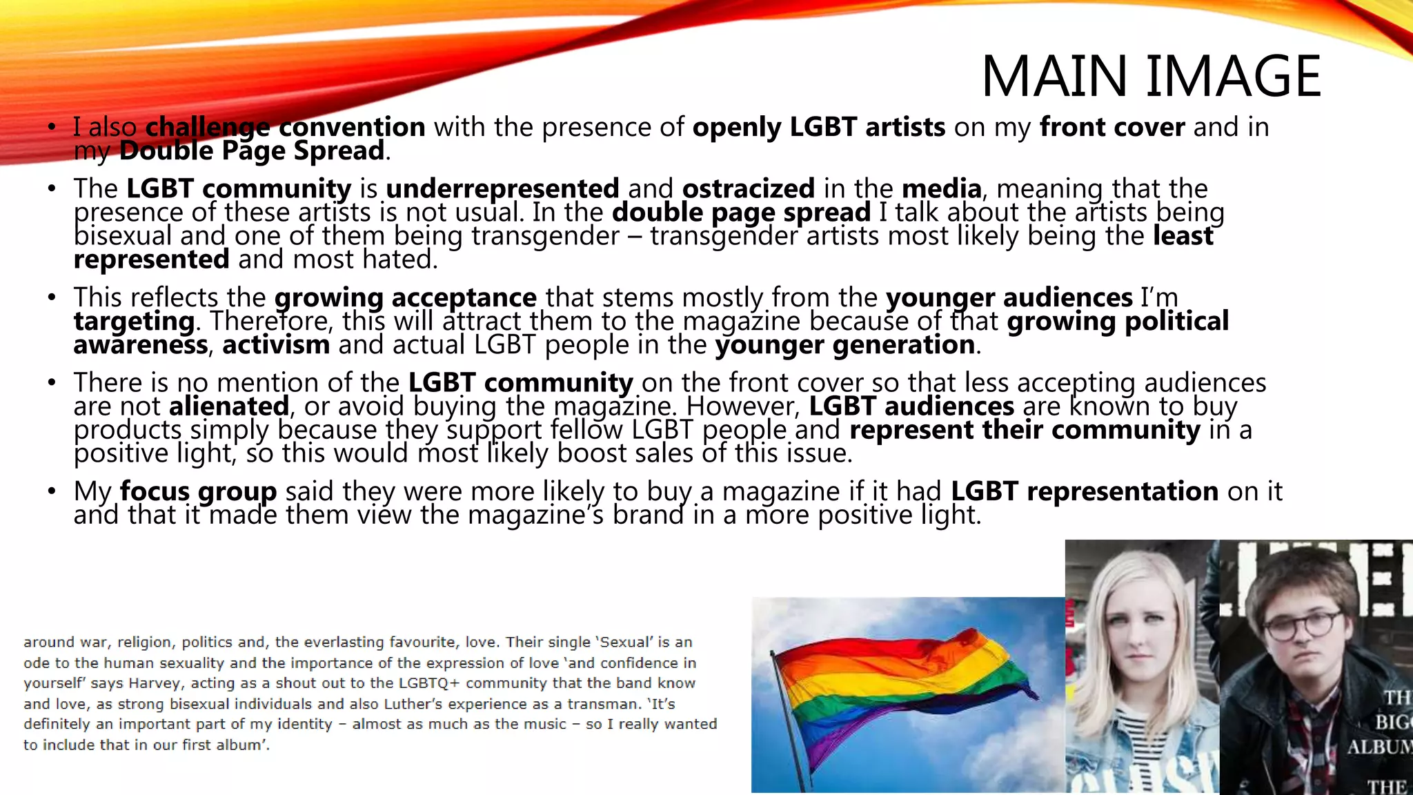
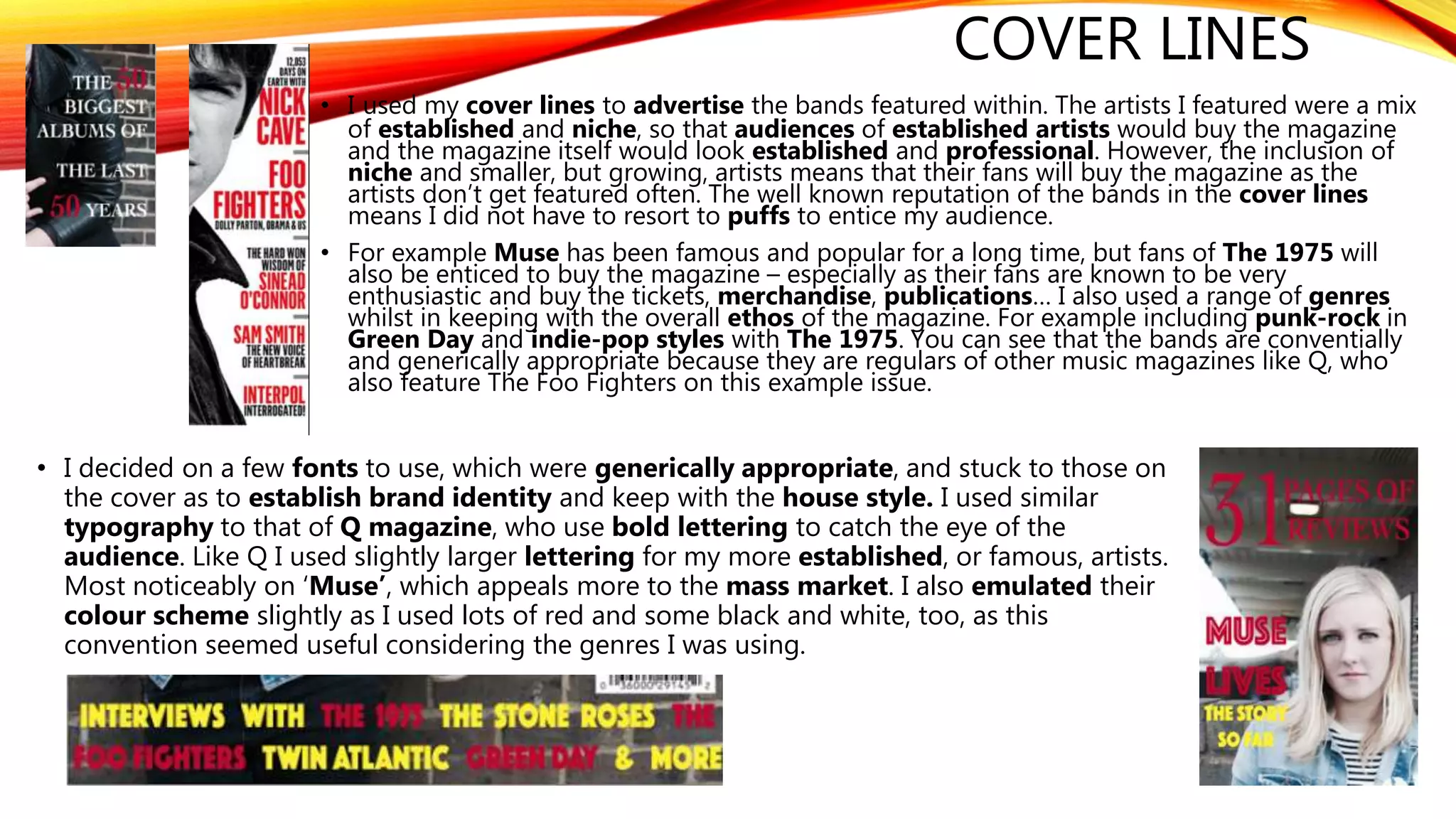
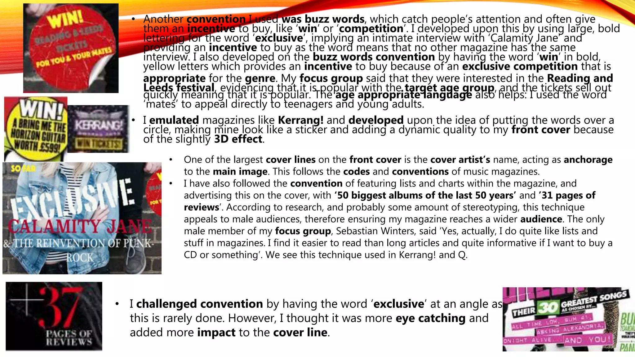
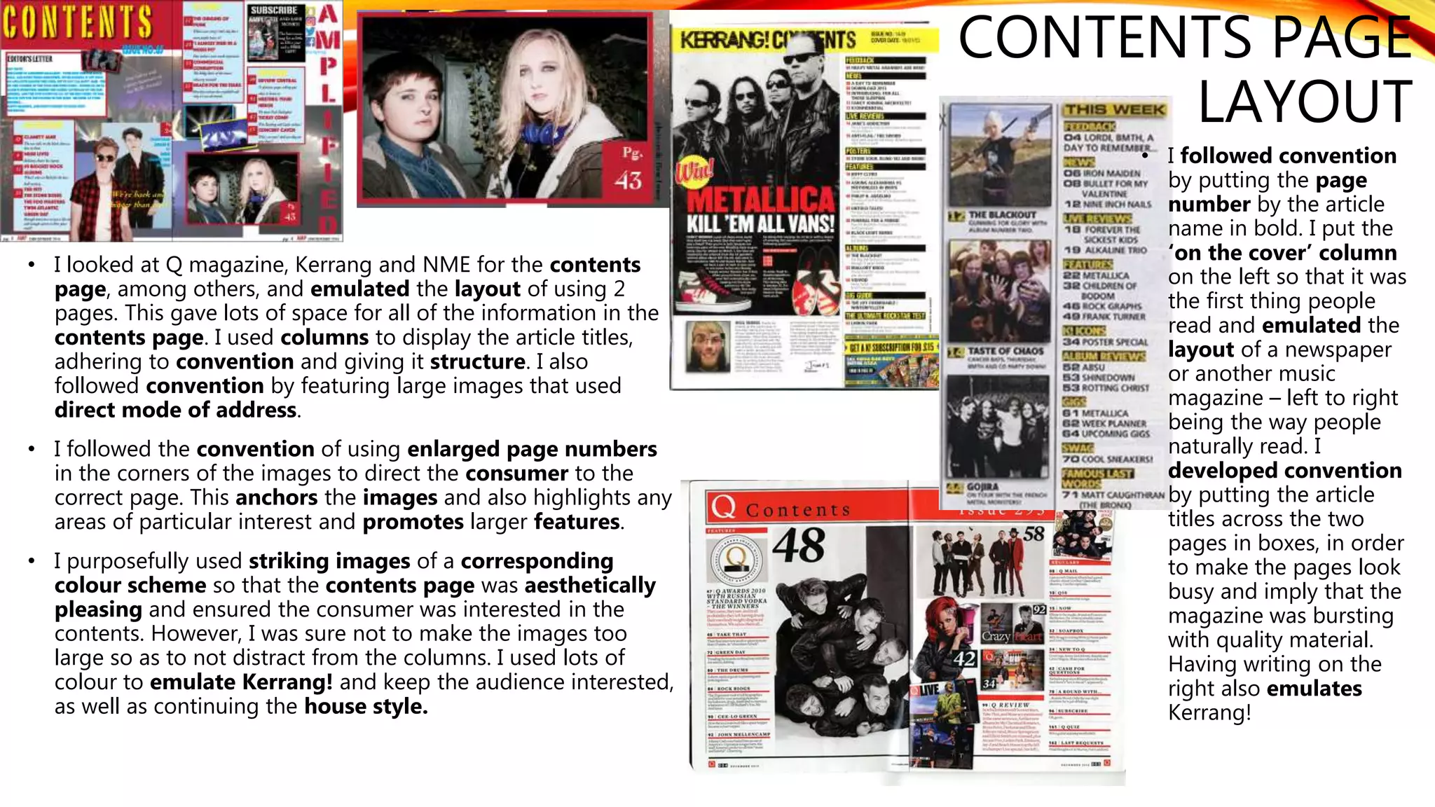
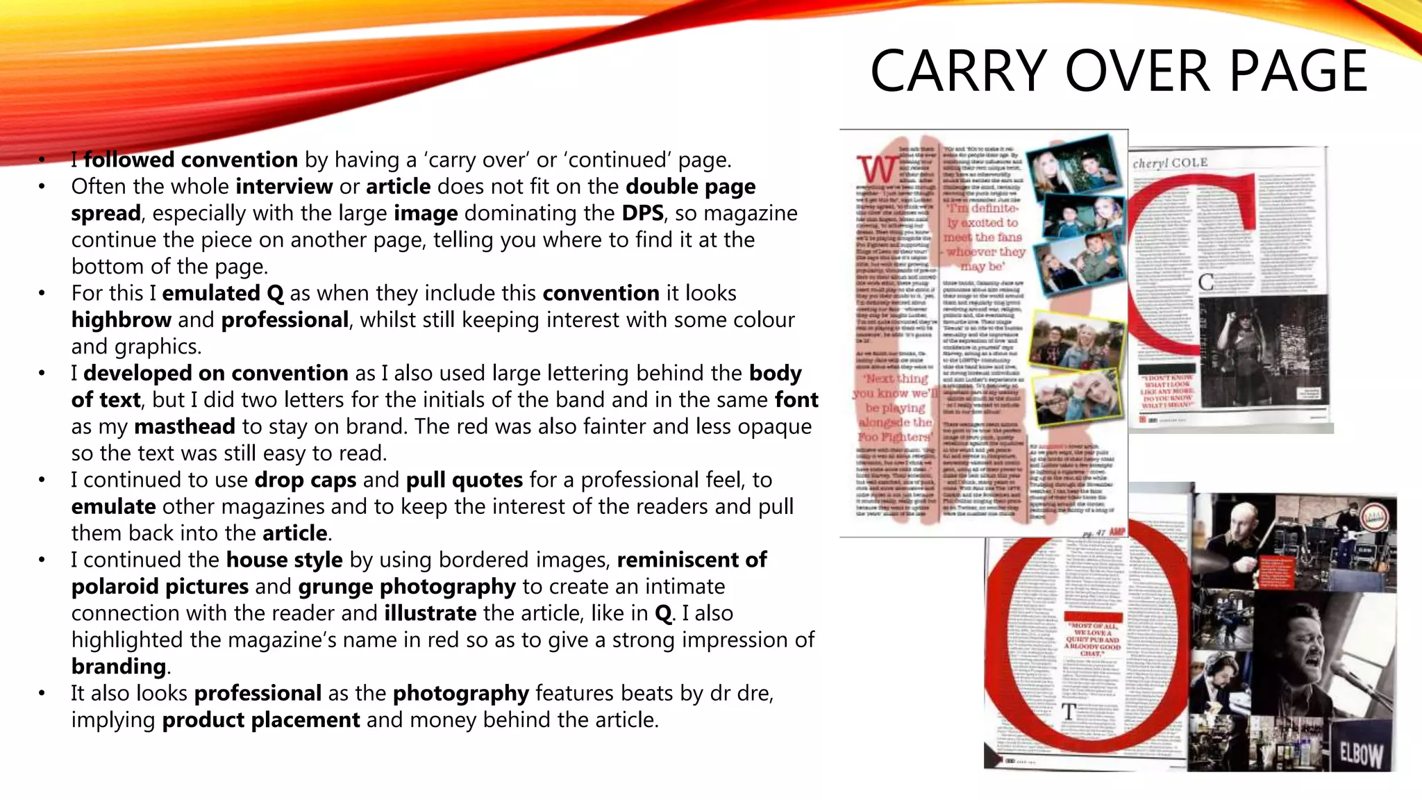
1. EVALUATION QUESTION 1
In what ways does your media product use, develop or challenge forms and
conventions of real media products?
2. FRONT COVER
MASTHEAD
• The masthead is a key part of any front cover, and are often eye catching so the audience identifies the
brand. It’s usually along the top of the cover, or in a box in the left hand corner. Examples of this would be
‘Q’ magazine or ‘NME’, but I chose a larger and bolder masthead to catch the eye of the audience, emulating
‘Kerrang!’.
• This conventional masthead establishes my magazine as being professional. However, a conventional
masthead also appeals to wider audiences and does not limit my magazine to a niche audience.
• The front cover conventionally includes a main image and this is superimposed in front of the masthead,
so that it does not ruin the photography. Partially covering the masthead implies that the brand is so
established or famous that you do not need to see the whole masthead to recognise the brand, which gives
audiences a better impression of the magazine. It also creates an interesting and aesthetically pleasing
layout effect.
• I followed all of these conventions because they majorly affect the way an audience view my magazine and
decisions to buy. This includes making my masthead white, as this also fit with my brand identity and
looked aesthetically pleasing. However, the convention is usually to have fonts with clean lines and I
developed this, taking inspiration from kerrang! And having a more genre specific font to give myself a
more unique brand identity and fitting with my punk-rock aesthetic backgrounds of brick walls and run
down areas.
My
magazine
3. MAIN IMAGE
• The main image of the front cover rarely shows a models whole body and the
generic convention is a mid-shot of the head and shoulders. The closeness of the
shot implies an intimacy between the audience and the model, exacerbated by the
direct mode of address. I develop upon this in my main image, as you can see
slightly more of the artists bodies, as to fully appreciate the genre specific costume
and background. This emulates Q.
• It’s convention that high key lighting is used so that audiences can fully see the
models and so that they are not unnecessarily concealed by shadow, and so I have
used this on my front cover too. To develop upon this I used filters on iPhoto to
conform to conventions specific to the grunge aesthetics, which usually have
darker, grey undertones to their photography and a faded look.
• Eg.
4. MAIN IMAGE
• An important part of the main image is the costume and background.
• I developed on grunge and punk conventions to appeal to my target audience and also to reference
the music featured. This meant I included leather/denim jackets, dark clothing, piercings and eyeliner
amongst other examples of iconography, which is intended to give information to the audience about
the artists and genre. I pared the extreme punk aesthetic down, however, to appeal to a wider
audience. This was especially important as youth subcultures are merging and young people are
listening to a wider variety of genres with the rise of platforms like Spotify. See my sub culture
research here and my punk research here.
• The main image is meant to look professionally shot and this is why I did it with a professional Canon
camera and not my iPhone.
• An further example of iconography or symbolism is the hand
gesture made by one of the band mates, which symbolizes rock
and is often done at festivals and concerts, or at rock themed
photo shoots. Eg. Like Matt Bellamy holding this guitar which
implies that he is dangerous and therefore the interview is
revealing, but also that he is representing the rock genre.
5. MAIN IMAGE
• I also challenge convention with the presence of openly LGBT artists on my front cover and in
my Double Page Spread.
• The LGBT community is underrepresented and ostracized in the media, meaning that the
presence of these artists is not usual. In the double page spread I talk about the artists being
bisexual and one of them being transgender – transgender artists most likely being the least
represented and most hated.
• This reflects the growing acceptance that stems mostly from the younger audiences I’m
targeting. Therefore, this will attract them to the magazine because of that growing political
awareness, activism and actual LGBT people in the younger generation.
• There is no mention of the LGBT community on the front cover so that less accepting audiences
are not alienated, or avoid buying the magazine. However, LGBT audiences are known to buy
products simply because they support fellow LGBT people and represent their community in a
positive light, so this would most likely boost sales of this issue.
• My focus group said they were more likely to buy a magazine if it had LGBT representation on it
and that it made them view the magazine’s brand in a more positive light.
6. COVER LINES
• I used my cover lines to advertise the bands featured within. The artists I featured were a mix
of established and niche, so that audiences of established artists would buy the magazine
and the magazine itself would look established and professional. However, the inclusion of
niche and smaller, but growing, artists means that their fans will buy the magazine as the
artists don’t get featured often. The well known reputation of the bands in the cover lines
means I did not have to resort to puffs to entice my audience.
• For example Muse has been famous and popular for a long time, but fans of The 1975 will
also be enticed to buy the magazine – especially as their fans are known to be very
enthusiastic and buy the tickets, merchandise, publications… I also used a range of genres
whilst in keeping with the overall ethos of the magazine. For example including punk-rock in
Green Day and indie-pop styles with The 1975. You can see that the bands are conventially
and generically appropriate because they are regulars of other music magazines like Q, who
also feature The Foo Fighters on this example issue.
• I decided on a few fonts to use, which were generically appropriate, and stuck to those on
the cover as to establish brand identity and keep with the house style. I used similar
typography to that of Q magazine, who use bold lettering to catch the eye of the
audience. Like Q I used slightly larger lettering for my more established, or famous, artists.
Most noticeably on ‘Muse’, which appeals more to the mass market. I also emulated their
colour scheme slightly as I used lots of red and some black and white, too, as this
convention seemed useful considering the genres I was using.
7. • Another convention I used was buzz words, which catch people’s attention and often give
them an incentive to buy, like ‘win’ or ‘competition’. I developed upon this by using large, bold
lettering for the word ‘exclusive’, implying an intimate interview with ‘Calamity Jane’ and
providing an incentive to buy as the word means that no other magazine has the same
interview. I also developed on the buzz words convention by having the word ‘win’ in bold,
yellow letters which provides an incentive to buy because of an exclusive competition that is
appropriate for the genre. My focus group said that they were interested in the Reading and
Leeds festival, evidencing that it is popular with the target age group, and the tickets sell out
quickly meaning that it is popular. The age appropriate language also helps: I used the word
‘mates’ to appeal directly to teenagers and young adults.
• I emulated magazines like Kerrang! and developed upon the idea of putting the words over a
circle, making mine look like a sticker and adding a dynamic quality to my front cover because
of the slightly 3D effect.
• One of the largest cover lines on the front cover is the cover artist’s name, acting as anchorage
to the main image. This follows the codes and conventions of music magazines.
• I have also followed the convention of featuring lists and charts within the magazine, and
advertising this on the cover, with ‘50 biggest albums of the last 50 years’ and ’31 pages of
reviews’. According to research, and probably some amount of stereotyping, this technique
appeals to male audiences, therefore ensuring my magazine reaches a wider audience. The only
male member of my focus group, Sebastian Winters, said ‘Yes, actually, I do quite like lists and
stuff in magazines. I find it easier to read than long articles and quite informative if I want to buy a
CD or something’. We see this technique used in Kerrang! and Q.
• I challenged convention by having the word ‘exclusive’ at an angle as
this is rarely done. However, I thought it was more eye catching and
added more impact to the cover line.
8. CONTENTS PAGE
LAYOUT
• I looked at Q magazine, Kerrang and NME for the contents
page, among others, and emulated the layout of using 2
pages. This gave lots of space for all of the information in the
contents page. I used columns to display the article titles,
adhering to convention and giving it structure. I also
followed convention by featuring large images that used
direct mode of address.
• I followed the convention of using enlarged page numbers
in the corners of the images to direct the consumer to the
correct page. This anchors the images and also highlights any
areas of particular interest and promotes larger features.
• I purposefully used striking images of a corresponding
colour scheme so that the contents page was aesthetically
pleasing and ensured the consumer was interested in the
contents. However, I was sure not to make the images too
large so as to not distract from the columns. I used lots of
colour to emulate Kerrang! and keep the audience interested,
as well as continuing the house style.
• I followed convention
by putting the page
number by the article
name in bold. I put the
‘on the cover’ column
on the left so that it was
the first thing people
read and emulated the
layout of a newspaper
or another music
magazine – left to right
being the way people
naturally read. I
developed convention
by putting the article
titles across the two
pages in boxes, in order
to make the pages look
busy and imply that the
magazine was bursting
with quality material.
Having writing on the
right also emulates
Kerrang!
9. • I developed convention and emulated Q by giving my images a
border in InDesign and often having them at angles, reminiscent
of polaroid pictures, making the contents page connect more with
the reader and making the photographs feel more intimate. By
using fan photography this creates a unique selling point,
reminiscent of the fan made ‘zines of the punk era, referencing
the history of the genres featured in the magazine. It also makes
the page more aesthetically pleasing.
• I followed convention and used a large, red box in the top left of
my contents that had the word ‘contents’ in it, and the issue
number. This is to inform the consumers of what they are reading.
reading. I established my brand identity by using the same font
as on the cover and also the same yellow colour, which attracts the
eye of the audience. I used a drop shadow to make it look more
3D and dynamic. I challenged convention by having the
magazine name down the side of the contents page, rather than
in the box.
• I developed convention by featuring an editor’s letter. This is not
done by all music magazines but it is done by Kerrang! and they
find it helps create a better sense of community and intimacy
with the readers, encouraging loyal readership. To further to loyal
readership and follow convention I also included a ‘subscribe’
section, which almost always has a small version of the front cover
and advertises how readers can save money.
• I also developed upon convention and featured images with the
background cut out so that the model looked as if they were
jumping out from the page. This is in Q magazine, among others,
but I thought it added to my busy and interesting, colourful theme.
• I also challenged convention because, instead of having a plain
background, I layered images of concerts. This anchors the rock
and roll message of the magazine and makes the contents more
aesthetically pleasing and stand out from other magazines.
CONTENTS PAGE
LAYOUT
10. CROSS MEDIA CONVERGENCE
• On my contents page I advertise ‘Amplified’s’ presence on several social media platforms which encourages
interaction with the magazine’s readers. This creates a stronger sense of community and higher interaction means
more loyal readership. This was confirmed by my focus group who said that they felt more ‘involved’ in the creation
of a magazine if they followed them online and that all the magazines they read most often, they followed on at least
one form of social media. For example a snapchat story would allow readers to access exclusive content like behind
the scene footage of a photoshoot.
• This also attracts a younger target audience, as the younger generation are internet natives, and more likely to
follow social media or consume online content like blogs or YouTube videos.
• This also ensures that the magazine stays up to speed with the rest of the publication industry. It has now become an
expectation, if not a requirement, for music magazines to extend their brand to social media and have an active
online presence.
• Its also a great opportunity for free marketing, advertising the product on the web using hashtags and social media
campaigns, but also to receive feedback from readers so that the magazine can stay ahead of the trends and tailor its
contents to its readership.
• An active online presence strengthens a brand and also globalises it as it means its accessible to anyone on the
same social media platform, this makes it a lot more influential.
• By including the magazine’s social media handle I have included a zeitgeist social media convention that isn’t as
prominent in music magazines yet, developing conventions as it means my magazine is ahead of other publications.
By combining popular platforms I am successfully using synergy.
11. DOUBLE PAGE SPREAD
LAYOUT
• I continued the colour palette from the previous
pages, ensuring to keep within the house style and
brand identity. This is somewhat unconventional as
often the colour choices are quite muted or
understated in a double page spread. I did this to
keep the interest of the younger readers and make
an aesthetically pleasing layout, but also to
represent the youth and fun loving of side of the
artist’s identity as this DPS is centred around the
band.
• The font is intended to remind audiences of cowboys
and wanted posters, therefore being a visual pun
and anchorage to the artist’s name ‘Calamity Jane’,
which is also a western musical.
• The layout is somewhat conventional as the majority
of the spread is taken up by a large, striking image, a
high quality shot, which uses direct mode of
address.
• I put the text in a coloured box, like in Kerrang, to
make it stand out and to continue the house style. I
also followed convention by using a drop caps
which makes it look professional and I also featured
pull quotes which creates intrigue and encourages
people to read the interview. This is professional
looking but also sets the tone for the interview too.
• The layout is conventional as almost a whole A4
side is dedicated to text, whilst the other side is
mostly focused on the image. This way both aspects
get equal focus. I also emulated Kerrang by adding
in extra images with borders to showcase the
photoshoot and make the DPS more aesthetically
pleasing. I developed upon convention as I tried to
strike a balance between the simpler layouts of the
highbrow magazines and the busier layouts of the
magazines aimed at younger audiences.
12. DOUBLE PAGE SPREAD
• The heading and subheading conforms to convention as it informs the readers what
they will learn from the interview, whilst also acting as an enticement.
• I drew comparisons to another great band, Pink Floyd, with the words ‘dark side’,
referencing their hit album ‘dark side of the moon’. This may be too subtle for some
readers, but even without the reference it draws readers in as it creates mystery and
implies scandal and a revealing interview. The use of ‘knocking the ball out of the punk-
rock park’ creates a visual pun because of the location of the shoot which is in a park, to
emphasise their youth and energy. This image creates anchorage for the subheading.
• The main image is conventional because of the direct mode of address which connects
with the consumer. The image is interesting and the fun nature of it juxtaposes the
seriousness implied with ‘dark side’, creating intrigue for the reader. The body language
is fairly informal which relaxes the reader and makes them more likely to identify with,
relate to and like the artist featured.
• The amount of small text and build up to the interview implies that it is highbrow and in
depth, emulating that of Q magazine who often publish long and honest interviews.
• It challenges convention, as despite having a woman on the cover, the photography does
not sexualise her like it does in Q. The male gaze does not seem to be as prominent in my
publication which implies feminist undertones and a concentration on the music rather
than the artist’s bodies and ‘look’. Whilst recognising that nudity is empowering for some
women, the concentration on the music implies that the magazine prefers to be more
highbrow and also recognises the age of the artists featured and that emulating Q in this
instance may not be appropriate or appreciated by the readership. This is especially as the
younger generations are becoming increasingly more politically aware and active in LGBT
and feminist communities amongst others. Respecting these views and seeking feedback
on social media, encourages readership from that particular demographic. Furthermore,
it challenges convention by using more ‘realistic’ looking bodies, which is encouraged by
teenage activists.
13. CARRY OVER PAGE
• I followed convention by having a ‘carry over’ or ‘continued’ page.
• Often the whole interview or article does not fit on the double page
spread, especially with the large image dominating the DPS, so magazine
continue the piece on another page, telling you where to find it at the
bottom of the page.
• For this I emulated Q as when they include this convention it looks
highbrow and professional, whilst still keeping interest with some colour
and graphics.
• I developed on convention as I also used large lettering behind the body
of text, but I did two letters for the initials of the band and in the same font
as my masthead to stay on brand. The red was also fainter and less opaque
so the text was still easy to read.
• I continued to use drop caps and pull quotes for a professional feel, to
emulate other magazines and to keep the interest of the readers and pull
them back into the article.
• I continued the house style by using bordered images, reminiscent of
polaroid pictures and grunge photography to create an intimate
connection with the reader and illustrate the article, like in Q. I also
highlighted the magazine’s name in red so as to give a strong impression of
branding.
• It also looks professional as the photography features beats by dr dre,
implying product placement and money behind the article.