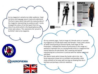
The perfect Sundabet Slot mudah menang Promo new member Animated PDF for your conversation. Discover and Share the best GIFs on Tenor
Admin Ramah Cantik Aktif 24 Jam Nonstop siap melayani pemain member Sundabet login via apk sundabet rtp daftar slot gacor daftar
2137ad Merindol Colony Interiors where refugee try to build a seemengly norm...luforfor
This are the interiors of the Merindol Colony in 2137ad after the Climate Change Collapse and the Apocalipse Wars. Merindol is a small Colony in the Italian Alps where there are around 4000 humans. The Colony values mainly around meritocracy and selection by effort.
Explore the multifaceted world of Muntadher Saleh, an Iraqi polymath renowned for his expertise in visual art, writing, design, and pharmacy. This SlideShare delves into his innovative contributions across various disciplines, showcasing his unique ability to blend traditional themes with modern aesthetics. Learn about his impactful artworks, thought-provoking literary pieces, and his vision as a Neo-Pop artist dedicated to raising awareness about Iraq's cultural heritage. Discover why Muntadher Saleh is celebrated as "The Last Polymath" and how his multidisciplinary talents continue to inspire and influence.
The Legacy of Breton In A New Age by Master Terrance LindallBBaez1
Brave Destiny 2003 for the Future for Technocratic Surrealmageddon Destiny for Andre Breton Legacy in Agenda 21 Technocratic Great Reset for Prison Planet Earth Galactica! The Prophecy of the Surreal Blasphemous Desires from the Paradise Lost Governments!
2137ad - Characters that live in Merindol and are at the center of main storiesluforfor
Kurgan is a russian expatriate that is secretly in love with Sonia Contado. Henry is a british soldier that took refuge in Merindol Colony in 2137ad. He is the lover of Sonia Contado.
thGAP - BAbyss in Moderno!! Transgenic Human Germline Alternatives ProjectMarc Dusseiller Dusjagr
thGAP - Transgenic Human Germline Alternatives Project, presents an evening of input lectures, discussions and a performative workshop on artistic interventions for future scenarios of human genetic and inheritable modifications.
To begin our lecturers, Marc Dusseiller aka "dusjagr" and Rodrigo Martin Iglesias, will give an overview of their transdisciplinary practices, including the history of hackteria, a global network for sharing knowledge to involve artists in hands-on and Do-It-With-Others (DIWO) working with the lifesciences, and reflections on future scenarios from the 8-bit computer games of the 80ies to current real-world endeavous of genetically modifiying the human species.
We will then follow up with discussions and hands-on experiments on working with embryos, ovums, gametes, genetic materials from code to slime, in a creative and playful workshop setup, where all paticipant can collaborate on artistic interventions into the germline of a post-human future.
2. In many ways my magazine resembles an existing one. I have created a classic rock genre magazine
taking most of my inspiration from Mojo magazine.
For my front cover, I used a long shot dominant image. Originally taken in colour, I edited it making it
black and white as this was a common convention seen amongst many other magazines.
Although my image is black and white, I wanted to keep in theme with the vintage look so I changed
the background to a black and white brick wall. As the front cover image was to promote the article I
was producing, I used the same image of the brick wall for the background of my article. When
researching into other magazines, I found that they did not use colourful or image backgrounds
showing that I challenged the convention. I placed the dominant image in the middle of the page due
to it being an 'exclusive' edition as I wanted the front cover to look dramatic. Again, I looked into
existing magazines and found that Rolling Stone magazine used only one image of The Beatles on
their cover as it was an issue mainly about them. This was the only image of a model I used
however; I did include two other images. I created the Quadrophenia logo and took a photo
of The Rolling Stones logo from a poster. By doing this, I had altered the convention I was following.
The colour scheme is black, white, red and blue. Although this was a decision made by my
audience, I think it links with the main article '40 Years of Quadrophenia' as this was a very
patriotic album written and performed by the British band, The Who. This colour scheme
follows through each of the pages I made just as a real magazine does.
3. My contents page resembles a real one as I have used sub-headings to keep it organised and easy to
navigate through. The sub-headings I have used feature in existing magazines such as 'reviews' and
'cover story'. As my magazine is aimed at an older, male audience, I have only included some of the
articles and features in my contents as the simplicity of the page will allow them to find the page they
want to read easily and with no difficulty. I have used minimal images on my contents page as it
should mainly focus on the writing. Because of this, I have used only one dominant image. I followed
this convention from Mojo magazine. The font stays constant throughout the front cover and
contents page however, changes on the article. I have done this as the article is exclusive and I
wanted it to stand out.
My article is split into 4 columns to make it organised and easy to follow. I placed the dominant image
on the first page to get the reader interested making them want to read on to the full article on the
second page. It also tricks them into thinking that they do not have a lot to read. I
followed this convention from Rolling Stones magazine, however, challenged it slightly as I
wrote my introduction on this page too.
The layout of a page is very important and is used in all magazines. The layout may be different
depending on the story, however, must be used as a page has to have structure. I have used two
images in my article. My dominant image is of the same model seen on the front cover. My
second image is of an album cover persuading the audience to buy it. This is a convention
seen in Mojo magazine however; they put it on the front cover.
Overall, I think my magazine has many factors that make it resemble
a real one.
4.
5. My media product shows mainly males as being
successful and devoted to their music. They are also
shown to be patriotic. I gave this idea to my audience
through my article ‘40 Years of Quadrophenia’. I used
pull quotes such as ‘Quadrophenia made The Who one
of the greatest classic rock bands of all time’. This
shows them to be very victorious in the music
industry. As my target audience were
teenagers when these bands were formed and
at their peak, they can relate to them and feel like
they have shared their success and grown up with
them.
The images I used of Roger Daltrey (lead singer of The Who) again,
represented them as outstanding and very good at what they do. The
image I used for my article shows them as confident and outgoing but
also different to any other band. For my front cover image, I took a
different approach. This image gives the impression that the band is
serious and determined to succeed as he is sat on a speaker with his
hands together looking directly at the camera. He is not wearing bold
clothing as I wanted this image to focus mainly on his stern
expression. I think this also shows the calm and mature side to them. I
used the prop of a large speaker as this shows that their music is loud
and everybody has heard of them. I edited this image into black and
white as I wanted it to look vintage. It
also represents them and my audience as being older and
from an older era; the 60’s and 70’s.
6. As my magazine is aimed at an older audience, I kept
my fonts and language easy to read and understand.
The font is basic which links with the maturity side of
the magazine representing my audience well. I rarely
changed the colour of my font apart from the
title of my article which is the Quadrophenia and
Union Jack colours. This represents the ‘proud to
be British’ side to my magazine.
On my contents page, I had an image of a female artist as I wanted
my magazine to include both males and females. I have used a photo
of Hollie Farnill posing as Chrissie Hynde, lead singer of The
Pretenders. I followed the theme of seriousness in this image as I
wanted to represent her as a strong female artist in a magazine that
mainly features all male bands. She is wearing red lipstick
representing her as feminine in contrast with her leather waistcoat
and black
Doc Martin boots which shows the harder side to her. Her
facial expression shows her as confident and possibly a little
cocky similarly to her pose with one leg up showing that she is
laid back and perhaps a little bit rebellious.
7.
8. Due to my previous research into four different publishing houses- Condé
Nast, IPC Media, Future and Bauer Media- I know what magazines they
tend to publish.
•Condé Nast publish lifestyle magazines aimed at a more female audience.
These include: Vogue, Glamour and House and Garden.
•IPC Media has a brand identity of ‘reality and living’ such as hobbies,
fashion and music such as InStyle, NME and Yachting Monthly.
•Bauer Media publish specialist magazines such as men's lifestyle and
entertainment. For example, Land Rover Owner International
and Practical Fish keeping
•Future publish magazines that are more so aimed at a male audience
in the areas of video games and technology. These include Nintendo
and Windows.
9. After looking at each of the publishing houses, I
have come to the conclusion that Condé Nast would
publish my magazine. This because they do not
market a genre of my magazine like mine that is
aimed at an older, male audience. Even though my
magazine does not link with any of the magazines
they publish, I believe that my magazine would fill
that is gap and attract a wider audience which
eventually would increase the company size.
10.
11. The audience I am aiming at is those who listen to classic rock bands for
example, The Rolling Stones and The Small Faces. My typical target
audience is males between the ages of 35 and 55 who were teenagers
when these bands were popular such as in the 60’s and 70’s. They are
likely to live in big cities such as Manchester and Liverpool; the places
where many classic rock bands formed. My target audience are likely to
have interests in motor-cycles and travelling as many of these bands
were seen as rebellious in the era of mods and rockers. They will have a
respectful amount of money as they are middle-aged making them very
likely to have a full time job.
The colours, house style, language and contents of the magazine will
appeal to this audience because it is vintage but also full of stories and
articles that they can relate to and be familiar with; they will have a
sense of belonging.