3. • Red masthead at the top left of the page with a tagline below – red connotes danger which
connotes the convention of rebelling against society’s expectations and will stand out to the
reader. It is also always short and catchy.
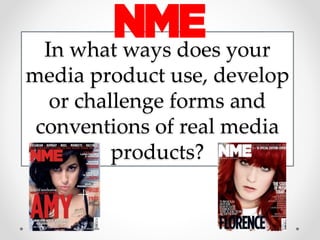
• I stuck to the idea of having a red masthead, but I challenged this
slightly by making the red my background and the title in white which I
found made it stand out more brightly, and I also placed the tagline
within the masthead which is conventional. In addition, RIFT is short and
catchy which sticks to that convention.
• Bright colours are used on the whole to create a statement which connotes the Indie
convention of standing out. Some Indie magazines such as Indie and Clash use more
understated, pastel colours with contrasting bolder colours for the
masthead which depicts the modern interest in the vintage and retro
style, and looks back to the 1980s when the term ‘Indie’ first became a
term used to describe music.
• I stuck to the convention of bright colours for the masthead, footer,
splash and house style, but challenged this convention in terms of the
editing of the photo. In hindsight I could have had Katie wearing a
bright item of clothing to make the image stand out more, however
then it would have clashed with the splash. The shades of blue and red
which I chose for the cover lines have a vintage edge to them, as does
the glow on the splash, so I adhered to this convention in some terms.
Conventions of an
Indie/Rock magazine
4. • Contents usually include information about upcoming gigs and critical reviews, because in
this genre there is not the pretence that there is in more mainstream genres like pop, and
autonomy is prioritised so the music critics do not hold back of what they really think. An
example of this is Steven Wells who once said that NIN managed to make the Adam and
the Ants song Physical ‘sound even crapper and even more ridiculous
than the original’.
• My magazine stuck to the convention of featuring a variety of album
reviews, and although I did not produce any of the pages with these reviews on, they
would have been based on the writing styles of critics such as Robert Christgau and
Steven Wells, neither of whom were bothered about who they were offending.
Furthermore, on my flat plan there were 2 double page spreads dedicated to
upcoming gigs, which show the importance of raw, live music in this genre.
• For the double page spread, the picture often
covers both pages, with the article layered on top,
often in a box.
• I stuck to this convention with my magazine, adding
shadow to the text and boxes to make them
stand out more.
Conventions of an
Indie/Rock magazine
5. Conventions of an
Indie/Rock magazine
• The facial expressions of the artists in any photo-shoot photos featured tend to be neutral
to convey their indifference to the fame which is a convention.
• I stuck to this on all of my photos which I
used, as there is no sign of any emotion
on the faces of any of them.
• Instruments are very important in this genre
to convey the rawness of their music and
lack of manufacturing. The instruments
tend to feature more on the contents page and
double page spread than the front cover.
• I stuck to this convention by featuring the main cover image
on my contents page as a picture of Tom playing guitar.
The image is very stripped back which depicts the rawness.
To improve it, I could have added in a studio background.
• Cover lines on a magazine tend to list some of the bands
which will be featured within the magazine, as this genre is very band orientated, and
readers will be interested in what content they are paying for.
• I stuck to this convention by making the top cover line on my magazine a list of
bands, and also having a band index on the contents page which is also very
conventional of magazines of this genre.
6. • The layout of an Indie/Rock magazine is usually quite sophisticated as it
targets a sophisticated audience.
• I feel like I adhered to this convention mostly, because
the layout of my contents page especially is quite
regimented. However I challenged this convention by
making the front cover splash to be in a sporadic font,
which makes it in a more scrapbook style which is
another way in which magazines which lend themselves
more closely to the rock side of the spectrum use.
• The front cover of Indie magazines are packed with information about featured
stories.
• I challenged this convention as I felt that the more
sophisticated audience which I am aiming my
product to would appreciate quality over quantity;
something which I discovered in my focus group, and I
also found that a lot of NME magazine covers did not
feature a huge amount of content, which my magazine
was based on.
Conventions of an
Indie/Rock magazine
7. Conventions of
Indie/Rock artists…
• Clothing worn by the featured artists is usually smart-casual,
although often crosses over gender roles which adheres to
Judith Butler’s Gender Performance, for instance a male
artists might wear a low cut top or they often wear jewellery,
which again connotes their refusal to follow expectations
set by social constructs.
• I stuck to this convention, as my artists are wearing smart/
casual clothes without losing the slight edginess which comes from being part of the
genre created in opposition to mainstream culture and music, hence challenging
hegemonic ideologies.
• Another way in which many artists of this genre adhere to Butler’s Gender Performance
is how many male artists have long hair.
• One of my male artists has long hair so I have adhered to this convention.
• The genre is a white dominated race, conventionally featuring artists in their 20s.
• I mostly adhered to this convention; all of the artists featured, although the models
were teenagers, were supposed to represent artists in their 20s. All except one of my
artists were white. I challenged this idea with one artist because I felt that a key fact
about Indie music is that it is about challenging stereotypes and hegemony, and the
audience are socially aware, hence why I felt it important to feature this other
audience as ‘Louis Del Grido’ on the contents page.
8. Conventions of
Indie/Rock artists…
• Many artists of this genre have tattoos which act as a form of
expressing themselves, and link to the conventional creativity
which is present among artists of this genre, as the music
prioritises Maslow’s highest need which features
creativity.
• I have challenged this convention because the
models which I used did not have tattoos themselves
as I used teenage models who are too young legally
to have their own tattoos. However had I had more time and access to a wider range
of people to use, I would have picked a couple of models with tattoos.
• There is an intense concern for authenticity surrounding this genre and so it is difficult to
place the artists into boxes and call them ‘conventions’ – each artist is very different,
contrasting pop in which many artists look and sound similar, as Adorno, the Marxist
theorist said that repetition distracts from true creativity, leading them to reproduce the
ideologies of pop as part of a homogenous group.
• In my article on the double page spread, I have tried to portray
each member of the group to have a different personality to depict
this authenticity through what they say in the article, aswell as how
they are dressed in the images on the front cover and double page
spread.
9. Conventions of
Indie/Rock artists
• Indie artists are often portrayed as the rebels of the music industry,
and they do not succumb to the monopolisation of this industry –
there is a focus on the ‘do-it-yourself’ attitude which was so
influential in the initial coining of the phrase ‘Indie-Rock’.
• While I adhered to this convention in some terms, I also steered
away from it and challenged it by mentioning that my band
played to a sold out Wembley crowd, which would earn them a lot of
money, and getting to the point that they have to be able to do that
clearly means that they have earned a lot of money. I did this to show the
disappearance of the true underground roots of the genre due to the evolution of the
internet, in particular Web 2.0; that it is impossible to stay hidden with everything
now available at the press of a button, showing the newly mainstream element to the
Indie/Rock genre.
• Indie artists are completely separate from pop ideologies as the audience is more
sophisticated, and there is minimal repetition in the industry despite the amount of
bands which have been influenced by others, and each have their own style due to their
autonomy which is a primary concern of these artists.
• I tried to retain the convention through the quote in the article; ‘we have a lot more
awareness of who we are as a band now and what our sound is’ as this portrays the
band to have their own individual sound. I also incorporate the convention of the
band being influenced by other bands as so many Indie bands are through
mentioning The White Stripes, The Strokes and The Black Keys in the article.
10. Conventions of
Indie/Rock artists
• Many artists of the Indie/Rock genre smoke/drink excessively
/do drugs, contrasting artists of the pop genre because they
have retained their autonomy and own image, and therefore
are not expected to retain a squeaky clean image by their
management.
• I have tried to portray this in the article inn the quote when
asked what their music is about; ‘money, relationships,
drinking’ which shows the fact that they do drink however also challenges the
assumption that indie artists are always on drugs/smoke a lot/drink excessively as
there is no mention of this. I did this to make the band seem more likeable and
relatable to the sophisticated audience, who are either still in school or have a good
job and a good income, so therefore are unlikely to want to ruin their opportunities
with these things.
• Despite the artists and audience of indie/rock music often being socially aware, it is still
male dominated.
• I challenged this stereotype by using Katie as part of the band to show Gauntlett’s
Empowered female. To improve the magazine and reinforce this notion, I would have
used more females as models, however at the time I was limited to time and who
could make the shoots. I would have kept the band as 2
males and a female, because I think depicted Katie as the
lead singer reinforces her Empowered Female status, but I
might have changed Josh for a female.
11. Institutional conventions
of Indie/Rock Magazines
• Indie magazines often take on a scrapbook theme which embraces their
independent roots but contrasts their conglomerate ownership.
• I challenged this theme by using a more sophisticated layout for my
front cover and contents page in particular, although it could be said
that the use of the two boxes on my double page spread represent the
scrapbook style, but I did this because I found it conventional to have
an image covering both pages of the double page spread, with text
over the top, and because of the nature of the brick background, it was
hard to make the text stand out otherwise.
• Indie artists and magazines were traditionally owned by independent institutions, but with the
evolution of Indie into the more mainstream market, due to the extinction of underground
music and the progression of the internet, they are now more conglomerate owned.
• I have adhered to the convention that Indie magazines are now more conglomerate
owned, because the institution which I chose in my research which I thought would be
best to own my magazine was IPC Media which has now disappeared
under TimeWarner, because they publish NME, which is the magazine most alike mine
and therefore I feel it would best cope with any issues and marketing necessary.
12. Evaluation of my Product
I think that this part is a
strength – it is conventional to
list bands featured inside of the
magazine, and I have done so in
a sophisticated way which
appeals to my target audience.
If I had had more time, I would
have fine tuned my photoshop
skills and tried to make Billy’s
hair better cut out. I also think
this was down to the lighting
which I used as the right of
Billy has a glare on him. While
this looks effective, it made it
difficult to distinguish between
Billy and the background at
times, therefore meaning that
some of his hair has not been
cut out as well as it might
have.
I think the way that this text is
wrapped around the picture is
effective and more conventional
than if it was just in a straight
line. It also allowed me to make
the main focal image bigger,
removing some of the blank
space.
Despite dedicating a large
amount of time to working on
this part of the splash, I am still
not entirely happy with it. I feel
like it doesn’t really fit into the
rest of the cover. To improve it, I
could have changed the font, or
made the whole splash bigger
meaning that the ‘How three…
Wembley’ part could also be
bigger.
I probably could still have
done with more content on this
page as parts of it still look
quite empty. My reasoning for
not was because a focus group
member said that they
preferred quality over quantity,
although the content on
Indie/Rock magazines varies
on whether they are going for
the more rocky edge or more
understated, reflecting
different artists.
13. Evaluation of my Product
The band index title is not
completely centred which could
be disorientating to the reader and
is not sophisticated enough for my
target audience, who prioritise
quality.
I think the boarder around the
page is quite effective as it
adds a sophisticated edge
which appeals to my audience.
However this part of the
boarder is not even as I had
some technical difficulties with
layers joining together and
therefore not being able to edit
individual lines – if I had had
more time to perfect my
product I would have
hopefully been able to change
this.
Although not visible here, the
lines around the social media sites
don’t quite match up and overlap
– this should have been perfected
as it is unconventional to have
simple mistakes.
In hindsight, I would make this
title smaller and add more content
to the contents page, as a
convention of Indie magazines is
the amount of content within the
magazine.
Some of these rectangles for
the titles are slightly different
sizes, and again it is
unconventional to have simple
mistakes, and does not appeal
to a sophisticated target
audience. It also undermines
the regimental layout of the
rest of the magazine.
14. Evaluation of my Product
I still think that
this pull quote
could take
more work as I
am not sure
that it quite fits
in with the
spread – I
could have
perhaps
incorporated
the pull quote
into one of the
boxes.
Were I to redo
this spread, I
would stretch
this font, as I
think that it
needs more
precedence on
the page.
Although I
edited the
picture to
make it less
exposed, the
lighting still
seems quite
unnatural, in
particular
Katie’s face,
which makes
me think
that I could
have added
more yellow
into the
photo.
Billy’s phone
was still in
his pocket
for the shoot
which is
unconventio
nal, and I
should have
made sure
he had
removed this
before.