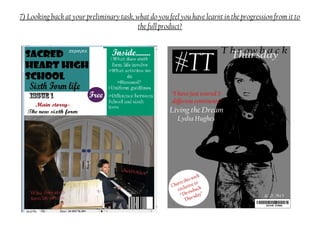
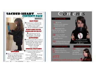
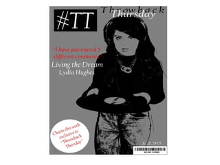
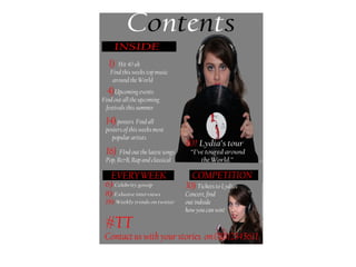
The document discusses the author's media studies foundation portfolio evaluation. It summarizes how the author's music magazine uses conventions from real music magazines in its design elements like the front cover, contents page, and double page spread. It discusses the use of masthead, headlines, images, page numbers, and more and how they conform to magazine conventions. It also discusses how the magazine represents its target audience of 16-25 year olds through the model, language, topics covered, and more.
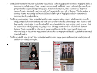
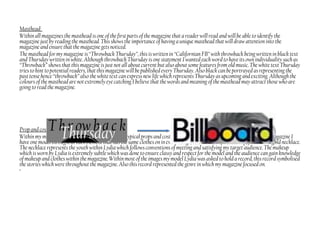
Mh0057 – management of healthcare human resourcessmumbahelp
DRIVE WINTER 2013
PROGRAM MBA/MBAHCSN3 - Sem 4 / PGDHSMN - Sem 2
SUBJECT CODE & NAME MH0057 – Management of Healthcare Human Resources
BK ID B1321
Credit and Max. Marks 4 credits; 60 marks
The Indian economy is classified into different sectors to simplify the analysis and understanding of economic activities. For Class 10, it's essential to grasp the sectors of the Indian economy, understand their characteristics, and recognize their importance. This guide will provide detailed notes on the Sectors of the Indian Economy Class 10, using specific long-tail keywords to enhance comprehension.
For more information, visit-www.vavaclasses.com
Instructions for Submissions thorugh G- Classroom.pptxJheel Barad
This presentation provides a briefing on how to upload submissions and documents in Google Classroom. It was prepared as part of an orientation for new Sainik School in-service teacher trainees. As a training officer, my goal is to ensure that you are comfortable and proficient with this essential tool for managing assignments and fostering student engagement.
How to Create Map Views in the Odoo 17 ERPCeline George
The map views are useful for providing a geographical representation of data. They allow users to visualize and analyze the data in a more intuitive manner.
2. In what ways does your media product use, develop or challenge forms and
conventions of real media products?
When researching many other music magazines such as, Billboard, NME and Q, it is clear that they all
conform to particular magazine conventions (see magazine conventions). Within my music magazine I have
used many of these stated conventions within each element of my magazine including, front cover, contents
page and double page spread. On my front cover some of these elements include, Masthead, headline, cover
lines, strapline, exclusive, barcode and main images. These are all aspects within a front cover which is why I
have chosen to add most of these to my own front cover. I have chosen to use these particular conventions on
the magazine; this is because they all have an important element within the magazine such as,
v
v The masthead will let readers know the magazine name and force them to acknowledge the magazine
they are reading.
v The headline makes the magazine seem exciting and lets the reader know the potential stories which are
going to feature inside. This may indicate to readers the genre of the magazine straight away so it is
important that the headline is exciting enough to entice people in.
v The strapline indicates more of the other stories within the magazine; this is used to persuade readers
into reading the magazine because of some of the stories inside.
v The exclusive is a persuasive technique used to ensure that the potential readers may be persuaded into
purchasing the magazine.
v The main image is used to catch the eye of potential readers which may then lead to the purchasing of the
magazine.
3. • Particularly these conventions it is clear that they are used within magazines not just music magazines and it is
important to include many of these conventions to persuade and let the readers acknowledge what they are
going to read at the purchasing of a magazine. Within my front cover, I have chosen to use the proven
theory of readers habitually read from top left of the page to bottom right of the page. This has lead me to
ensuring that my main image and masthead are all to the right of the page as these are tremendously
important for the reader to know.
• Within my contents page I have included a headline, main image including a teaser which is written over the
image, competition section and an every week news section. Within my contents page I have chosen to add
large numbers, this is a particular form in which has to be added to the contents page this is to ensure that
the readers know which page they are going to read. The page numbers will be situated with the main
features. This is comparable to other music magazines. I have decided to ensure that the images are
relatively large on the contents page; this will ensure that the magazine will be able to grab the attention of
potential readers.
• Within my double page spread I have included a headline, main image, quotes and an article which consists of
an interview with Lydia Hughes.
•
4. Masthead:
Within all magazines the masthead is one of the first parts of the magazine that a reader will read and will be able to identify the
magazine just by reading the masthead. This shows the importance of having a unique masthead that will draw attention into the
magazine and ensure that the magazine gets noticed.
The masthead for my magazine is “Throwback Thursday”, this is written in “Californian FB” with throwback being written in black text
and Thursday written in white. Although throwback Thursdayis one statement I wanted each word to have its own individuality such as
“Throwback” shows that this magazine isjust not all about current but also about some features from old music. The white text Thursday
tries to hint to potential readers, that this magazine will be published every Thursday. Also black can be portrayed as representing the
pasttense hence “throwback” also the white text can express new life which represents Thursday as upcoming and exciting. Although the
colours of the masthead are not extremely eye catching I believe that the words and meaning of the masthead may attract those who are
going to read the magazine.
Prop and costume:
Within my magazine I have followed conventions of typical props and costumesworn by their particular model. Within my magazine I
have one model throughout each element that has the same clotheson in every image; this consists of a black top, jeans and a gold necklace.
The necklace represents the youth within Lydia which follows conventions of meeting and satisfying my target audience. The makeup
which is worn by Lydia is extremely subtle which was done to ensure classy and respect for the model and the audience can gain knowledge
of makeup and clothes within the magazine.Within most of the images mymodel Lydia was asked to hold a record, this record symbolised
the stories which were throughout the magazine. Also this record represented the genre in which my magazine focused on.
•
5. Prop and costume:
Within my magazine I have followed conventions of typical props
and costumes worn by their particular model. Within my
magazine I have one model throughout each element that has the
same clothes on in every image; this consists of a black top, jeans
and a gold necklace. The necklace represents the youth within
Lydia which follows conventions of meeting and satisfying my
target audience. The makeup which is worn by Lydia is extremely
subtle which was done to ensure classy and respect for the model
and the audience can gain knowledge of makeup and clothes
within the magazine. Within most of the images my model Lydia
was asked to hold a record, this record symbolised the stories
which were throughout the magazine. Also this record represented
the genre in which my magazine focused on.
People:
The model within my magazine is extremely conventional to usual
models within a magazine; this is because Lydia clearly represents
the genre and target audience of my magazine. For example in
most of the images Lydia is smiling and seemingly enjoying life
which tries to emphasis the age of my target audience of youth and
that youth is the most fun time in someone’s life. Within most
magazines it is common to have more than one artist but most
magazines try and have one to show dominance and focus on that
specific artist for example “Billboard” features many different
artists on their own.
•
6. Font and colour:
Throughout my magazine I have chosen to continuously keep to a house style
consisting of grey, black, red and white. I decided on these colours by looking at
other music magazines and finding hardly any magazines use colours such as
black and white which has led to me conforming against conventions of typical
music magazines and chosen to choose different colours that I believe will work
and attract artists. However most magazine stick will a house style to be able to
identify them from other music magazines. For example Billboard uses black text
but many different colours such as blue to fill in some of the text this is clearly
evident that this is billboard magazine. This has led me to wanting specific colours
which would allow my magazine to be identified as “Throwback Thursday”.
Written content:
The written content within my magazine does use forms and conventions of typical
magazines, for example the main article within my magazine (see final double page
spread) does use a typical way in what is involved and what each article is about.
For example my whole magazine is about Lydia Hughes and her fame, which
means her story is then written on the double page spread in a form or of and
interview which is extremely typical in other magazines which has lead me to
develop mine into Lydia story and her music career. Also the straplines within the
magazine each represent a form of music which is clear within real media products
as whatever the genre that is expressed within each element of the written content
throughout.
•
7. A social group is defined as many people who interact within
one another share similar characteristics and share the same
interests which enable them to interact with one another.
Within my magazine I have tried to express, teenagers
predominantly at girls at the age of 16-25 years old. Within
today’s generation if it is clear that the “youth” of today are
looked down upon and are not very well respected. Girls of
today’s youth have been represented in the media to dress
provocatively,. I have chosen to go against the stereotypical
view of youth today to try and change people’s idea and
ensure that this particular social group is no longer frowned
upon. I believe that that it necessary to try and show the
public that many girls in today’s generation can lead to be
successful.
However within my music magazine I have chosen to conform
against the idea of this, and ensure that Lydia is dressed
within dull colours, with most of her body being modestly
covered. This is to ensure that girls today are represented in a
good way. This goes against usual music magazines as the
women are usually dress quite provocatively which then leads
to some bad publicity. As Lydia is wearing a black top, grey
jeans and her makeup is extremely subtle and classy, this is
trying to push away from bad publicity of today’s women. The
colour black is usually known to represent “secrets and
elegance”, this may lead people to want to know more about
Lydia’s life. This will also want readers to read more in the
magazine such as, competitions and new music.
•
2 How does your media product represent particular social groups?
8. • Within each image, I have chosen a prop which is a vinyl record, I have chosen this to again conform against the
social media of teenagers listening to an iPod and phone, I wanted to express that a lot of teenagers today
are listening and dressing in a way which was always seen in the 80’s. Such as blouses, long dresses and
now some are listening to music through a record.
• The language used within my magazine, is short and sharp sentences which get straight to the point, also within
the interview on my double page spread there is a clear element of formality but there is still an element of
fun, this represents my particular social group because teenagers do enjoy having fun, and reading news
about relevant artists within a particular period of time. I have chosen to not add long complex questions
for my interview, this is because when reading a magazine it is usually for a “chilled out time” which
means that teenagers would not want to read complex interview, but rather would enjoy a fun and quirky
interview to read. My magazine represents social media using this language as teenagers are typically
known for not reading enough but on their phones a lot. This means within my magazine I chose short
questions and articles to ensure they do not get dis interested when reading.
•
9. Within each element of my article I have tried to represent my social group throughout each three parts of my
magazine within my “front cover” (See front cover final), I have included an image of a teenage girl (my model
Lydia) this would ensure that she would be able to represent my social group as she is part of it. I have also
included an exclusive which states that each week the charts will be in a magazine. This is particularly vital
when trying to engage teenagers. Within my “contents page” (see contents page), I have included two images of
my model again who is within this particular social group within one of these images my model Lydia is clearly
holding a phone which represents that today’s generation is the “world of technology” this represents my
particular social group . I have also ensured that the articles represent my particular social groups for example
“news about upcoming festivals”, it is clear that teenagers enjoy going to festivals within their summer and
although some older people go to festivals the majority of their income comes from teenagers going in their
summertime. Within my “Double page spread” (see final double page spread), I have put the interview with the
main subject within the magazine Lydia and have incorporated some of her life within. This represents my
social group as each element uses images, language to express teenagers and their life.
My magazine again represents the particular social group; this is because of the use of different font and text
styles, throughout each three elements I have chosen to keep to a clear house style which includes the colours of:
• Grey
• White
• Black
• Red
These colours represent teenagers as they are very subtle colours, but attract for example the colour red
insinuates that it is an important part of the magazine. The colour black was mainly used for the font colour
which will ensure that it is easy to read and does not require any effort which teenagers enjoy as most teenagers
do not enjoy having a challenge. Throughout my magazine have also used a number of different fonts, including,
Edwardian Script ITC and Californian fb, these show some elegance within the magazine, this is again to
conform against the stereotypical view of women within todays younger generation, this is shown through the
elegance of writing (see final double page spread).
Within the images on all three elements, my model Lydia is always smiling and seeming like she is having fun,
this is like many other music magazines. They try and create a particular image to show fun and excitement.
Which again fits in with the social groups that at the age of 16-25, it is seen as to be the “prime time of your
life” , so the smiles represent fun within life and youth.
•
10. 3 What kind of media institution might distribute your media product and why?
• An institution is a company in which distributes the media product for an audience to consume.
When researching many other distributer institutions (see final ideas), it is evident to me that my magazine would
most appeal to IPC media institution. I have chosen this particular distributor because they are extremely well
known within the music industry also IPC media publish many other magazines including “NME” and “guitar and
bass”. Although guitar and bass is not part of my genre, the NME magazines that they produce fit in extremely well
with what my target audience want. For example they always have modern artists, exclusive interviews which fit in
well with my magazines and what I include. NME target their magazine to younger ages as is my magazine.
Although they try and aim their magazine to each male and female, my main focus for my magazine is mainly
women.
I have decided to reject other music magazine distributors such as development hill this is because, they are an
independent music magazine company but are the leading company of a dance music magazine, however my main
genre is not all about dance music which suggests, this distributor would not fit in with my particular music
magazine.
I have also decided to reject other institutions such as Factory Media this is because it is the world’s leading action
sports publisher, this suggests that this magazine would not conform to the ideas that is needed when publishing my
magazine, also their overall their target market would clearly not want to read a music magazine when they believe
that they are buying a magazine about leading action sports.
•
11. • I believe that I could bring some new elements to IPC publishing company such as
combining new music with some old music. This suggests that I would be able to
show that I could add something new which may attract more readers. From
doing this IPC institution may lead to a larger target audience because the
magazine is not just focused on modern music. This means that an element of my
magazine would be able to bring something new to the magazine. Although I am
able to bring new elements to this publishing company, I am also able to fit in
with the company portfolio, through ensuring that the target audience is always
thought of at every step of the development of the magazine. Ensuring the artists
are all within today’s generation and modern towards the target audience. Also
ensuring that the latest gossip is known to the potential readers, and giving news
on concerts and festivals.
• My magazine compliments to other magazines as it ensures to keep in with their
beliefs of what their own magazines should look like, and how they will appeal to
all of their audience. It is clear that a magazine will not suddenly be in the
readers hands, this is because my magazine is not known at all yet to potential
readers this has lead me to believe that my magazine would be able to share IPC
media marketing and advertisers, this is because my magazine is mostly
dedicated within the UK as is most of IPC media magazines, which suggests that
whilst advertising within the UK my magazine can then become known to the
UK consumers for example NME magazine has some in common with my
magazine “Throw back Thursday” (see front cover final) which again suggests
that my magazine would be able to be published with these types of magazines.
Also IPC media is within many leading supermarkets, which is where most
people of my target audience age would shop (See final ideas) this means that my
magazine would be easier for potential readers to consume. This is why I have
believe IPC would be the paramount media institution to distribute my
magazine “throwback Thursday”.
•
12. 4 Who would be the audience for your media product?Within my music magazine I have chosen a particular audience for my music magazine (See final decisions, my main target audience for my music magazine
consists of male and female although the main focus within my magazine is predominately women feel that my magazine will mainly focus on women because
of the main story inside which consists of Lydia whom is “girl” explaining her life as a singer. I feel this is more aimed towards women because they are able to
relate to the same sex.
The age in which I am aiming my magazine to be the younger generation of today’s society 16-25 year olds, who enjoy listening to the charts, finding out the
latest gossip and new interviews with artists.
The main focus within my magazine is ensuring the my potential readers are kept up to date within the music industry ensuring this happens every Thursday
hence the name “throwback Thursday”. I have chosen to ensure that my magazine is published every Thursday because as my age is 16-25 year olds I want to
ensure that my target have something to look forward to throughout their week.
A clear way of profiling my target audience is also known as demographics, the first is NRS social grade, which allows the population to be divided up into
categories which is defined by their income and status, from analysing each section I believe that my target audience falls under category E which includes,
unemployed, students pensioners and casual workers. Although my magazine is not aimed at pensioners my magazines main focus is on students and
unemployed or sometimes casual workers. This is clear to me that this is the right category as my target audience is 16-25 year olds which suggests that they
will be students, such as 6th form, college, university and apprentices.
The second way in which my target audience was being identified was through psychographics, which describe an audience by looking at their specific
behaviour and personality trait. I have decided that my target audience would be aspires and explorers. Which the main traits within these are:
• Adventurers
• Values differences
• Brand choice will highlight satisfaction
• Younger students
• Strong goals
• Confidence
• Self-reward
• Quality , This concludes that my target audience consists of male and female, 16-25 year olds, type E within the NRS social grade, aspires and explorers.
Which lead to the creation of my magazine (see finals).
•
13. 5 How did you attract/address your audience?
The target audience for my magazine is 16-25 year olds and is mostly aimed
at girls and women. Within my magazine I had to make sure that each
element represents my target audience through the use of language, images
and contents. This had to be done to ensure that my magazine will appeal to
my target audience and ensure that they can potentially relate to
“Throwback Thursday”.
Language:
• I have chosen a specific way in which I chose to write each section of
my magazine, I have concluded that because my target audience
age range is 16-25, it would be inappropriate to write in such a
formal way which lead my magazine to not appeal to my target
audience, therefore I have chosen to write in an informal way and
casually. This would be able to address my audience as I believe
that if there is no difficulty reading the magazine by the reader
than those potentially buying the magazine will not feel
uncomfortable and actually delight in reading the magazine.
Also, as the magazine main focus is on an artist’s life, it would not
be successful in portraying the artists life if such formal language
was used, which lead to the belief that when answering the
interview questions I wanted to express the age in which the main
artist actually is through the use of language for example the
answers given where very straight forward but would be
extremely factual to the reader who wants to find out more about
Lydia the artists life. Therefore I have used informal language
that will be casual to the reader which consequently may make
them relate to the magazine and gain a pleasure through reading
the magazine.
14. Model:
Throughout “Throwback Thursday” I have decided to use one model “Lydia Hughes”,
my model is 16 years old, I decided to ensure that my model would be in the age range of
my target audience which Lydia is, I chose to do this to ensure that the reader would be
able to relate to the artist. Through Lydia being in the same age range it may lead to
readers feeling as though they can share some life experiences and to ensure that they
feel that they are less important than the main artist on the magazine. This will lead to
the model, having a connection with the magazine readers. I believe that using Lydia as
my main model, it would lead to more relation from the distributor to the consumer
rather than having a model which will make the reader feel as though the artist is more
dominant than them.
Layout:
Throughout my magazine I have a clear layout, to ensure that it is easier for the readers
to read and they are at ease when reading. This is shown through the layout within each
section (see finals), I believe that having a layout that is simple for the readers to read
would lead to the attraction of my audience this is because:
Simple to read which means the magazine would appeal to my target audience as it will
not be seen as a “challenge”.
Unique layouts throughout, for example it is typical of a magazine to put columns
throughout out the magazine, although I have chosen to use columns they are very
refined and there is not many of them, which ensures that my reader will not get bored.
•
15. Colour scheme:
Throughout each element I have had to ensure that the colour schemes work and would be able to capture
the attention of potential readers. It is clear that throughout my magazine there is a clear house style
including the colours of red, grey, black and white. I have chosen these colours as my target audience is
age 16-25, which means the colours have to be subtle and sophisticated, this is because bright colours such
as bright pinks, would not suite what my target audience wants.
Pricing:
When creating my magazine, I had to ensure that I was knowledgeable of what my potential readers need
and want. This is why my survey was conducted (see survey analysis, from this I was able to find a price
that would best suite my target audience which the response was £2.00-£2.99, however I have priced my
magazine at £2.50. I had to ensure that the price was correct for my audience otherwise it will not attract
because it may be too expensive, So by pricing my magazine using actual results from my potential target
audience, my pricing should most certainly appeal to the target audience.
Choice of articles:
Within my magazine the main article within is situated on the double page spread (See final double page
spread), within my main article I have included an interview with Lydia my model, who shares some of
her life through her singing career. I have chosen an article such as this to ensure that the readers can
actual connect to the model/artists. I believe this attracts my audience because it ensures that the readers
know of the exclusive within the magazine and can get excited about what they are going to have the
opportunity to read about inside.
•
16. 6) What have you learnt about technologies from the process of constructing this
product?
When creating my magazine, blog and all research elements I have learnt about many different technologies that
can be used and gaining more experience on these:
Adobe Photoshop:
When using Adobe I learnt many new skills in which I did not know about, I used many different tools provided
(See construction), for example, the magic tool which is a tool that quickly takes away a background which is
not desired, this means I saved a lot of time when designing my front cover, contents page and double page
spread. I have also gained the knowledge on adding images and text. I also learnt why layers are actually used
within Photoshop which allowed me to ensure that every part of the magazine had its own unique layer within
each element. From this I was able to delete layers that I felt were not right for my magazine; from this I learnt
that I only had to delete the one layer. Within my front cover I gained an understanding of how to make the
image completely black and white (see construction). The main achievement in which I learnt when creating my
magazine was to crop images ad cut the sides to make it seem as though the picture just sits on top of the
background layer (shown on final contents page and double page spread).
Slide share:
When starting this project I did not know that “slide share” existed but since then I know how to add a slide onto
a blog and letting viewers automatically see the PowerPoint when the slide was added. I used the website
http://www.slideshare.net/ which gave clear guides as to how to use. Once the link was created I copied and
pasted onto my blog, this is then how all of the PowerPoint are clearly visible on my blog.
Barcode:
When creating my front cover a convention that was essential, was a barcode so I used a website in which
created the barcode, which allowed me to save the image and add it to my final front cover on front cover. This
website was completely a new technology in which I learnt about.
17. Blogger:
Before starting this project I had never had a blog or new much about blogs. So this lead me from the very beginning
that everything about blogs was new to me and a learning time. When first starting this project I had to create my
own blog, which I learnt how to:
Add new posts for each section of work.
Add images.
Add text.
Edit posts when necessary.
An understanding of what colour schemes and layouts work.
Overall within the blog, I learnt how a blog actually works and how I could then input my work.
•
Survey monkey:
As part of the project it was essential to create a survey in which my potential readers could answer. Before this
project I had heard some things about “survey monkey” through YouTube adverts etc. but had never actually needed
to use, however when creating a survey was necessary within this project I decided to use “survey monkey” (See
survey analysis). From this I learnt different aspect when creating a survey for example whether the answer given
where going to be through a tick box or a text box etc. This then lead to me to learn how to send the survey via email
or SMS for potential readers to answer.
Overall though this project I have learnt a range of new skills on software devices that I already knew of but from
this I was able to develop various more skills. I also gained knowledge of websites that I never knew existed however
which I am now very confident in using.
•
•
•
•
•
18. 7) Looking back at your preliminary task, what do you feel you have learnt in the progression from it to
the full product?
19.
20. When first starting the course the first task was to complete a preliminary task which was to create a school
magazine. It is evident that I have learnt the skills, codes and conventions a lot clearer which lead me to showing
progression within my magazine. I have learnt a lot more about what a professional magazine should actually look
like. For example within the front cover for my school magazine, there is many different colours which does not look
consistent which leads to a look of unprofessionalism however within my final front cover there is clear colours
throughout which shows a consistency which then lead to the magazine looking more professional.
I have also made an improvement within the actual image taking; this is because I have gained a deeper development
into different shots that are used for example within my school magazine, there is no clear shot being used however,
within my final there is an evidence of using a mid-shot. Also within school magazine contents page the image doesn’t
express enough what the magazine is going to be about however within my music magazine there is a clear element of
music.
From the preliminary task I have learnt the importance of a clear layout within a magazine, I have learnt that a
clear layout will help to determine whether the target audience will buy my magazine or not. There is a clear
improvement within the layouts; within my final there is a clear element of structure throughout however within the
school magazine everything was “random” on the page.
Overall I feel that I have learnt that when creating a magazine the most important element is approaching a way in
which you can satisfy your target audience, this is because without doing so, the target audience will not buy or read
the magazine which therefore leads to there being no point in creating the magazine. Also I have learnt to properly
plan every step to ensure that everything will lead to the final elements which should be perfect for the target
audience.
Finally I feel as though I have massively improved on independence such as conducting my own research and finding
everything out first hand. Lastly I feel I have learnt new skills within technology that can be used when doing another
project.
•