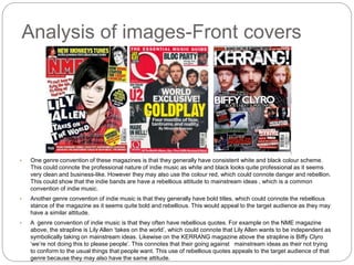
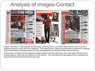
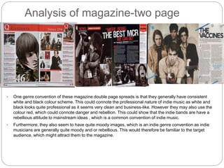
The document analyzes genre conventions in indie music magazines. It finds that they generally have consistent black and white color schemes with some red, representing professionalism but also rebellion. They also feature bold titles and rebellious quotes that appeal to audiences who value independence from mainstream ideas. Contents pages follow the traditional red and black colors and promote many indie artists. Double page spreads also use moody images, aligning with how indie musicians are portrayed as rebellious or moody. These visual conventions attract target audiences by feeling familiar to the indie genre.