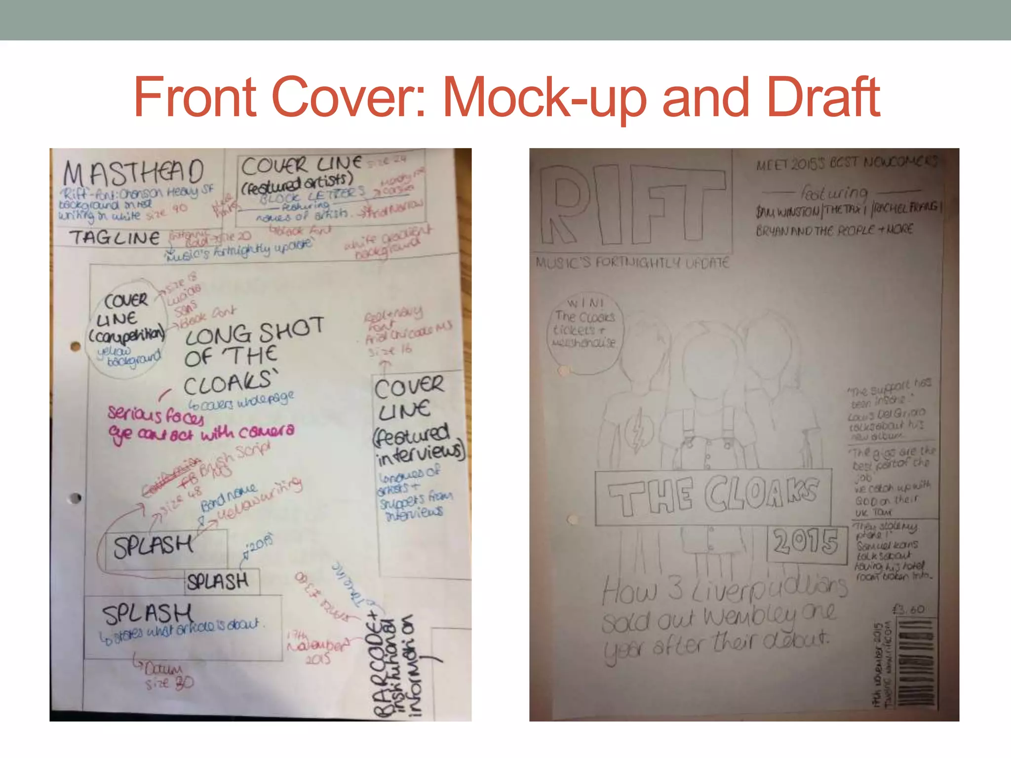
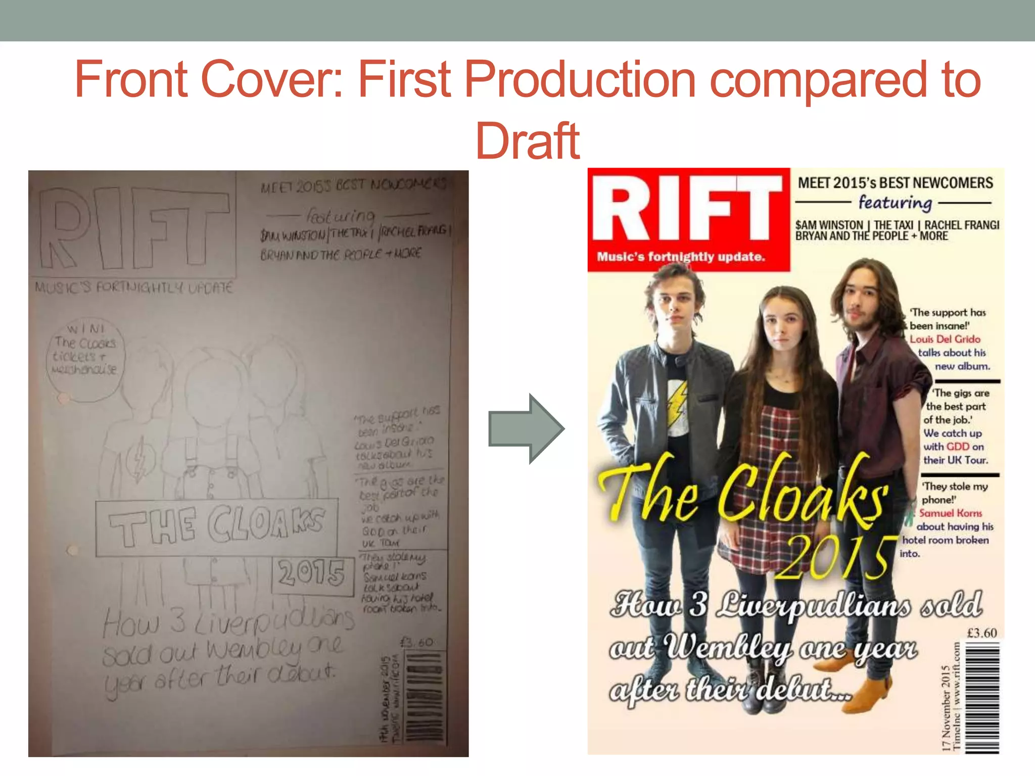
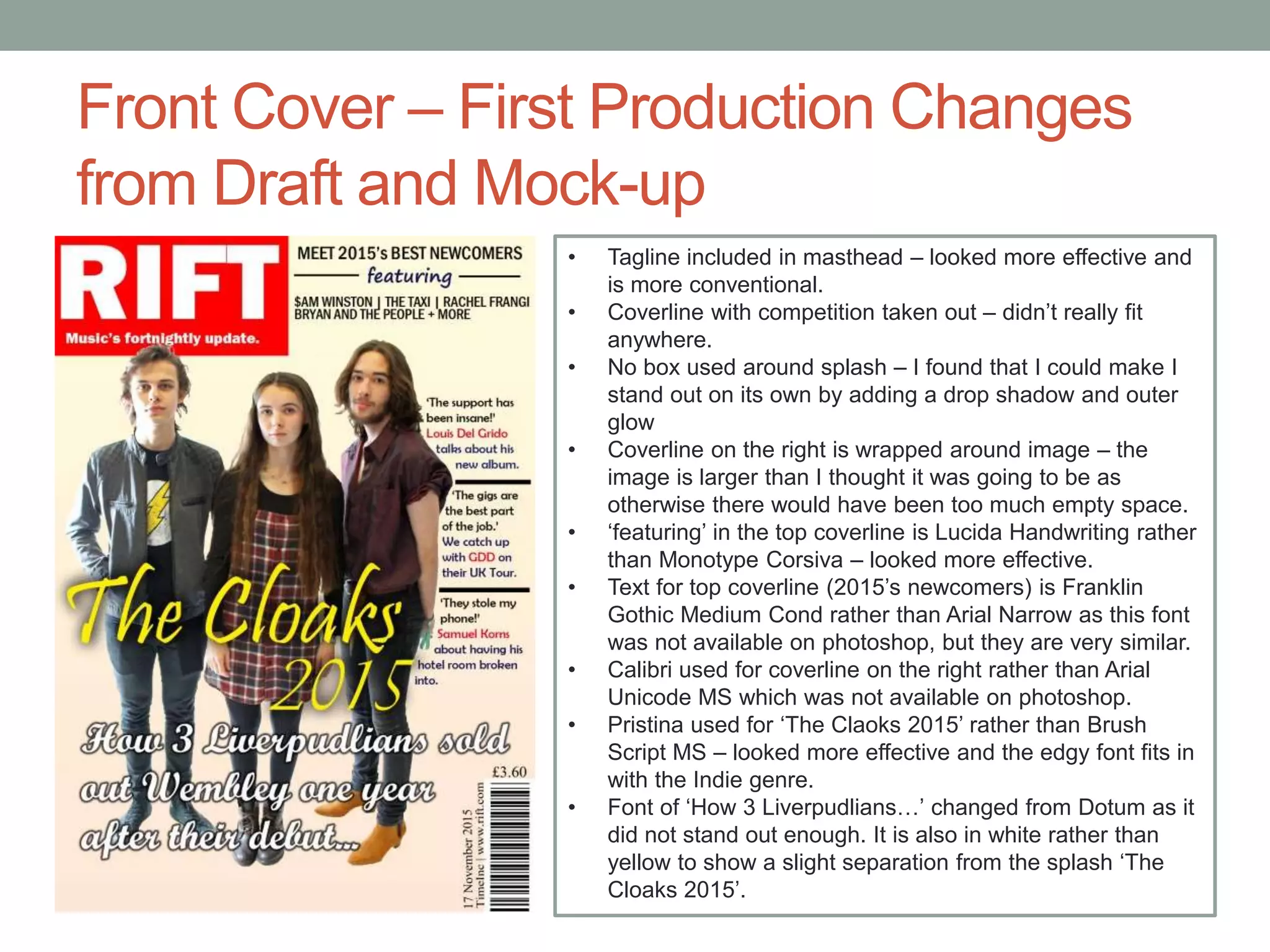
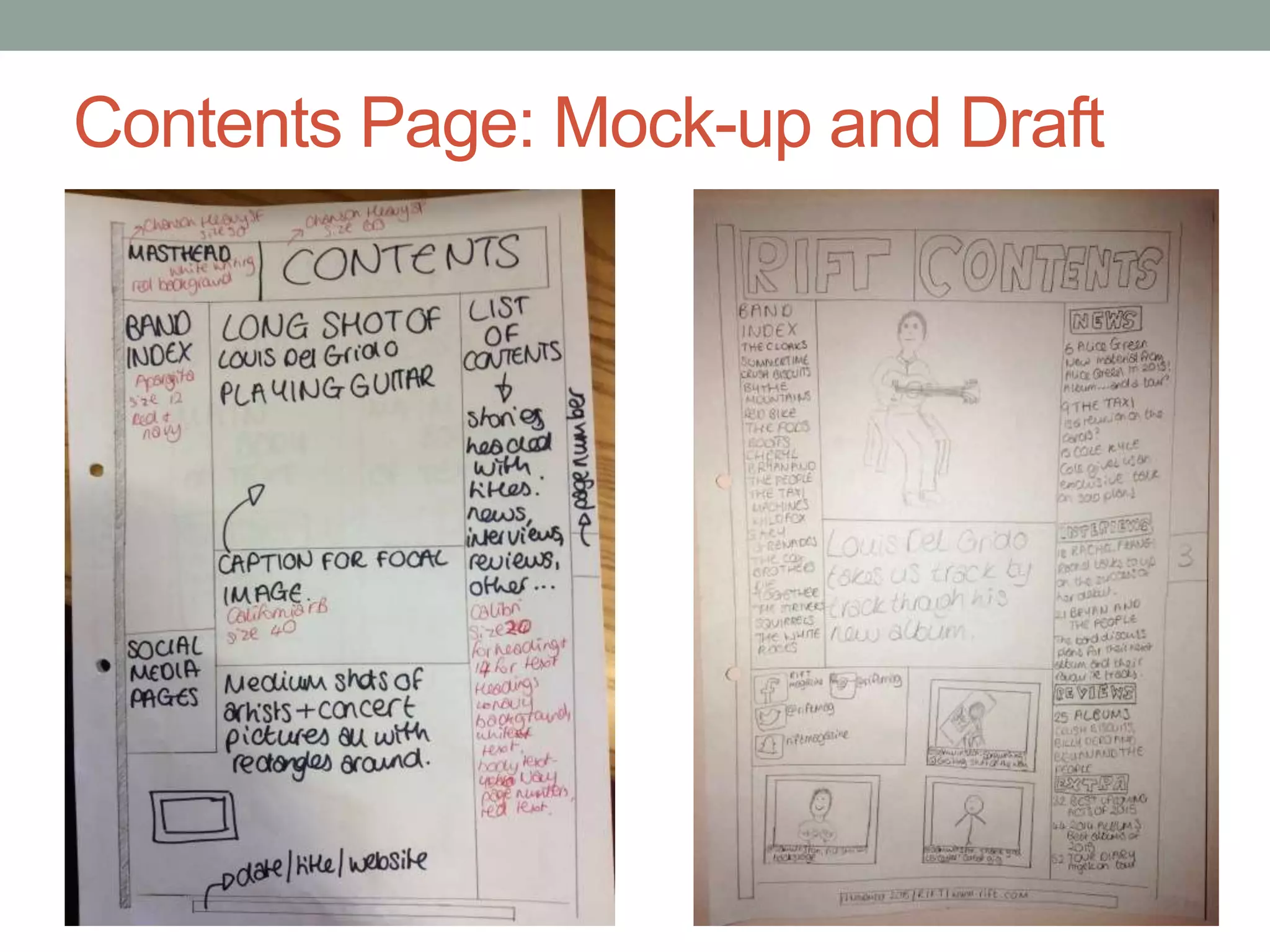
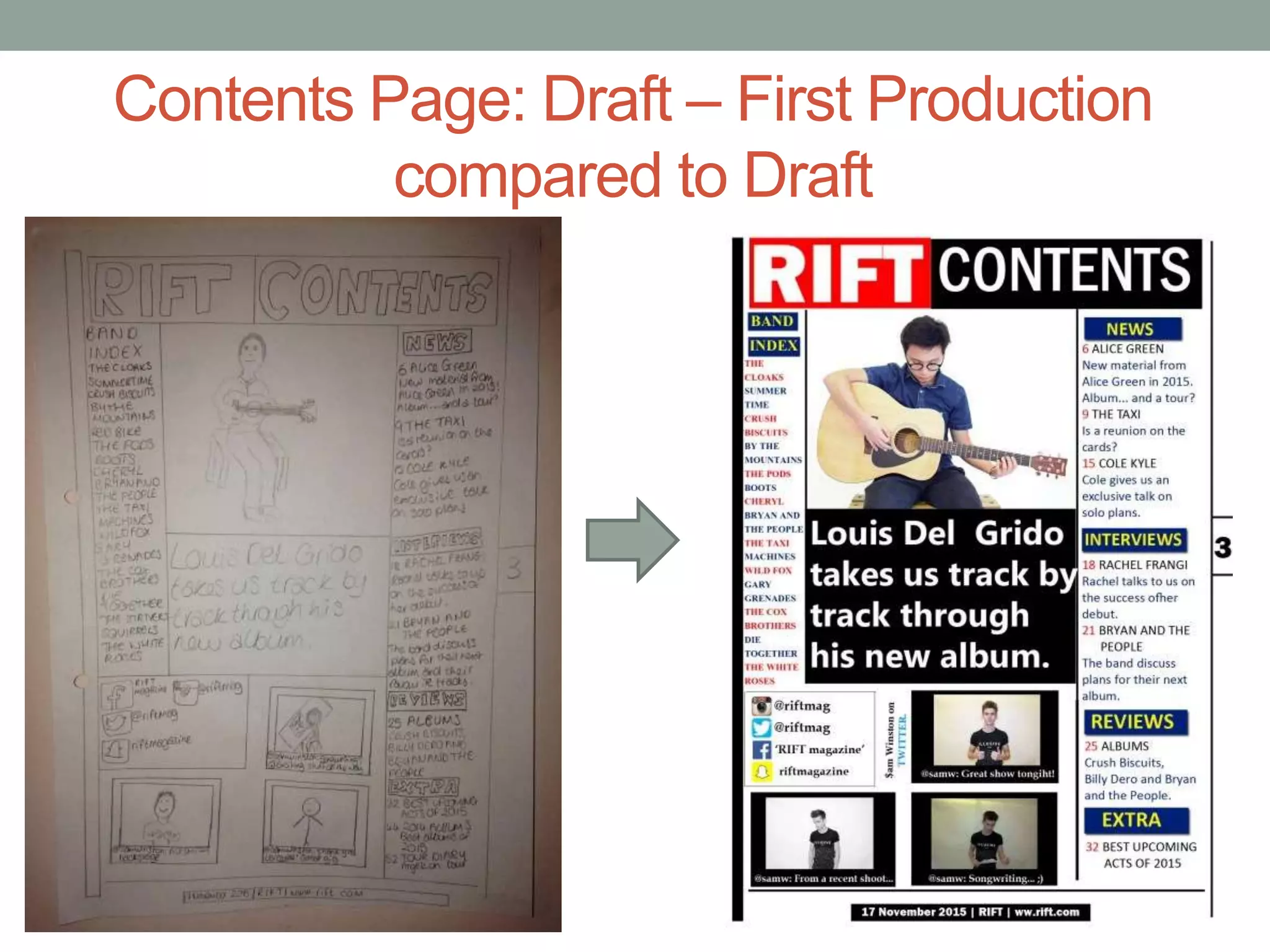
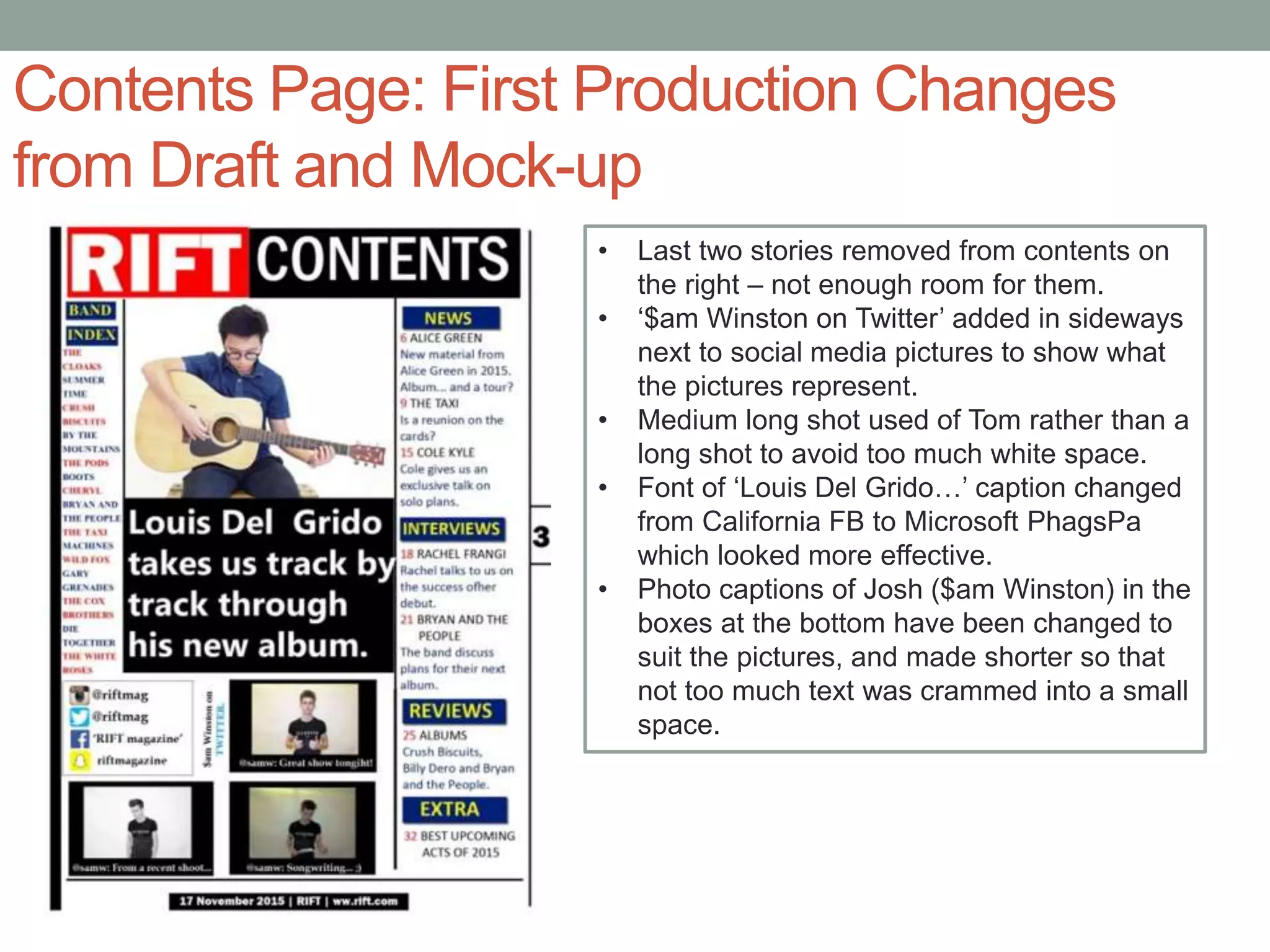
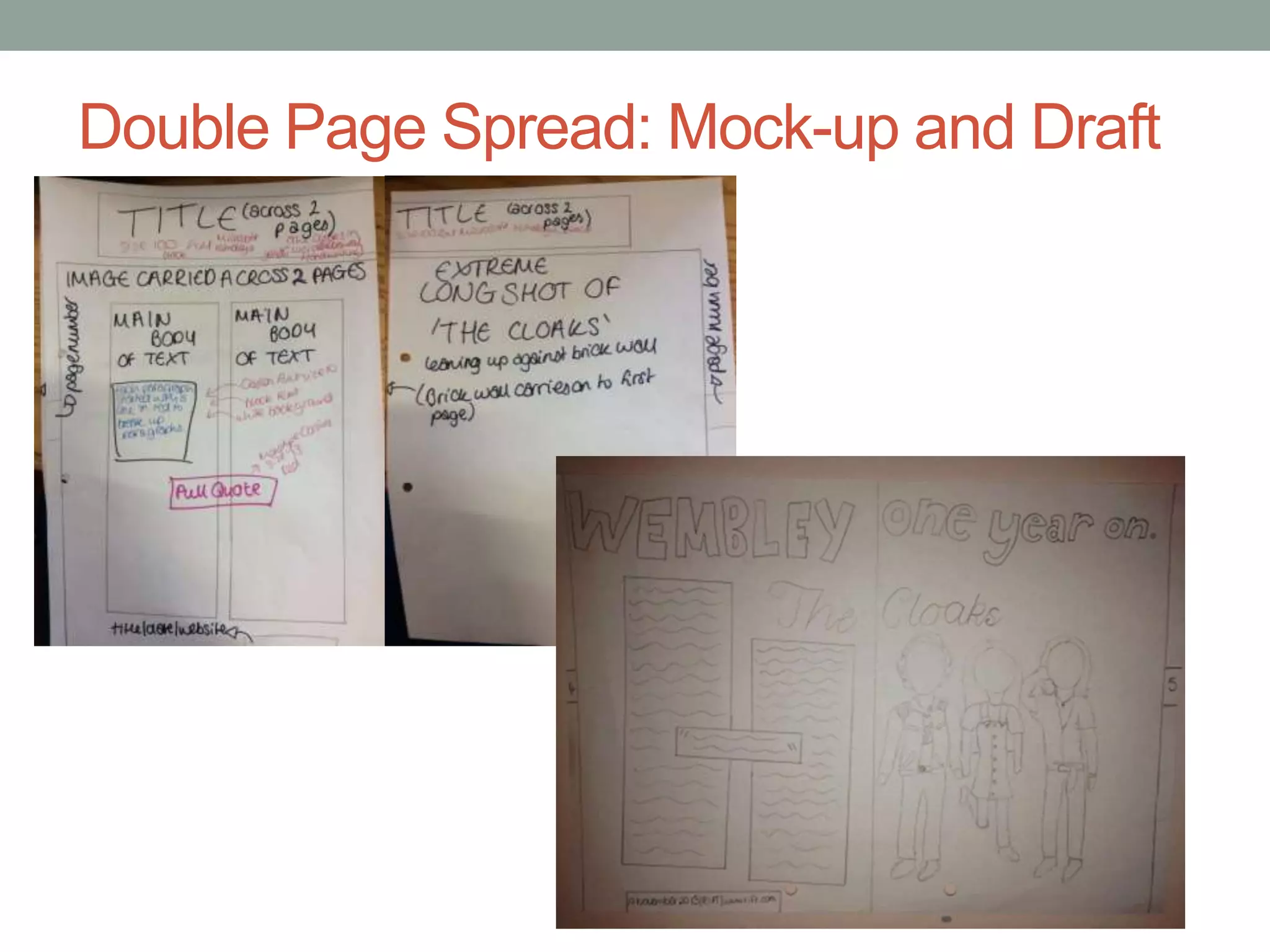
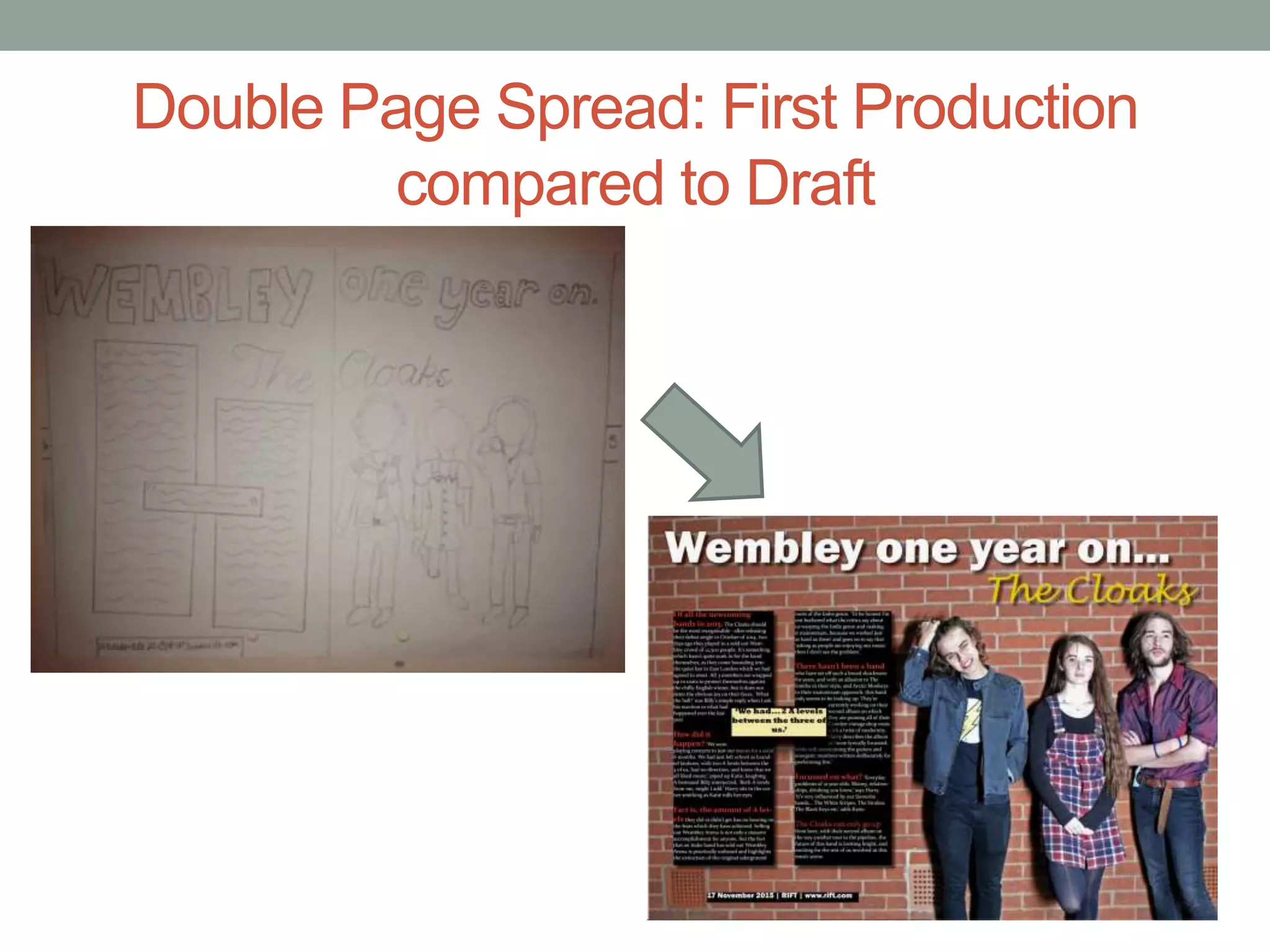
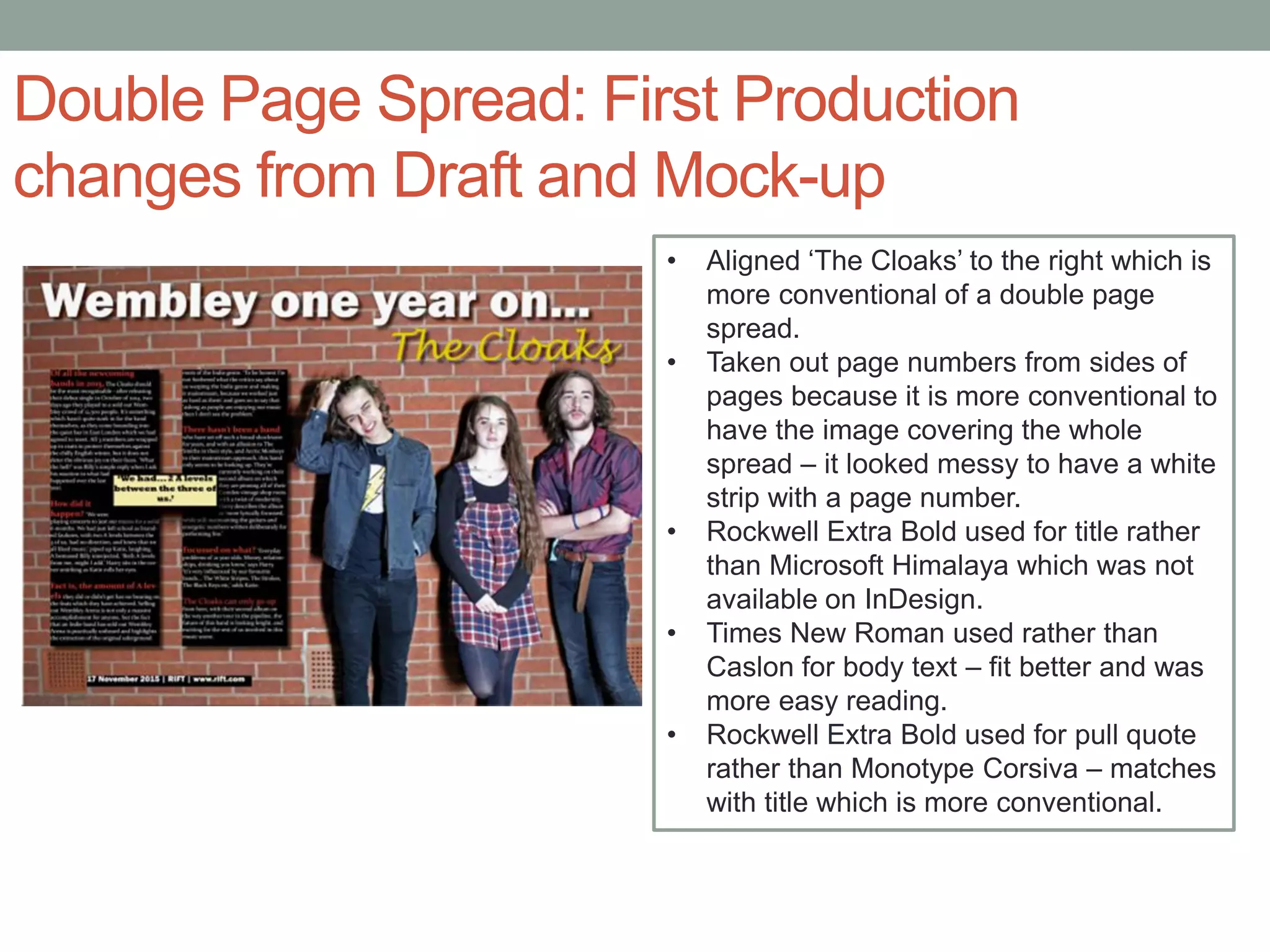
CORRECTIONS FROM
DRAFTS
Front Cover: Mock-up and Draft
Front Cover: First Production compared to
Draft
Front Cover – First Production Changes
from Draft and Mock-up
• Tagline included in masthead – looked more effective and
is more conventional.
• Coverline with competition taken out – didn’t really fit
anywhere.
• No box used around splash – I found that I could make I
stand out on its own by adding a drop shadow and outer
glow
• Coverline on the right is wrapped around image – the
image is larger than I thought it was going to be as
otherwise there would have been too much empty space.
• ‘featuring’ in the top coverline is Lucida Handwriting rather
than Monotype Corsiva – looked more effective.
• Text for top coverline (2015’s newcomers) is Franklin
Gothic Medium Cond rather than Arial Narrow as this font
was not available on photoshop, but they are very similar.
• Calibri used for coverline on the right rather than Arial
Unicode MS which was not available on photoshop.
• Pristina used for ‘The Claoks 2015’ rather than Brush
Script MS – looked more effective and the edgy font fits in
with the Indie genre.
• Font of ‘How 3 Liverpudlians…’ changed from Dotum as it
did not stand out enough. It is also in white rather than
yellow to show a slight separation from the splash ‘The
Cloaks 2015’.
Contents Page: Mock-up and Draft
Contents Page: Draft – First Production
compared to Draft
Contents Page: First Production Changes
from Draft and Mock-up
• Last two stories removed from contents on
the right – not enough room for them.
• ‘$am Winston on Twitter’ added in sideways
next to social media pictures to show what
the pictures represent.
• Medium long shot used of Tom rather than a
long shot to avoid too much white space.
• Font of ‘Louis Del Grido…’ caption changed
from California FB to Microsoft PhagsPa
which looked more effective.
• Photo captions of Josh ($am Winston) in the
boxes at the bottom have been changed to
suit the pictures, and made shorter so that
not too much text was crammed into a small
space.
Double Page Spread: Mock-up and Draft
Double Page Spread: First Production
compared to Draft
Double Page Spread: First Production
changes from Draft and Mock-up
• Aligned ‘The Cloaks’ to the right which is
more conventional of a double page
spread.
• Taken out page numbers from sides of
pages because it is more conventional to
have the image covering the whole
spread – it looked messy to have a white
strip with a page number.
• Rockwell Extra Bold used for title rather
than Microsoft Himalaya which was not
available on InDesign.
• Times New Roman used rather than
Caslon for body text – fit better and was
more easy reading.
• Rockwell Extra Bold used for pull quote
rather than Monotype Corsiva – matches
with title which is more conventional.

Drafts first production changes

  • 1.
  • 2.
  • 3.
    Front Cover: FirstProduction compared to Draft
  • 4.
    Front Cover –First Production Changes from Draft and Mock-up • Tagline included in masthead – looked more effective and is more conventional. • Coverline with competition taken out – didn’t really fit anywhere. • No box used around splash – I found that I could make I stand out on its own by adding a drop shadow and outer glow • Coverline on the right is wrapped around image – the image is larger than I thought it was going to be as otherwise there would have been too much empty space. • ‘featuring’ in the top coverline is Lucida Handwriting rather than Monotype Corsiva – looked more effective. • Text for top coverline (2015’s newcomers) is Franklin Gothic Medium Cond rather than Arial Narrow as this font was not available on photoshop, but they are very similar. • Calibri used for coverline on the right rather than Arial Unicode MS which was not available on photoshop. • Pristina used for ‘The Claoks 2015’ rather than Brush Script MS – looked more effective and the edgy font fits in with the Indie genre. • Font of ‘How 3 Liverpudlians…’ changed from Dotum as it did not stand out enough. It is also in white rather than yellow to show a slight separation from the splash ‘The Cloaks 2015’.
  • 5.
  • 6.
    Contents Page: Draft– First Production compared to Draft
  • 7.
    Contents Page: FirstProduction Changes from Draft and Mock-up • Last two stories removed from contents on the right – not enough room for them. • ‘$am Winston on Twitter’ added in sideways next to social media pictures to show what the pictures represent. • Medium long shot used of Tom rather than a long shot to avoid too much white space. • Font of ‘Louis Del Grido…’ caption changed from California FB to Microsoft PhagsPa which looked more effective. • Photo captions of Josh ($am Winston) in the boxes at the bottom have been changed to suit the pictures, and made shorter so that not too much text was crammed into a small space.
  • 8.
    Double Page Spread:Mock-up and Draft
  • 9.
    Double Page Spread:First Production compared to Draft
  • 10.
    Double Page Spread:First Production changes from Draft and Mock-up • Aligned ‘The Cloaks’ to the right which is more conventional of a double page spread. • Taken out page numbers from sides of pages because it is more conventional to have the image covering the whole spread – it looked messy to have a white strip with a page number. • Rockwell Extra Bold used for title rather than Microsoft Himalaya which was not available on InDesign. • Times New Roman used rather than Caslon for body text – fit better and was more easy reading. • Rockwell Extra Bold used for pull quote rather than Monotype Corsiva – matches with title which is more conventional.