SlideShare a Scribd company logo
1 of 65
TEXTUAL ANALYSIS 
FRONT PAGE 1 
B Y J A C K W A L S H
AUDIENCE 
I feel that the target audience of this magazine is 16-25 year olds, who are working to 
middle class and who are explorers. I also believe that this magazines target audience is 
uni-sex as it doesn't seem to be targeted at a single sex.
MASTHEAD 
• The Masthead 'NME' is on the top right hand side corner of the page, 
which makes it look professional, as it is in the correct format for a 
magazine. This would make it's target audience confident with the 
magazine as they know it is very professional. This could symbolise the 
high standard of quality generally shown in indie music and would attract 
its target audience if they likje high quality magazines and music. 
• Also, the Masthead 'NME' has a very vibrant colour (red), which would 
attract its target audience, because people would be attracted to it and 
therefore would be willing to buy it. I also, believe this makes the article 
seem quite bold, which could represent the rebellious nature of indie 
music and would attract its target audience if they have a similar 
disposition 
• Furthermore, it is also in a very large, which would also attract its target 
audience as they would be drawn in by large, bold writing.
MAIN IMAGE 
• You could argue that Jake Bugg is in Indie style 
clothes. This means that people who read Indie 
magazines (NME’s target audience) would probably 
like Jake Bugg’s style and would therefore read his 
magazine. 
• Also, the main image is in a typical indie style as it 
seems quite moody, which would attract the target 
audiences they would be familiar with the style and 
would therefore be attracted to it.
MAIN ARTICLE TITLE 
• The main article title is in the middle of the page, 
which is the correct format for a magazine article, 
which is professional because it seems more 
business-like. 
• Furthermore the title is very bold, which suggests a 
that ‘Jake Bugg’ has a non-conformist attitude and 
is symbolically making a bold stance against 
people.
COVER LINES 
• The cover line for ‘the killers’ has very vibrant colours, which 
would attract ‘NME’s’ target audience, because it is very eye-catching. 
Also ‘the killers’ in a more vibrant colour than the 
other cover lines, which suggests ‘The killers’ is more popular 
with magazines target audience and is therefore more likely to 
sell magazines if its in more vibrant colour.
STRAPLINE 
• This is the main headline of the article, which should 
draw the attention of the target audience will be 
interested to known what is inside. This is because the 
strapline is small enough to hook people and make 
them want to read the rest of the story. 
• The word ‘enemy’ suggests that ‘Jake Bugg’ is against 
the x factor, which is quite a popular show. This shows a 
non conformist attitude as he is going against something 
that many people watch. This is conventional for many 
indie musicians. This would appeal to the target 
audience if they were also non conformist as they may 
understand where ‘Jake ‘bugg’ is coming from
STRUCTURE 
The structure of this article draws attention to the main image by having him 
situated in the middle, which would appeal to the target audience as they would 
probably want to see an indie musician on the front cover. This is because people 
who like indie magazines probably want to be able to recognise the magazine, 
which indie musicians would be able to do.
TEXTUAL ANALYSIS 
FRONT PAGE 2
AUDIENCE 
I feel that the target audience of this magazine is 16-25 year olds, who are 
working to middle class and who are explorers. I also believe that this magazines 
target audience is uni-sex as it doesn't seem to be targeted at a single sex.
MASTHEAD 
• The masthead seems quite simple, which connotes 
professionalism as it seems very clean. This most 
likely symbolises the high-quality standard of indie 
music. The masthead also has very vibrant colours, 
which attracts the audience to the magazine as they 
can easily se it. This also most likely connotes indies 
music's bold stance, which would attract people who 
also feel this way as it shows that people can be proud 
to listen to indie music. This is because they may be 
comforted by thought that there are other people who 
listen to indie music.
MAIN IMAGE 
• You could say that ‘Florence's’ dark blue mascara is 
quite unusual, which shows a very explorer like 
attitude, which is a convention of many indie music 
artists. This would appeal to the indies target 
audience if they also had that or a similar attitude 
as they would probably like similar things. 
• However, although Florence looks quite unusal, the 
way she is looking at the camera still seems quite 
sexualised, which is common in mainstream 
magazine articles.
MAIN ARTICLE TITLE 
• The text seems very bold, but also quite clean, which 
wold attract indie audiences as Indie music is generally 
of a professional standard.
COVER LINES 
• Suggesting that ‘Skrillex’ might be a ‘noisy git’ 
shows a critical attitude to certain popular things, 
which is a common convention of the people who 
listen to indie music. This makes it seem like they 
are targeting their articles at people who like indie 
music, which would allow them to gain a large profit 
if those popele like the magazine.
STRAPLINE 
• The phrase ‘women on the edge’ could connote 
‘Florence's’ rebellious attitude as she is 
metaphorically living on the ‘edge’, which fits into 
the typical conventions of many indie bands. This 
would attract people who are interested in indie 
music as they would be most likely have a similar 
attitude and would want to listen to peoples music 
that shares their attitude to the world.
STRUCTURE 
The structure of this article draws attention to the main image by having him situated 
in the middle, which would appeal to the target audience as they would probably 
want to see an indie musician on the front cover. This is because people who like 
indie magazines probably want to be able to recognise the magazine, which indie 
musicians would be able to do.
TEXTUAL ANALYSIS 
FRONT PAGE 3
AUDIENCE 
I feel that the target audience of this magazine is 16-25 year olds, who are 
working to middle class and who are explorers. I also believe that this magazines 
target audience is uni-sex as it doesn't seem to be targeted at a single sex.
MASTHEAD 
• This it is very large and striking, which looks very 
bold. This could shows the rebellious nature as 
they are making a bold. 
• Furthermore, the style seem broken and archaic, 
which could represent the magazines anti-capitalist 
views.
MAIN IMAGE 
• The band is in the typical indie style of 
clothing as they are slightly unusual, which 
shows they are un-comformist as they are 
trying to find their own style. This would 
appeal to the indie target audience as they 
appreciate the fact the band is trying to find 
their own identity and no adhering to 
mainstream ideas.
MAIN ARTICLE TITLE 
• The phrase ‘we’re not doing this to please people’ which shows a very un-conformist 
attitude as they are doing it only for themselves and not doing it for 
anyone else. This is further emphasised by making the word ‘not’ stand out by 
using red.
COVER LINES 
• The cover lines are very jumbled and informal, which could suggest the 
chaotic attitude or un-conformist attitude of the band. This would appeal to 
their target audience if they are familiar with the magazines point of view.
STRAPLINE 
• This it is very large and striking, which looks very 
bold. This could shows the rebellious nature as 
they are making a bold. 
• Also, this directly the ‘rock’s’ dirctly links into the 
fact that it is a indie/rock magazine, which could 
appeal to the target audience if they are informed 
as to what the magazine is about.
STRUCTURE 
The structure of this front page seems quite professional as it is 
cleanly layed out on the page. This suggest that the magazine is indie 
as they are normally very high quality magazines.
TEXTUAL ANALYSIS 
CONTENTS PAGE 1
AUDIENCE 
I feel that the target audience of this magazine is 16-25 year olds, who are 
working to middle class and who are explorers. I also believe that this magazines 
target audience is uni-sex as it doesn't seem to be targeted at a single sex.
MASTHEAD 
• The single letter ‘Q’ seems quite simple, which connotes professionalism as it 
seems very clean and business-like. This most likely symbolises the high-quality 
standard of indie music. 
• Also the style the masthead is in the same style as all of ‘Q’s’ magazines, 
which connotes professionalism as there is consistency in their magazines. 
This would appeal to their target audience who like high quality magazines.
BANNER-INCLUDES TITLE AND CONTACT DETAILS 
• The entire banner looks very simple, which 
connotes professionalism as it is more business 
like. This could also connote the generally good 
quality music of indie musicians 
• Also, the use of contact details would appeal to the 
target audience, because if they enjoyed the 
magazine then they can easily find out more about 
the bands or where they can buy another 
magazine.
FEATURES 
• The first part of the contents are very ordered and 
professional as it is numbered, which connotes the 
professional standard of many indie magazines. 
This would appeal to fans of indie music as they 
would be able to easily recognise the magazine as 
and indie magazine, which make it easier to find.
MAIN IMAGE 
• The people in the image are wearing stereotypically 
indie clothes as they seem quite ‘normal’, which would 
attract their target audience if they find the clothes that 
people wear familiar to themselves. 
• The background seems quite unusual for many 
magazines, which could connote the courteeners 
attempt to be independent, which people who enjoy 
indie magazines would probably respect and want to find 
out more if they also think that way.
SPECIAL 
• The special is in a different colour to the main part 
of the magazine. This makes it seem more 
important as its in a gold colour. 
• It is also numbered, which makes it look 
proffesional as it seems very ordered. This is 
convention to indie magazines as they are normally 
good quality.
EVERY MONTH 
It is also numbered, which makes it look proffesional as it seems very ordered. 
This is convention to indie magazines as they are normally good quality.
REVIEW 
• The image in the review is professionally shot, which could connote the 
professional standard quality of indie magazines. This would appeal ‘Q’s’ 
target audience if they like proffesional magazines.
STRUCTURE 
• This structure of this page seems quite professional as its laid 
out in a table structure. This makes it look more professional 
as it seems more ordered and business-like. This could 
connote the high standard of quality of indie music and 
magazines, which people who enjoy music could appreciate.
TEXTURAL ANALYSAIS 
CONTENTS PAGE 2
AUDIENCE 
I feel that the target audience of this magazine is 16-25 year olds, who are 
working to middle class and who are explorers. I also believe that this magazines 
target audience is uni-sex as it doesn't seem to be targeted at a single sex.
BANNER- INCLUDING MASTHEAD 
• The masthead (NME) is very simple and bold as it is red and in capitals. 
I believe this could symbolise a non conformist attitude as it is trying to 
make a bold statement. This would attract the magazines target 
audience if they also felt this way.
CONTENTS - NEWS, RADAR, REVIEWS, LIVE AND 
FEATURES 
• The reviews as shown below contain many indie band names, which appeal 
to the indie target audience as they would most likely want to see bands that 
they enjoy (indie).
MAIN ARTICLE 
• The people in the image have an unusual variety of clothing and instruments, 
which connotes the ant-establisment ethos of indie music. This would appeal 
to the indie target audience if they have a similar disposition.
BAND INDEX 
• The band index is very ordered into a nice, easy to read column, which looks 
professional. This could represent the high quality standard of indie music 
magazines.
STRUCTURE 
• This structure of this page seems quite professional as its laid 
out in a table structure. This makes it look more professional as 
it seems more ordered and business-like. This could connote 
the high standard of quality of indie music and magazines, 
which people who enjoy music could appreciate.
TEXTURAL ANALYSAIS 
CONTENTS PAGE 3
AUDIENCE 
I feel that the target audience of this magazine is 16-25 year olds, who are 
working to middle class and who are explorers. I also believe that this 
magazines target audience is uni-sex as it doesn't seem to be targeted at a 
single sex.
BANNER- INCLUDING MASTHEAD 
• The banner and masthead seem very simplistic, which makes it seem 
professional as it looks quite buisness-like. This makes it seem very 
proffesional, which could connote the high quality standard of indie 
music. This would appeal to the indie target audience if they like high 
ulity magazines.
FEATURES 
• It is numbered, which makes it look professional as it seems very 
ordered. This is convention to indie magazines as they are normally 
good quality.
MAIN IMAGE 
• This person seems to be wearing quite indie clothing as it seems quite 
unusual. This is because it clothes are generally either unusual or working 
class. This would appeal to the indie target audience if they like people 
wearing those clothes.
STRUCTURE 
• This structure of this page seems quite professional as its laid 
out in a table structure. This makes it look more professional 
as it seems more ordered and business-like. This could 
connote the high standard of quality of indie music and 
magazines, which people who enjoy music could appreciate.
TEXTUAL ANALYSIS 
DOUBLE PAGE SPREAD 1
AUDIENCE 
I feel that the target audience of this magazine is 16-25 year olds, who are 
working to middle class and who are explorers. I also believe that this magazines 
target audience is uni-sex as it doesn't seem to be targeted at a single sex.
MAIN IMAGE 
• The image seems quite indie as the general 
picture seems quite grim and moody, because 
it uses extremely monochrome colours such 
as black and grey. This creates a slightly 
uncomfortable and edgy atmosphere, which is 
quite unusual for mainstream magazines as 
these are usually bright and colourful. This 
suggests that they are trying to move away 
from mainstream ideas, which is a typical 
convention of many indie artists and 
magazines.
TITLE 
• The title seems quite simple as it just black, which seems professional 
as it looks very business like. This could connote the high-quality of 
indie music magazines and indie music in general as they are normally 
of a high standard.
SUB-PARAGRAPH
ARTICLE 
• The article has a very clean professional style to it, 
which could connote the high quality standard of 
indie. This would appeal to indie music musicians if 
they like high quality magazines and music such as 
indie.
STRUCTURE 
• The structure of this double page spread seems very good as looks quite 
clean and professional.
TEXTUAL ANALYSIS 
DOUBLE PAGE SPREAD 2
MASTHEAD 
• The title seems quite bold as it sits across the entirety of the page. This 
could connote a bold rebellious stance, which is a convention of indie music. 
This would appeal to the target audience if they are of a similar disposition, 
because they may like the same things.
MAIN IMAGE 
• Due to the different lightings of the background this 
image is more convential to the rock genre than to 
indie. However, because indie is a subset of the 
rock genre it could appeal to the indie target 
audience as they might also like rock magazines as 
they are relatively similar (in terms of music) to 
rock. 
• Part of the background is red, which could connote 
danger or perhaps rebellion
BANNER 
• The textual font looks quite professional, which 
could connote the high quality standard of indie 
music as indie music is generally considered to be 
of good quality. This would appeal to the target 
audience of indie music as they may be more 
inclined to appreciate the high quality of the 
magazine.
MAIN ARTICLE 
• The layout of the main article seems quite ordered 
and professional as it has very clean looking 
paragraphs. This could further connote the high 
quality standard of indie music, which people who 
like indie music may appreciate.
STRUCTURE
TEXTUAL ANALYSIS 
DOUBLE PAGE SPREAD 3
TITLE 
• This is a very bold title in terms of size and colour as it is very large, 
which could connote a bold stance against the people that call her an 
‘attention seeker’. This is a convention of indie musicians as they 
generally have a rebellious attitude against what other people consider 
normal. 
• Furthermore, she says she is being ‘honest’, which could suggest 
connote that she is trying to tell the truth about society .
MAIN IMAGE 
• The woman has black hair and quite a lot 
of mascara, which makes her seem quite 
unusual as most magazines (apart from 
punk) do not have that sort of thing. This 
could connote the reader that she is un-conformist 
as she is going against what 
most people do. This would therefore 
appeal to the indie target audience if they 
enjoy looking at someone who shares their 
beliefs.
ARTICLE 
• The columns are actually quite ordered and professional, which could 
connote the high quality standard of indie of music. This would appeal to the 
target audience of indie music, because they might appreciate a high 
standard of quality in their magazines.
STRUCTURE 
• The structure of this double page spread seems quite messy, which connote the 
woman's unusual or non conformist attitudes. This is because she seems to be 
against having structure in her article, which is against mainstream ideas. This 
could appeal to her target audience if they share her feelings.

More Related Content

What's hot

Media Studies Coursework 1
Media Studies Coursework 1Media Studies Coursework 1
Media Studies Coursework 1Zoyia
 
Unit 30 lo2 simpson
Unit 30 lo2 simpsonUnit 30 lo2 simpson
Unit 30 lo2 simpsonjoliver1994
 
Evaluation questions
Evaluation questionsEvaluation questions
Evaluation questionsLeon Cheslett
 
Planning and research
Planning and researchPlanning and research
Planning and researchRhiya Heir
 
Evaluation Questions 4 and 5
Evaluation Questions 4 and 5Evaluation Questions 4 and 5
Evaluation Questions 4 and 5emilybritcliffe
 
My preliminary task
My preliminary taskMy preliminary task
My preliminary taskAmanda Geijs
 
Media evaluation
Media evaluationMedia evaluation
Media evaluationOllySnowxx
 
Magazine evaluation
Magazine evaluationMagazine evaluation
Magazine evaluationHeather
 
Coveranalysis[1]
Coveranalysis[1]Coveranalysis[1]
Coveranalysis[1]BigCheese1
 
Media Evaluation 2
Media Evaluation 2Media Evaluation 2
Media Evaluation 2LaurenBC
 
L.i.i.a.r analysis of q magazine
L.i.i.a.r analysis of q magazineL.i.i.a.r analysis of q magazine
L.i.i.a.r analysis of q magazineemily_rhian18
 
UNIT 30 LO2
UNIT 30 LO2 UNIT 30 LO2
UNIT 30 LO2 tmcenaney
 

What's hot (17)

Unzipped pitch
Unzipped pitchUnzipped pitch
Unzipped pitch
 
Media Studies Coursework 1
Media Studies Coursework 1Media Studies Coursework 1
Media Studies Coursework 1
 
Unit 30 lo2 simpson
Unit 30 lo2 simpsonUnit 30 lo2 simpson
Unit 30 lo2 simpson
 
Evaluation questions
Evaluation questionsEvaluation questions
Evaluation questions
 
Planning and research
Planning and researchPlanning and research
Planning and research
 
Evaluation
EvaluationEvaluation
Evaluation
 
Evaluation Questions 4 and 5
Evaluation Questions 4 and 5Evaluation Questions 4 and 5
Evaluation Questions 4 and 5
 
NEA Task 1,2,3,4
NEA Task 1,2,3,4NEA Task 1,2,3,4
NEA Task 1,2,3,4
 
My preliminary task
My preliminary taskMy preliminary task
My preliminary task
 
Media evaluation
Media evaluationMedia evaluation
Media evaluation
 
Magazine evaluation
Magazine evaluationMagazine evaluation
Magazine evaluation
 
Coveranalysis[1]
Coveranalysis[1]Coveranalysis[1]
Coveranalysis[1]
 
Media Evaluation 2
Media Evaluation 2Media Evaluation 2
Media Evaluation 2
 
Evaluation
EvaluationEvaluation
Evaluation
 
L.i.i.a.r analysis of q magazine
L.i.i.a.r analysis of q magazineL.i.i.a.r analysis of q magazine
L.i.i.a.r analysis of q magazine
 
UNIT 30 LO2
UNIT 30 LO2 UNIT 30 LO2
UNIT 30 LO2
 
Media evaluation question 2
Media evaluation question 2Media evaluation question 2
Media evaluation question 2
 

Viewers also liked

Theoretical research 2
Theoretical research 2Theoretical research 2
Theoretical research 2JACKWALSH10
 
Textual analysis (3)
Textual analysis (3)Textual analysis (3)
Textual analysis (3)JACKWALSH10
 
How did you attract your audience
How did you attract your audienceHow did you attract your audience
How did you attract your audienceJACKWALSH10
 
Hughs war on waste
Hughs war on wasteHughs war on waste
Hughs war on wasteJACKWALSH10
 
Textual analysis secrets of the super brands
Textual analysis secrets of the super brandsTextual analysis secrets of the super brands
Textual analysis secrets of the super brandsJACKWALSH10
 
Evaluation 3 what have you learnt from your audience feedback
Evaluation 3 what have you learnt from your audience feedbackEvaluation 3 what have you learnt from your audience feedback
Evaluation 3 what have you learnt from your audience feedbackJACKWALSH10
 
What i have learnt from my preliminary task
What i have learnt from my preliminary taskWhat i have learnt from my preliminary task
What i have learnt from my preliminary taskJACKWALSH10
 
Genre research (2)
Genre research (2)Genre research (2)
Genre research (2)JACKWALSH10
 
Genre research (2)
Genre research (2)Genre research (2)
Genre research (2)JACKWALSH10
 
Analysis of documenatries
Analysis of documenatriesAnalysis of documenatries
Analysis of documenatriesJACKWALSH10
 
Questionnaire analysis 2
Questionnaire analysis 2Questionnaire analysis 2
Questionnaire analysis 2JACKWALSH10
 
Britains really disgusting food
Britains really disgusting foodBritains really disgusting food
Britains really disgusting foodJACKWALSH10
 
Evaluation question 1 (2)
Evaluation  question 1 (2)Evaluation  question 1 (2)
Evaluation question 1 (2)JACKWALSH10
 
High school-unit-slam-poetry
High school-unit-slam-poetryHigh school-unit-slam-poetry
High school-unit-slam-poetrymradawetz
 
Yoshinori Ohsumi - a presentation in Polish
Yoshinori Ohsumi - a presentation in PolishYoshinori Ohsumi - a presentation in Polish
Yoshinori Ohsumi - a presentation in PolishLidia Rudnicka
 

Viewers also liked (20)

Theoretical research 2
Theoretical research 2Theoretical research 2
Theoretical research 2
 
Textual analysis (3)
Textual analysis (3)Textual analysis (3)
Textual analysis (3)
 
How did you attract your audience
How did you attract your audienceHow did you attract your audience
How did you attract your audience
 
Hughs war on waste
Hughs war on wasteHughs war on waste
Hughs war on waste
 
Textual analysis secrets of the super brands
Textual analysis secrets of the super brandsTextual analysis secrets of the super brands
Textual analysis secrets of the super brands
 
Welcome to paris.1.2
Welcome to paris.1.2Welcome to paris.1.2
Welcome to paris.1.2
 
7 question
7 question7 question
7 question
 
Evaluation 3 what have you learnt from your audience feedback
Evaluation 3 what have you learnt from your audience feedbackEvaluation 3 what have you learnt from your audience feedback
Evaluation 3 what have you learnt from your audience feedback
 
What i have learnt from my preliminary task
What i have learnt from my preliminary taskWhat i have learnt from my preliminary task
What i have learnt from my preliminary task
 
Food inc (1)
Food inc (1)Food inc (1)
Food inc (1)
 
Genre research (2)
Genre research (2)Genre research (2)
Genre research (2)
 
Documentruies
DocumentruiesDocumentruies
Documentruies
 
Genre research (2)
Genre research (2)Genre research (2)
Genre research (2)
 
Analysis of documenatries
Analysis of documenatriesAnalysis of documenatries
Analysis of documenatries
 
Questionnaire analysis 2
Questionnaire analysis 2Questionnaire analysis 2
Questionnaire analysis 2
 
Documentruies
DocumentruiesDocumentruies
Documentruies
 
Britains really disgusting food
Britains really disgusting foodBritains really disgusting food
Britains really disgusting food
 
Evaluation question 1 (2)
Evaluation  question 1 (2)Evaluation  question 1 (2)
Evaluation question 1 (2)
 
High school-unit-slam-poetry
High school-unit-slam-poetryHigh school-unit-slam-poetry
High school-unit-slam-poetry
 
Yoshinori Ohsumi - a presentation in Polish
Yoshinori Ohsumi - a presentation in PolishYoshinori Ohsumi - a presentation in Polish
Yoshinori Ohsumi - a presentation in Polish
 

Similar to Discover Indie Musicians and Culture

Similar to Discover Indie Musicians and Culture (20)

Vibe
VibeVibe
Vibe
 
4)who would be the audience for your media
4)who would be the audience for your media4)who would be the audience for your media
4)who would be the audience for your media
 
Task 9 formal proposal
Task 9   formal proposal Task 9   formal proposal
Task 9 formal proposal
 
Media evaluation- Question 3
Media evaluation- Question 3Media evaluation- Question 3
Media evaluation- Question 3
 
Iconography
Iconography Iconography
Iconography
 
Planning my music magazine
Planning my music magazinePlanning my music magazine
Planning my music magazine
 
Source
SourceSource
Source
 
Unit 13 - LO2
Unit 13 - LO2Unit 13 - LO2
Unit 13 - LO2
 
Q5
Q5Q5
Q5
 
Media Evaluation
Media EvaluationMedia Evaluation
Media Evaluation
 
Planning and research
Planning and researchPlanning and research
Planning and research
 
Different Genres of Music Magazine
Different Genres of Music MagazineDifferent Genres of Music Magazine
Different Genres of Music Magazine
 
Media evaluation - Question 3
Media evaluation - Question 3Media evaluation - Question 3
Media evaluation - Question 3
 
Question five
Question fiveQuestion five
Question five
 
Evaluation
EvaluationEvaluation
Evaluation
 
Evaluation
EvaluationEvaluation
Evaluation
 
Evaluation
EvaluationEvaluation
Evaluation
 
Evaluation
EvaluationEvaluation
Evaluation
 
Evaluation
EvaluationEvaluation
Evaluation
 
Evaluation
EvaluationEvaluation
Evaluation
 

Recently uploaded

BDSM⚡Call Girls in Sector 76 Noida Escorts >༒8448380779 Escort Service
BDSM⚡Call Girls in Sector 76 Noida Escorts >༒8448380779 Escort ServiceBDSM⚡Call Girls in Sector 76 Noida Escorts >༒8448380779 Escort Service
BDSM⚡Call Girls in Sector 76 Noida Escorts >༒8448380779 Escort ServiceDelhi Call girls
 
SELECTING A SOCIAL MEDIA MARKETING COMPANY
SELECTING A SOCIAL MEDIA MARKETING COMPANYSELECTING A SOCIAL MEDIA MARKETING COMPANY
SELECTING A SOCIAL MEDIA MARKETING COMPANYdizinfo
 
Night 7k Call Girls Noida Sector 121 Call Me: 8448380779
Night 7k Call Girls Noida Sector 121 Call Me: 8448380779Night 7k Call Girls Noida Sector 121 Call Me: 8448380779
Night 7k Call Girls Noida Sector 121 Call Me: 8448380779Delhi Call girls
 
O9654467111 Call Girls In Dwarka Women Seeking Men
O9654467111 Call Girls In Dwarka Women Seeking MenO9654467111 Call Girls In Dwarka Women Seeking Men
O9654467111 Call Girls In Dwarka Women Seeking MenSapana Sha
 
Elite Class ➥8448380779▻ Call Girls In New Friends Colony Delhi NCR
Elite Class ➥8448380779▻ Call Girls In New Friends Colony Delhi NCRElite Class ➥8448380779▻ Call Girls In New Friends Colony Delhi NCR
Elite Class ➥8448380779▻ Call Girls In New Friends Colony Delhi NCRDelhi Call girls
 
Factors-on-Authenticity-and-Validity-of-Evidences-and-Information.pptx
Factors-on-Authenticity-and-Validity-of-Evidences-and-Information.pptxFactors-on-Authenticity-and-Validity-of-Evidences-and-Information.pptx
Factors-on-Authenticity-and-Validity-of-Evidences-and-Information.pptxvemusae
 
Call Girls In Noida Mall Of Noida O9654467111 Escorts Serviec
Call Girls In Noida Mall Of Noida O9654467111 Escorts ServiecCall Girls In Noida Mall Of Noida O9654467111 Escorts Serviec
Call Girls In Noida Mall Of Noida O9654467111 Escorts ServiecSapana Sha
 
Unlock the power of Instagram with SocioCosmos. Start your journey towards so...
Unlock the power of Instagram with SocioCosmos. Start your journey towards so...Unlock the power of Instagram with SocioCosmos. Start your journey towards so...
Unlock the power of Instagram with SocioCosmos. Start your journey towards so...SocioCosmos
 
Night 7k Call Girls Pari Chowk Escorts Call Me: 8448380779
Night 7k Call Girls Pari Chowk Escorts Call Me: 8448380779Night 7k Call Girls Pari Chowk Escorts Call Me: 8448380779
Night 7k Call Girls Pari Chowk Escorts Call Me: 8448380779Delhi Call girls
 
Top Call Girls In Charbagh ( Lucknow ) 🔝 8923113531 🔝 Cash Payment
Top Call Girls In Charbagh ( Lucknow  ) 🔝 8923113531 🔝  Cash PaymentTop Call Girls In Charbagh ( Lucknow  ) 🔝 8923113531 🔝  Cash Payment
Top Call Girls In Charbagh ( Lucknow ) 🔝 8923113531 🔝 Cash Paymentanilsa9823
 
c Starting with 5000/- for Savita Escorts Service 👩🏽‍❤️‍💋‍👨🏿 8923113531 ♢ Boo...
c Starting with 5000/- for Savita Escorts Service 👩🏽‍❤️‍💋‍👨🏿 8923113531 ♢ Boo...c Starting with 5000/- for Savita Escorts Service 👩🏽‍❤️‍💋‍👨🏿 8923113531 ♢ Boo...
c Starting with 5000/- for Savita Escorts Service 👩🏽‍❤️‍💋‍👨🏿 8923113531 ♢ Boo...gurkirankumar98700
 
Call Girls In South Ex. Delhi O9654467111 Women Seeking Men
Call Girls In South Ex. Delhi O9654467111 Women Seeking MenCall Girls In South Ex. Delhi O9654467111 Women Seeking Men
Call Girls In South Ex. Delhi O9654467111 Women Seeking MenSapana Sha
 
CALL ON ➥8923113531 🔝Call Girls Takrohi Lucknow best Female service 👖
CALL ON ➥8923113531 🔝Call Girls Takrohi Lucknow best Female service  👖CALL ON ➥8923113531 🔝Call Girls Takrohi Lucknow best Female service  👖
CALL ON ➥8923113531 🔝Call Girls Takrohi Lucknow best Female service 👖anilsa9823
 
This is a Powerpoint about research into the codes and conventions of a film ...
This is a Powerpoint about research into the codes and conventions of a film ...This is a Powerpoint about research into the codes and conventions of a film ...
This is a Powerpoint about research into the codes and conventions of a film ...samuelcoulson30
 
Film show pre-production powerpoint for site
Film show pre-production powerpoint for siteFilm show pre-production powerpoint for site
Film show pre-production powerpoint for siteAshtonCains
 
Your LinkedIn Makeover: Sociocosmos Presence Package
Your LinkedIn Makeover: Sociocosmos Presence PackageYour LinkedIn Makeover: Sociocosmos Presence Package
Your LinkedIn Makeover: Sociocosmos Presence PackageSocioCosmos
 
DickinsonSlides teeeeeeeeeeessssssssssst.pptx
DickinsonSlides teeeeeeeeeeessssssssssst.pptxDickinsonSlides teeeeeeeeeeessssssssssst.pptx
DickinsonSlides teeeeeeeeeeessssssssssst.pptxednyonat
 
CALL ON ➥8923113531 🔝Call Girls Ashiyana Colony Lucknow best sexual service O...
CALL ON ➥8923113531 🔝Call Girls Ashiyana Colony Lucknow best sexual service O...CALL ON ➥8923113531 🔝Call Girls Ashiyana Colony Lucknow best sexual service O...
CALL ON ➥8923113531 🔝Call Girls Ashiyana Colony Lucknow best sexual service O...anilsa9823
 
9990611130 Find & Book Russian Call Girls In Crossings Republik
9990611130 Find & Book Russian Call Girls In Crossings Republik9990611130 Find & Book Russian Call Girls In Crossings Republik
9990611130 Find & Book Russian Call Girls In Crossings RepublikGenuineGirls
 

Recently uploaded (20)

BDSM⚡Call Girls in Sector 76 Noida Escorts >༒8448380779 Escort Service
BDSM⚡Call Girls in Sector 76 Noida Escorts >༒8448380779 Escort ServiceBDSM⚡Call Girls in Sector 76 Noida Escorts >༒8448380779 Escort Service
BDSM⚡Call Girls in Sector 76 Noida Escorts >༒8448380779 Escort Service
 
SELECTING A SOCIAL MEDIA MARKETING COMPANY
SELECTING A SOCIAL MEDIA MARKETING COMPANYSELECTING A SOCIAL MEDIA MARKETING COMPANY
SELECTING A SOCIAL MEDIA MARKETING COMPANY
 
Night 7k Call Girls Noida Sector 121 Call Me: 8448380779
Night 7k Call Girls Noida Sector 121 Call Me: 8448380779Night 7k Call Girls Noida Sector 121 Call Me: 8448380779
Night 7k Call Girls Noida Sector 121 Call Me: 8448380779
 
O9654467111 Call Girls In Dwarka Women Seeking Men
O9654467111 Call Girls In Dwarka Women Seeking MenO9654467111 Call Girls In Dwarka Women Seeking Men
O9654467111 Call Girls In Dwarka Women Seeking Men
 
Elite Class ➥8448380779▻ Call Girls In New Friends Colony Delhi NCR
Elite Class ➥8448380779▻ Call Girls In New Friends Colony Delhi NCRElite Class ➥8448380779▻ Call Girls In New Friends Colony Delhi NCR
Elite Class ➥8448380779▻ Call Girls In New Friends Colony Delhi NCR
 
Factors-on-Authenticity-and-Validity-of-Evidences-and-Information.pptx
Factors-on-Authenticity-and-Validity-of-Evidences-and-Information.pptxFactors-on-Authenticity-and-Validity-of-Evidences-and-Information.pptx
Factors-on-Authenticity-and-Validity-of-Evidences-and-Information.pptx
 
Russian Call Girls Rohini Sector 37 💓 Delhi 9999965857 @Sabina Modi VVIP MODE...
Russian Call Girls Rohini Sector 37 💓 Delhi 9999965857 @Sabina Modi VVIP MODE...Russian Call Girls Rohini Sector 37 💓 Delhi 9999965857 @Sabina Modi VVIP MODE...
Russian Call Girls Rohini Sector 37 💓 Delhi 9999965857 @Sabina Modi VVIP MODE...
 
Call Girls In Noida Mall Of Noida O9654467111 Escorts Serviec
Call Girls In Noida Mall Of Noida O9654467111 Escorts ServiecCall Girls In Noida Mall Of Noida O9654467111 Escorts Serviec
Call Girls In Noida Mall Of Noida O9654467111 Escorts Serviec
 
Unlock the power of Instagram with SocioCosmos. Start your journey towards so...
Unlock the power of Instagram with SocioCosmos. Start your journey towards so...Unlock the power of Instagram with SocioCosmos. Start your journey towards so...
Unlock the power of Instagram with SocioCosmos. Start your journey towards so...
 
Night 7k Call Girls Pari Chowk Escorts Call Me: 8448380779
Night 7k Call Girls Pari Chowk Escorts Call Me: 8448380779Night 7k Call Girls Pari Chowk Escorts Call Me: 8448380779
Night 7k Call Girls Pari Chowk Escorts Call Me: 8448380779
 
Top Call Girls In Charbagh ( Lucknow ) 🔝 8923113531 🔝 Cash Payment
Top Call Girls In Charbagh ( Lucknow  ) 🔝 8923113531 🔝  Cash PaymentTop Call Girls In Charbagh ( Lucknow  ) 🔝 8923113531 🔝  Cash Payment
Top Call Girls In Charbagh ( Lucknow ) 🔝 8923113531 🔝 Cash Payment
 
c Starting with 5000/- for Savita Escorts Service 👩🏽‍❤️‍💋‍👨🏿 8923113531 ♢ Boo...
c Starting with 5000/- for Savita Escorts Service 👩🏽‍❤️‍💋‍👨🏿 8923113531 ♢ Boo...c Starting with 5000/- for Savita Escorts Service 👩🏽‍❤️‍💋‍👨🏿 8923113531 ♢ Boo...
c Starting with 5000/- for Savita Escorts Service 👩🏽‍❤️‍💋‍👨🏿 8923113531 ♢ Boo...
 
Call Girls In South Ex. Delhi O9654467111 Women Seeking Men
Call Girls In South Ex. Delhi O9654467111 Women Seeking MenCall Girls In South Ex. Delhi O9654467111 Women Seeking Men
Call Girls In South Ex. Delhi O9654467111 Women Seeking Men
 
CALL ON ➥8923113531 🔝Call Girls Takrohi Lucknow best Female service 👖
CALL ON ➥8923113531 🔝Call Girls Takrohi Lucknow best Female service  👖CALL ON ➥8923113531 🔝Call Girls Takrohi Lucknow best Female service  👖
CALL ON ➥8923113531 🔝Call Girls Takrohi Lucknow best Female service 👖
 
This is a Powerpoint about research into the codes and conventions of a film ...
This is a Powerpoint about research into the codes and conventions of a film ...This is a Powerpoint about research into the codes and conventions of a film ...
This is a Powerpoint about research into the codes and conventions of a film ...
 
Film show pre-production powerpoint for site
Film show pre-production powerpoint for siteFilm show pre-production powerpoint for site
Film show pre-production powerpoint for site
 
Your LinkedIn Makeover: Sociocosmos Presence Package
Your LinkedIn Makeover: Sociocosmos Presence PackageYour LinkedIn Makeover: Sociocosmos Presence Package
Your LinkedIn Makeover: Sociocosmos Presence Package
 
DickinsonSlides teeeeeeeeeeessssssssssst.pptx
DickinsonSlides teeeeeeeeeeessssssssssst.pptxDickinsonSlides teeeeeeeeeeessssssssssst.pptx
DickinsonSlides teeeeeeeeeeessssssssssst.pptx
 
CALL ON ➥8923113531 🔝Call Girls Ashiyana Colony Lucknow best sexual service O...
CALL ON ➥8923113531 🔝Call Girls Ashiyana Colony Lucknow best sexual service O...CALL ON ➥8923113531 🔝Call Girls Ashiyana Colony Lucknow best sexual service O...
CALL ON ➥8923113531 🔝Call Girls Ashiyana Colony Lucknow best sexual service O...
 
9990611130 Find & Book Russian Call Girls In Crossings Republik
9990611130 Find & Book Russian Call Girls In Crossings Republik9990611130 Find & Book Russian Call Girls In Crossings Republik
9990611130 Find & Book Russian Call Girls In Crossings Republik
 

Discover Indie Musicians and Culture

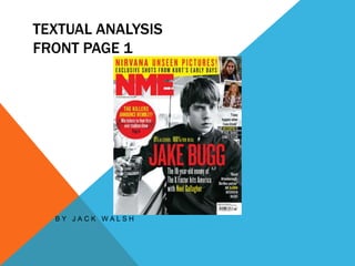
  • 1. TEXTUAL ANALYSIS FRONT PAGE 1 B Y J A C K W A L S H
  • 2. AUDIENCE I feel that the target audience of this magazine is 16-25 year olds, who are working to middle class and who are explorers. I also believe that this magazines target audience is uni-sex as it doesn't seem to be targeted at a single sex.
  • 3. MASTHEAD • The Masthead 'NME' is on the top right hand side corner of the page, which makes it look professional, as it is in the correct format for a magazine. This would make it's target audience confident with the magazine as they know it is very professional. This could symbolise the high standard of quality generally shown in indie music and would attract its target audience if they likje high quality magazines and music. • Also, the Masthead 'NME' has a very vibrant colour (red), which would attract its target audience, because people would be attracted to it and therefore would be willing to buy it. I also, believe this makes the article seem quite bold, which could represent the rebellious nature of indie music and would attract its target audience if they have a similar disposition • Furthermore, it is also in a very large, which would also attract its target audience as they would be drawn in by large, bold writing.
  • 4. MAIN IMAGE • You could argue that Jake Bugg is in Indie style clothes. This means that people who read Indie magazines (NME’s target audience) would probably like Jake Bugg’s style and would therefore read his magazine. • Also, the main image is in a typical indie style as it seems quite moody, which would attract the target audiences they would be familiar with the style and would therefore be attracted to it.
  • 5. MAIN ARTICLE TITLE • The main article title is in the middle of the page, which is the correct format for a magazine article, which is professional because it seems more business-like. • Furthermore the title is very bold, which suggests a that ‘Jake Bugg’ has a non-conformist attitude and is symbolically making a bold stance against people.
  • 6. COVER LINES • The cover line for ‘the killers’ has very vibrant colours, which would attract ‘NME’s’ target audience, because it is very eye-catching. Also ‘the killers’ in a more vibrant colour than the other cover lines, which suggests ‘The killers’ is more popular with magazines target audience and is therefore more likely to sell magazines if its in more vibrant colour.
  • 7. STRAPLINE • This is the main headline of the article, which should draw the attention of the target audience will be interested to known what is inside. This is because the strapline is small enough to hook people and make them want to read the rest of the story. • The word ‘enemy’ suggests that ‘Jake Bugg’ is against the x factor, which is quite a popular show. This shows a non conformist attitude as he is going against something that many people watch. This is conventional for many indie musicians. This would appeal to the target audience if they were also non conformist as they may understand where ‘Jake ‘bugg’ is coming from
  • 8. STRUCTURE The structure of this article draws attention to the main image by having him situated in the middle, which would appeal to the target audience as they would probably want to see an indie musician on the front cover. This is because people who like indie magazines probably want to be able to recognise the magazine, which indie musicians would be able to do.
  • 10. AUDIENCE I feel that the target audience of this magazine is 16-25 year olds, who are working to middle class and who are explorers. I also believe that this magazines target audience is uni-sex as it doesn't seem to be targeted at a single sex.
  • 11. MASTHEAD • The masthead seems quite simple, which connotes professionalism as it seems very clean. This most likely symbolises the high-quality standard of indie music. The masthead also has very vibrant colours, which attracts the audience to the magazine as they can easily se it. This also most likely connotes indies music's bold stance, which would attract people who also feel this way as it shows that people can be proud to listen to indie music. This is because they may be comforted by thought that there are other people who listen to indie music.
  • 12. MAIN IMAGE • You could say that ‘Florence's’ dark blue mascara is quite unusual, which shows a very explorer like attitude, which is a convention of many indie music artists. This would appeal to the indies target audience if they also had that or a similar attitude as they would probably like similar things. • However, although Florence looks quite unusal, the way she is looking at the camera still seems quite sexualised, which is common in mainstream magazine articles.
  • 13. MAIN ARTICLE TITLE • The text seems very bold, but also quite clean, which wold attract indie audiences as Indie music is generally of a professional standard.
  • 14. COVER LINES • Suggesting that ‘Skrillex’ might be a ‘noisy git’ shows a critical attitude to certain popular things, which is a common convention of the people who listen to indie music. This makes it seem like they are targeting their articles at people who like indie music, which would allow them to gain a large profit if those popele like the magazine.
  • 15. STRAPLINE • The phrase ‘women on the edge’ could connote ‘Florence's’ rebellious attitude as she is metaphorically living on the ‘edge’, which fits into the typical conventions of many indie bands. This would attract people who are interested in indie music as they would be most likely have a similar attitude and would want to listen to peoples music that shares their attitude to the world.
  • 16. STRUCTURE The structure of this article draws attention to the main image by having him situated in the middle, which would appeal to the target audience as they would probably want to see an indie musician on the front cover. This is because people who like indie magazines probably want to be able to recognise the magazine, which indie musicians would be able to do.
  • 18. AUDIENCE I feel that the target audience of this magazine is 16-25 year olds, who are working to middle class and who are explorers. I also believe that this magazines target audience is uni-sex as it doesn't seem to be targeted at a single sex.
  • 19. MASTHEAD • This it is very large and striking, which looks very bold. This could shows the rebellious nature as they are making a bold. • Furthermore, the style seem broken and archaic, which could represent the magazines anti-capitalist views.
  • 20. MAIN IMAGE • The band is in the typical indie style of clothing as they are slightly unusual, which shows they are un-comformist as they are trying to find their own style. This would appeal to the indie target audience as they appreciate the fact the band is trying to find their own identity and no adhering to mainstream ideas.
  • 21. MAIN ARTICLE TITLE • The phrase ‘we’re not doing this to please people’ which shows a very un-conformist attitude as they are doing it only for themselves and not doing it for anyone else. This is further emphasised by making the word ‘not’ stand out by using red.
  • 22. COVER LINES • The cover lines are very jumbled and informal, which could suggest the chaotic attitude or un-conformist attitude of the band. This would appeal to their target audience if they are familiar with the magazines point of view.
  • 23. STRAPLINE • This it is very large and striking, which looks very bold. This could shows the rebellious nature as they are making a bold. • Also, this directly the ‘rock’s’ dirctly links into the fact that it is a indie/rock magazine, which could appeal to the target audience if they are informed as to what the magazine is about.
  • 24. STRUCTURE The structure of this front page seems quite professional as it is cleanly layed out on the page. This suggest that the magazine is indie as they are normally very high quality magazines.
  • 26. AUDIENCE I feel that the target audience of this magazine is 16-25 year olds, who are working to middle class and who are explorers. I also believe that this magazines target audience is uni-sex as it doesn't seem to be targeted at a single sex.
  • 27. MASTHEAD • The single letter ‘Q’ seems quite simple, which connotes professionalism as it seems very clean and business-like. This most likely symbolises the high-quality standard of indie music. • Also the style the masthead is in the same style as all of ‘Q’s’ magazines, which connotes professionalism as there is consistency in their magazines. This would appeal to their target audience who like high quality magazines.
  • 28. BANNER-INCLUDES TITLE AND CONTACT DETAILS • The entire banner looks very simple, which connotes professionalism as it is more business like. This could also connote the generally good quality music of indie musicians • Also, the use of contact details would appeal to the target audience, because if they enjoyed the magazine then they can easily find out more about the bands or where they can buy another magazine.
  • 29. FEATURES • The first part of the contents are very ordered and professional as it is numbered, which connotes the professional standard of many indie magazines. This would appeal to fans of indie music as they would be able to easily recognise the magazine as and indie magazine, which make it easier to find.
  • 30. MAIN IMAGE • The people in the image are wearing stereotypically indie clothes as they seem quite ‘normal’, which would attract their target audience if they find the clothes that people wear familiar to themselves. • The background seems quite unusual for many magazines, which could connote the courteeners attempt to be independent, which people who enjoy indie magazines would probably respect and want to find out more if they also think that way.
  • 31. SPECIAL • The special is in a different colour to the main part of the magazine. This makes it seem more important as its in a gold colour. • It is also numbered, which makes it look proffesional as it seems very ordered. This is convention to indie magazines as they are normally good quality.
  • 32. EVERY MONTH It is also numbered, which makes it look proffesional as it seems very ordered. This is convention to indie magazines as they are normally good quality.
  • 33. REVIEW • The image in the review is professionally shot, which could connote the professional standard quality of indie magazines. This would appeal ‘Q’s’ target audience if they like proffesional magazines.
  • 34. STRUCTURE • This structure of this page seems quite professional as its laid out in a table structure. This makes it look more professional as it seems more ordered and business-like. This could connote the high standard of quality of indie music and magazines, which people who enjoy music could appreciate.
  • 36. AUDIENCE I feel that the target audience of this magazine is 16-25 year olds, who are working to middle class and who are explorers. I also believe that this magazines target audience is uni-sex as it doesn't seem to be targeted at a single sex.
  • 37. BANNER- INCLUDING MASTHEAD • The masthead (NME) is very simple and bold as it is red and in capitals. I believe this could symbolise a non conformist attitude as it is trying to make a bold statement. This would attract the magazines target audience if they also felt this way.
  • 38. CONTENTS - NEWS, RADAR, REVIEWS, LIVE AND FEATURES • The reviews as shown below contain many indie band names, which appeal to the indie target audience as they would most likely want to see bands that they enjoy (indie).
  • 39. MAIN ARTICLE • The people in the image have an unusual variety of clothing and instruments, which connotes the ant-establisment ethos of indie music. This would appeal to the indie target audience if they have a similar disposition.
  • 40. BAND INDEX • The band index is very ordered into a nice, easy to read column, which looks professional. This could represent the high quality standard of indie music magazines.
  • 41. STRUCTURE • This structure of this page seems quite professional as its laid out in a table structure. This makes it look more professional as it seems more ordered and business-like. This could connote the high standard of quality of indie music and magazines, which people who enjoy music could appreciate.
  • 43. AUDIENCE I feel that the target audience of this magazine is 16-25 year olds, who are working to middle class and who are explorers. I also believe that this magazines target audience is uni-sex as it doesn't seem to be targeted at a single sex.
  • 44. BANNER- INCLUDING MASTHEAD • The banner and masthead seem very simplistic, which makes it seem professional as it looks quite buisness-like. This makes it seem very proffesional, which could connote the high quality standard of indie music. This would appeal to the indie target audience if they like high ulity magazines.
  • 45. FEATURES • It is numbered, which makes it look professional as it seems very ordered. This is convention to indie magazines as they are normally good quality.
  • 46. MAIN IMAGE • This person seems to be wearing quite indie clothing as it seems quite unusual. This is because it clothes are generally either unusual or working class. This would appeal to the indie target audience if they like people wearing those clothes.
  • 47. STRUCTURE • This structure of this page seems quite professional as its laid out in a table structure. This makes it look more professional as it seems more ordered and business-like. This could connote the high standard of quality of indie music and magazines, which people who enjoy music could appreciate.
  • 48. TEXTUAL ANALYSIS DOUBLE PAGE SPREAD 1
  • 49. AUDIENCE I feel that the target audience of this magazine is 16-25 year olds, who are working to middle class and who are explorers. I also believe that this magazines target audience is uni-sex as it doesn't seem to be targeted at a single sex.
  • 50. MAIN IMAGE • The image seems quite indie as the general picture seems quite grim and moody, because it uses extremely monochrome colours such as black and grey. This creates a slightly uncomfortable and edgy atmosphere, which is quite unusual for mainstream magazines as these are usually bright and colourful. This suggests that they are trying to move away from mainstream ideas, which is a typical convention of many indie artists and magazines.
  • 51. TITLE • The title seems quite simple as it just black, which seems professional as it looks very business like. This could connote the high-quality of indie music magazines and indie music in general as they are normally of a high standard.
  • 53. ARTICLE • The article has a very clean professional style to it, which could connote the high quality standard of indie. This would appeal to indie music musicians if they like high quality magazines and music such as indie.
  • 54. STRUCTURE • The structure of this double page spread seems very good as looks quite clean and professional.
  • 55. TEXTUAL ANALYSIS DOUBLE PAGE SPREAD 2
  • 56. MASTHEAD • The title seems quite bold as it sits across the entirety of the page. This could connote a bold rebellious stance, which is a convention of indie music. This would appeal to the target audience if they are of a similar disposition, because they may like the same things.
  • 57. MAIN IMAGE • Due to the different lightings of the background this image is more convential to the rock genre than to indie. However, because indie is a subset of the rock genre it could appeal to the indie target audience as they might also like rock magazines as they are relatively similar (in terms of music) to rock. • Part of the background is red, which could connote danger or perhaps rebellion
  • 58. BANNER • The textual font looks quite professional, which could connote the high quality standard of indie music as indie music is generally considered to be of good quality. This would appeal to the target audience of indie music as they may be more inclined to appreciate the high quality of the magazine.
  • 59. MAIN ARTICLE • The layout of the main article seems quite ordered and professional as it has very clean looking paragraphs. This could further connote the high quality standard of indie music, which people who like indie music may appreciate.
  • 61. TEXTUAL ANALYSIS DOUBLE PAGE SPREAD 3
  • 62. TITLE • This is a very bold title in terms of size and colour as it is very large, which could connote a bold stance against the people that call her an ‘attention seeker’. This is a convention of indie musicians as they generally have a rebellious attitude against what other people consider normal. • Furthermore, she says she is being ‘honest’, which could suggest connote that she is trying to tell the truth about society .
  • 63. MAIN IMAGE • The woman has black hair and quite a lot of mascara, which makes her seem quite unusual as most magazines (apart from punk) do not have that sort of thing. This could connote the reader that she is un-conformist as she is going against what most people do. This would therefore appeal to the indie target audience if they enjoy looking at someone who shares their beliefs.
  • 64. ARTICLE • The columns are actually quite ordered and professional, which could connote the high quality standard of indie of music. This would appeal to the target audience of indie music, because they might appreciate a high standard of quality in their magazines.
  • 65. STRUCTURE • The structure of this double page spread seems quite messy, which connote the woman's unusual or non conformist attitudes. This is because she seems to be against having structure in her article, which is against mainstream ideas. This could appeal to her target audience if they share her feelings.