Promotional Packaging ideas:
CD & DVD
CD FRONT IDEAS
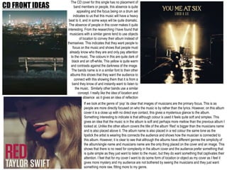
The CD cover for this single has no placement of
band members or people, this absence is quite
appealing and the focus being on a drum set
indicates to us that this music will have a heavy
beat to it, and in some ways will be quite dramatic.
The absence of people in this cover makes it quite
interesting. From the researching I have found that
musicians with a similar genre tend to use objects
of location to convey their album instead of
themselves. This indicates that they want people to
focus on the music and shows that people must
already know who they are and only pay attention
to the music. The colours in this are quite dark of
black and an off-white. This yellow is quite warm
and contrasts against the darkness of the image.
The bands name is in a similar font to their other
albums this shows that they want the audience to
connect with this showing them that it is from a
band they know of and instantly want to listen to
the music. Similarly other bands use a similar
concept. I really like the idea of location and
absence as it gives an idea of reflection
If we look at the genre of ‘pop’ its clear that images of musicians are the primary focus. This is as
people are more directly focused on who the music is by rather than the lyrics. However, on this album
cover it is a close up with no direct eye contact, this gives a mysterious glance to the album.
Something interesting to indicate is that although colour is used it feels quite soft and simplex. This
gives an idea that the music is in the album is soft and perhaps more mellow than the previous album I
looked at. Unlike the other album covers the title of the album ‘Red’ is bigger than the musicians name
and is also placed above it. The album name is also placed in a red colour the same tone as the
lipstick the artist is wearing this connects the audience and shows how the musician is connected to
this album. However, it is clear to see that although the albums have different genres the simplicity of
the album/single name and musicians name are the only thing placed on the cover and an image. This
shows that there is no need for complexity in the album cover and the audience prefer something that
is quite simple as they just want to listen to the music, but they do want something that captivates their
attention. I feel that for my cover I want to do some form of location or object as my cover as I feel it
gives more mystery and my audience are not bothered by seeing the musicians and they just want
something more raw, fitting more to my genre.
DVD PACKAGING IDEAS
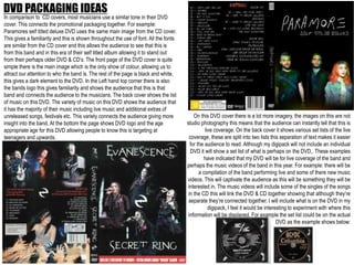
In comparison to CD covers, most musicians use a similar tone in their DVD
cover. This connects the promotional packaging together. For example:
Paramores self titled deluxe DVD uses the same main image from the CD cover.
This gives a familiarity and this is shown throughout the use of font. All the fonts
are similar from the CD cover and this allows the audience to see that this is
from this band and in this era of their self titled album allowing it to stand out
from their perhaps older DVD & CD’s. The front page of the DVD cover is quite
simple there is the main image which is the only show of colour, allowing us to
attract our attention to who the band is. The rest of the page is black and white,
this gives a dark element to the DVD. In the Left hand top corner there is also
the bands logo this gives familiarity and shows the audience that this is that
band and connects the audience to the musicians. The back cover shows the list
of music on this DVD. The variety of music on this DVD shows the audience that
it has the majority of their music including live music and additional extras of
unreleased songs, festivals etc. This variety connects the audience giving more
insight into the band. At the bottom the page shows DVD logo and the age
appropriate age for this DVD allowing people to know this is targeting at
teenagers and upwards.
On this DVD cover there is a lot more imagery, the images on this are not
studio photography this means that the audience can instantly tell that this is
live coverage. On the back cover it shows various set lists of the live
coverage, these are split into two lists this separation of text makes it easier
for the audience to read. Although my digipack will not include an individual
DVD it will show a set list of what is perhaps on the DVD,. These examples
have indicated that my DVD will be for live coverage of the band and
perhaps the music videos of the band in this year. For example: there will be
a compilation of the band performing live and some of there new music
videos. This will captivate the audience as this will be something they will be
interested in. The music videos will include some of the singles of the songs
in the CD this will link the DVD & CD together showing that although they’re
separate they’re connected together. I will include what is on the DVD in my
digipack, I feel it would be interesting to experiment with where this
information will be displayed. For example the set list could be on the actual
DVD as the example shows below:
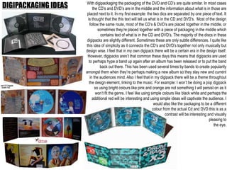
DIGIPACKAGING IDEAS With digipackaging the packaging of the DVD and CD’s are quite similar. In most cases
the CD’s and DVD’s are in the middle and the information about what is in those are
placed next to it. In my first example: the two dics are separated by one piece of text. It
is thought that the this text will tell us what is in the CD and DVD’s. Most of the design
follow the same route, most of the CD’s & DVD’s are placed together in the middle, or
sometimes they’re placed together with a piece of packaging in the middle which
contains text of what is in the CD and DVD’s. The majority of the discs in these
digipacks are slightly different. Sometimes these are only subtle differences. I quite like
this idea of simplicity as it connects the CD’s and DVD’s together not only musically but
design wise. I feel that in my own digipack there will be a certain era in the design itself.
However, digipacks aren’t that common these days this means that digipacks are used
to perhaps hype a band up again after an album has been released or to put the band
back out there. This has been used several times by bands to create popularity
amongst them when they’re perhaps making a new album so they stay new and current
in the audiences mind. Also I feel that in my digipack there will be a theme throughout
the design element, linking to the music. For example: I won’t be doing a pop digipack
so using bright colours like pink and orange are not something I will persist on as it
won’t fit the genre. I feel like using simple colours like black white and perhaps the
additional red will be interesting and using simple ideas will captivate the audience. I
would also like the packaging to be a different
colour from the actual Cd and DVD this is as a
contrast will be interesting and visually
pleasing to
the eye.
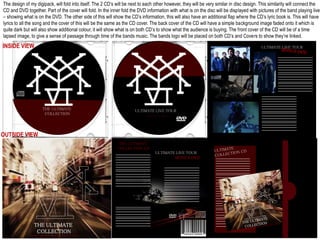
The design of my digipack, will fold into itself. The 2 CD’s will be next to each other however, they will be very similar in disc design. This similarity will connect the
CD and DVD together. Part of the cover will fold. In the inner fold the DVD information with what is on the disc will be displayed with pictures of the band playing live
– showing what is on the DVD. The other side of this will show the CD’s information, this will also have an additional flap where the CD’s lyric book is. This will have
lyrics to all the song and the cover of this will be the same as the CD cover. The back cover of the CD will have a simple background image faded onto it which is
quite dark but will also show additional colour, it will show what is on both CD’s to show what the audience is buying. The front cover of the CD will be of a time
lapsed image, to give a sense of passage through time of the bands music. The bands logo will be placed on both CD’s and Covers to show they’re linked.
ULTIMATE LIVE TOUR
BONUS DVD
ULTIMATE LIVE TOUR
THE ULTIMATE
COLLECTION
INSIDE VIEW
THE ULTIMATE
COLLECTION CD
ULTIMATE LIVE TOUR
BONUS DVD
THE ULTIMATE
COLLECTION
SECIAL EDITION WITH ULTIMATE DVD
OUTSIDE VIEW

Promotional Packaging

  • 1.
  • 2.
    CD FRONT IDEAS TheCD cover for this single has no placement of band members or people, this absence is quite appealing and the focus being on a drum set indicates to us that this music will have a heavy beat to it, and in some ways will be quite dramatic. The absence of people in this cover makes it quite interesting. From the researching I have found that musicians with a similar genre tend to use objects of location to convey their album instead of themselves. This indicates that they want people to focus on the music and shows that people must already know who they are and only pay attention to the music. The colours in this are quite dark of black and an off-white. This yellow is quite warm and contrasts against the darkness of the image. The bands name is in a similar font to their other albums this shows that they want the audience to connect with this showing them that it is from a band they know of and instantly want to listen to the music. Similarly other bands use a similar concept. I really like the idea of location and absence as it gives an idea of reflection If we look at the genre of ‘pop’ its clear that images of musicians are the primary focus. This is as people are more directly focused on who the music is by rather than the lyrics. However, on this album cover it is a close up with no direct eye contact, this gives a mysterious glance to the album. Something interesting to indicate is that although colour is used it feels quite soft and simplex. This gives an idea that the music is in the album is soft and perhaps more mellow than the previous album I looked at. Unlike the other album covers the title of the album ‘Red’ is bigger than the musicians name and is also placed above it. The album name is also placed in a red colour the same tone as the lipstick the artist is wearing this connects the audience and shows how the musician is connected to this album. However, it is clear to see that although the albums have different genres the simplicity of the album/single name and musicians name are the only thing placed on the cover and an image. This shows that there is no need for complexity in the album cover and the audience prefer something that is quite simple as they just want to listen to the music, but they do want something that captivates their attention. I feel that for my cover I want to do some form of location or object as my cover as I feel it gives more mystery and my audience are not bothered by seeing the musicians and they just want something more raw, fitting more to my genre.
  • 3.
    DVD PACKAGING IDEAS Incomparison to CD covers, most musicians use a similar tone in their DVD cover. This connects the promotional packaging together. For example: Paramores self titled deluxe DVD uses the same main image from the CD cover. This gives a familiarity and this is shown throughout the use of font. All the fonts are similar from the CD cover and this allows the audience to see that this is from this band and in this era of their self titled album allowing it to stand out from their perhaps older DVD & CD’s. The front page of the DVD cover is quite simple there is the main image which is the only show of colour, allowing us to attract our attention to who the band is. The rest of the page is black and white, this gives a dark element to the DVD. In the Left hand top corner there is also the bands logo this gives familiarity and shows the audience that this is that band and connects the audience to the musicians. The back cover shows the list of music on this DVD. The variety of music on this DVD shows the audience that it has the majority of their music including live music and additional extras of unreleased songs, festivals etc. This variety connects the audience giving more insight into the band. At the bottom the page shows DVD logo and the age appropriate age for this DVD allowing people to know this is targeting at teenagers and upwards. On this DVD cover there is a lot more imagery, the images on this are not studio photography this means that the audience can instantly tell that this is live coverage. On the back cover it shows various set lists of the live coverage, these are split into two lists this separation of text makes it easier for the audience to read. Although my digipack will not include an individual DVD it will show a set list of what is perhaps on the DVD,. These examples have indicated that my DVD will be for live coverage of the band and perhaps the music videos of the band in this year. For example: there will be a compilation of the band performing live and some of there new music videos. This will captivate the audience as this will be something they will be interested in. The music videos will include some of the singles of the songs in the CD this will link the DVD & CD together showing that although they’re separate they’re connected together. I will include what is on the DVD in my digipack, I feel it would be interesting to experiment with where this information will be displayed. For example the set list could be on the actual DVD as the example shows below:
  • 4.
    DIGIPACKAGING IDEAS Withdigipackaging the packaging of the DVD and CD’s are quite similar. In most cases the CD’s and DVD’s are in the middle and the information about what is in those are placed next to it. In my first example: the two dics are separated by one piece of text. It is thought that the this text will tell us what is in the CD and DVD’s. Most of the design follow the same route, most of the CD’s & DVD’s are placed together in the middle, or sometimes they’re placed together with a piece of packaging in the middle which contains text of what is in the CD and DVD’s. The majority of the discs in these digipacks are slightly different. Sometimes these are only subtle differences. I quite like this idea of simplicity as it connects the CD’s and DVD’s together not only musically but design wise. I feel that in my own digipack there will be a certain era in the design itself. However, digipacks aren’t that common these days this means that digipacks are used to perhaps hype a band up again after an album has been released or to put the band back out there. This has been used several times by bands to create popularity amongst them when they’re perhaps making a new album so they stay new and current in the audiences mind. Also I feel that in my digipack there will be a theme throughout the design element, linking to the music. For example: I won’t be doing a pop digipack so using bright colours like pink and orange are not something I will persist on as it won’t fit the genre. I feel like using simple colours like black white and perhaps the additional red will be interesting and using simple ideas will captivate the audience. I would also like the packaging to be a different colour from the actual Cd and DVD this is as a contrast will be interesting and visually pleasing to the eye.
  • 5.
    The design ofmy digipack, will fold into itself. The 2 CD’s will be next to each other however, they will be very similar in disc design. This similarity will connect the CD and DVD together. Part of the cover will fold. In the inner fold the DVD information with what is on the disc will be displayed with pictures of the band playing live – showing what is on the DVD. The other side of this will show the CD’s information, this will also have an additional flap where the CD’s lyric book is. This will have lyrics to all the song and the cover of this will be the same as the CD cover. The back cover of the CD will have a simple background image faded onto it which is quite dark but will also show additional colour, it will show what is on both CD’s to show what the audience is buying. The front cover of the CD will be of a time lapsed image, to give a sense of passage through time of the bands music. The bands logo will be placed on both CD’s and Covers to show they’re linked. ULTIMATE LIVE TOUR BONUS DVD ULTIMATE LIVE TOUR THE ULTIMATE COLLECTION INSIDE VIEW THE ULTIMATE COLLECTION CD ULTIMATE LIVE TOUR BONUS DVD THE ULTIMATE COLLECTION SECIAL EDITION WITH ULTIMATE DVD OUTSIDE VIEW