DigiPack Moodboard
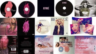
I have collected a variety of well known female artist based digipacks to compare,
and find inspiration from, in order to create my own digipack. A lot of these
digipacks are based around a feminine colour scheme to conform to gender
stereotypes but also to ‘soften’ the tone and appeal more to the female audience.
Most digipacks also conform to conventions such as including an image on the
front cover of the artist which empowers the artist and creates a sense of
inspiration for the younger audiences. I particularly like Ciara’s “Goodies” album
digipack as it continues the same theme throughout the front, back and cd, using
a picture of her frontal view on the front of the cover and a view from the back on
the back of the album and then creatively uses the same pose but as an animated
silhouette which also continued the generic colour scheme of black and pink. This
colour scheme symbolises femininity but with a hint of darkness and deviance
which I really liked. Other digipacks such as Rihanna’s “Loud” and Katy Perry’s
“Teenage Dream” also conform to this style.
Another digipack I became fond of was Beyonce’s “Beyonce” album which was
the most simplistic yet interesting. It’s colour scheme was simple and generic, yet
it subverted from typical conventions as it did not include a main image on the
front cover. The simplicity continued onto the cd as well, with only the album
name on the cd. I liked this idea as it represented Beyonce’s status in the industry
and how her fame is at it’s peak that her image/beauty or a generated album
name is not needed to gain sales off her album as her fans internationally are
able to recognise her name and buy it simply because she is a well known icon in
the music industry. I also really like the font as it is conforms to the theme being
simplistic yet bold in a bright pink colour.

Digipack moodboard

  • 2.
    DigiPack Moodboard I havecollected a variety of well known female artist based digipacks to compare, and find inspiration from, in order to create my own digipack. A lot of these digipacks are based around a feminine colour scheme to conform to gender stereotypes but also to ‘soften’ the tone and appeal more to the female audience. Most digipacks also conform to conventions such as including an image on the front cover of the artist which empowers the artist and creates a sense of inspiration for the younger audiences. I particularly like Ciara’s “Goodies” album digipack as it continues the same theme throughout the front, back and cd, using a picture of her frontal view on the front of the cover and a view from the back on the back of the album and then creatively uses the same pose but as an animated silhouette which also continued the generic colour scheme of black and pink. This colour scheme symbolises femininity but with a hint of darkness and deviance which I really liked. Other digipacks such as Rihanna’s “Loud” and Katy Perry’s “Teenage Dream” also conform to this style.
  • 3.
    Another digipack Ibecame fond of was Beyonce’s “Beyonce” album which was the most simplistic yet interesting. It’s colour scheme was simple and generic, yet it subverted from typical conventions as it did not include a main image on the front cover. The simplicity continued onto the cd as well, with only the album name on the cd. I liked this idea as it represented Beyonce’s status in the industry and how her fame is at it’s peak that her image/beauty or a generated album name is not needed to gain sales off her album as her fans internationally are able to recognise her name and buy it simply because she is a well known icon in the music industry. I also really like the font as it is conforms to the theme being simplistic yet bold in a bright pink colour.