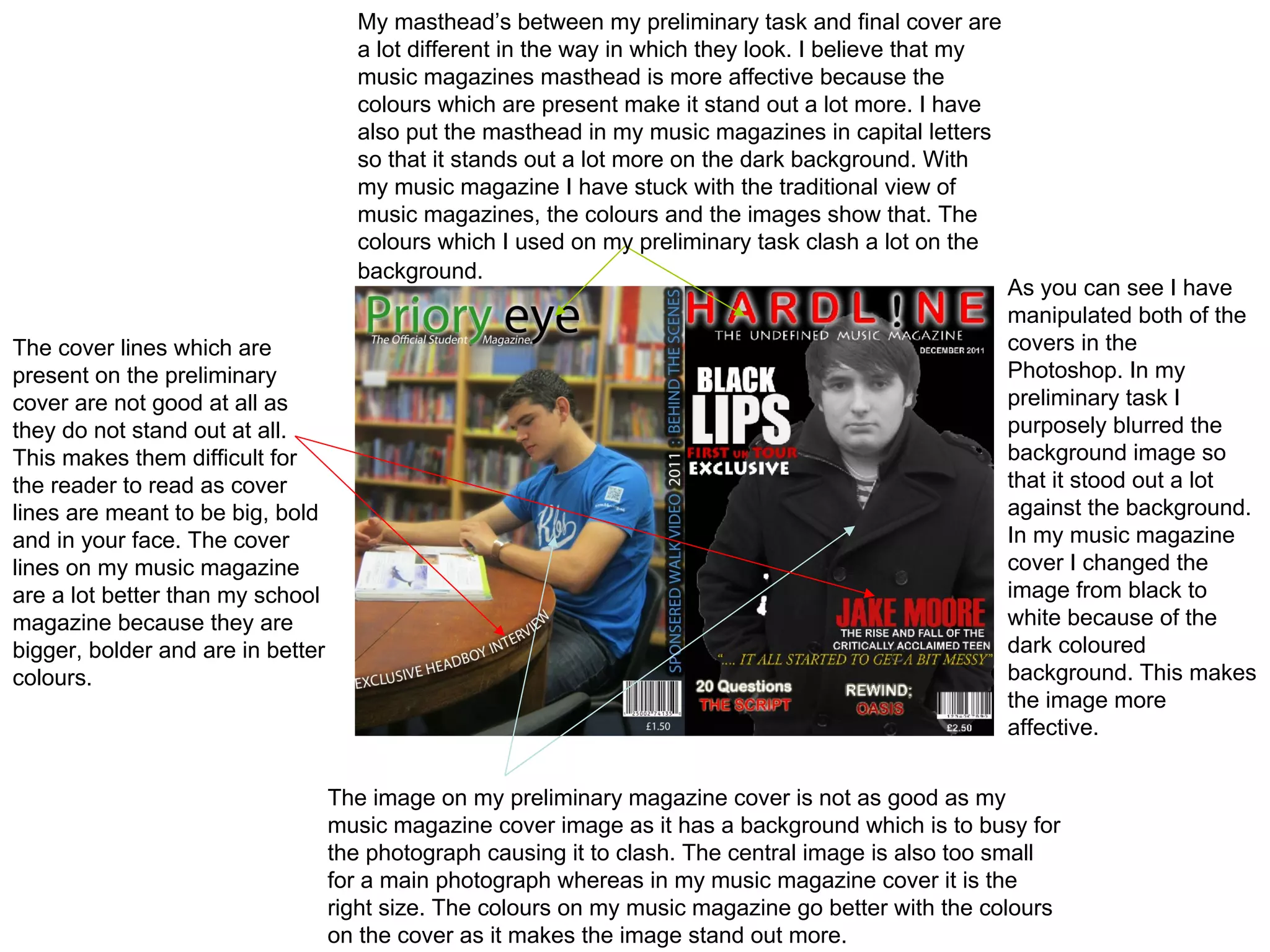
My masthead’s between my preliminary task and final cover are
                                     a lot different in the way in which they look. I believe that my
                                     music magazines masthead is more affective because the
                                     colours which are present make it stand out a lot more. I have
                                     also put the masthead in my music magazines in capital letters
                                     so that it stands out a lot more on the dark background. With
                                     my music magazine I have stuck with the traditional view of
                                     music magazines, the colours and the images show that. The
                                     colours which I used on my preliminary task clash a lot on the
                                     background.
                                                                                                        As you can see I have
                                                                                                        manipulated both of the
The cover lines which are                                                                               covers in the
present on the preliminary                                                                              Photoshop. In my
cover are not good at all as                                                                            preliminary task I
they do not stand out at all.                                                                           purposely blurred the
This makes them difficult for                                                                           background image so
the reader to read as cover                                                                             that it stood out a lot
lines are meant to be big, bold                                                                         against the background.
and in your face. The cover                                                                             In my music magazine
lines on my music magazine                                                                              cover I changed the
are a lot better than my school                                                                         image from black to
magazine because they are                                                                               white because of the
bigger, bolder and are in better                                                                        dark coloured
colours.                                                                                                background. This makes
                                                                                                        the image more
                                                                                                        affective.


                                   The image on my preliminary magazine cover is not as good as my
                                   music magazine cover image as it has a background which is to busy for
                                   the photograph causing it to clash. The central image is also too small
                                   for a main photograph whereas in my music magazine cover it is the
                                   right size. The colours on my music magazine go better with the colours
                                   on the cover as it makes the image stand out more.

Ques 7

  • 1.
    My masthead’s betweenmy preliminary task and final cover are a lot different in the way in which they look. I believe that my music magazines masthead is more affective because the colours which are present make it stand out a lot more. I have also put the masthead in my music magazines in capital letters so that it stands out a lot more on the dark background. With my music magazine I have stuck with the traditional view of music magazines, the colours and the images show that. The colours which I used on my preliminary task clash a lot on the background. As you can see I have manipulated both of the The cover lines which are covers in the present on the preliminary Photoshop. In my cover are not good at all as preliminary task I they do not stand out at all. purposely blurred the This makes them difficult for background image so the reader to read as cover that it stood out a lot lines are meant to be big, bold against the background. and in your face. The cover In my music magazine lines on my music magazine cover I changed the are a lot better than my school image from black to magazine because they are white because of the bigger, bolder and are in better dark coloured colours. background. This makes the image more affective. The image on my preliminary magazine cover is not as good as my music magazine cover image as it has a background which is to busy for the photograph causing it to clash. The central image is also too small for a main photograph whereas in my music magazine cover it is the right size. The colours on my music magazine go better with the colours on the cover as it makes the image stand out more.