SlideShare a Scribd company logo
Samantha Jones
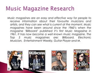
Music magazines are an easy and effective way for people to
 receive information about their favourite musicians and
 artists, and they can see what is current at the moment. Music
 magazines have been around since the 1960’s when the
 magazine ‘Billboard’ published it’s first Music Magazine in
 1961. It has now become a well known music magazine. The
 Top 5 music magazines are; Billboard, Electronic
 Musician, Entertainment Weekly, Guitar Player and M.
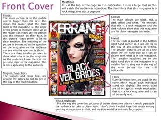
Masthead
                                            It is at the top of the page so it is noticeable. It is in a large font so this
                                            will catch the audiences attention. The font hints that this magazine is a
                                            rock magazine not a pop one
Images
                                                                                     Colours
The main picture is in the middle
                                                                                     The main colours are black, red, a
and is bigger then the rest, this
                                                                                     dark yellow and white. This enforces
shows the reader what the main
                                                                                     that this is a rock magazine and the
topic of the magazine is. The angle
                                                                                     dark colours show that this magazine
of the photo is medium close up so
                                                                                     are for older teenagers and older.
the reader can really see the person
and the emotion on their face, in
this picture there seems to be no                                                    Layout
clear emotion. The meaning of the                                                    The bar code is placed in the bottom
picture is connected to the question                                                 right hand corner so it will not be in
on the magazine so the audience                                                      the way of any pictures or writing.
can see who the question is about.                                                   The smaller pictures are all in a line
There are then smaller pictures to                                                   down the left hand side so it can be
show what else is in the magazine                                                    clearly seen what is in the magazine.
so the audience know there is not                                                    The smaller headlines are on the
just one topic in the magazine. This                                                 right hand side of the magazine in a
is more appealing to the audience                                                    smaller font so they not in the way of
                                                                                     the main picture but are still
                                                                                     noticeable.
Slogans/Cover lines
The slogans and cover lines are                                                       Fonts
around the edges so not to get in                                                     Many different fonts are used for the
the way of the main headline.                                                         cover which makes each individual
                                                                                      stand out slightly. The words used
                                                                                      are all in capitals which emphasises
                                                                                      that it is a rock magazine and it can
                                                                                      all be easily read.

                                       What I might use
                                       I like the way the cover has pictures of artists down one side so it would persuade
                                       the audience to take a closer look. I don’t think I would have that much writing
                                       over my main picture as that, and my title would be my main focus point.
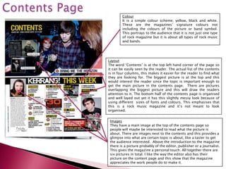
Colour
        It is a simple colour scheme; yellow, black and white.
        These are the magazines’ signature colours not
        including the colours of the picture or band symbol.
        This portrays to the audience that it is not just one type
        of rock magazine but it is about all types of rock music
        and bands.


Layout
The word ‘Contents’ is at the top left hand corner of the page so
it can be easily seen by the reader. The actual list of the contents
is in four columns, this makes it easier for the reader to find what
they are looking for. The biggest picture is at the top and this
would interest the reader since the topic is important enough to
get the main picture in the contents page. There are pictures
overlapping the biggest picture and this will draw the readers
attention to it. The bottom half of the contents page is organised
and well layed out yet it has this slightly messy look because of
using different sizes of fonts and colours. This emphasises that
this is a rock music magazine and it’s not meant to look
organised.


 Images
 They have a main image at the top of the contents page so
 people will maybe be interested to read what the picture is
 about. There are images next to the contents and this provides a
 glimpse into what are certain topic is about, like a taster to get
 the audience interested. Above the introduction to the magazine
 there is a picture probably of the editor, publisher or a journalist.
 This gives the magazine a personal touch. All together there are
 six pictures in total. I like the way the editor also has their
 picture on the content page and this show that the magazine
 appreciates the work people do to make it.
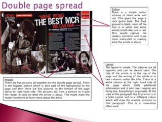
Colour
                                                                              There is a simple colour
                                                                              scheme of black write and
                                                                              red. This gives the page a
                                                                              rock genre look. The back
                                                                              ground is black, most of the
                                                                              font is in white and some
                                                                              words/small titles are in red.
                                                                              This would capture the
                                                                              readers attention and make
                                                                              them interested in reading
                                                                              what the article is about.


                                                                         Layout
                                                                         The layout is simple. The pictures are all
                                                                         together and can be clearly seen. The
                                                                         title of the article is at the top of the
                                                                         page and the writing of the article is in
Images                                                                   two columns under the title. There is a
There are five pictures all together on this double page spread. There   white column at the right hand side of
is the biggest picture which is also part of the background to the       the    page    which    holds    additional
page and then there are five pictures on the bottom of the page          information and it isn’t over lapping any
closer to right hand side. The pictures are from a concert so it give    thing else. Everything is organised. At the
the reader an idea on what the article is about. This might make the     start of the paragraph the first letter is in
reader interested to learn more about the artist.                        a bold capital and in a different colour
                                                                         which will draw the readers attention to
                                                                         that paragraph. This is a convention
                                                                         often used.
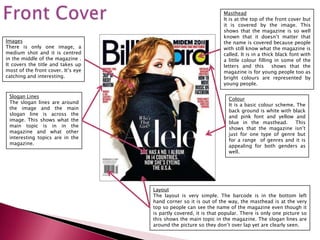
Masthead
                                                                  It is at the top of the front cover but
                                                                  it is covered by the image. This
                                                                  shows that the magazine is so well
                                                                  known that it doesn’t matter that
Images                                                            the name is covered because people
There is only one image, a                                        with still know what the magazine is
medium shot and it is centred                                     called. It is in a thick black font with
in the middle of the magazine .                                   a little colour filling in some of the
It covers the title and takes up                                  letters and this       shows that the
most of the front cover. It’s eye                                 magazine is for young people too as
catching and interesting.                                         bright colours are represented by
                                                                  young people.

 Slogan Lines
                                                                    Colour
 The slogan lines are around
                                                                    It is a basic colour scheme. The
 the image and the main
                                                                    back ground is white with black
 slogan line is across the
                                                                    and pink font and yellow and
 image. This shows what the
                                                                    blue in the masthead.       This
 main topic is in in the
                                                                    shows that the magazine isn’t
 magazine and what other
                                                                    just for one type of genre but
 interesting topics are in the
                                                                    for a range of genres and it is
 magazine.
                                                                    appealing for both genders as
                                                                    well.


                                    Layout
                                    The layout is very simple. The barcode is in the bottom left
                                    hand corner so it is out of the way, the masthead is at the very
                                    top so people can see the name of the magazine even though it
                                    is partly covered, it is that popular. There is only one picture so
                                    this shows the main topic in the magazine. The slogan lines are
                                    around the picture so they don’t over lap yet are clearly seen.
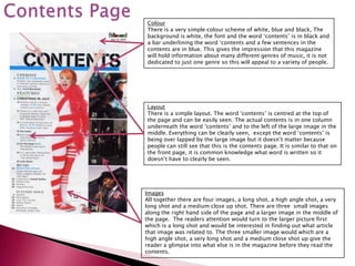
Colour
There is a very simple colour scheme of white, blue and black, The
background is white, the font and the word ‘contents’ is in black and
a bar underlining the word ‘contents and a few sentences in the
contents are in blue. This gives the impression that this magazine
will hold information about many different genres of music, it is not
dedicated to just one genre so this will appeal to a variety of people.


Layout
There is a simple layout. The word ‘contents’ is centred at the top of
the page and can be easily seen. The actual contents is in one column
underneath the word ‘contents’ and to the left of the large image in the
middle. Everything can be clearly seen, except the word ‘contents’ is
being over lapped by the large image but it doesn’t matter because
people can still see that this is the contents page. It is similar to that on
the front page, it is common knowledge what word is written so it
doesn’t have to clearly be seen.


Images
All together there are four images, a long shot, a high angle shot, a very
long shot and a medium close up shot. There are three small images
along the right hand side of the page and a larger image in the middle of
the page. The readers attention would turn to the larger picture first
which is a long shot and would be interested in finding out what article
that image was related to. The three smaller image would which are a
high angle shot, a very long shot and a medium close shot up give the
reader a glimpse into what else is in the magazine before they read the
contents.
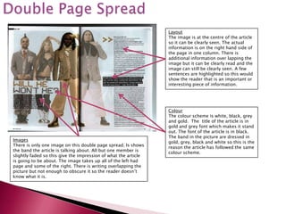
Layout
                                                                 The image is at the centre of the article
                                                                 so it can be clearly seen. The actual
                                                                 information is on the right hand side of
                                                                 the page in one column. There is
                                                                 additional information over lapping the
                                                                 image but it can be clearly read and the
                                                                 image can still be clearly seen. A few
                                                                 sentences are highlighted so this would
                                                                 show the reader that is an important or
                                                                 interesting piece of information.


                                                                 Colour
                                                                 The colour scheme is white, black, grey
                                                                 and gold. The title of the article is in
                                                                 gold and grey font which makes it stand
                                                                 out. The font of the article is in black.
                                                                 The band in the picture are dressed in
Images                                                           gold, grey, black and white so this is the
There is only one image on this double page spread. Is shows     reason the article has followed the same
the band the article is talking about. All but one member is     colour scheme.
slightly faded so this give the impression of what the article
is going to be about. The image takes up all of the left had
page and some of the right. There is writing overlapping the
picture but not enough to obscure it so the reader doesn’t
know what it is.

More Related Content

What's hot

Analysing magazine features and connotations
Analysing magazine features and connotationsAnalysing magazine features and connotations
Analysing magazine features and connotationsJoshWilliamson14
 
Magazine Analysis - Jess Pardoe
Magazine Analysis - Jess PardoeMagazine Analysis - Jess Pardoe
Magazine Analysis - Jess Pardoe
jessspardoe
 
Evaluation of Music Magazine
Evaluation of Music MagazineEvaluation of Music Magazine
Evaluation of Music Magazine
Julia Crouch
 
Media coursework content page analysis
Media coursework content page analysisMedia coursework content page analysis
Media coursework content page analysismattmosey1
 
Analyse music magazine
Analyse music magazineAnalyse music magazine
Analyse music magazinejillmuri
 
Magazine Photography Analysis and Research
Magazine Photography Analysis and Research Magazine Photography Analysis and Research
Magazine Photography Analysis and Research selinargyrou
 
Magazine cover reviews
Magazine cover reviewsMagazine cover reviews
Magazine cover reviewsToddwhitsey
 
Music Magazine Case Study
Music Magazine Case StudyMusic Magazine Case Study
Music Magazine Case Study0blivi4te
 
Front cover music magazine analysis
Front cover music magazine analysisFront cover music magazine analysis
Front cover music magazine analysisKyraM16
 
Evaluation q1
Evaluation q1Evaluation q1
Evaluation q1Ollie1994
 
Evaluation
EvaluationEvaluation
Evaluationbenhope
 
Analysing Magazines
Analysing MagazinesAnalysing Magazines
Analysing MagazinesRay Anjum
 
Magazines front covers
Magazines front coversMagazines front covers
Magazines front coversRachell_94
 
Front Cover Analysis
Front Cover AnalysisFront Cover Analysis
Front Cover Analysisemilyshep
 

What's hot (20)

Analysing magazine features and connotations
Analysing magazine features and connotationsAnalysing magazine features and connotations
Analysing magazine features and connotations
 
Magazine Analysis - Jess Pardoe
Magazine Analysis - Jess PardoeMagazine Analysis - Jess Pardoe
Magazine Analysis - Jess Pardoe
 
Evaluation of Music Magazine
Evaluation of Music MagazineEvaluation of Music Magazine
Evaluation of Music Magazine
 
Media coursework content page analysis
Media coursework content page analysisMedia coursework content page analysis
Media coursework content page analysis
 
Analysis of Magazines
Analysis of MagazinesAnalysis of Magazines
Analysis of Magazines
 
Analyse music magazine
Analyse music magazineAnalyse music magazine
Analyse music magazine
 
Magazine Photography Analysis and Research
Magazine Photography Analysis and Research Magazine Photography Analysis and Research
Magazine Photography Analysis and Research
 
Radial Analysis
Radial AnalysisRadial Analysis
Radial Analysis
 
Magazine cover reviews
Magazine cover reviewsMagazine cover reviews
Magazine cover reviews
 
Mojo complete
Mojo  completeMojo  complete
Mojo complete
 
Music Magazine Case Study
Music Magazine Case StudyMusic Magazine Case Study
Music Magazine Case Study
 
Front cover music magazine analysis
Front cover music magazine analysisFront cover music magazine analysis
Front cover music magazine analysis
 
Mojo complete
Mojo  completeMojo  complete
Mojo complete
 
Evaluation q1
Evaluation q1Evaluation q1
Evaluation q1
 
Evaluation
EvaluationEvaluation
Evaluation
 
Music magazine[1]
Music magazine[1]Music magazine[1]
Music magazine[1]
 
Analysing Magazines
Analysing MagazinesAnalysing Magazines
Analysing Magazines
 
Magazines front covers
Magazines front coversMagazines front covers
Magazines front covers
 
Front Cover Analysis
Front Cover AnalysisFront Cover Analysis
Front Cover Analysis
 
Rolling stones analysis
Rolling stones analysisRolling stones analysis
Rolling stones analysis
 

Viewers also liked

Por dónde empezar
Por dónde empezarPor dónde empezar
Por dónde empezar
Rosa Cristina Parra Lozano
 
Production log
Production logProduction log
Production log
bethanyvaughan
 
Üllar Vahtramäe, Järva maavanem 2004-2010
Üllar Vahtramäe, Järva maavanem 2004-2010Üllar Vahtramäe, Järva maavanem 2004-2010
Üllar Vahtramäe, Järva maavanem 2004-2010
Jarvamaavanem
 
Catálogo tecom
Catálogo tecomCatálogo tecom
Catálogo tecomnievesbb
 
Los Simpson
Los SimpsonLos Simpson
Los Simpson
Christian Mejía
 
2010 quiz
2010 quiz2010 quiz
2010 quiz
Colin Watson
 
Q7. evaluation
Q7. evaluationQ7. evaluation
Q7. evaluationBelladog55
 

Viewers also liked (8)

Por dónde empezar
Por dónde empezarPor dónde empezar
Por dónde empezar
 
Production log
Production logProduction log
Production log
 
Üllar Vahtramäe, Järva maavanem 2004-2010
Üllar Vahtramäe, Järva maavanem 2004-2010Üllar Vahtramäe, Järva maavanem 2004-2010
Üllar Vahtramäe, Järva maavanem 2004-2010
 
Catálogo tecom
Catálogo tecomCatálogo tecom
Catálogo tecom
 
Los Simpson
Los SimpsonLos Simpson
Los Simpson
 
Investigation
InvestigationInvestigation
Investigation
 
2010 quiz
2010 quiz2010 quiz
2010 quiz
 
Q7. evaluation
Q7. evaluationQ7. evaluation
Q7. evaluation
 

Similar to Textual analysis

Magazine analysis
Magazine analysisMagazine analysis
Magazine analysisitb6mdu
 
Content page reviews
Content page reviewsContent page reviews
Content page reviews
Tubbsterinator
 
Powerpoint on magazines
Powerpoint on magazinesPowerpoint on magazines
Powerpoint on magazinesben_dickinson
 
Textual analysis music magazine
Textual analysis music magazineTextual analysis music magazine
Textual analysis music magazineannie-rose3
 
Textual Analysis 1
Textual Analysis 1Textual Analysis 1
Textual Analysis 1mnoficzer
 
Kerrang evaluation
Kerrang evaluationKerrang evaluation
Kerrang evaluationsophiex
 
Deconstructing three double page spreads
Deconstructing three double page spreadsDeconstructing three double page spreads
Deconstructing three double page spreadsaimeexjade
 
Magazine analysis3 totp
Magazine analysis3 totpMagazine analysis3 totp
Magazine analysis3 totpramondeholmes
 
Rock sounds content page
Rock sounds content pageRock sounds content page
Rock sounds content pagetarunkapp
 

Similar to Textual analysis (20)

Magazine Analysis
Magazine AnalysisMagazine Analysis
Magazine Analysis
 
Magazine analysis
Magazine analysisMagazine analysis
Magazine analysis
 
Inner
Inner Inner
Inner
 
Content page reviews
Content page reviewsContent page reviews
Content page reviews
 
Powerpoint on magazines
Powerpoint on magazinesPowerpoint on magazines
Powerpoint on magazines
 
Cover magazine
Cover magazineCover magazine
Cover magazine
 
Cover research
Cover researchCover research
Cover research
 
Cover magazine
Cover magazineCover magazine
Cover magazine
 
Mixmag analysis 2
Mixmag analysis 2Mixmag analysis 2
Mixmag analysis 2
 
Q1
Q1Q1
Q1
 
Content page reviews
Content page reviewsContent page reviews
Content page reviews
 
Textual analysis music magazine
Textual analysis music magazineTextual analysis music magazine
Textual analysis music magazine
 
Textual Analysis 1
Textual Analysis 1Textual Analysis 1
Textual Analysis 1
 
Ali (1)
Ali (1)Ali (1)
Ali (1)
 
Ali (1)
Ali (1)Ali (1)
Ali (1)
 
Kerrang evaluation
Kerrang evaluationKerrang evaluation
Kerrang evaluation
 
Deconstructing three double page spreads
Deconstructing three double page spreadsDeconstructing three double page spreads
Deconstructing three double page spreads
 
Magazine analysis3 totp
Magazine analysis3 totpMagazine analysis3 totp
Magazine analysis3 totp
 
Magazine research
Magazine researchMagazine research
Magazine research
 
Rock sounds content page
Rock sounds content pageRock sounds content page
Rock sounds content page
 

More from sugarxspice95

Photography research
Photography researchPhotography research
Photography researchsugarxspice95
 

More from sugarxspice95 (6)

Test shots
Test shotsTest shots
Test shots
 
Font research
Font researchFont research
Font research
 
Work calender
Work calenderWork calender
Work calender
 
Test shots
Test shotsTest shots
Test shots
 
Photography research
Photography researchPhotography research
Photography research
 
Audience research
Audience researchAudience research
Audience research
 

Textual analysis

  • 2. Music magazines are an easy and effective way for people to receive information about their favourite musicians and artists, and they can see what is current at the moment. Music magazines have been around since the 1960’s when the magazine ‘Billboard’ published it’s first Music Magazine in 1961. It has now become a well known music magazine. The Top 5 music magazines are; Billboard, Electronic Musician, Entertainment Weekly, Guitar Player and M.
  • 3.
  • 4. Masthead It is at the top of the page so it is noticeable. It is in a large font so this will catch the audiences attention. The font hints that this magazine is a rock magazine not a pop one Images Colours The main picture is in the middle The main colours are black, red, a and is bigger then the rest, this dark yellow and white. This enforces shows the reader what the main that this is a rock magazine and the topic of the magazine is. The angle dark colours show that this magazine of the photo is medium close up so are for older teenagers and older. the reader can really see the person and the emotion on their face, in this picture there seems to be no Layout clear emotion. The meaning of the The bar code is placed in the bottom picture is connected to the question right hand corner so it will not be in on the magazine so the audience the way of any pictures or writing. can see who the question is about. The smaller pictures are all in a line There are then smaller pictures to down the left hand side so it can be show what else is in the magazine clearly seen what is in the magazine. so the audience know there is not The smaller headlines are on the just one topic in the magazine. This right hand side of the magazine in a is more appealing to the audience smaller font so they not in the way of the main picture but are still noticeable. Slogans/Cover lines The slogans and cover lines are Fonts around the edges so not to get in Many different fonts are used for the the way of the main headline. cover which makes each individual stand out slightly. The words used are all in capitals which emphasises that it is a rock magazine and it can all be easily read. What I might use I like the way the cover has pictures of artists down one side so it would persuade the audience to take a closer look. I don’t think I would have that much writing over my main picture as that, and my title would be my main focus point.
  • 5. Colour It is a simple colour scheme; yellow, black and white. These are the magazines’ signature colours not including the colours of the picture or band symbol. This portrays to the audience that it is not just one type of rock magazine but it is about all types of rock music and bands. Layout The word ‘Contents’ is at the top left hand corner of the page so it can be easily seen by the reader. The actual list of the contents is in four columns, this makes it easier for the reader to find what they are looking for. The biggest picture is at the top and this would interest the reader since the topic is important enough to get the main picture in the contents page. There are pictures overlapping the biggest picture and this will draw the readers attention to it. The bottom half of the contents page is organised and well layed out yet it has this slightly messy look because of using different sizes of fonts and colours. This emphasises that this is a rock music magazine and it’s not meant to look organised. Images They have a main image at the top of the contents page so people will maybe be interested to read what the picture is about. There are images next to the contents and this provides a glimpse into what are certain topic is about, like a taster to get the audience interested. Above the introduction to the magazine there is a picture probably of the editor, publisher or a journalist. This gives the magazine a personal touch. All together there are six pictures in total. I like the way the editor also has their picture on the content page and this show that the magazine appreciates the work people do to make it.
  • 6. Colour There is a simple colour scheme of black write and red. This gives the page a rock genre look. The back ground is black, most of the font is in white and some words/small titles are in red. This would capture the readers attention and make them interested in reading what the article is about. Layout The layout is simple. The pictures are all together and can be clearly seen. The title of the article is at the top of the page and the writing of the article is in Images two columns under the title. There is a There are five pictures all together on this double page spread. There white column at the right hand side of is the biggest picture which is also part of the background to the the page which holds additional page and then there are five pictures on the bottom of the page information and it isn’t over lapping any closer to right hand side. The pictures are from a concert so it give thing else. Everything is organised. At the the reader an idea on what the article is about. This might make the start of the paragraph the first letter is in reader interested to learn more about the artist. a bold capital and in a different colour which will draw the readers attention to that paragraph. This is a convention often used.
  • 7.
  • 8. Masthead It is at the top of the front cover but it is covered by the image. This shows that the magazine is so well known that it doesn’t matter that Images the name is covered because people There is only one image, a with still know what the magazine is medium shot and it is centred called. It is in a thick black font with in the middle of the magazine . a little colour filling in some of the It covers the title and takes up letters and this shows that the most of the front cover. It’s eye magazine is for young people too as catching and interesting. bright colours are represented by young people. Slogan Lines Colour The slogan lines are around It is a basic colour scheme. The the image and the main back ground is white with black slogan line is across the and pink font and yellow and image. This shows what the blue in the masthead. This main topic is in in the shows that the magazine isn’t magazine and what other just for one type of genre but interesting topics are in the for a range of genres and it is magazine. appealing for both genders as well. Layout The layout is very simple. The barcode is in the bottom left hand corner so it is out of the way, the masthead is at the very top so people can see the name of the magazine even though it is partly covered, it is that popular. There is only one picture so this shows the main topic in the magazine. The slogan lines are around the picture so they don’t over lap yet are clearly seen.
  • 9. Colour There is a very simple colour scheme of white, blue and black, The background is white, the font and the word ‘contents’ is in black and a bar underlining the word ‘contents and a few sentences in the contents are in blue. This gives the impression that this magazine will hold information about many different genres of music, it is not dedicated to just one genre so this will appeal to a variety of people. Layout There is a simple layout. The word ‘contents’ is centred at the top of the page and can be easily seen. The actual contents is in one column underneath the word ‘contents’ and to the left of the large image in the middle. Everything can be clearly seen, except the word ‘contents’ is being over lapped by the large image but it doesn’t matter because people can still see that this is the contents page. It is similar to that on the front page, it is common knowledge what word is written so it doesn’t have to clearly be seen. Images All together there are four images, a long shot, a high angle shot, a very long shot and a medium close up shot. There are three small images along the right hand side of the page and a larger image in the middle of the page. The readers attention would turn to the larger picture first which is a long shot and would be interested in finding out what article that image was related to. The three smaller image would which are a high angle shot, a very long shot and a medium close shot up give the reader a glimpse into what else is in the magazine before they read the contents.
  • 10. Layout The image is at the centre of the article so it can be clearly seen. The actual information is on the right hand side of the page in one column. There is additional information over lapping the image but it can be clearly read and the image can still be clearly seen. A few sentences are highlighted so this would show the reader that is an important or interesting piece of information. Colour The colour scheme is white, black, grey and gold. The title of the article is in gold and grey font which makes it stand out. The font of the article is in black. The band in the picture are dressed in Images gold, grey, black and white so this is the There is only one image on this double page spread. Is shows reason the article has followed the same the band the article is talking about. All but one member is colour scheme. slightly faded so this give the impression of what the article is going to be about. The image takes up all of the left had page and some of the right. There is writing overlapping the picture but not enough to obscure it so the reader doesn’t know what it is.