BEST Call Girls In BELLMONT HOTEL ✨ 9773824855 ✨ Escorts Service In Delhi Ncr,
Double page spread analysis
1. Olivia Lyons
AS Media
Foundation Portfolio>Product Research
Double page spread analysis
The black and white banner of images relate to the article The use of the pull quote attracts the audience’s
and break it down so that it is not all just text making the attention and draws them into reading the article
page more appealing to the audience and keeping them
interested in the article.
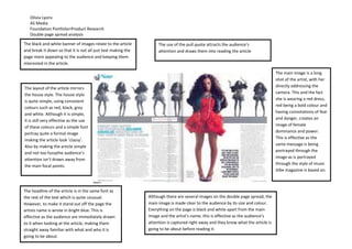
The main image is a long
shot of the artist, with her
The layout of the article mirrors directly addressing the
the house style. The house style camera. This and the fact
she is wearing a red dress,
is quite simple, using consistent
red being a bold colour and
colours such as red, black, grey
and white. Although it is simple, having connotations of fear
it is still very effective as the use and danger, creates an
of these colours and a simple font image of female
portray quite a formal image dominance and power.
This is effective as the
making the article look ‘classy’.
Also by making the article simple same message is being
and not too fussythe audience’s portrayed through the
attention isn’t drawn away from image as is portrayed
through the style of music
the main focal points.
Vibe magazine is based on.
The headline of the article is in the same font as
the rest of the text which is quite unusual. Although there are several images on the double page spread, the
However, to make it stand out off the page the main image is made clear to the audience by its size and colour.
artists name is wrote in bright blue. This is Everything on the page is black and white apart from the main
effective as the audience are immediately drawn image and the artist’s name; this is effective as the audience’s
to it when looking at the article, making them attention is captured right away and they know what the article is
straight away familiar with what and who it is going to be about before reading it.
going to be about.