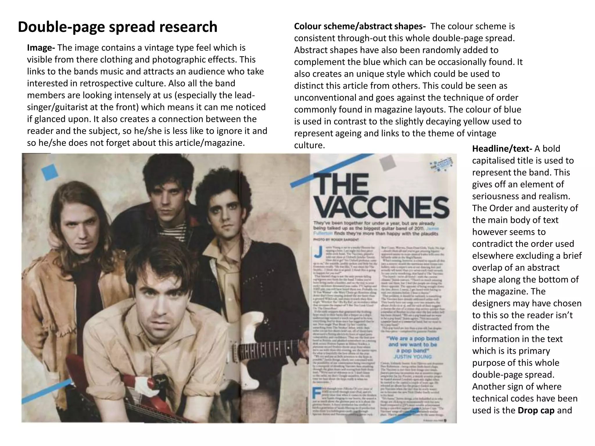
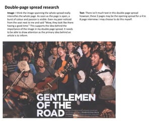
Double-page spread research                                        Colour scheme/abstract shapes- The colour scheme is
                                                                   consistent through-out this whole double-page spread.
 Image- The image contains a vintage type feel which is            Abstract shapes have also been randomly added to
 visible from there clothing and photographic effects. This        complement the blue which can be occasionally found. It
 links to the bands music and attracts an audience who take        also creates an unique style which could be used to
 interested in retrospective culture. Also all the band            distinct this article from others. This could be seen as
 members are looking intensely at us (especially the lead-         unconventional and goes against the technique of order
 singer/guitarist at the front) which means it can me noticed      commonly found in magazine layouts. The colour of blue
 if glanced upon. It also creates a connection between the         is used in contrast to the slightly decaying yellow used to
 reader and the subject, so he/she is less like to ignore it and   represent ageing and links to the theme of vintage
 so he/she does not forget about this article/magazine.            culture.                                       Headline/text- A bold
                                                                                                                capitalised title is used to
                                                                                                                represent the band. This
                                                                                                                gives off an element of
                                                                                                                seriousness and realism.
                                                                                                                The Order and austerity of
                                                                                                                the main body of text
                                                                                                                however seems to
                                                                                                                contradict the order used
                                                                                                                elsewhere excluding a brief
                                                                                                                overlap of an abstract
                                                                                                                shape along the bottom of
                                                                                                                the magazine. The
                                                                                                                designers may have chosen
                                                                                                                to this so the reader isn’t
                                                                                                                distracted from the
                                                                                                                information in the text
                                                                                                                which is its primary
                                                                                                                purpose of this whole
                                                                                                                double-page spread.
                                                                                                                Another sign of where
                                                                                                                technical codes have been
                                                                                                                used is the Drop cap and
Double-page spread research
 Image- I think the image spanning the whole spread really      Text- There isn’t much text in this double-page spread
 intensifies the whole page. As soon as the page is open, a     however, these 2 pages may be the opening spread for a 4 to
 burst of colour and passion is visible. Even my peer noticed   8 page interview. I may choose to do this myself.
 from the seat next to me and said “Wow, they look like there
 having a good time.” This supports the idea behind the
 importance of the image in my double page spread. It needs
 to be able to draw attention as the primary idea behind an
 article is to inform.
Double page spread research

Double page spread research

  • 1.
    Double-page spread research Colour scheme/abstract shapes- The colour scheme is consistent through-out this whole double-page spread. Image- The image contains a vintage type feel which is Abstract shapes have also been randomly added to visible from there clothing and photographic effects. This complement the blue which can be occasionally found. It links to the bands music and attracts an audience who take also creates an unique style which could be used to interested in retrospective culture. Also all the band distinct this article from others. This could be seen as members are looking intensely at us (especially the lead- unconventional and goes against the technique of order singer/guitarist at the front) which means it can me noticed commonly found in magazine layouts. The colour of blue if glanced upon. It also creates a connection between the is used in contrast to the slightly decaying yellow used to reader and the subject, so he/she is less like to ignore it and represent ageing and links to the theme of vintage so he/she does not forget about this article/magazine. culture. Headline/text- A bold capitalised title is used to represent the band. This gives off an element of seriousness and realism. The Order and austerity of the main body of text however seems to contradict the order used elsewhere excluding a brief overlap of an abstract shape along the bottom of the magazine. The designers may have chosen to this so the reader isn’t distracted from the information in the text which is its primary purpose of this whole double-page spread. Another sign of where technical codes have been used is the Drop cap and
  • 2.
    Double-page spread research Image- I think the image spanning the whole spread really Text- There isn’t much text in this double-page spread intensifies the whole page. As soon as the page is open, a however, these 2 pages may be the opening spread for a 4 to burst of colour and passion is visible. Even my peer noticed 8 page interview. I may choose to do this myself. from the seat next to me and said “Wow, they look like there having a good time.” This supports the idea behind the importance of the image in my double page spread. It needs to be able to draw attention as the primary idea behind an article is to inform.