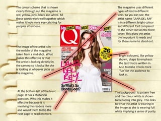
The magazine cover uses a color scheme of red, yellow, pink, black and white. Different fonts, font sizes, and colors are used for different elements like the artist's name to make it stand out. The central image features the artist looking directly at the camera. At the bottom is a rhetorical question to engage readers. The background fades from white to gray, linking to the artist's white outfit. There are different colored, sized, and styled texts and shapes used to draw attention and emphasize certain elements.
2. The colour scheme that is shown The magazine uses different
clearly through out the magazine is types of font in different
red, yellow, pink, black and white. All sizes. As you can see, the
these words work well together which artist name ‘LANA DEL RAY’
makes it look more eye-catching for is in a different bright colour
peoples attentions. and different font compared
to the other text on the front
cover. This gives the artist
the important it needs and
for there name to stand out.
The image of the artist is in
the middle of the magazine
taken from a mid-shot. What Bright coloured, like yellow
makes this effective is that shown, shape to emphasis
the artist is looking directly in the text that is written in.
the camera so it looks like she Also to make it look more
is looking at whoever picks up ‘fun’ for the audience to
the magazine. look at.
At the bottom left of the front The background is pattern free
page, it has a rhetorical and the colour white is shown
question. Why this makes it to be fading into grey. This links
effective because it is to what the artist is wearing in
involving the readers more the image as she is wearing full
and would them to flip the white implying a sense of purity.
next page to read on more.
3. The main image on the
The colour scheme that is going front cover is the famous
through out this magazine cover Rihanna. The shot of the
is pink, yellow, white and black. image is a mid long shot
With the genre that this because we can see
magazine is about ‘Pop’, the everything apart from her
colours work well to emphasis legs.
this.
There are different
coloured, sized and
The front cover includes a styled texts going on
couple of currently popular the front cover. The
artists/bands of today. The effect of this is it shows
effect of this it that it gives an the how much
idea to the audience already emphasis there is for
of what to expect. each content. For
example, in bold and
pink, ‘RIHANNA’ is
written and place
diagonally across her
There are pull out quotes image.
on the front cover. This
effect of this is that it would There are few types of
interest readers to flip the shapes going around
page and read more about the front cover with
it. text written inside and
all shapes are in yellow.
The effect of this that it
would catch the
audiences attention.