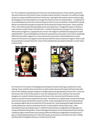
The document discusses conventions used in horror media products and how the author has developed and challenged some of these conventions in their own horror magazine cover, film poster, and trailer. For the magazine cover, the author uses bold text and red and black colors which represent blood and death for horror. The film poster features a dark and sinister background with a creepy house in the center and smudged tagline. The trailer uses unsettling old-fashioned music and only features one character instead of many to make it unique.