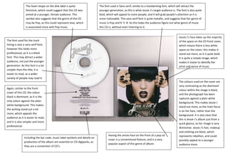
The document summarizes key design elements of Jessie J's CD cover and how they appeal to her target audience. The heart shape and sans-serif font on the cover suggest a feminine, young, pop music audience. The bold, metallic sans-serif font and dominant black and white colors make the cover stand out and draw attention. Having Jessie J's face prominently displayed identifies the artist and genre clearly.
1. The heart shape on the disk label is quite The font used is Sans-serif, similar to a handwriting font, which will attract the
feminine, which could suggest that this CD was younger generation, as this is what Jessie J’s target audience is. The font is also quite
aimed at a younger, female audience. This bold, which will appeal to more people, and it will grab people’s attention as it is
symbol also suggests that the genre of the CD more noticeable. This sans-serif font is quite metallic, and suggests that her genre of
may be Pop, as this could represent love, which music is Pop and R ‘n’ B. So this helps the audience figure out what genre of music
is associated more with Pop music. this CD is, without even listening to it.
Jessie J’s face takes up the majority
The font used for the track of the space on the CD front cover,
listing is also a sans-serif font; which means there is less white
however this looks more space on the cover; this makes it
professional, as it is a block stand out more, as it is quite bold.
font. This may attract a wider It is quite a simple image, which
audience, not just the younger makes it easier to identify the
generation. As this font is a lot artist and genre of music.
simpler than the title, it is
easier to read, so a wider
variety of people may read it.
The colours used on the cover are
very contrasting as the dominant
Again, similar to the front
colour within the image is black,
cover of this CD, the colour
and the photograph has been
black is dominant, as it is the
captures against a plain white
only colour against the plain
background. This makes Jessie J
white background. This makes
stand out more, as the main focus
the writing stand out a lot
is on her face, rather than the
more, which appeals the
background. It is also clear that
audience as it is easier to read,
this is Jessie J’s album just from a
and it is also simpler and more
quick glance, as her image is very
professional.
distinctive. Jessie J’s hair, makeup
and clothing are black, which
Having the artists face on the front of a pop cd represents rebellion, and could
Including the bar code, music label symbols and details on
cover is a conventional feature, and is a very possibly appeal to a younger
production of the album are essential on CD digipacks, as
popular aspect of this genre of album. audience more.
they are a convention of CD’s.