
Recommended
More Related Content
What's hot
What's hot (18)
Viewers also liked
Viewers also liked (20)
Similar to Media evaluation
Similar to Media evaluation (20)
Recently uploaded
Recently uploaded (20)
Media evaluation
- 2. In what ways does your media product use, develop or challenge forms and conventions of real media products? My music magazine front cover has similar conventions to other music magazines that I have seen. Examples of this being my title it is in capitals and bold across the top of the magazine but behind the image. My magazine also has anchorage which is for the readers benefit and can help to buy the magazine. I have used a colour scheme like other magazines they usually consist of 3-5 colours, my magazine has a colour scheme of pink, grey, brown and black. I feel like these colours really connect with my theme as it is mainly for girls at a teenage age so they were appropriate. These colours were also the most popular chosen when I did my questionnaire. I also have a strong large mid shot image this is usually common on music magazines but I have challenged conventions because my imagine is different as I purposely have my model looking down at the instrument she is playing. This is because I wanted to capture a picture of her actually playing the instrument so it was realistic towards my audience, So it comes across as a more mature magazine. My content magazine conveys all the features that are in regular magazines for example 3 columns of writing and then a column of pictures to illustrate some off the pages in the magazine. I think my arrangement worked well because I linked it into the colour scheme I had for the front cover, so the writing wasn’t just one block colour, it consisted of a editors letter. Also there wasn’t loads going on as it had a plain background this convention leads to the maturity of the magazine. For the contents page I haven't challenged any conventions there is no reason for this I just wanted the contents to be effectively simple.
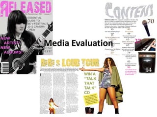
- 3. My final front page Masthead- I have put the title across the top of my magazine , this is Date & Issue- it is essential that because I wanted my title to every magazine has this standout over everything this is to somewhere on the magazine it why it slightly over laps the imagine. is either on the front cover or I think it catchy and fresh, it peruses on the content page. This is what I wanted to come across, because it lets the reader know publishing new released artists. The when the magazine was colour of the title stands out on the released and what number the plain background and the black & magazine is. white image. Main image- My image was purposely Cover lines- Every magazine conveyed to be in black and white consists of cover lines they are to because I wanted the title and cover give and incite as to what is in the lines to stand out in different colours magazine. It is a way of persuading but then the image wouldn’t clash. I the reader to buy a magazine if think it also shows the magazine to be they are eye catching and look mature and professional. Magazines interesting there is normally a usually have the model looking at the positive outcome. Mine are a camera to show emotion and there variation off colours and effects expression relates to the topic but my this is so that come across as image challenges that convention I individual cover lines. wanted my model to be looking down at the image this was to express her passion for music and concentration towards the instrument. Competition- also off magazine have competitions Barcode and price that every available to enter this was a great way to make my magazine will have magazine individual and attract the reader.
- 4. My final contents page I have a big bold title and put on an affect so that it dips down in the centre left. This is my editors letter that is talking to my audience about my magazine, each issue will have a new letter. All my pictures are on one side they are all an incite on different pages. I have purposely made it so that they don’t over lap and are all separate. I have put all my writing into 2 columns. Which would normally be found in any magazines.
- 5. My final feature page I have a big bold title that says who and what the article is about. I have put on a long shot picture and This is a introduction to purposely made it so the article. that her arm fits under the title. Usually double page The colour scheme spreads will have one doesn’t link into front large image that cover and content page covers the page. Mine but I have used the doesn’t because I colours from the picture wanted the picture to into the competition. All be outlined. off my titles for each page are used in the same font. I have chosen this image here to break up the text, I have included a this picture is while she is performing. My text has competition to this been divided into 3 columns this has the same page to make it more conventions as other magazines. unique .
- 6. How does your media product represent particular social groups? In my music magazine I wanted to represent a social group of teenage girls but who are interested in the latest songs and new Artists, I am following the stereotype of chart music, girl bands, female solo artists but it does not have any male artist or make bands. It also is for older teenagers as it links into festivals and feature careers. In my magazine there are pictures of instruments as well as people but on my front cover it has a female teenager looking cool in a leather jacket and holding an instrument. She has a fashionable hair style so in this way she can be seen as a role model towards the readers she has the latest trends and her variation in music she can perform. It can encourage are target audience to seek there fame as she has at this ages. It allows the audience to know it is possible. My music magazine isn’t against the male gender I just think it would be unusual to have a music magazine that only contains female artists and bands. This then allows all of the other cover stories in the magazine to be idols because they will be females. My cover story focuses on a famous female artist Rihanna, she is a female icon, which relates to the social groups. My music Magazine is likely to cover other female artists from all over the world for example Rihanna is from Barbados, Katy Perry and singers from the x-factor which search all over the UK. My magazine does not address to sexuality so for in future issues I can search for artists that are willing to express there sexuality and how it doesn’t have an effect or matter in the music industry.
- 7. What kind of media institution might distribute your media product and why? When I looked into other popular music magazines I found Q, Heat, Karrang, Classic Rock, NME, Vibe, Blender, Billboard. There wasn’t any magazines that I deeply looked into I just used different inspiration from all types. I discovered that they all have different unique selling points. So my magazine doesn’t fit into a specific one, but if it was to get categorised it would fall into R&B.
- 8. Who would be the audience for your media product? My audience research is teenage girl but its is more elderly teenagers for example 16+. I have chosen this because I knew what I needed to include in my magazine to appeal to them. I have related to my audience by having a female front cover and my colour scheme relates to the girl theme I have taken on. When doing my research I found that there’s wasn’t many female music magazines that don’t feature males throughout.
- 9. Audience feedback For my audience research I produced a questionnaire. I asked 20 participants. The following graphs show some of my results. 80 80 60 60 40 40 20 0 20 0 <Genre <Masthead Record… Unplug… 2012… Mental… Broken… Rock… Dance Rock R&B Metal Techno Dub Step Pop Classic Hip Hop 8 Music Released 60 100 40 80 20 60 0 <Font 40 20 <Artists Bodoni… Arial… Arabic… Comic… 0 Bauhous Kaiti Calibria 100 80 60 80 40 20 <Story lines 60 0 40 20 0 <Colour scheme Yellow/… Yellow/… Whie/B… Purple/… White/… Red/Blu… Pink/Gr… Blue/Gr… Black/… 60 40 60 20 0 <Magazines 40 20 <Frequency Q NME Kerrang Heat Blender Billboard Vibe 0 Every 1 Ever 1 Ever 1 Ever Day week Month Year
- 10. What have you learnt about technology from the process of construction of this product? Before I constructed my magazine I didn’t really know much about Photoshop or Quark, so I learnt a lot during this project. Over the time I’ve developed skills, this has then made me able to make my magazine look more professional. This is the development of my front cover page. I’ve been unable to shot my contents page and double page spread as I didn’t do it as I went along but I developed skills in importing images, making my pages into columns to fir the convention of a magazine. Overall I have made my magazine look more professional by knowing how to do certain effects to my images and text. The skills I have now gained will be helpful in future projects. If I was to do it again I think I would change my target audience, I then could had more of a variation in my colour scheme and cover lines. But other than that I was very pleased with my final outcome
- 11. Photography and using Photoshop This is my original large picture on my cover page I haven't added any effects to the final image all I have done is cropped the background out so it is the outline off her. This is another original image I haven’t added an effect I have just cropped out the background. This picture has been edited into black and white and the background has been cloned.
- 12. I haven’t applied any effect to this image I have just cropped out the background. I have cropped out the background then given the image a faded effect arou8nd the edge using a rubber. I have cropped out the back ground and a made it so that it has a smooth edge using an effect. I have only cropped our the background on the image and not given it any effect.