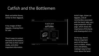
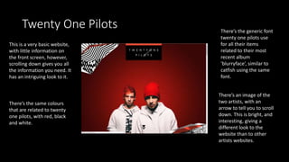
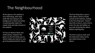
Website Analysis
Catfish and the Bottlemen
Black and white theme,
similar to their digipack.
Artist’s logo, shown on
digipaks, and all
merchandise associated
with the band, takes up a
large proportion of the
page, which shows the
importance of the band,
and showing who’s it is.
It has images of their
digipaks, showing them
for sale.
There’s ways to contact
the band at the bottom,
with links to their social
media, and other
important information.
At the top, there’s
links to important
parts of the band,
such as videos, shops,
lyrics and photos,
making it easy to find
more about the band.
Twenty One Pilots
This is a very basic website,
with little information on
the front screen, however,
scrolling down gives you all
the information you need. It
has an intriguing look to it.
There’s an image of the
two artists, with an
arrow to tell you to scroll
down. This is bright, and
interesting, giving a
different look to the
website than to other
artists websites.
There’s the generic font
twenty one pilots use
for all their items
related to their most
recent album
‘blurryface’, similar to
catfish using the same
font.
There’s the same colours
that are related to twenty
one pilots, with red, black
and white.
The Neighbourhood
At first glance, this website is
very interesting, with what
looks like men laying in the
background in black and white.
It automatically makes the
viewer look and take interest in
the website.
The first thing that is seen is
their album, which is firstly
central to the website, making
it the first thing seen. There’s
also links to buy it, and a link to
enter the site, but hidden so
you look at buying the album
before anything else.
It’s has an obvious black and
white theme, however the
green on the link draws you in,
which makes you look at it, and
go to buy/download the album.
The font is easy to read, and
the italics/non italics at the
top match those in the
album.
Conclusion
• The best indie websites are in black and white, it looks more
interesting.
• They also have easy to read text, however it should match those that
are on a digipak/common font the artist usually uses.
• A website is more interesting with images.
• There should be an obvious link to the most recent album/EP.
• It’s good if there are links to social media.
• A different layout to most websites make the website more
interesting.

Webiste analysis

  • 1.
  • 2.
    Catfish and theBottlemen Black and white theme, similar to their digipack. Artist’s logo, shown on digipaks, and all merchandise associated with the band, takes up a large proportion of the page, which shows the importance of the band, and showing who’s it is. It has images of their digipaks, showing them for sale. There’s ways to contact the band at the bottom, with links to their social media, and other important information. At the top, there’s links to important parts of the band, such as videos, shops, lyrics and photos, making it easy to find more about the band.
  • 3.
    Twenty One Pilots Thisis a very basic website, with little information on the front screen, however, scrolling down gives you all the information you need. It has an intriguing look to it. There’s an image of the two artists, with an arrow to tell you to scroll down. This is bright, and interesting, giving a different look to the website than to other artists websites. There’s the generic font twenty one pilots use for all their items related to their most recent album ‘blurryface’, similar to catfish using the same font. There’s the same colours that are related to twenty one pilots, with red, black and white.
  • 4.
    The Neighbourhood At firstglance, this website is very interesting, with what looks like men laying in the background in black and white. It automatically makes the viewer look and take interest in the website. The first thing that is seen is their album, which is firstly central to the website, making it the first thing seen. There’s also links to buy it, and a link to enter the site, but hidden so you look at buying the album before anything else. It’s has an obvious black and white theme, however the green on the link draws you in, which makes you look at it, and go to buy/download the album. The font is easy to read, and the italics/non italics at the top match those in the album.
  • 5.
    Conclusion • The bestindie websites are in black and white, it looks more interesting. • They also have easy to read text, however it should match those that are on a digipak/common font the artist usually uses. • A website is more interesting with images. • There should be an obvious link to the most recent album/EP. • It’s good if there are links to social media. • A different layout to most websites make the website more interesting.