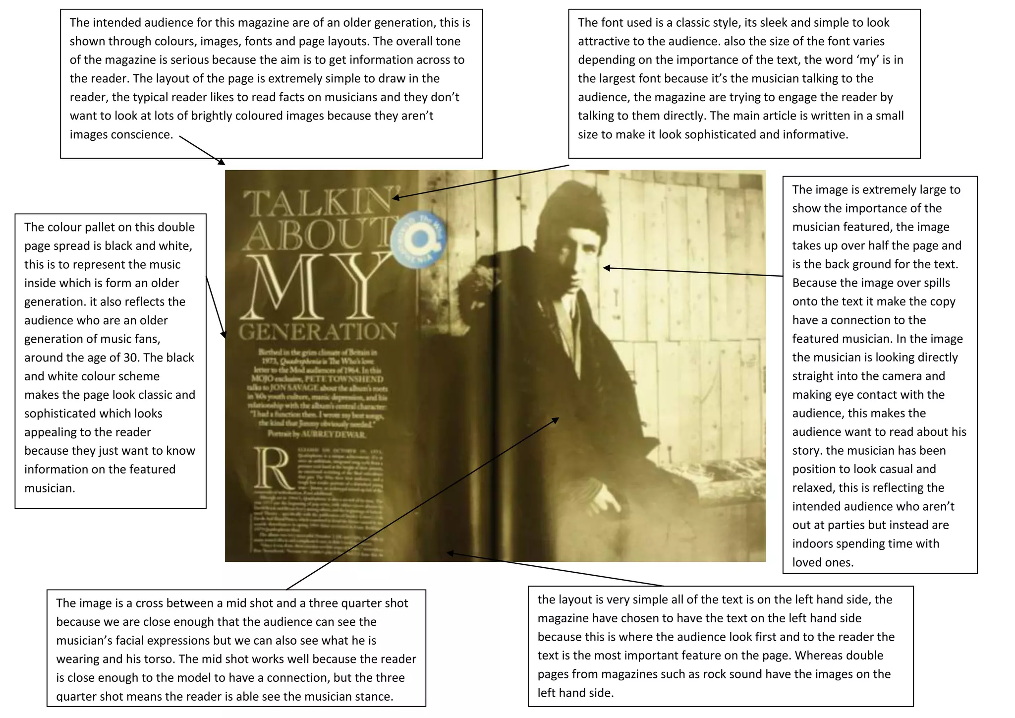
The intended audience for this magazine are of an older generation, this is           The font used is a classic style, its sleek and simple to look
        shown through colours, images, fonts and page layouts. The overall tone               attractive to the audience. also the size of the font varies
        of the magazine is serious because the aim is to get information across to            depending on the importance of the text, the word ‘my’ is in
        the reader. The layout of the page is extremely simple to draw in the                 the largest font because it’s the musician talking to the
        reader, the typical reader likes to read facts on musicians and they don’t            audience, the magazine are trying to engage the reader by
        want to look at lots of brightly coloured images because they aren’t                  talking to them directly. The main article is written in a small
        images conscience.                                                                    size to make it look sophisticated and informative.


                                                                                                                                        The image is extremely large to
                                                                                                                                        show the importance of the
The colour pallet on this double                                                                                                        musician featured, the image
page spread is black and white,                                                                                                         takes up over half the page and
this is to represent the music                                                                                                          is the back ground for the text.
inside which is form an older                                                                                                           Because the image over spills
generation. it also reflects the                                                                                                        onto the text it make the copy
audience who are an older                                                                                                               have a connection to the
generation of music fans,                                                                                                               featured musician. In the image
around the age of 30. The black                                                                                                         the musician is looking directly
and white colour scheme                                                                                                                 straight into the camera and
makes the page look classic and                                                                                                         making eye contact with the
sophisticated which looks                                                                                                               audience, this makes the
appealing to the reader                                                                                                                 audience want to read about his
because they just want to know                                                                                                          story. the musician has been
information on the featured                                                                                                             position to look casual and
musician.                                                                                                                               relaxed, this is reflecting the
                                                                                                                                        intended audience who aren’t
                                                                                                                                        out at parties but instead are
                                                                                                                                        indoors spending time with
                                                                                                                                        loved ones.


     The image is a cross between a mid shot and a three quarter shot                 the layout is very simple all of the text is on the left hand side, the
     because we are close enough that the audience can see the                        magazine have chosen to have the text on the left hand side
     musician’s facial expressions but we can also see what he is                     because this is where the audience look first and to the reader the
     wearing and his torso. The mid shot works well because the reader                text is the most important feature on the page. Whereas double
     is close enough to the model to have a connection, but the three                 pages from magazines such as rock sound have the images on the
     quarter shot means the reader is able see the musician stance.                   left hand side.

Mojo

  • 1.
    The intended audiencefor this magazine are of an older generation, this is The font used is a classic style, its sleek and simple to look shown through colours, images, fonts and page layouts. The overall tone attractive to the audience. also the size of the font varies of the magazine is serious because the aim is to get information across to depending on the importance of the text, the word ‘my’ is in the reader. The layout of the page is extremely simple to draw in the the largest font because it’s the musician talking to the reader, the typical reader likes to read facts on musicians and they don’t audience, the magazine are trying to engage the reader by want to look at lots of brightly coloured images because they aren’t talking to them directly. The main article is written in a small images conscience. size to make it look sophisticated and informative. The image is extremely large to show the importance of the The colour pallet on this double musician featured, the image page spread is black and white, takes up over half the page and this is to represent the music is the back ground for the text. inside which is form an older Because the image over spills generation. it also reflects the onto the text it make the copy audience who are an older have a connection to the generation of music fans, featured musician. In the image around the age of 30. The black the musician is looking directly and white colour scheme straight into the camera and makes the page look classic and making eye contact with the sophisticated which looks audience, this makes the appealing to the reader audience want to read about his because they just want to know story. the musician has been information on the featured position to look casual and musician. relaxed, this is reflecting the intended audience who aren’t out at parties but instead are indoors spending time with loved ones. The image is a cross between a mid shot and a three quarter shot the layout is very simple all of the text is on the left hand side, the because we are close enough that the audience can see the magazine have chosen to have the text on the left hand side musician’s facial expressions but we can also see what he is because this is where the audience look first and to the reader the wearing and his torso. The mid shot works well because the reader text is the most important feature on the page. Whereas double is close enough to the model to have a connection, but the three pages from magazines such as rock sound have the images on the quarter shot means the reader is able see the musician stance. left hand side.