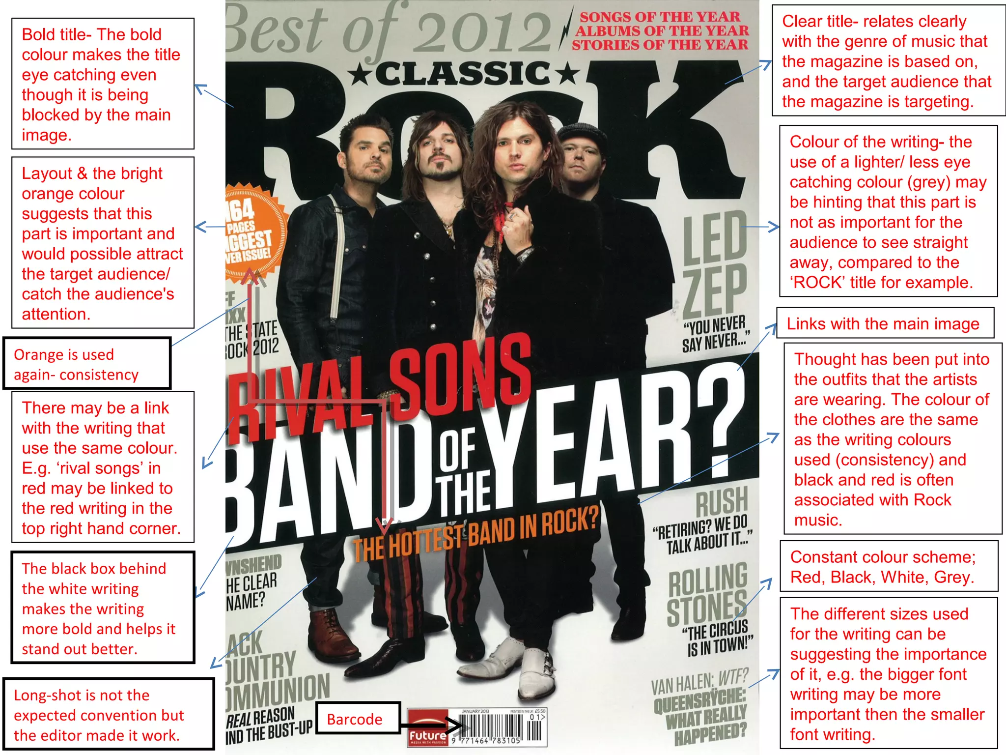
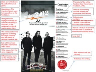
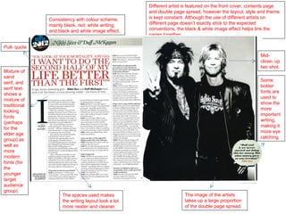
Clear title- relates clearly
 Bold title- The bold                with the genre of music that
 colour makes the title              the magazine is based on,
 eye catching even                   and the target audience that
 though it is being                  the magazine is targeting.
 blocked by the main
 image.                               Colour of the writing- the
                                      use of a lighter/ less eye
 Layout & the bright
                                      catching colour (grey) may
 orange colour
                                      be hinting that this part is
 suggests that this
                                      not as important for the
 part is important and
                                      audience to see straight
 would possible attract
                                      away, compared to the
 the target audience/
                                      ‘ROCK’ title for example.
 catch the audience's
 attention.
                                     Links with the main image
Orange is used                        Thought has been put into
again- consistency                    the outfits that the artists
                                      are wearing. The colour of
 There may be a link
                                      the clothes are the same
 with the writing that
                                      as the writing colours
 use the same colour.
                                      used (consistency) and
 E.g. ‘rival songs’ in
                                      black and red is often
 red may be linked to
                                      associated with Rock
 the red writing in the
                                      music.
 top right hand corner.
                                      Constant colour scheme;
 The black box behind
                                      Red, Black, White, Grey.
 the white writing
 makes the writing                    The different sizes used
 more bold and helps it               for the writing can be
 stand out better.                    suggesting the importance
                                      of it, e.g. the bigger font
Long-shot is not the                  writing may be more
expected convention but    Barcode    important then the smaller
the editor made it work.              font writing.
Black and white theme       The colour of the writing
fits well with the rock     has been kept the constant;
genre.                      red, black, white.

Consistency- The            The size of the writing
thunder shape is used       could be showing the
here as well as on the      importance of the writing.
front cover.
                            Ordered page
Orange thunder              numbers.
highlight- this may be     Not started with page number
to show this writing is    1, instead it has used the
important for the          important page numbers.
audience to notice &
read to attract them.      There is a mixture of serif and
                           san serif fonts- a mixture of
The artists used on this   modern and traditional writing.
page may be hinting
the target audience        Long-shot
they are aiming at,
perhaps the same age.

Eye catching image
shows the importance
of the artists.

Other issues from the
same magazine.               Red- importance & eye
                             catching.
Different colour used,
so that it catches the
                             Website in fine writing.
audiences attention.
Different artist is featured on the front cover, contents page
                                                    and double page spread, however the layout, style and theme
              Consistency with colour scheme;       is kept constant. Although the use of different artists on
              mainly black, red, white writing,     different page doesn’t exactly stick to the expected
              and black and white image effect.     conventions, the black & white image effect helps link the
                                                    pages together.

Pull- quote
                                                                                                        Mid-
                                                                                                        close- up
                                                                                                        two shot.
Mixture of
sand
                                                                                                        Some
serif, and
                                                                                                        bolder
serif text-
                                                                                                        fonts are
shows a
                                                                                                        used to
mixture of
                                                                                                        show the
traditional
                                                                                                        more
looking
                                                                                                        important
fonts
                                                                                                        writing,
(perhaps
                                                                                                        making it
for the
                                                                                                        more eye
elder age
                                                                                                        catching.
group) as
well as
more
modern
fonts (for
the
younger
target
audience
group).
                    The spaces used makes                            The image of the artists
                    the writing layout look a lot                    takes up a large proportion
                    more neater and cleaner.                         of the double page spread.

Rock music magazine analysis

  • 1.
    Clear title- relatesclearly Bold title- The bold with the genre of music that colour makes the title the magazine is based on, eye catching even and the target audience that though it is being the magazine is targeting. blocked by the main image. Colour of the writing- the use of a lighter/ less eye Layout & the bright catching colour (grey) may orange colour be hinting that this part is suggests that this not as important for the part is important and audience to see straight would possible attract away, compared to the the target audience/ ‘ROCK’ title for example. catch the audience's attention. Links with the main image Orange is used Thought has been put into again- consistency the outfits that the artists are wearing. The colour of There may be a link the clothes are the same with the writing that as the writing colours use the same colour. used (consistency) and E.g. ‘rival songs’ in black and red is often red may be linked to associated with Rock the red writing in the music. top right hand corner. Constant colour scheme; The black box behind Red, Black, White, Grey. the white writing makes the writing The different sizes used more bold and helps it for the writing can be stand out better. suggesting the importance of it, e.g. the bigger font Long-shot is not the writing may be more expected convention but Barcode important then the smaller the editor made it work. font writing.
  • 2.
    Black and whitetheme The colour of the writing fits well with the rock has been kept the constant; genre. red, black, white. Consistency- The The size of the writing thunder shape is used could be showing the here as well as on the importance of the writing. front cover. Ordered page Orange thunder numbers. highlight- this may be Not started with page number to show this writing is 1, instead it has used the important for the important page numbers. audience to notice & read to attract them. There is a mixture of serif and san serif fonts- a mixture of The artists used on this modern and traditional writing. page may be hinting the target audience Long-shot they are aiming at, perhaps the same age. Eye catching image shows the importance of the artists. Other issues from the same magazine. Red- importance & eye catching. Different colour used, so that it catches the Website in fine writing. audiences attention.
  • 3.
    Different artist isfeatured on the front cover, contents page and double page spread, however the layout, style and theme Consistency with colour scheme; is kept constant. Although the use of different artists on mainly black, red, white writing, different page doesn’t exactly stick to the expected and black and white image effect. conventions, the black & white image effect helps link the pages together. Pull- quote Mid- close- up two shot. Mixture of sand Some serif, and bolder serif text- fonts are shows a used to mixture of show the traditional more looking important fonts writing, (perhaps making it for the more eye elder age catching. group) as well as more modern fonts (for the younger target audience group). The spaces used makes The image of the artists the writing layout look a lot takes up a large proportion more neater and cleaner. of the double page spread.