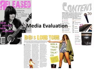
The document provides an analysis of a music magazine created by the author. It discusses conventions used from real music magazines, such as the masthead across the top, color scheme, and large cover image. It also highlights ways the author's magazine challenged conventions, like having the cover model look down rather than at the camera. Feedback from audience research is presented in graphs showing preferences for genre, font, artists featured, and other categories. The author concludes they gained skills in Photoshop and page layout from constructing the magazine.


