Download to read offline
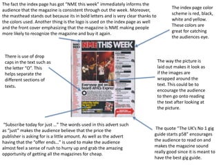
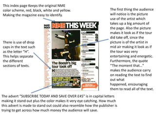
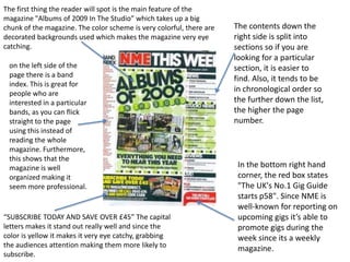

The index page uses consistent colors and logos to help readers easily recognize the magazine. It provides essential information about the magazine's contents in an organized manner to help readers find what they are looking for. Eye-catching design elements like large images, bold text, and drop caps are used to draw readers in and encourage them to explore the magazine further.


