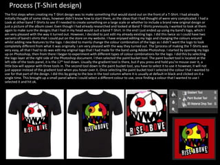
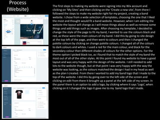
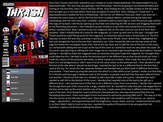
Production Reflection
Process (research)
One of the tools that I used throughout the production side of creating my experiment was the selection tool. I used
this to select layers and move them about, so that they were where I wanted them to be. One of the times I used this
was when moving the circular shape that I had created using the ellipse tool, and moving that circle to a position that I
wanted it to be, which was at the bottom of the page in the centre. I found this tool to be very helpful and essential
when creating my experiment. I think that when it comes to creating my final design, I will use this tool a lot as it
enables you to select layers and move them about. Another tool that I used was the ellipse tool, which can be found
when clicking on the rectangle tool and holding it down. It will show a selection of different tools. The ellipse tool is the
third tool down when hovering over the little menu that appears showcasing all the tools. This tool helped me create
the sun which was the centre piece of my experiment. One of the processes that I used was the gradient editor, to
choose a gradient that I liked. I did this by making sure that I had the sun layer selected and then went to the top of the
page. From there I went onto layer, then layer mask and reveal all. This then created a white layer mask next to the sun
layer (ellipse).
Process (Experiments)
This week I started my production experiments. The first experiment that I did was of a retro-futuristic poster. I
followed the steps of a YouTube tutorial and completed half of it, as the other half of the tutorial was adding the text
to the poster, which I already knew how to do. I found the tutorial very easy to follow, but I found that it was quite
boring. The reason I chose to create something like this was, because I have never done anything like that before, and
I wanted to try something knew and learn some more Photoshop skills that could be beneficial when it comes to
creating my final design. Once I finished the experiment, I wrote about the process on a power point document called
Production Experiments. Then I reflected on the experiment. I also did an additional experiment in which I followed
another YouTube tutorial. The tutorial was on how to make a book with a landscape popping out of it. It was a type of
Photoshop manipulation. I found this tutorial quite hard to follow as know one was speaking and telling you how to
do it, I had to follow his steps by pausing the video and copying what he did and so on. I found it quite boring to follow
as well. However, I have learnt a lot from that tutorial as I was doing it very slowly as I didn't want to make a mistake. I
think that I will include some of the effects that I have used for my second experiment in one of my final products. I
did the same thing after finishing this experiment writing about the process of the experiment as well as reflecting
upon it. I am happy with both the experiments I did, they didn't turn out perfect nor did they look exactly like the You-
tuber's version of the experiment that I was creating. However, I am happy with the way they turned out. I also
started on my proposal this week, I have nearly finished it. I have found the proposal easy, as I already had a idea in
my head of the band that I am going to create, as well as already having an idea about the target audience. Another
reason that I found it easy as I feel like I can talk a lot about that type of genre of music as its what I am passionate
about. I feel as if this week has been very productive and I have got a lot done. So far I am up to date with everything
and I am feeling happy with the current project so far. Next week I hope to finish my proposal.
Process (Album cover)
This week I started production, the first of my final major products was to start on the logo for the band. However, I couldn't come up
with one at the time of trying to create one, and I wanted the logo to be detailed and stand out. Therefore, I decided to start on the
album cover. First I started with creating characters to be put onto my album cover. I did this by going onto Google and getting a few
pictures up of character development sketches. This gave me some inspiration for when I was creating my characters, such as face
shapes. I began by drawing a general shape and working from what I just drew. I used the pen tool mainly, and used the colour black
as the main colour for the lines that determined what the image was. I created lots of different characters so that I could choose
from a variety of them. I have really enjoyed creating these characters as I find it easy to do them and it allows me to be creative, and
make whatever I want. The tool that I used to create my cartoon characters was the pen tool which I had set to a size of 12. I did this
by making sure that I had the pen tool selected then at the top left there is a little bar with a number below a small white circle. I
then clicked on the little arrow, which brought a dropdown menu and changed the size to 12 by scrolling along the bar. I found this to
be the right size as I didn’t want the lines to be too thick, neither did I want the lines to be too thin. It was a perfect size to draw with.
Another tool that I used a lot was the paint bucket tool. I found this by hovering over the gradient tool whilst holding my mouse over
and selecting it. It brings up some menu where you can select from three tools, one being the paint bucket tool. This tool made it a
lot easier to colour in my characters, as if I did it by hand it would take too long. However, if I had a gap in the lines the paint would
leak through and cover the whole page. So I had to make sure that all the lines of my characters were connected. When it came to
creating my cartoon characters for my album cover I created different layers for different hairstyles so at the end I could decide which
hairstyle I liked the best, and use that one. Overall, I am very happy with my album cover it isn’t what I initially planned it to be,
however I am very pleased with the way it turned out. If I were to do it again I wouldn’t change anything. If I had to I would end up
adding some more characters or props to the album cover to make it look like more is happening.
Process (logo) When I started making the logo, I didn’t know what I wanted to do so I experimented with a few
designs. In the end I went for quite a simple design, however it still works. The main tools that I used
to create this logo were the pen tool, paint bucket tool, the ellipse tool, and the rectangular tool. I
used the ellipse tool, mainly for the shape of the characters face, and the eyes. One of the reasons I
used the ellipse tool instead of drawing it was because, if I drew it by hand it wouldn’t be as neat.
The tool was easy to use all I had to do was have the tool selected and then click on the page and
stretch it out to the right size that I want. I also duplicated some of the shapes that I made, then
increased the size so that it was just slightly bigger, this left an outline behind the shape that I
duplicated. I then needed to change the colour of the circle as it blended into the other circle.
Therefore, I changed it to black so that it stood out amongst the white. Whilst making the logo I
used a lot of layers, especially when it came to making the eyes and head. I had to layer certain
layers behind one another or it would completely cover up parts of the face. I did this by dragging
the layer I wanted to be most visible above the layer that I wanted to cover up parts of. For the logo I
mainly used three colours, black, white, and red. I decided to use these colours after doing research
on what colours most represent Rock ‘N’ Roll. These were the colours that are most used for this
genre of music. When it came to making the rectangle behind the characters face. I used different
layers to make sure that the characters face wasn’t hidden under the rectangular box. Layers helped
me a lot as if I wanted to hide something or change it, I could just hide the layer. The logo was
actually easy to make there was not that much to it other than drawing using the pen tool, then
colouring in sections using the paint bucket tool, and layering parts of the logo so that it looked like
it had an outline behind it. Overall I am quite happy with my logo it turned out better than I
imagined it would. I originally was thinking of creating a hand clenched like a fist with angel wings
attached to the fist. However, now that I have created this design I am happy with it a lot more than
I would have been if I were to have created the hand with wings logo. The logo I made goes along
with the style of my bands album cover as well. I was originally supposed to make the logo first, but I
couldn’t think of what to do. So I decided to do the album cover first. In the end I am very happy
with my band logo, its definitely different from other band logos. The font that I used I got from
Dafont.com. I think that the font fits with the style I have going.
Process (Poster) I first started my poster by creating a new layer and naming it ‘background 2’, I then selected the paint
bucket tool and changed the colour from black to a colour of my choice which was red. From there I made
a new layer and started the lay out of the poster. I first started by adding some page dividers to split the
poster up a bit. I did this by using the line tool to draw lines that split the poster up. I did this to make the
poster look less boring, and having different sections helps with making it easier to read as there isn't just
one block of text stretching across the poster. Next I selected my logo on a new Photoshop document, and
drag and dropped it onto the poster Photoshop document. I then renamed the layer ‘band logo’. From
there I decided that I needed to get all of the information onto the poster so I could decide whereabouts it
goes. The first steps to doing this was to find a font that I liked from Dafont.com. I found fonts that would
match the style that I was going for. I found three different font styles that I liked and would match the
style I was going for with my poster design. Once I found the fonts that I wanted I typed the information
that I wanted the font to appear in and clicked enter this helped me preview what it would look like. I then
screenshot the text in the font that I wanted to use. From there I put the screenshot into Photoshop by
dragging the screenshot onto the document and letting go. This made a new layer with the screenshot. I
then renamed the layer, by double clicking on the text that the layer was already named this then allowed
me to rename the layer what I liked. I did this for all of the text and information that I have on the poster.
Therefore, I did this four times as I have four pieces of text on my poster. Once doing this for all of the
information that I needed, I arranged them in places that would be visible and easily read. Once having the
general layout of the poster I decided to make the guitar and drum silhouettes I already had the guitar
design from my album cover therefore, I just drag and dropped that into my poster document. Once I had
the guitar on the document I resized it to the size that I wanted by pressing CMD and T, on the keyboard.
This allowed me to resize the guitar. Once doing this and renaming the layer to ‘Guitar’. I double clicked on
the layer, this brought up a mini tab that allowed me to select lots of different effects for the layer that I
had chosen. I then went down to colour overlay and selected it which changed the guitar into a black
silhouette of a guitar. I did the same thing for the drums. However, I needed to create some drums. So I
decided to use drums from another project that I had created in the past. So I transferred the drums onto
this document and did the same thing to make them a silhouette, by double clicking on the layer and
selecting colour overlay. This made the drums a black silhouette. Once doing this I needed to find a place
on the poster to put the drums and guitar. I experimented with a few different places but in the end,
ended up putting them near the bottom of the page. After finishing this I decided that the poster was still
quite boring and that I needed to add something else to it like a pattern to break it up. I decided to add a
pattern that breaks up the page a bit. I did this by using the pen tool on a setting of twelve. I got some
inspiration from band concert posters. Originally I was going to have the background one single colour.
However, looking at it, it didn’t look very good. It wasn’t as good as I imagined it would be when it had one
colour as the background, I felt that it looked too plain and that it wouldn’t attract anyone to look at it.
However, I did like the brightness of the colour.
Once I had some feedback on my Band advertisement poster, I needed to centralise my band logo to make it the most important
part of my poster. One of the reasons for this was hierarchy to make the logo the main attraction as I would want people to see
my band logo first as that’s the reason I am creating the poster, to advertise an event. The first step was moving the text down to
the bottom of the page, I did this by making sure that I had the selection tool selected and moved the text individually down to
the bottom of the page. Once moving the text down, I enlarged my band logo my pressing CMD and T. This allowed me to resize
the logo. I then made the logo bigger, and then moved it to the center of the page. I also moved the guitar, and drums to either
side of the logo. Next I made the date at the top of the poster bigger and stretched it across the top of the poster.
Next I wanted to make my text stand out against the background. So I decided to put an effect on it. I did this by
double-clicking on the layer which brought up a mini box where I could decide from different effects. I decided to put a
stroke effect on it, this made it stand out a lot more as it gave a bright outline behind the text. However, I did have to
change it to outside instead of inside. Once doing this for all of the text and the guitar and drums, I exported it as a
JPG. I did this by going over to file – export – export as. This brought up a tab where I could change it to export as a
JPG. Once I changed it to JPG, I clicked export and exported it to my USB stick.
Process (T-Shirt design)
The first steps when creating my T-Shirt design was to make something that would stand out on the front of a T-Shirt. I had already
initially thought of some ideas, however didn’t know how to start them, as the ideas that I had thought of were very complicated. I had a
Look at other band T-Shirts to see if I needed to create something on a large scale or whether to include a brand new original design or
just a picture of the album cover. Even though I had already researched and looked at Band T-Shirts previously, I wanted to look at them
again to make sure the designs that I had in my head would suit a band T-Shirt. In the end I just ended up using my band’s logo, which I
am very pleased with the way it turned out. However, I decided to just edit my already existing logo. I did this twice so I could have two
variants of band t-shirts that I could put on the store on my website. I have enjoyed editing my logo and changing the colours around
whilst adding new features to the logo. I decided to mainly change the colour combination of the logo as I didn’t want the logo to look
completely different from what it was originally. I am very pleased with the way they turned out. The [process of making the T-Shirts was
very easy, all that I had to do was edit my original logo that I had made for the band using Adobe Photoshop. I started by opening my logo
up on Photoshop, then from there I began to experiment with different types of colour combinations for the logo. I did this by selecting
the logo layer at the right side of the Photoshop document. I then selected the paint bucket tool. The paint bucket tool is located at the
left side of the tools panel, it is the 12th tool down. Usually the gradient tool is there, but if you press and hold you’re mouse over it, a
little box will appear with three tools in. The second tool down is the paint bucket tool, you have to select it to use it however, it will not
just appear instead of the gradient tool when you hover over it. Once selecting the paint bucket tool I selected the colour that I wanted to
use for that part of the design. I did this by going to the box in the tool column where it is usually at default in black and clicked on it a
single time. This brought up a small panel where I could select a different colour to use, once finding a colour that I wanted to use I
selected it and hit ok.
Process
(Website)
The first steps to making my website were signing into my Wix account and
clicking on ‘My Sites’ and then clicking on the ‘Create a new site’, from there I
followed the steps to make my website right for my project, creating a band
website. I chose from a wide selection of templates, choosing the one that I liked
the most and thought would fit a band website. However, when I am editing the
website the layout will change as I will move things about as well as remove some
things and add things such as images. After choosing my template, I decided to
change the style of the page to fit my band, I wanted to use the colours black and
red, as these were the main colours of my band. I did this by going to site design
at the top left of the page, and then went to colours and then I changed the
palette colours by clicking on change palette colours. I changed all of the colours
to dark colours and whites. I used a red for the main colour, and black for the
secondary colour then different shades of colours for the other options. For the
theme option I picked black ice, as I found that to match the style of my band the
most out of all of the other styles. At this point I found my website to have a good
layout and was very happy with the design of the website. I still needed to add
lots to the website though, but at that point I was very happy with the way the
website was looking, as the colours matched the design I had in my head as well
as the plan I created. From there I wanted to add my band logo that I made to the
top of the website. I did this by going over to the left side of the screen and
clicking on edit from there it brought up a panel at the left side of my screen. In
the panel there is an option to add a logo, by clicking where it says ‘Logo’, when
clicking on it I changed the logo it gave me to my band logo that I made.
Process (Website)
Process (Double-page spread)
The first thing that I did was open a new InDesign document. From there I already had the settings for the document that
I wanted to use, as the last thing that I did on InDesign was create my double-page spread for the print project. The next
thing that I did was change the colour of the two pages from white to black. I did this by drawing a rectangle across both
the pages and choosing for the colour of the rectangle to be black. The rectangle tool is located at the left side of the
page where all of the tools are. I had to change the little colour box which was originally white to black. I did this by
selecting the box a single time which came up with a little tab where I could choose a colour of my choice. Once I
selected the colour black, I clicked ok, and that changed the colour from white to black. From there I wanted to create
the layout that I had planned to create in my pre-production power point. I started by adding in my photos and product
images from my photos folder on my USB stick. I did this by opening my folder up and dragging the images that I wanted
to use onto my InDesign document. From there I followed my plan to an extent. I moved some of the images to the top
left of the page and the others to the bottom right of the page. The next step was to add some text to both pages, I did
this but used Lorem Ipsum. I found it easier using this as it saved me a lot of time to arrange the page and make it look
good. I found that creating my double-page spread was very easy, but didn’t really enjoy it as much as I thought I would. I
found it to be boring, but I am happy with the way that the double-page spread turned out. However, if I had more time I
would maybe add more to it like split the text up more. Maybe add a separate little article like an exclusive interview at
the side of the page along with some more images of the band. One part of my double-page spread that I like the most,
is the way that I have laid out my band’s name, and the title of the article at the top right side of the page. I have put
them on an angle. I did this as I thought it would give the page a messy feel like I wanted to match the band and the
target audience.
After I added the text and arranged it on the two pages, where I wanted it to be, I thought that I should add
dividers to the text to split the text up and make it look like there was less text on the page. I did this by
selecting the line tool and drawing it in-between the text. I wanted the lines to stand out, and be quite a bright
colour. I also wanted to stick to my band’s main colour which was red. So I decided to change the colour of each
of the lines that I drew out to red from white, which I originally had them as. When I was researching other
magazines, I found that most articles started with the first letter of the whole paragraph a lot bigger than the
rest of the text and the colour of that letter was also different from the rest of the text. Therefore, I wanted to
do this, so I did this twice, all I did was select the first letter of the article and make it bigger, also changing the
colour. The next thing that I did was making sure that everything was lined up right, and a tiny bit away from
the center of the page.
Process (Magazine Cover)
I first started by opening a new document on Adobe Photoshop, and going to the document type and selecting international
paper from the drop down menu. I then clicked ok, which opened up the document. From there I added one of the images that I
had taken of my band, Rise Above. Once adding it in, I renamed it, by double-clicking on the text what it was originally named.
This allowed me to change the layer/image to whatever I wanted. I renamed the layer then hit enter which changed the name of
the layer. From there I wanted to edit the image itself as I thought that I could make it better quality as well as the size of the
image. I started off with the resize of the image, I did this by clicking CMD and T. This allowed me to resize the image to the size
that I wanted it to be. I resized it to a size where the lead singer was the main center of the image, as when researching other
magazines they only had one person as the center piece of the cover, to attract people to the magazine. I also thought it would
look better this way. Originally I was going to start editing the image. However, later on that day I wanted to start adding more to
the cover so that I could do the layout of the cover before I start making it look better. I already had a layout plan that I created
before I begun any of my final products. I followed whilst I added my next addition to the cover which was shapes so that my text
could go over the top of it. I first selected the rectangle tool and then drew the shape to the size that I wanted it to be. The
shapes colour was black at first but I changed it to red by double clicking on the layer and going down to the colour overlay and
changing it from black to red. I drew out two rectangles at the top of the magazine cover, this was so that my exclusive
information could go at the top of the cover. I made one black and the other red, as these colours I used throughout most of my
products and wanted this to be the main colour scheme. I then drew out two more rectangles one red and one black. The
second rectangle that I had drawn I wanted to flip it so that it is vertical. Therefore, I clicked on CMD and T, this allowed me to
resize it as well as flip it. The rectangle that I flipped was the black one, and I placed it at the bottom left of the cover up against
the page. I found that a lot of magazines had this section on their covers therefore, I wanted to do it as I thought it would make
my cover look much more professional. Now that I had the main picture, and the rectangular boxes placed around the cover. I
then went onto Dafont.com looking for fonts that would fit my cover style.
Once that I found a font that I wanted to use I clicked on it and clicked download. This downloaded it to my
download folder. The next step was getting it onto Photoshop. I did this by going to my download folder and
clicking on the font files, then I had to find the .tff file. Once finding this file I double-clicked on the file and it
then brought up a a mini box where there was an option to install font. Once clicking on “install font” it
downloaded and installed the font to Photoshop. I did this for ten different fonts but I didn’t use them all. I
followed the same steps as I did for the first font that I installed. Before I started writing the titles and
subheadings with the new fonts that I installed, I wanted to add my band logo in, both the picture logo and the
title logo of my band. I did this by opening up my folder and selecting the JPG versions and dragging them both
to my Photoshop document. I then followed my plan of where to put them and moved them to a location
where I wanted them. Next I wanted to put the magazine title on the cover and use one of the fonts that I
installed. I didn’t initially think of a name for the magazine, so I came up with one on the spot. I thought that
Thrash would be a well fitting name for the magazine, as I want the style to have a thrash look to it. The first
step was to select the text tool, and draw a text box, then write Thrash. Once I wrote that, I highlighted the
text and changed the font to the one that I wanted to use. I then moved the title into the top center of the
page but below the rectangular boxes that I had at the top. Next was to add the rest of the text on the cover,
so I started with adding the text to put at the top of the cover as I wanted to work my way down the cover. At
this point I was planning on editing the main image last as I wanted to get everything else done before I started
editing it. I decided to make the magazine have an exclusive interview inside the magazine. So I thought that I
could advertise this. I decided to write the exclusive part in the different box as that should stand out more. I
made the colours of the exclusive text white, as white stands out on black. I then made the rest of the text
black on a red background as I didn’t want it to be the same colour as the exclusive text. I then decided to add
the text at the side where I placed my band logo. I wanted the text to be in a different font to the font that I
used at the top. So I wrote the two, separate headers and decided two put them both in different fonts from
one another. I lined them up using the selection tool which is a little white cursor symbol. I made sure that they
fit in the box and had a gap in between each of the headers so people could tell that they were different from
one another. I found out that later on I needed to add a barcode, a date, and a price. I decided that next I
needed to add info to the bottom of the cover. I decided that I wanted most of the text to be split up in
different fonts. I also wanted some of the text to be a different colour from one another. I decide that I wanted
the Grunge Rock part of the cover to be a large, eroded, font. So I decided to make that part, the largest font in
the box and to take up the entire bottom row of the box. I made some of the text in different fonts from other
parts of the text. Once doing this I went and found a barcode picture, and copy and pasted that onto my
Photoshop document. I then rearranged it from horizontal to vertical by pressing CMD and T. This was so it fits
into the section at the left side of the cover. Once doing this I still needed to edit the picture, so I went to
image – adjustments , and experimented with the brightness, curves, levels, and hue. I experimented lots with
it, so that it didn't look to much or too less. I wanted the quality of the picture to be very good but not
overdone. I spent a lot of time on editing the picture.

Fmp production reflection

  • 1.
  • 2.
    Process (research) One ofthe tools that I used throughout the production side of creating my experiment was the selection tool. I used this to select layers and move them about, so that they were where I wanted them to be. One of the times I used this was when moving the circular shape that I had created using the ellipse tool, and moving that circle to a position that I wanted it to be, which was at the bottom of the page in the centre. I found this tool to be very helpful and essential when creating my experiment. I think that when it comes to creating my final design, I will use this tool a lot as it enables you to select layers and move them about. Another tool that I used was the ellipse tool, which can be found when clicking on the rectangle tool and holding it down. It will show a selection of different tools. The ellipse tool is the third tool down when hovering over the little menu that appears showcasing all the tools. This tool helped me create the sun which was the centre piece of my experiment. One of the processes that I used was the gradient editor, to choose a gradient that I liked. I did this by making sure that I had the sun layer selected and then went to the top of the page. From there I went onto layer, then layer mask and reveal all. This then created a white layer mask next to the sun layer (ellipse).
  • 3.
    Process (Experiments) This weekI started my production experiments. The first experiment that I did was of a retro-futuristic poster. I followed the steps of a YouTube tutorial and completed half of it, as the other half of the tutorial was adding the text to the poster, which I already knew how to do. I found the tutorial very easy to follow, but I found that it was quite boring. The reason I chose to create something like this was, because I have never done anything like that before, and I wanted to try something knew and learn some more Photoshop skills that could be beneficial when it comes to creating my final design. Once I finished the experiment, I wrote about the process on a power point document called Production Experiments. Then I reflected on the experiment. I also did an additional experiment in which I followed another YouTube tutorial. The tutorial was on how to make a book with a landscape popping out of it. It was a type of Photoshop manipulation. I found this tutorial quite hard to follow as know one was speaking and telling you how to do it, I had to follow his steps by pausing the video and copying what he did and so on. I found it quite boring to follow as well. However, I have learnt a lot from that tutorial as I was doing it very slowly as I didn't want to make a mistake. I think that I will include some of the effects that I have used for my second experiment in one of my final products. I did the same thing after finishing this experiment writing about the process of the experiment as well as reflecting upon it. I am happy with both the experiments I did, they didn't turn out perfect nor did they look exactly like the You- tuber's version of the experiment that I was creating. However, I am happy with the way they turned out. I also started on my proposal this week, I have nearly finished it. I have found the proposal easy, as I already had a idea in my head of the band that I am going to create, as well as already having an idea about the target audience. Another reason that I found it easy as I feel like I can talk a lot about that type of genre of music as its what I am passionate about. I feel as if this week has been very productive and I have got a lot done. So far I am up to date with everything and I am feeling happy with the current project so far. Next week I hope to finish my proposal.
  • 4.
    Process (Album cover) Thisweek I started production, the first of my final major products was to start on the logo for the band. However, I couldn't come up with one at the time of trying to create one, and I wanted the logo to be detailed and stand out. Therefore, I decided to start on the album cover. First I started with creating characters to be put onto my album cover. I did this by going onto Google and getting a few pictures up of character development sketches. This gave me some inspiration for when I was creating my characters, such as face shapes. I began by drawing a general shape and working from what I just drew. I used the pen tool mainly, and used the colour black as the main colour for the lines that determined what the image was. I created lots of different characters so that I could choose from a variety of them. I have really enjoyed creating these characters as I find it easy to do them and it allows me to be creative, and make whatever I want. The tool that I used to create my cartoon characters was the pen tool which I had set to a size of 12. I did this by making sure that I had the pen tool selected then at the top left there is a little bar with a number below a small white circle. I then clicked on the little arrow, which brought a dropdown menu and changed the size to 12 by scrolling along the bar. I found this to be the right size as I didn’t want the lines to be too thick, neither did I want the lines to be too thin. It was a perfect size to draw with. Another tool that I used a lot was the paint bucket tool. I found this by hovering over the gradient tool whilst holding my mouse over and selecting it. It brings up some menu where you can select from three tools, one being the paint bucket tool. This tool made it a lot easier to colour in my characters, as if I did it by hand it would take too long. However, if I had a gap in the lines the paint would leak through and cover the whole page. So I had to make sure that all the lines of my characters were connected. When it came to creating my cartoon characters for my album cover I created different layers for different hairstyles so at the end I could decide which hairstyle I liked the best, and use that one. Overall, I am very happy with my album cover it isn’t what I initially planned it to be, however I am very pleased with the way it turned out. If I were to do it again I wouldn’t change anything. If I had to I would end up adding some more characters or props to the album cover to make it look like more is happening.
  • 5.
    Process (logo) WhenI started making the logo, I didn’t know what I wanted to do so I experimented with a few designs. In the end I went for quite a simple design, however it still works. The main tools that I used to create this logo were the pen tool, paint bucket tool, the ellipse tool, and the rectangular tool. I used the ellipse tool, mainly for the shape of the characters face, and the eyes. One of the reasons I used the ellipse tool instead of drawing it was because, if I drew it by hand it wouldn’t be as neat. The tool was easy to use all I had to do was have the tool selected and then click on the page and stretch it out to the right size that I want. I also duplicated some of the shapes that I made, then increased the size so that it was just slightly bigger, this left an outline behind the shape that I duplicated. I then needed to change the colour of the circle as it blended into the other circle. Therefore, I changed it to black so that it stood out amongst the white. Whilst making the logo I used a lot of layers, especially when it came to making the eyes and head. I had to layer certain layers behind one another or it would completely cover up parts of the face. I did this by dragging the layer I wanted to be most visible above the layer that I wanted to cover up parts of. For the logo I mainly used three colours, black, white, and red. I decided to use these colours after doing research on what colours most represent Rock ‘N’ Roll. These were the colours that are most used for this genre of music. When it came to making the rectangle behind the characters face. I used different layers to make sure that the characters face wasn’t hidden under the rectangular box. Layers helped me a lot as if I wanted to hide something or change it, I could just hide the layer. The logo was actually easy to make there was not that much to it other than drawing using the pen tool, then colouring in sections using the paint bucket tool, and layering parts of the logo so that it looked like it had an outline behind it. Overall I am quite happy with my logo it turned out better than I imagined it would. I originally was thinking of creating a hand clenched like a fist with angel wings attached to the fist. However, now that I have created this design I am happy with it a lot more than I would have been if I were to have created the hand with wings logo. The logo I made goes along with the style of my bands album cover as well. I was originally supposed to make the logo first, but I couldn’t think of what to do. So I decided to do the album cover first. In the end I am very happy with my band logo, its definitely different from other band logos. The font that I used I got from Dafont.com. I think that the font fits with the style I have going.
  • 6.
    Process (Poster) Ifirst started my poster by creating a new layer and naming it ‘background 2’, I then selected the paint bucket tool and changed the colour from black to a colour of my choice which was red. From there I made a new layer and started the lay out of the poster. I first started by adding some page dividers to split the poster up a bit. I did this by using the line tool to draw lines that split the poster up. I did this to make the poster look less boring, and having different sections helps with making it easier to read as there isn't just one block of text stretching across the poster. Next I selected my logo on a new Photoshop document, and drag and dropped it onto the poster Photoshop document. I then renamed the layer ‘band logo’. From there I decided that I needed to get all of the information onto the poster so I could decide whereabouts it goes. The first steps to doing this was to find a font that I liked from Dafont.com. I found fonts that would match the style that I was going for. I found three different font styles that I liked and would match the style I was going for with my poster design. Once I found the fonts that I wanted I typed the information that I wanted the font to appear in and clicked enter this helped me preview what it would look like. I then screenshot the text in the font that I wanted to use. From there I put the screenshot into Photoshop by dragging the screenshot onto the document and letting go. This made a new layer with the screenshot. I then renamed the layer, by double clicking on the text that the layer was already named this then allowed me to rename the layer what I liked. I did this for all of the text and information that I have on the poster. Therefore, I did this four times as I have four pieces of text on my poster. Once doing this for all of the information that I needed, I arranged them in places that would be visible and easily read. Once having the general layout of the poster I decided to make the guitar and drum silhouettes I already had the guitar design from my album cover therefore, I just drag and dropped that into my poster document. Once I had the guitar on the document I resized it to the size that I wanted by pressing CMD and T, on the keyboard. This allowed me to resize the guitar. Once doing this and renaming the layer to ‘Guitar’. I double clicked on the layer, this brought up a mini tab that allowed me to select lots of different effects for the layer that I had chosen. I then went down to colour overlay and selected it which changed the guitar into a black silhouette of a guitar. I did the same thing for the drums. However, I needed to create some drums. So I decided to use drums from another project that I had created in the past. So I transferred the drums onto this document and did the same thing to make them a silhouette, by double clicking on the layer and selecting colour overlay. This made the drums a black silhouette. Once doing this I needed to find a place on the poster to put the drums and guitar. I experimented with a few different places but in the end, ended up putting them near the bottom of the page. After finishing this I decided that the poster was still quite boring and that I needed to add something else to it like a pattern to break it up. I decided to add a pattern that breaks up the page a bit. I did this by using the pen tool on a setting of twelve. I got some inspiration from band concert posters. Originally I was going to have the background one single colour. However, looking at it, it didn’t look very good. It wasn’t as good as I imagined it would be when it had one colour as the background, I felt that it looked too plain and that it wouldn’t attract anyone to look at it. However, I did like the brightness of the colour.
  • 7.
    Once I hadsome feedback on my Band advertisement poster, I needed to centralise my band logo to make it the most important part of my poster. One of the reasons for this was hierarchy to make the logo the main attraction as I would want people to see my band logo first as that’s the reason I am creating the poster, to advertise an event. The first step was moving the text down to the bottom of the page, I did this by making sure that I had the selection tool selected and moved the text individually down to the bottom of the page. Once moving the text down, I enlarged my band logo my pressing CMD and T. This allowed me to resize the logo. I then made the logo bigger, and then moved it to the center of the page. I also moved the guitar, and drums to either side of the logo. Next I made the date at the top of the poster bigger and stretched it across the top of the poster.
  • 8.
    Next I wantedto make my text stand out against the background. So I decided to put an effect on it. I did this by double-clicking on the layer which brought up a mini box where I could decide from different effects. I decided to put a stroke effect on it, this made it stand out a lot more as it gave a bright outline behind the text. However, I did have to change it to outside instead of inside. Once doing this for all of the text and the guitar and drums, I exported it as a JPG. I did this by going over to file – export – export as. This brought up a tab where I could change it to export as a JPG. Once I changed it to JPG, I clicked export and exported it to my USB stick.
  • 9.
    Process (T-Shirt design) Thefirst steps when creating my T-Shirt design was to make something that would stand out on the front of a T-Shirt. I had already initially thought of some ideas, however didn’t know how to start them, as the ideas that I had thought of were very complicated. I had a Look at other band T-Shirts to see if I needed to create something on a large scale or whether to include a brand new original design or just a picture of the album cover. Even though I had already researched and looked at Band T-Shirts previously, I wanted to look at them again to make sure the designs that I had in my head would suit a band T-Shirt. In the end I just ended up using my band’s logo, which I am very pleased with the way it turned out. However, I decided to just edit my already existing logo. I did this twice so I could have two variants of band t-shirts that I could put on the store on my website. I have enjoyed editing my logo and changing the colours around whilst adding new features to the logo. I decided to mainly change the colour combination of the logo as I didn’t want the logo to look completely different from what it was originally. I am very pleased with the way they turned out. The [process of making the T-Shirts was very easy, all that I had to do was edit my original logo that I had made for the band using Adobe Photoshop. I started by opening my logo up on Photoshop, then from there I began to experiment with different types of colour combinations for the logo. I did this by selecting the logo layer at the right side of the Photoshop document. I then selected the paint bucket tool. The paint bucket tool is located at the left side of the tools panel, it is the 12th tool down. Usually the gradient tool is there, but if you press and hold you’re mouse over it, a little box will appear with three tools in. The second tool down is the paint bucket tool, you have to select it to use it however, it will not just appear instead of the gradient tool when you hover over it. Once selecting the paint bucket tool I selected the colour that I wanted to use for that part of the design. I did this by going to the box in the tool column where it is usually at default in black and clicked on it a single time. This brought up a small panel where I could select a different colour to use, once finding a colour that I wanted to use I selected it and hit ok.
  • 10.
    Process (Website) The first stepsto making my website were signing into my Wix account and clicking on ‘My Sites’ and then clicking on the ‘Create a new site’, from there I followed the steps to make my website right for my project, creating a band website. I chose from a wide selection of templates, choosing the one that I liked the most and thought would fit a band website. However, when I am editing the website the layout will change as I will move things about as well as remove some things and add things such as images. After choosing my template, I decided to change the style of the page to fit my band, I wanted to use the colours black and red, as these were the main colours of my band. I did this by going to site design at the top left of the page, and then went to colours and then I changed the palette colours by clicking on change palette colours. I changed all of the colours to dark colours and whites. I used a red for the main colour, and black for the secondary colour then different shades of colours for the other options. For the theme option I picked black ice, as I found that to match the style of my band the most out of all of the other styles. At this point I found my website to have a good layout and was very happy with the design of the website. I still needed to add lots to the website though, but at that point I was very happy with the way the website was looking, as the colours matched the design I had in my head as well as the plan I created. From there I wanted to add my band logo that I made to the top of the website. I did this by going over to the left side of the screen and clicking on edit from there it brought up a panel at the left side of my screen. In the panel there is an option to add a logo, by clicking where it says ‘Logo’, when clicking on it I changed the logo it gave me to my band logo that I made.
  • 11.
  • 12.
    Process (Double-page spread) Thefirst thing that I did was open a new InDesign document. From there I already had the settings for the document that I wanted to use, as the last thing that I did on InDesign was create my double-page spread for the print project. The next thing that I did was change the colour of the two pages from white to black. I did this by drawing a rectangle across both the pages and choosing for the colour of the rectangle to be black. The rectangle tool is located at the left side of the page where all of the tools are. I had to change the little colour box which was originally white to black. I did this by selecting the box a single time which came up with a little tab where I could choose a colour of my choice. Once I selected the colour black, I clicked ok, and that changed the colour from white to black. From there I wanted to create the layout that I had planned to create in my pre-production power point. I started by adding in my photos and product images from my photos folder on my USB stick. I did this by opening my folder up and dragging the images that I wanted to use onto my InDesign document. From there I followed my plan to an extent. I moved some of the images to the top left of the page and the others to the bottom right of the page. The next step was to add some text to both pages, I did this but used Lorem Ipsum. I found it easier using this as it saved me a lot of time to arrange the page and make it look good. I found that creating my double-page spread was very easy, but didn’t really enjoy it as much as I thought I would. I found it to be boring, but I am happy with the way that the double-page spread turned out. However, if I had more time I would maybe add more to it like split the text up more. Maybe add a separate little article like an exclusive interview at the side of the page along with some more images of the band. One part of my double-page spread that I like the most, is the way that I have laid out my band’s name, and the title of the article at the top right side of the page. I have put them on an angle. I did this as I thought it would give the page a messy feel like I wanted to match the band and the target audience.
  • 13.
    After I addedthe text and arranged it on the two pages, where I wanted it to be, I thought that I should add dividers to the text to split the text up and make it look like there was less text on the page. I did this by selecting the line tool and drawing it in-between the text. I wanted the lines to stand out, and be quite a bright colour. I also wanted to stick to my band’s main colour which was red. So I decided to change the colour of each of the lines that I drew out to red from white, which I originally had them as. When I was researching other magazines, I found that most articles started with the first letter of the whole paragraph a lot bigger than the rest of the text and the colour of that letter was also different from the rest of the text. Therefore, I wanted to do this, so I did this twice, all I did was select the first letter of the article and make it bigger, also changing the colour. The next thing that I did was making sure that everything was lined up right, and a tiny bit away from the center of the page.
  • 14.
    Process (Magazine Cover) Ifirst started by opening a new document on Adobe Photoshop, and going to the document type and selecting international paper from the drop down menu. I then clicked ok, which opened up the document. From there I added one of the images that I had taken of my band, Rise Above. Once adding it in, I renamed it, by double-clicking on the text what it was originally named. This allowed me to change the layer/image to whatever I wanted. I renamed the layer then hit enter which changed the name of the layer. From there I wanted to edit the image itself as I thought that I could make it better quality as well as the size of the image. I started off with the resize of the image, I did this by clicking CMD and T. This allowed me to resize the image to the size that I wanted it to be. I resized it to a size where the lead singer was the main center of the image, as when researching other magazines they only had one person as the center piece of the cover, to attract people to the magazine. I also thought it would look better this way. Originally I was going to start editing the image. However, later on that day I wanted to start adding more to the cover so that I could do the layout of the cover before I start making it look better. I already had a layout plan that I created before I begun any of my final products. I followed whilst I added my next addition to the cover which was shapes so that my text could go over the top of it. I first selected the rectangle tool and then drew the shape to the size that I wanted it to be. The shapes colour was black at first but I changed it to red by double clicking on the layer and going down to the colour overlay and changing it from black to red. I drew out two rectangles at the top of the magazine cover, this was so that my exclusive information could go at the top of the cover. I made one black and the other red, as these colours I used throughout most of my products and wanted this to be the main colour scheme. I then drew out two more rectangles one red and one black. The second rectangle that I had drawn I wanted to flip it so that it is vertical. Therefore, I clicked on CMD and T, this allowed me to resize it as well as flip it. The rectangle that I flipped was the black one, and I placed it at the bottom left of the cover up against the page. I found that a lot of magazines had this section on their covers therefore, I wanted to do it as I thought it would make my cover look much more professional. Now that I had the main picture, and the rectangular boxes placed around the cover. I then went onto Dafont.com looking for fonts that would fit my cover style.
  • 15.
    Once that Ifound a font that I wanted to use I clicked on it and clicked download. This downloaded it to my download folder. The next step was getting it onto Photoshop. I did this by going to my download folder and clicking on the font files, then I had to find the .tff file. Once finding this file I double-clicked on the file and it then brought up a a mini box where there was an option to install font. Once clicking on “install font” it downloaded and installed the font to Photoshop. I did this for ten different fonts but I didn’t use them all. I followed the same steps as I did for the first font that I installed. Before I started writing the titles and subheadings with the new fonts that I installed, I wanted to add my band logo in, both the picture logo and the title logo of my band. I did this by opening up my folder and selecting the JPG versions and dragging them both to my Photoshop document. I then followed my plan of where to put them and moved them to a location where I wanted them. Next I wanted to put the magazine title on the cover and use one of the fonts that I installed. I didn’t initially think of a name for the magazine, so I came up with one on the spot. I thought that Thrash would be a well fitting name for the magazine, as I want the style to have a thrash look to it. The first step was to select the text tool, and draw a text box, then write Thrash. Once I wrote that, I highlighted the text and changed the font to the one that I wanted to use. I then moved the title into the top center of the page but below the rectangular boxes that I had at the top. Next was to add the rest of the text on the cover, so I started with adding the text to put at the top of the cover as I wanted to work my way down the cover. At this point I was planning on editing the main image last as I wanted to get everything else done before I started editing it. I decided to make the magazine have an exclusive interview inside the magazine. So I thought that I could advertise this. I decided to write the exclusive part in the different box as that should stand out more. I made the colours of the exclusive text white, as white stands out on black. I then made the rest of the text black on a red background as I didn’t want it to be the same colour as the exclusive text. I then decided to add the text at the side where I placed my band logo. I wanted the text to be in a different font to the font that I used at the top. So I wrote the two, separate headers and decided two put them both in different fonts from one another. I lined them up using the selection tool which is a little white cursor symbol. I made sure that they fit in the box and had a gap in between each of the headers so people could tell that they were different from one another. I found out that later on I needed to add a barcode, a date, and a price. I decided that next I needed to add info to the bottom of the cover. I decided that I wanted most of the text to be split up in different fonts. I also wanted some of the text to be a different colour from one another. I decide that I wanted the Grunge Rock part of the cover to be a large, eroded, font. So I decided to make that part, the largest font in the box and to take up the entire bottom row of the box. I made some of the text in different fonts from other parts of the text. Once doing this I went and found a barcode picture, and copy and pasted that onto my Photoshop document. I then rearranged it from horizontal to vertical by pressing CMD and T. This was so it fits into the section at the left side of the cover. Once doing this I still needed to edit the picture, so I went to image – adjustments , and experimented with the brightness, curves, levels, and hue. I experimented lots with it, so that it didn't look to much or too less. I wanted the quality of the picture to be very good but not overdone. I spent a lot of time on editing the picture.

Editor's Notes

  • #3 Discuss the tools and processes used in your production. Log your thoughts and feelings about your work.
  • #5 Discuss the tools and processes used in your production. Log your thoughts and feelings about your work.
  • #6 Discuss the tools and processes used in your production. Log your thoughts and feelings about your work.
  • #7 Discuss the tools and processes used in your production. Log your thoughts and feelings about your work.
  • #10 Discuss the tools and processes used in your production. Log your thoughts and feelings about your work.
  • #11 Discuss the tools and processes used in your production. Log your thoughts and feelings about your work.
  • #13 Discuss the tools and processes used in your production. Log your thoughts and feelings about your work.