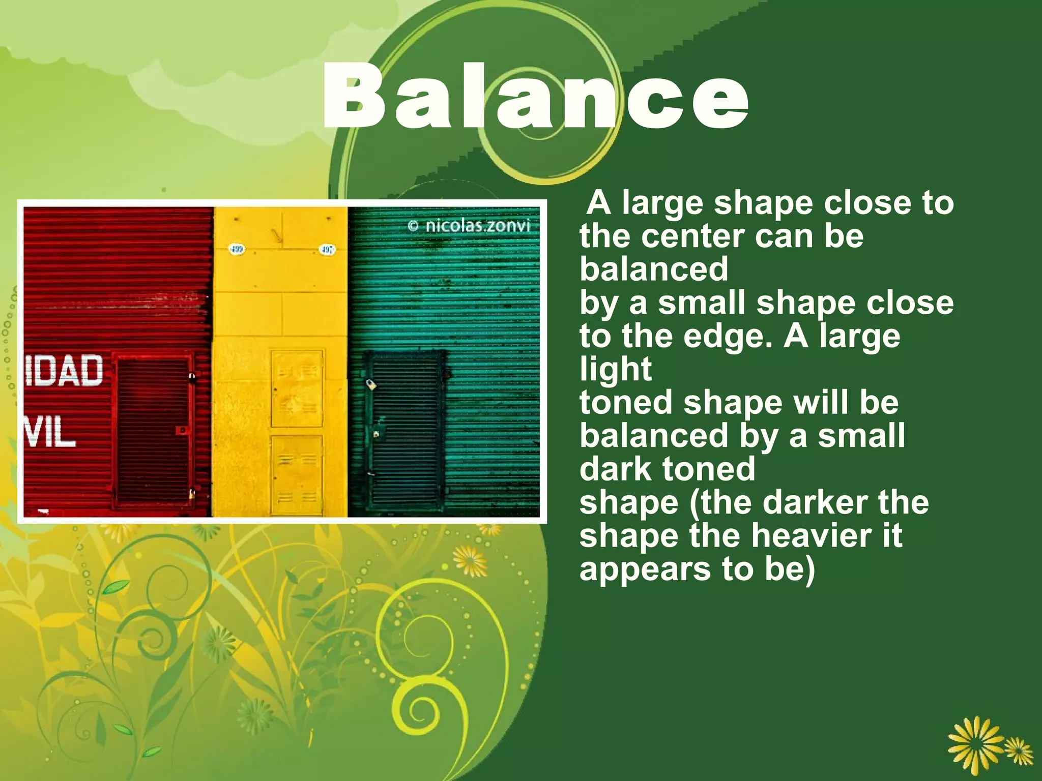
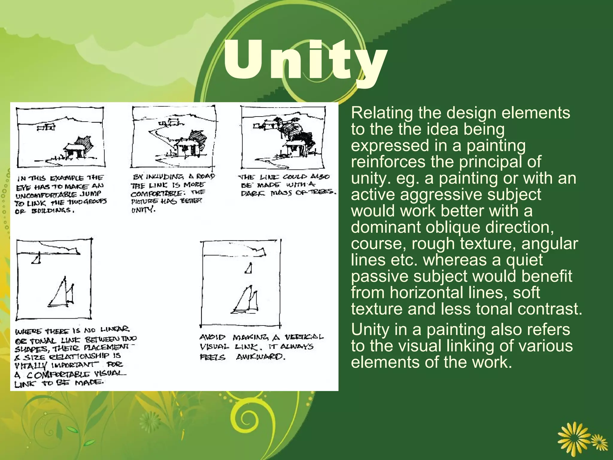
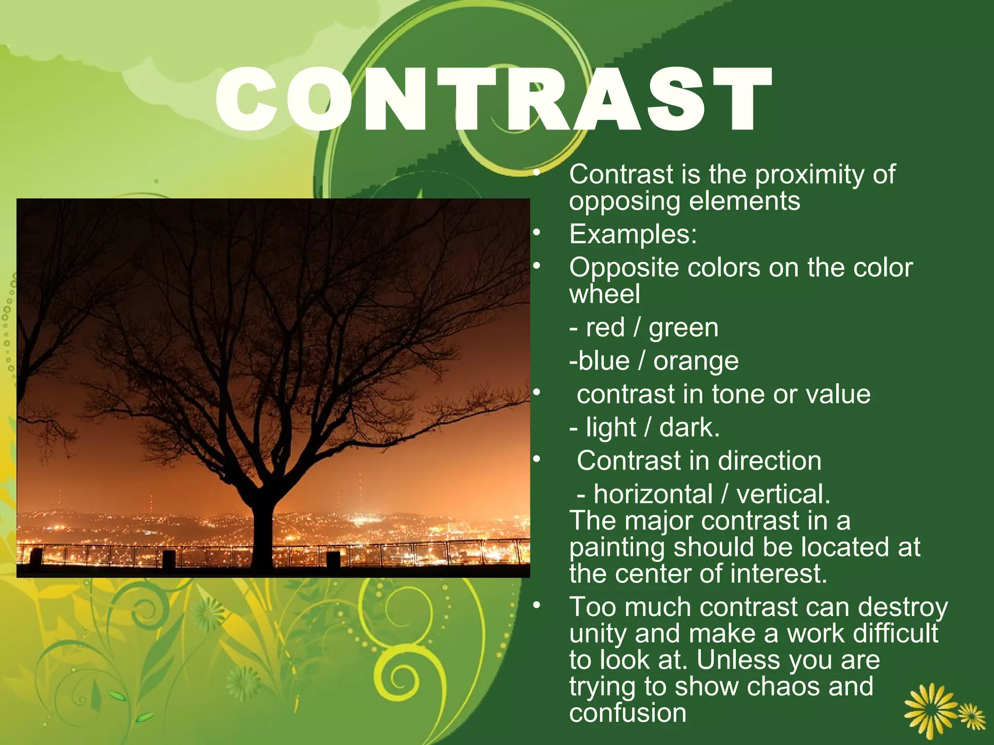
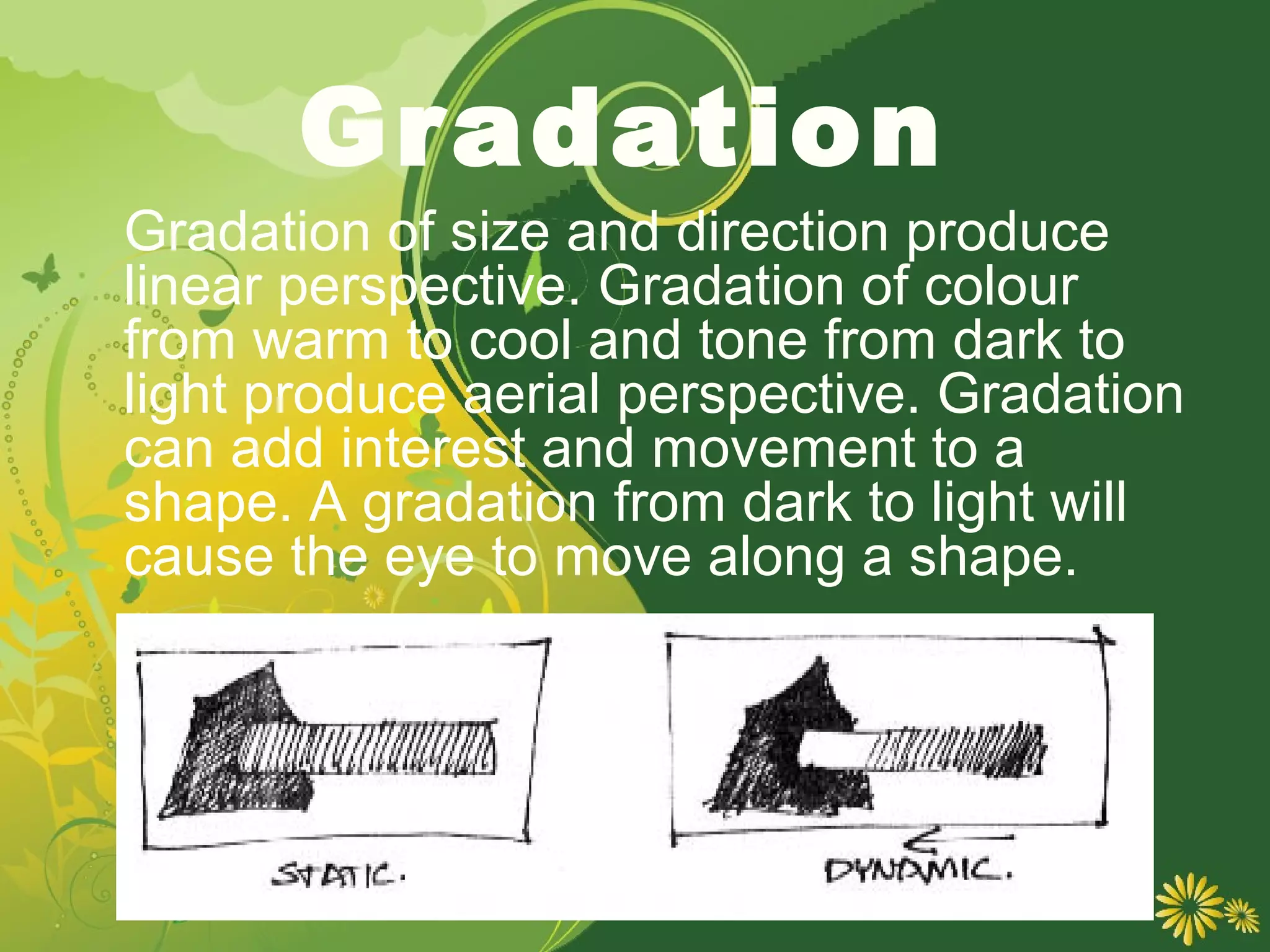
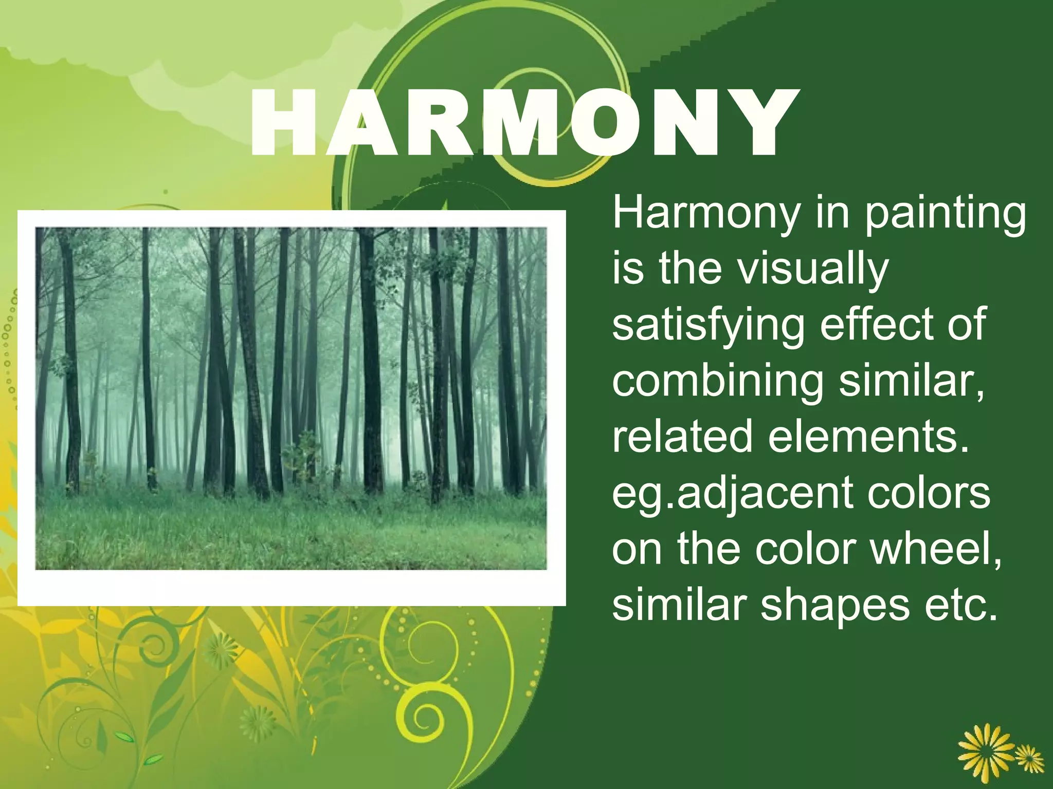
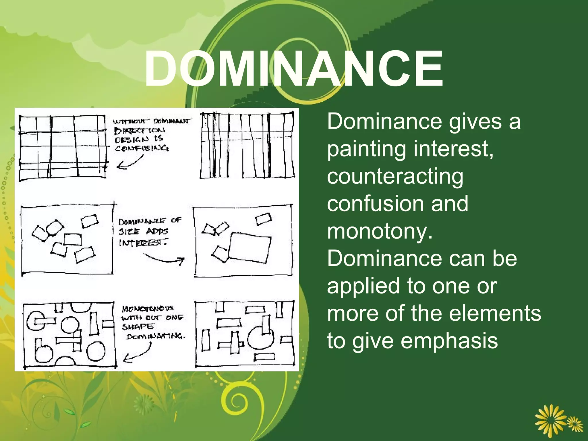
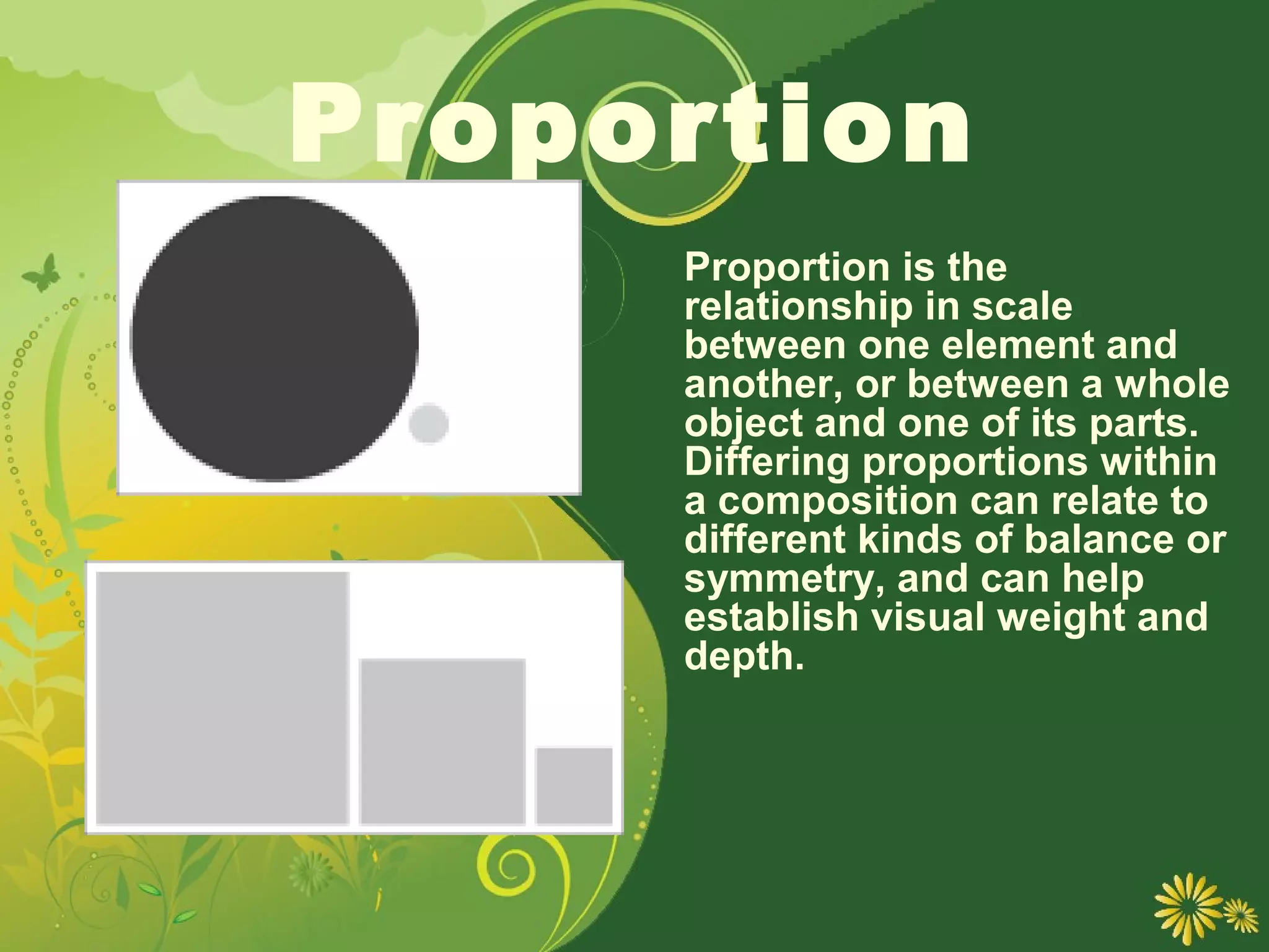
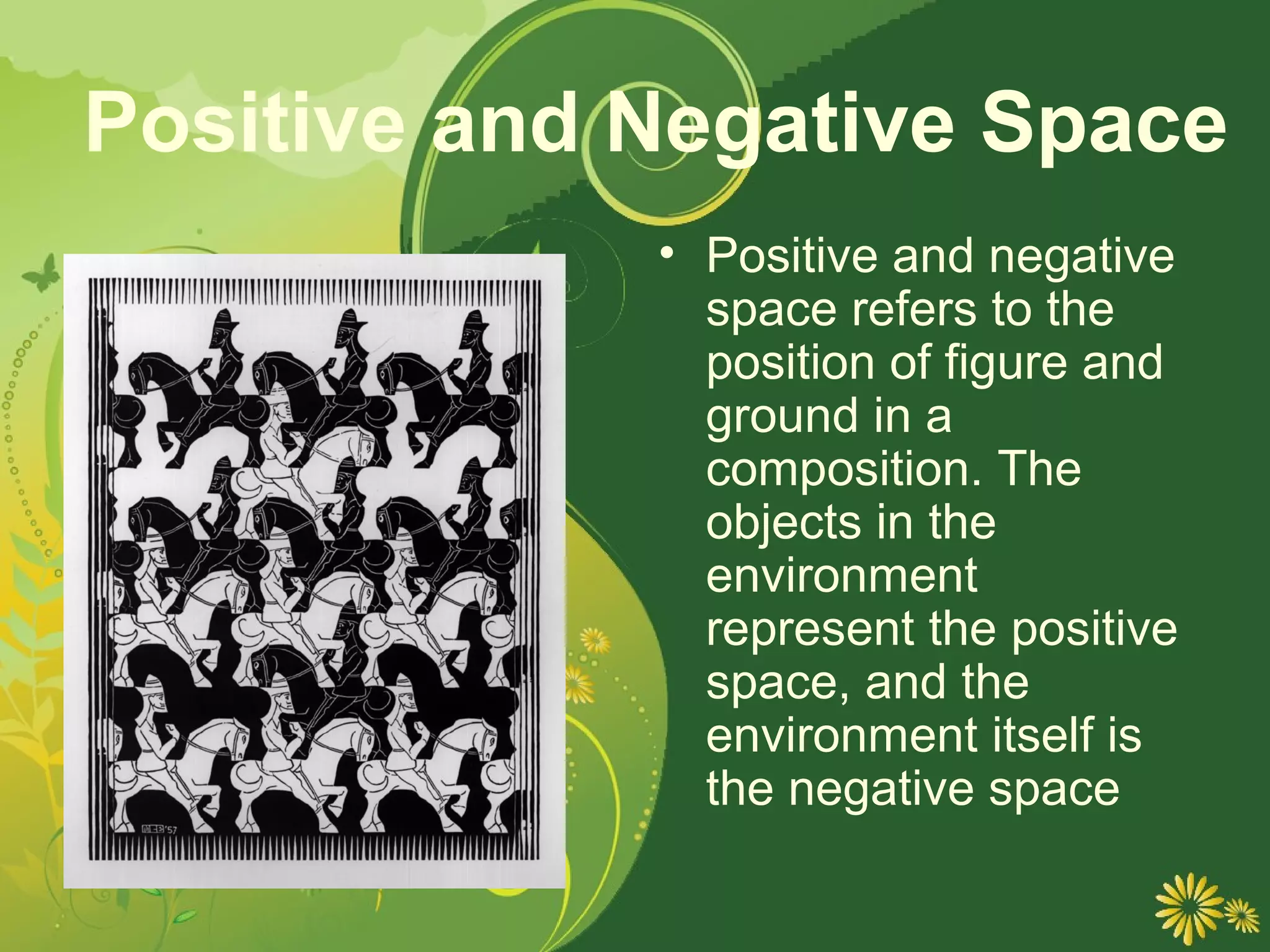
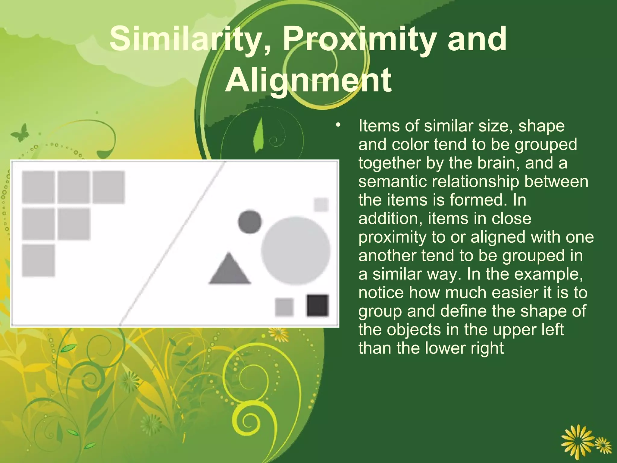
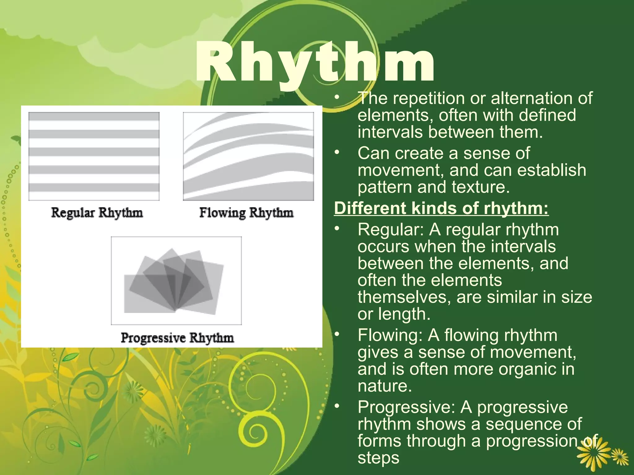
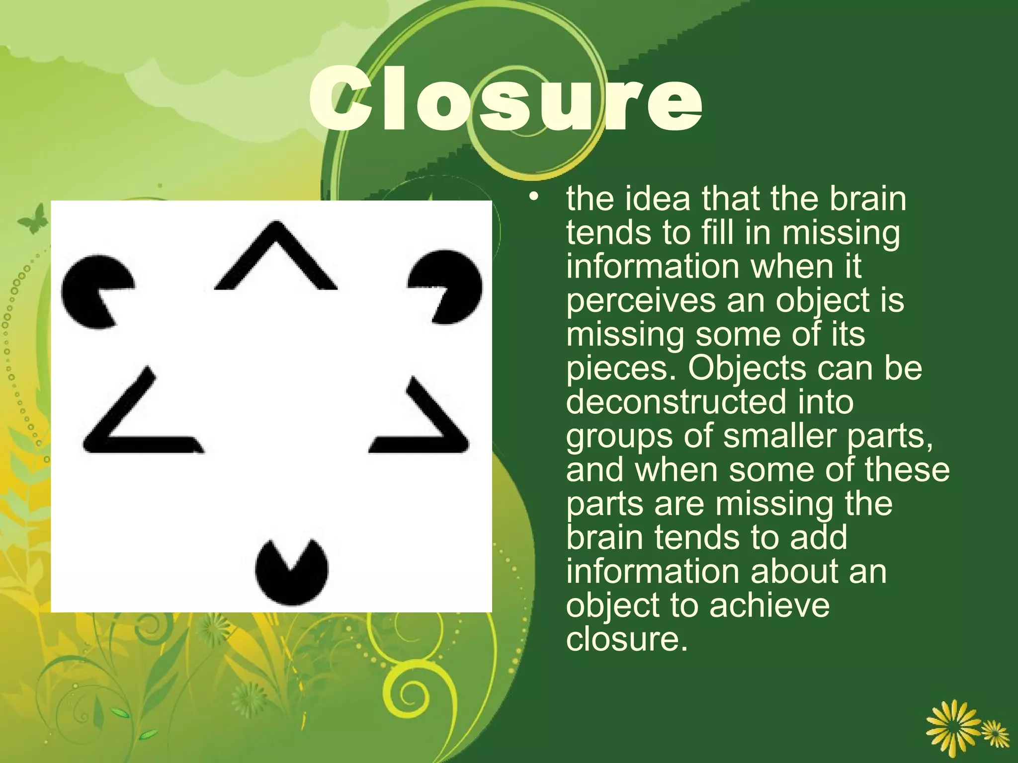
Principles
of Design
Balance
     A large shape close to
    the center can be
    balanced
    by a small shape close
    to the edge. A large
    light
    toned shape will be
    balanced by a small
    dark toned
    shape (the darker the
    shape the heavier it
    appears to be)
Unity
   •   Relating the design elements
       to the the idea being
       expressed in a painting
       reinforces the principal of
       unity. eg. a painting or with an
       active aggressive subject
       would work better with a
       dominant oblique direction,
       course, rough texture, angular
       lines etc. whereas a quiet
       passive subject would benefit
       from horizontal lines, soft
       texture and less tonal contrast.
   •   Unity in a painting also refers
       to the visual linking of various
       elements of the work.
CONTRAST
    •   Contrast is the proximity of
        opposing elements
    •   Examples:
    •   Opposite colors on the color
        wheel
        - red / green
        -blue / orange
    •    contrast in tone or value
        - light / dark.
    •    Contrast in direction
         - horizontal / vertical.
        The major contrast in a
        painting should be located at
        the center of interest.
    •   Too much contrast can destroy
        unity and make a work difficult
        to look at. Unless you are
        trying to show chaos and
        confusion
Gradation
Gradation of size and direction produce
linear perspective. Gradation of colour
from warm to cool and tone from dark to
light produce aerial perspective. Gradation
can add interest and movement to a
shape. A gradation from dark to light will
cause the eye to move along a shape.
HARMONY
    Harmony in painting
    is the visually
    satisfying effect of
    combining similar,
    related elements.
    eg.adjacent colors
    on the color wheel,
    similar shapes etc.
DOMINANCE
     Dominance gives a
     painting interest,
     counteracting
     confusion and
     monotony.
     Dominance can be
     applied to one or
     more of the elements
     to give emphasis
Proportion
     Proportion is the
     relationship in scale
     between one element and
     another, or between a whole
     object and one of its parts.
     Differing proportions within
     a composition can relate to
     different kinds of balance or
     symmetry, and can help
     establish visual weight and
     depth.
Positive and Negative Space
             • Positive and negative
               space refers to the
               position of figure and
               ground in a
               composition. The
               objects in the
               environment
               represent the positive
               space, and the
               environment itself is
               the negative space
Similarity, Proximity and
       Alignment
              •   Items of similar size, shape
                  and color tend to be grouped
                  together by the brain, and a
                  semantic relationship between
                  the items is formed. In
                  addition, items in close
                  proximity to or aligned with one
                  another tend to be grouped in
                  a similar way. In the example,
                  notice how much easier it is to
                  group and define the shape of
                  the objects in the upper left
                  than the lower right
Rhythm
   •  The repetition or alternation of
      elements, often with defined
      intervals between them.
   • Can create a sense of
      movement, and can establish
      pattern and texture.
   Different kinds of rhythm:
   • Regular: A regular rhythm
      occurs when the intervals
      between the elements, and
      often the elements
      themselves, are similar in size
      or length.
   • Flowing: A flowing rhythm
      gives a sense of movement,
      and is often more organic in
      nature.
   • Progressive: A progressive
      rhythm shows a sequence of
      forms through a progression of
      steps
Closure
   • the idea that the brain
     tends to fill in missing
     information when it
     perceives an object is
     missing some of its
     pieces. Objects can be
     deconstructed into
     groups of smaller parts,
     and when some of these
     parts are missing the
     brain tends to add
     information about an
     object to achieve
     closure.
Continuance idea
      • Continuance is the
             that once you begin
             looking in one direction,
             you will continue to do
             so until something more
             significant catches your
             attention. Perspective, or
             the use of dominant
             directional lines, tends to
             successfully direct the
             viewers eye in a given
             direction. In addition, the
             eye direction of any
             subjects in the design
             itself can cause a similar
             effect.

Principles of design

  • 1.
  • 2.
    Balance A large shape close to the center can be balanced by a small shape close to the edge. A large light toned shape will be balanced by a small dark toned shape (the darker the shape the heavier it appears to be)
  • 3.
    Unity • Relating the design elements to the the idea being expressed in a painting reinforces the principal of unity. eg. a painting or with an active aggressive subject would work better with a dominant oblique direction, course, rough texture, angular lines etc. whereas a quiet passive subject would benefit from horizontal lines, soft texture and less tonal contrast. • Unity in a painting also refers to the visual linking of various elements of the work.
  • 4.
    CONTRAST • Contrast is the proximity of opposing elements • Examples: • Opposite colors on the color wheel - red / green -blue / orange • contrast in tone or value - light / dark. • Contrast in direction - horizontal / vertical. The major contrast in a painting should be located at the center of interest. • Too much contrast can destroy unity and make a work difficult to look at. Unless you are trying to show chaos and confusion
  • 5.
    Gradation Gradation of sizeand direction produce linear perspective. Gradation of colour from warm to cool and tone from dark to light produce aerial perspective. Gradation can add interest and movement to a shape. A gradation from dark to light will cause the eye to move along a shape.
  • 6.
    HARMONY Harmony in painting is the visually satisfying effect of combining similar, related elements. eg.adjacent colors on the color wheel, similar shapes etc.
  • 7.
    DOMINANCE Dominance gives a painting interest, counteracting confusion and monotony. Dominance can be applied to one or more of the elements to give emphasis
  • 8.
    Proportion Proportion is the relationship in scale between one element and another, or between a whole object and one of its parts. Differing proportions within a composition can relate to different kinds of balance or symmetry, and can help establish visual weight and depth.
  • 9.
    Positive and NegativeSpace • Positive and negative space refers to the position of figure and ground in a composition. The objects in the environment represent the positive space, and the environment itself is the negative space
  • 10.
    Similarity, Proximity and Alignment • Items of similar size, shape and color tend to be grouped together by the brain, and a semantic relationship between the items is formed. In addition, items in close proximity to or aligned with one another tend to be grouped in a similar way. In the example, notice how much easier it is to group and define the shape of the objects in the upper left than the lower right
  • 11.
    Rhythm • The repetition or alternation of elements, often with defined intervals between them. • Can create a sense of movement, and can establish pattern and texture. Different kinds of rhythm: • Regular: A regular rhythm occurs when the intervals between the elements, and often the elements themselves, are similar in size or length. • Flowing: A flowing rhythm gives a sense of movement, and is often more organic in nature. • Progressive: A progressive rhythm shows a sequence of forms through a progression of steps
  • 12.
    Closure • the idea that the brain tends to fill in missing information when it perceives an object is missing some of its pieces. Objects can be deconstructed into groups of smaller parts, and when some of these parts are missing the brain tends to add information about an object to achieve closure.
  • 13.
    Continuance idea • Continuance is the that once you begin looking in one direction, you will continue to do so until something more significant catches your attention. Perspective, or the use of dominant directional lines, tends to successfully direct the viewers eye in a given direction. In addition, the eye direction of any subjects in the design itself can cause a similar effect.