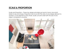
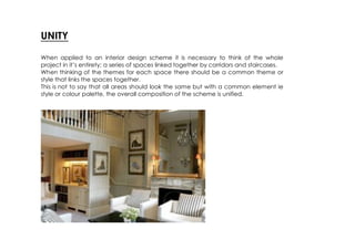
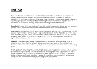
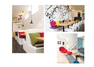
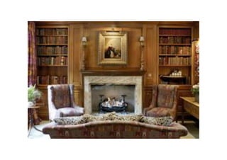
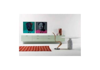
The 7 principles of
design
Objectives -
         • To demonstrate an understanding of the
         principles of design
          • To identify the principles of design in
         interior schemes
         • To apply the principles to personal
         design schemes
The 7 principles of design
• Scale & Proportion
• Unity & Harmony
• Rhythm
• Balance
• Emphasis (Focal Point)
• Colour
• Detail
SCALE & PROPORTION

Scale and Proportion – These two design principles go hand in hand, since both
relate to size and shape. Proportion has to do with the ratio of one design element to
another, or one element to the whole. Scale concerns itself with the size of one
object compared to another.
UNITY

When applied to an interior design scheme it is necessary to think of the whole
project in it’s entirety; a series of spaces linked together by corridors and staircases.
When thinking of the themes for each space there should be a common theme or
style that links the spaces together.
This is not to say that all areas should look the same but with a common element ie
style or colour palette, the overall composition of the scheme is unified.
RHYTHM
If we would speak about music we would describe rhytmas the beat of pulse of the music. In
interior design, rhythm is all about visual pattern repetition. Rhythm is defined as continuity,
recurrence or organised movement. To achieve these themes in a design, you need to think about
repetition, progression, transition and contrast. Using these mechanisms will impart a sense of
movement to your space, leading the eye from one design element to another.

Repetition is the use of the same element more than once throughout a space. You can repeat a
pattern, colour, texture, line, or any other element, or even more than one element.

Progression is taking an element and increasing or decreasing one or more of its qualities. The most
obvious implementation of this would be a gradation by size. A cluster of candles of varying sizes
on a simple tray creates interest because of the natural progression shown. You can also achieve
progression via colour, such as in a monochromatic colour scheme where each element is a
slightly different shade of the same hue.

Transition is a little harder to define. Unlike repetition or progression, transition tends to be a
smoother flow, where the eye naturally glides from one area to another. The most common
transition is the use of a curved line to gently lead the eye, such as an arched doorway or winding
path.

Finally, contrast is fairly straightforward. Putting two elements in opposition to one another, such as
black and white pillows on a sofa, is the hallmark of this design principle. Opposition can also be
implied by contrasts in form, such as circles and squares used together. Contrast can be quite
jarring, and is generally used to enliven a space. Be careful not to undo any hard work you’ve
done using the other mechanisms by introducing too much contrast!
BALANCE
In a short, balance can be described as the equal distribution of visual weight in a space. There
are three styles of balance: symmetrical, asymmetrical, and radial.

Symmetrical balance is usually found in traditional interiors. Symmetrical balance is characterised
by the same objects repeated in the same positions on either side of a vertical axis, for example
you might remember old rooms where on each side of a room is an exact mirror of the other. This
symmetry also reflects the human form, so we are inately comfortable in a balanced setting.

Asymmetrical balance is more appropriate in design in these days. Balance is achieved with some
dissimilar objects that have equal visual weight or eye attraction. Assymetrical balance is more
casual and less contrived in feeling, but more difficult to achieve. Asymmetry suggests movement,
and leads to more lively interiors.

Radial symmetry is when all the elements of a design are arrayed around a centre point. A spiral
staircase is also an excellent example of radial balance. Though not often employed in interiors, it
can provide an interesting counterpoint if used appropriately.
EMPHASIS (FOCAL POINT)
Interior design’s biggest enemy is boredom. A well-designed space always has,
depending on the size of it, one or more focal points. A focal point must be
dominant to draw attention and interesting enough to encourage the viewer to look
further. A focal point thus must have a lasting impression but must also be an integral
part of the decoration linked through scale, style, color or theme. A fireplace or a
flat tv is the first example that most people think of when we talk about a room focal
point.

If you don’t have a natural focal point in your space, such as a fireplace for
example, you can create one by highlighting a particular piece of furniture, artwork,
or by simply painting a contrasting colour in one area. Try to maintain balance,
though, so that the focal point doesn’t hog all of the attention..
COLOUR

Colours have a definite impact on the atmosphere that you want to create in your design
scheme.
Colour can influence our mood and our thoughts. Colours affect people in many ways,
depending upon one’s age, gender, ethnic background or local climate. Certain colours
or groups of colours tend to get a similar reaction from most people – the overall difference
being in the shade or tones used. So it’s important to choose wisely.

Colour can be injected, not only with the use of paint, but materials used on the floor, wall
cladding and lighting.
DETAIL

Another important element of interior design where it is necessary to take infinite pains is
details. Everything from the a light fitting, the colour of the piping on the furniture, to the
light switches and cupboard handles need attention. Unlike colour, people find details
boring. As a result it gets neglected and skimmed over or generally left out. As colour
expresses the whole spirit and life of a scheme; details are just as an important
underpinning of interior design. Details should not be obvious but they should be right,
enhancing the overall scheme.


   London studio West Architecture refurbished the ground floor of this London office by
   dividing the lobby and meeting room with sliding wooden screens.

7 Design Principles

  • 1.
  • 2.
    Objectives - • To demonstrate an understanding of the principles of design • To identify the principles of design in interior schemes • To apply the principles to personal design schemes
  • 3.
    The 7 principlesof design • Scale & Proportion • Unity & Harmony • Rhythm • Balance • Emphasis (Focal Point) • Colour • Detail
  • 4.
    SCALE & PROPORTION Scaleand Proportion – These two design principles go hand in hand, since both relate to size and shape. Proportion has to do with the ratio of one design element to another, or one element to the whole. Scale concerns itself with the size of one object compared to another.
  • 5.
    UNITY When applied toan interior design scheme it is necessary to think of the whole project in it’s entirety; a series of spaces linked together by corridors and staircases. When thinking of the themes for each space there should be a common theme or style that links the spaces together. This is not to say that all areas should look the same but with a common element ie style or colour palette, the overall composition of the scheme is unified.
  • 6.
    RHYTHM If we wouldspeak about music we would describe rhytmas the beat of pulse of the music. In interior design, rhythm is all about visual pattern repetition. Rhythm is defined as continuity, recurrence or organised movement. To achieve these themes in a design, you need to think about repetition, progression, transition and contrast. Using these mechanisms will impart a sense of movement to your space, leading the eye from one design element to another. Repetition is the use of the same element more than once throughout a space. You can repeat a pattern, colour, texture, line, or any other element, or even more than one element. Progression is taking an element and increasing or decreasing one or more of its qualities. The most obvious implementation of this would be a gradation by size. A cluster of candles of varying sizes on a simple tray creates interest because of the natural progression shown. You can also achieve progression via colour, such as in a monochromatic colour scheme where each element is a slightly different shade of the same hue. Transition is a little harder to define. Unlike repetition or progression, transition tends to be a smoother flow, where the eye naturally glides from one area to another. The most common transition is the use of a curved line to gently lead the eye, such as an arched doorway or winding path. Finally, contrast is fairly straightforward. Putting two elements in opposition to one another, such as black and white pillows on a sofa, is the hallmark of this design principle. Opposition can also be implied by contrasts in form, such as circles and squares used together. Contrast can be quite jarring, and is generally used to enliven a space. Be careful not to undo any hard work you’ve done using the other mechanisms by introducing too much contrast!
  • 8.
    BALANCE In a short,balance can be described as the equal distribution of visual weight in a space. There are three styles of balance: symmetrical, asymmetrical, and radial. Symmetrical balance is usually found in traditional interiors. Symmetrical balance is characterised by the same objects repeated in the same positions on either side of a vertical axis, for example you might remember old rooms where on each side of a room is an exact mirror of the other. This symmetry also reflects the human form, so we are inately comfortable in a balanced setting. Asymmetrical balance is more appropriate in design in these days. Balance is achieved with some dissimilar objects that have equal visual weight or eye attraction. Assymetrical balance is more casual and less contrived in feeling, but more difficult to achieve. Asymmetry suggests movement, and leads to more lively interiors. Radial symmetry is when all the elements of a design are arrayed around a centre point. A spiral staircase is also an excellent example of radial balance. Though not often employed in interiors, it can provide an interesting counterpoint if used appropriately.
  • 11.
    EMPHASIS (FOCAL POINT) Interiordesign’s biggest enemy is boredom. A well-designed space always has, depending on the size of it, one or more focal points. A focal point must be dominant to draw attention and interesting enough to encourage the viewer to look further. A focal point thus must have a lasting impression but must also be an integral part of the decoration linked through scale, style, color or theme. A fireplace or a flat tv is the first example that most people think of when we talk about a room focal point. If you don’t have a natural focal point in your space, such as a fireplace for example, you can create one by highlighting a particular piece of furniture, artwork, or by simply painting a contrasting colour in one area. Try to maintain balance, though, so that the focal point doesn’t hog all of the attention..
  • 12.
    COLOUR Colours have adefinite impact on the atmosphere that you want to create in your design scheme. Colour can influence our mood and our thoughts. Colours affect people in many ways, depending upon one’s age, gender, ethnic background or local climate. Certain colours or groups of colours tend to get a similar reaction from most people – the overall difference being in the shade or tones used. So it’s important to choose wisely. Colour can be injected, not only with the use of paint, but materials used on the floor, wall cladding and lighting.
  • 13.
    DETAIL Another important elementof interior design where it is necessary to take infinite pains is details. Everything from the a light fitting, the colour of the piping on the furniture, to the light switches and cupboard handles need attention. Unlike colour, people find details boring. As a result it gets neglected and skimmed over or generally left out. As colour expresses the whole spirit and life of a scheme; details are just as an important underpinning of interior design. Details should not be obvious but they should be right, enhancing the overall scheme. London studio West Architecture refurbished the ground floor of this London office by dividing the lobby and meeting room with sliding wooden screens.